Picking the right contrasting kitchen cabinet colors can be overwhelming when you want something bold but still balanced enough for everyday living.
Some kitchen cabinet colors often look great online, but once installed, they may clash with flooring, counters, or even natural lighting.
You might feel unsure whether to go light on top or bottom, or how to mix wood tones with painted finishes the right way.
Some combinations feel too trendy, while others fall flat and make your kitchen look disconnected or messy instead of being designed with purpose.
Budget also becomes a concern since repainting or replacing cabinets is not something most people want to do twice in one year.
Pinterest shows perfect two-tone kitchen cabinet ideas that are hard to recreate with real-life layout issues or outdated appliances in the way.
It’s also tough to know which colors work together without making the space feel smaller, darker, or overly decorated with clashing finishes.
This post may contain affiliate links. As an Amazon Associate and a participant in other affiliate programs, I earn a commission on qualifying purchases at no additional cost to you.
And when you finally settle on colors, you still have to figure out hardware, backsplash, and decor that actually match and flow.
That’s why many people stick to all-white kitchens, even though they secretly want something more bold and personal for their space.
If this sounds familiar, it’s time to explore contrasting kitchen cabinet colors that add style, depth, and personality without sacrificing comfort or function.
What Are Contrasting Kitchen Cabinet Colors
Contrasting kitchen cabinet colors use two or more shades to divide upper and lower cabinets, highlight the island, or frame accent areas.
This idea goes beyond basic color matching and brings a custom look by using bold kitchen color combinations that feel fresh and well-planned.
Dark and light cabinet contrast helps define the space and gives your kitchen more structure without adding any extra walls or visual clutter.
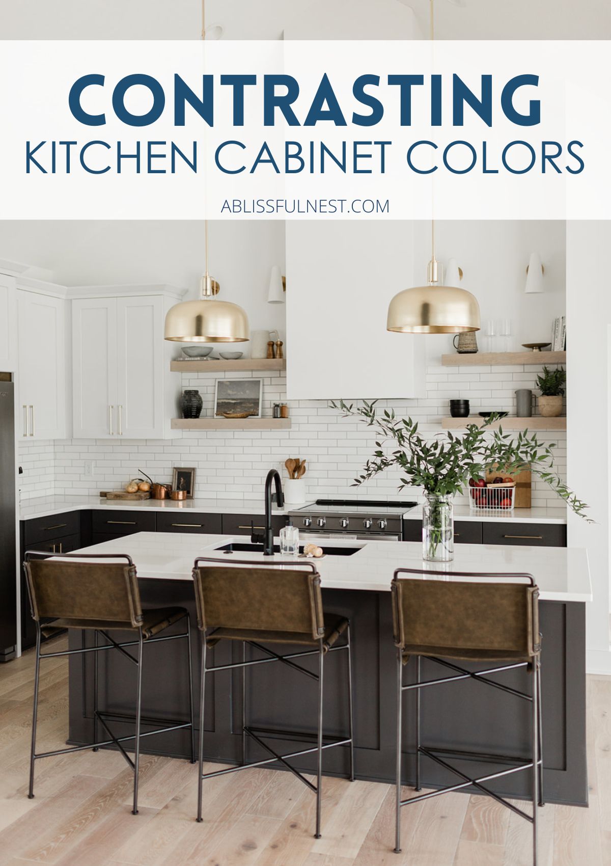
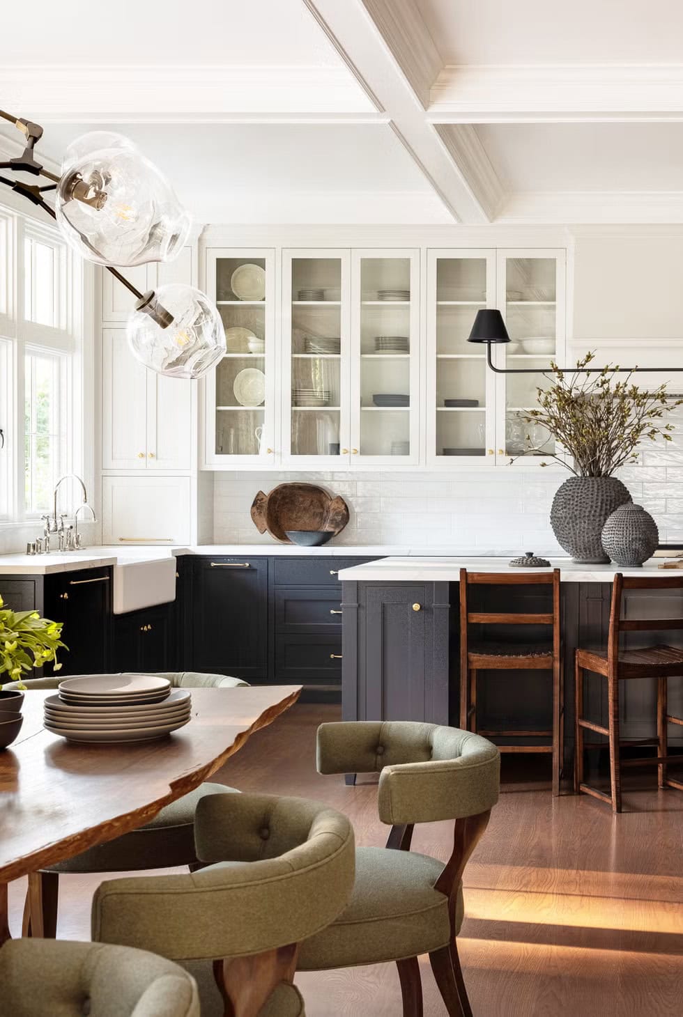
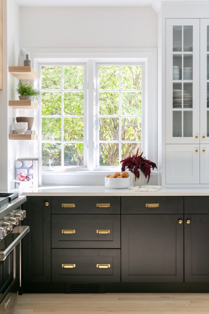
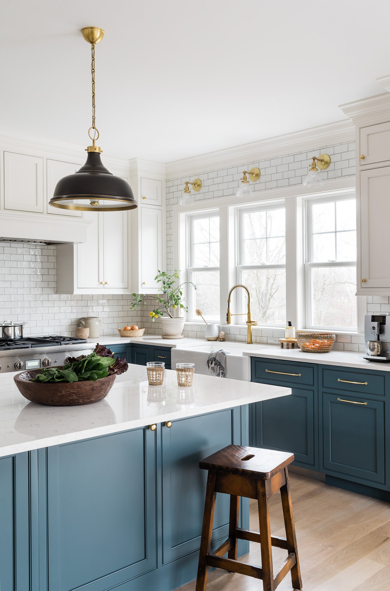
One popular mix is using crisp white upper cabinets with navy or black lowers, which brings clean contrast and a timeless style.
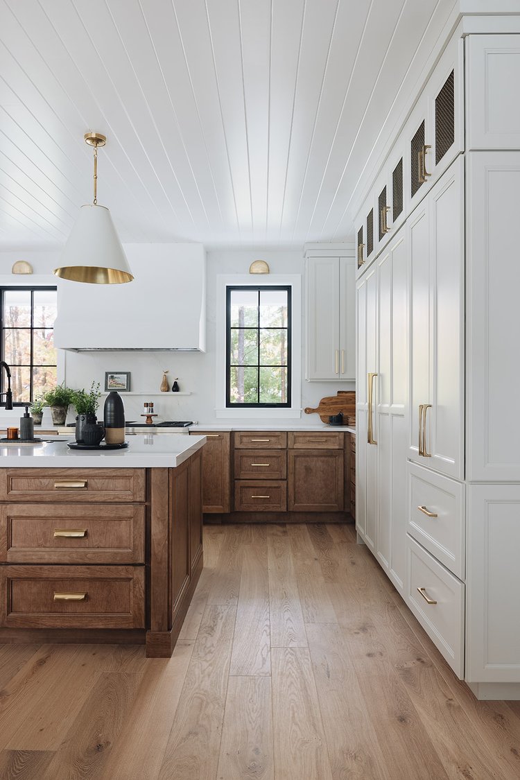
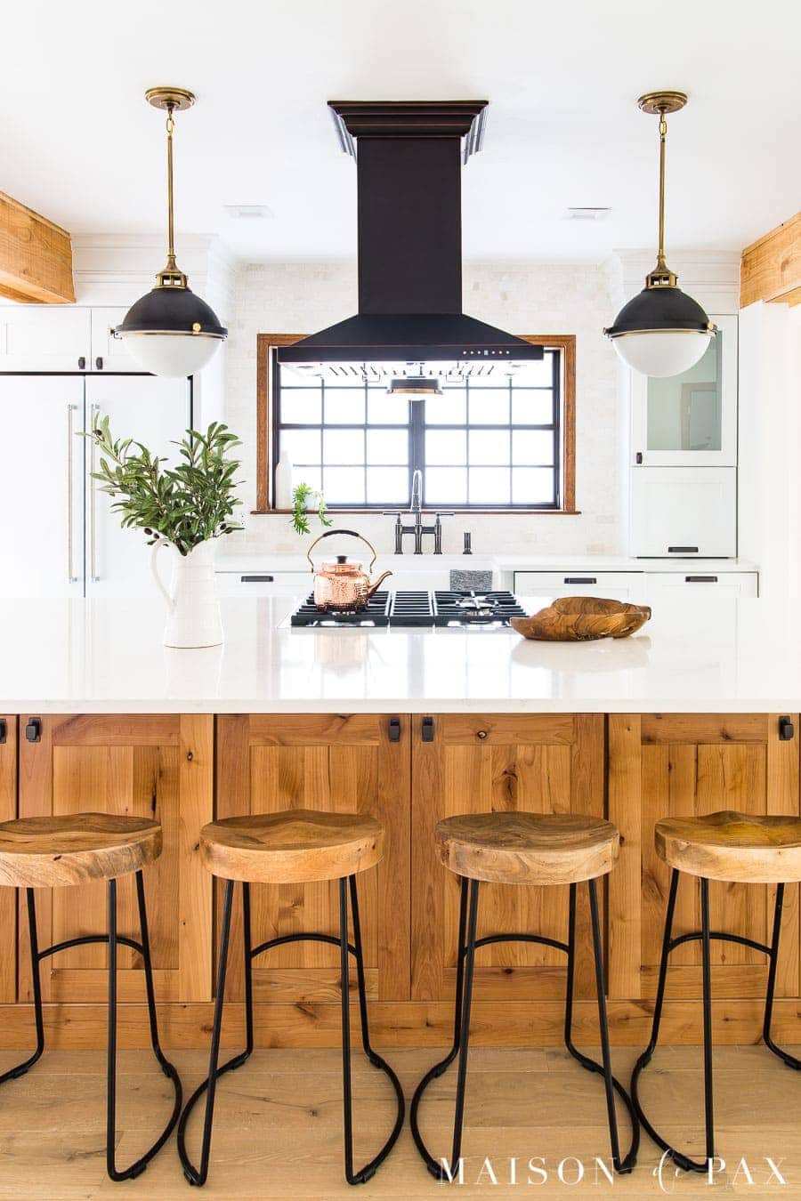
Another option is pairing natural wood bases with painted uppers to add warmth while keeping the top half light and bright.
When done well, this high-contrast cabinet design draws the eye and creates natural focal points that work in both small and large kitchens.
It also gives you a chance to show off your personality without overwhelming the room with too many loud or trendy colors.
Mixed kitchen cabinet finishes are ideal for people who like a layered look and want to break away from all-matching furniture or surfaces.
You can choose colors based on mood, material, or even layout to help guide people through the space naturally as they walk in.
Whether you want something dramatic or subtle, this concept gives your kitchen more style without changing its layout or footprint.
Why You Should Choose Contrasting Cabinet Colors
Choosing contrasting cabinets brings balance, depth, and movement to your space, making everything feel more open, stylish, and custom-built for your needs.
This approach is great for breaking up monotony in kitchens with long cabinet runs or open-concept layouts that need better visual separation.
A light upper and dark lower setup works especially well in small kitchens where you want height without sacrificing a grounding base color.
Dark and light cabinet contrast also brings attention to key features like the island, window walls, or built-in pantry cabinets.
These two-tone kitchen cabinet ideas help you blend modern and traditional styles without having to choose one or the other completely.
Open-concept kitchens benefit from contrast because it helps define the cooking zone while keeping the dining or living space connected.
Using contrast allows you to highlight beautiful countertops, floating shelves, or backsplashes without having everything compete for attention.
Even a bold island painted in a different color can anchor your layout and make the whole kitchen feel more intentional and grounded.
If you’re bored with your all-white kitchen but not ready for bright colors, contrast offers the perfect middle ground with better style.
It’s a practical choice that makes your kitchen feel unique while still working with everyday needs like storage, flow, and light.
The Best Backsplash Colors For Contrasting Cabinets
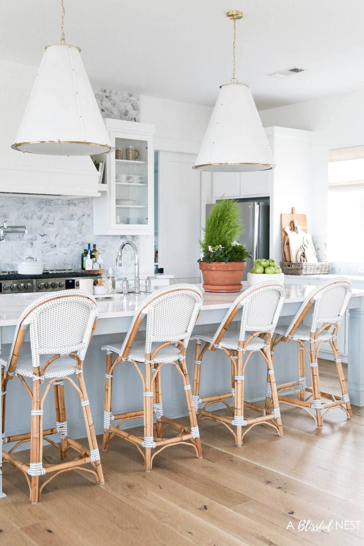
For kitchens with light upper cabinets and dark lowers, try simple white subway tile or soft neutral mosaic to balance the two tones.
If your lower cabinets are colorful or bold, matching the backsplash to the uppers keeps things grounded and avoids visual overload.
Would you like to save this post?
A high-contrast kitchen island should be the star, so choose a plain backsplash like white herringbone or soft gray to let it shine.
Natural stone or neutral tile helps soften strong color combinations without removing their impact or cluttering up the wall space behind the stove.
In open-concept layouts, a quiet backsplash keeps the kitchen feeling connected to other areas while still highlighting your cabinet color choice.
If your kitchen has high ceilings or wide walls, a tall backsplash in a soft tone can draw the eye up without overwhelming the space.
Match the grout to your cabinet hardware or fixtures for subtle detail that ties everything together without shouting for attention.
Glass tile backsplashes can also work well with mixed cabinet colors, especially in lighter shades that reflect natural light around the kitchen.
Don’t choose a backsplash with too many colors or patterns if your cabinets already have contrast built in through bold color differences.
The goal is to support your high-contrast cabinet designs, not distract from the work your upper and lower shades are already doing.
Tips For Choosing Hardware For Contrasting Cabinets
When choosing hardware, match the finish to the dominant cabinet color or the one you want to highlight most in your kitchen.
For example, if your uppers are white and lowers are navy, use brass handles on top and matte black pulls on the bottom.
Mixed metals work best when one finish stays consistent across uppers and another across lowers to keep the look balanced and polished.
Chrome and stainless steel finishes feel sleek and clean, especially with light cabinets, while dark bronze adds warmth to wood or navy shades.
Try oversized pulls for lower cabinets to balance scale and go for smaller knobs or simple handles on top to keep things light.
If your cabinets already have a strong contrast, stick with hardware that blends into each zone instead of adding a third visual distraction.
Use the same shape for both upper and lower hardware to keep the design clean, even if you choose different colors or finishes.
For a farmhouse look, use cup pulls on base cabinets and simple knobs up top, finished in a soft matte black or brushed nickel.
Satin brass can add a rich look when paired with soft whites, while aged bronze makes dark cabinets feel grounded and timeless.
Test the hardware against both finishes before installing to make sure it plays well with each color and doesn’t pull focus too strongly.
Best Decor To Use For Contrasting Kitchen Cabinet Colors
The right decor can help tie everything together and highlight the style you worked hard to create.
So, I’m going to share some of the best decor that supports the mood and color flow of your mixed cabinet finishes without looking forced.
Tap Photos To Shop

Design Styles That Work Best With Contrasting Cabinets
Some kitchen styles naturally support contrasting cabinet colors, making it easier to create a space that feels balanced, layered, and well-designed.
Here are a few kitchen design styles where high-contrast cabinets shine, each offering its own mix of warmth, function, and visual appeal.
- Modern Farmhouse – Soft white uppers and warm wood base cabinets bring together comfort and style for a look that feels both cozy and updated.
- Transitional – Gray uppers paired with navy lowers blend traditional cabinet shapes with bold kitchen color combinations for a fresh, versatile appearance.
- Scandinavian – Light wood uppers and pastel-toned lowers like sage or dusty blue keep the design clean, simple, and grounded in natural elements.
- Industrial – White uppers and black or charcoal lowers, paired with open metal shelving, create a practical space that feels sleek and hardworking.
- Traditional – Cream-colored uppers with deep wood base cabinets add richness and structure while keeping the kitchen timeless and inviting.
- Boho-Inspired – Colorful base cabinets with vintage shelving and white walls create a relaxed setup filled with personality and a casual, lived-in feel.
- Coastal – Seafoam or light blue lowers and crisp white uppers, with brushed nickel touches, bring in that light, breezy, seaside mood.
- Minimalist – Pale gray paired with light oak keeps the contrast soft and subtle, perfect for clean spaces that avoid clutter and bright colors.
- Eclectic – Contrasting cabinets offer room for layering rugs, art, and vintage finds without overwhelming the space or competing with each element.
- Rustic – Distressed wood base cabinets and creamy uppers keep the kitchen bright and natural while staying true to a comfortable farmhouse setting.
Frequently Asked Questions
Navy, charcoal, and forest green offer rich contrast against white walls while still feeling classic, clean, and easy to decorate around. Natural wood tones also pair beautifully with white walls, adding warmth and texture that keeps the space feeling grounded and balanced.
Yes, pairing dark cabinets with light countertops adds visual balance and keeps the space feeling open, especially in kitchens with limited light. Just make sure the undertones in the cabinet and counter match so the look stays intentional instead of clashing or feeling unfinished.
Choose matte for a soft, modern look that hides smudges better. Go glossy if you want shine, depth, and an easier wipe-down after cooking. You can also mix both by using matte lowers and glossy uppers to bring in contrast through texture as well as color.
Yes, well-designed two-tone cabinets make your kitchen look updated and custom, which can boost appeal during a home sale or appraisal. Buyers like kitchens that feel current but timeless, especially when contrast adds style without needing a full remodel or major layout change.
Satin and matte finishes do best at hiding fingerprints and dust, especially on darker cabinets that usually show more marks than light ones. Avoid high-gloss on base cabinets if you have kids or pets since shiny finishes can highlight every scratch, drip, or daily smudge.
Designing a kitchen that feels stylish and personal can be tough with so many color choices and layout details to figure out.
The beauty of contrasting kitchen cabinet colors is that they offer a bold but practical way to upgrade without tearing everything out.
These mixed finishes work across many styles and bring personality without making the space feel loud, busy, or off-balance.
With the right colors, backsplash, hardware, and decor, your kitchen can feel pulled together and unique without losing everyday function.
So, I hope these kitchen cabinet colors help you bring energy, depth, and a fresh update into the heart of your home!