Choosing from the top Sherwin Williams kitchen cabinet colors sounds easy until you’re staring at dozens of paint samples that all start to look the same.
Many people struggle with kitchen cabinet colors because they want something warm and timeless, but it still needs to match everything else already in the room.
It can be hard to tell if a paint will feel cozy or too dark once it’s on a larger surface like a cabinet door.
Some paint colors look nice on the swatch, but under your kitchen’s natural lighting, they suddenly feel cooler, duller, or not what you imagined.
Deciding between warm tones and gray undertones feels confusing when you’re trying to create a space that feels both fresh and inviting every single day.
It’s common to second-guess everything once you tape the samples on the cabinets and still don’t feel excited about any of the shades.
People also worry about choosing a color that might go out of style or clash with hardware, counters, and other permanent details in the room.
This post may contain affiliate links. As an Amazon Associate and a participant in other affiliate programs, I earn a commission on qualifying purchases at no additional cost to you.
That’s why many people love using the Sherwin Williams kitchen cabinet colors since they’ve already worked beautifully in all kinds of real kitchens.
From soft pure white to cozy neutrals, these paints add warmth, depth, and balance that help your kitchen feel clean, fresh, and pulled together.
If you’ve been unsure where to start, I’ve got some simple tips and creative ideas that will help you paint kitchen cabinets with confidence.
Why People Love Sherwin Williams Paint Colors
When it comes time to paint kitchen cabinets, many people turn to Sherwin Williams because it’s a brand they know, trust, and keep coming back to.
One big reason is its long-lasting formula that holds up through everyday messes like spills, fingerprints, and heavy cabinet use without peeling or fading quickly.
Their wide range of paint colors gives people plenty of choices, whether they want something soft and neutral or bold and full of personality.
Each color goes on smoothly with very little streaking, making the job easier and less stressful, even if you’re not a professional painter.
Many people also love that Sherwin Williams paints dry to a strong, clean finish that stays beautiful year after year with basic care.
Thanks to soft gray undertones and gentle warm tones, these paints can blend into nearly any kitchen without feeling too modern or too old-fashioned.
Whether you love white cabinets, soft beige, or something darker, Sherwin Williams has a tone that works with your floors, walls, and appliances.
These paints are also made to look different in natural lighting, helping your kitchen feel bright during the day and cozy in the evening.
The best part is how easy it is to match a shade that feels like you, bringing comfort and happiness into your everyday space.
So grab some samples, trust your gut, and find a color that makes your kitchen feel more like home every time you walk in.
Top Sherwin Williams Kitchen Cabinet Colors
Sherwin Williams offers a wonderful mix of warm, cool, and neutral tones that make it easy to bring new life to your kitchen cabinets.
Whether you’re dreaming of a bright modern look or something cozy and timeless, these paint colors can help transform your space with ease.
Each shade below blends beautifully with different finishes, hardware, and natural lighting, giving you plenty of inspiration to find your perfect match.
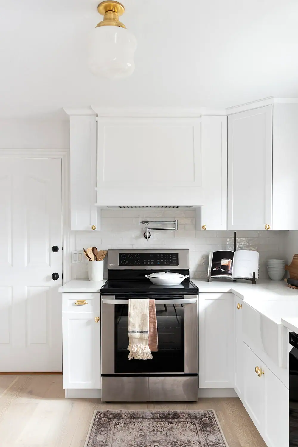
- Pure White SW 7005 — A crisp, clean white with subtle gray undertones that keep it from feeling too bright or sterile in your kitchen. It’s a favorite for modern and farmhouse-style spaces because it reflects natural lighting beautifully, creating an airy and refreshing feel.
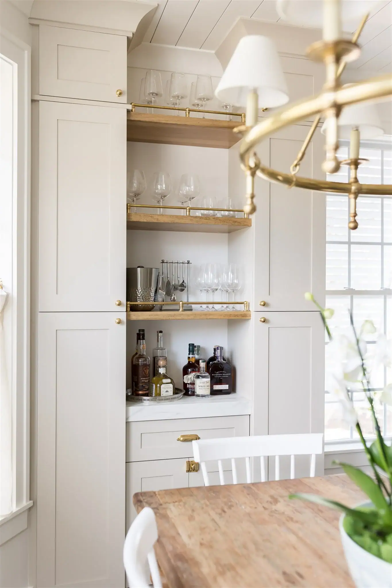
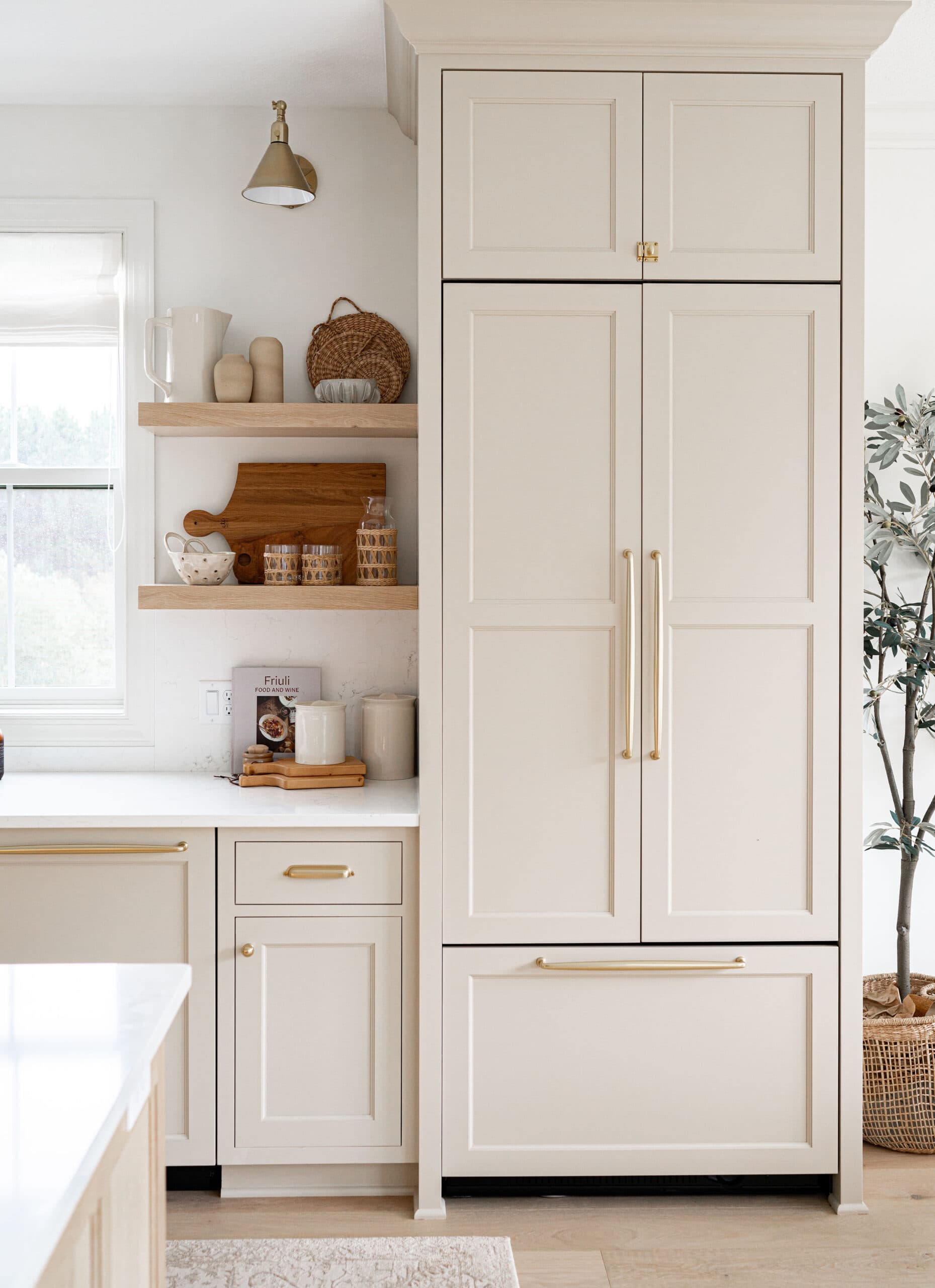
- Alabaster SW 7008 — A creamy white with warm tones that make your kitchen feel cozy while still keeping everything light and inviting. It works wonderfully in both classic and cottage-style kitchens, especially when paired with wood accents or brushed brass hardware.
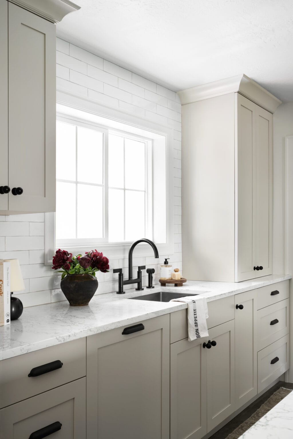
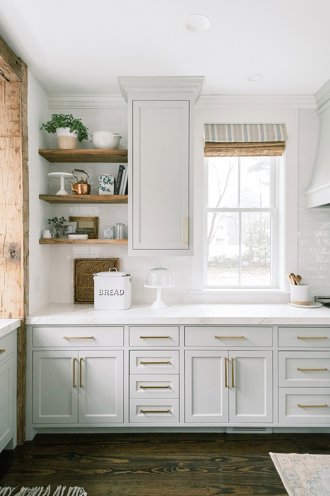
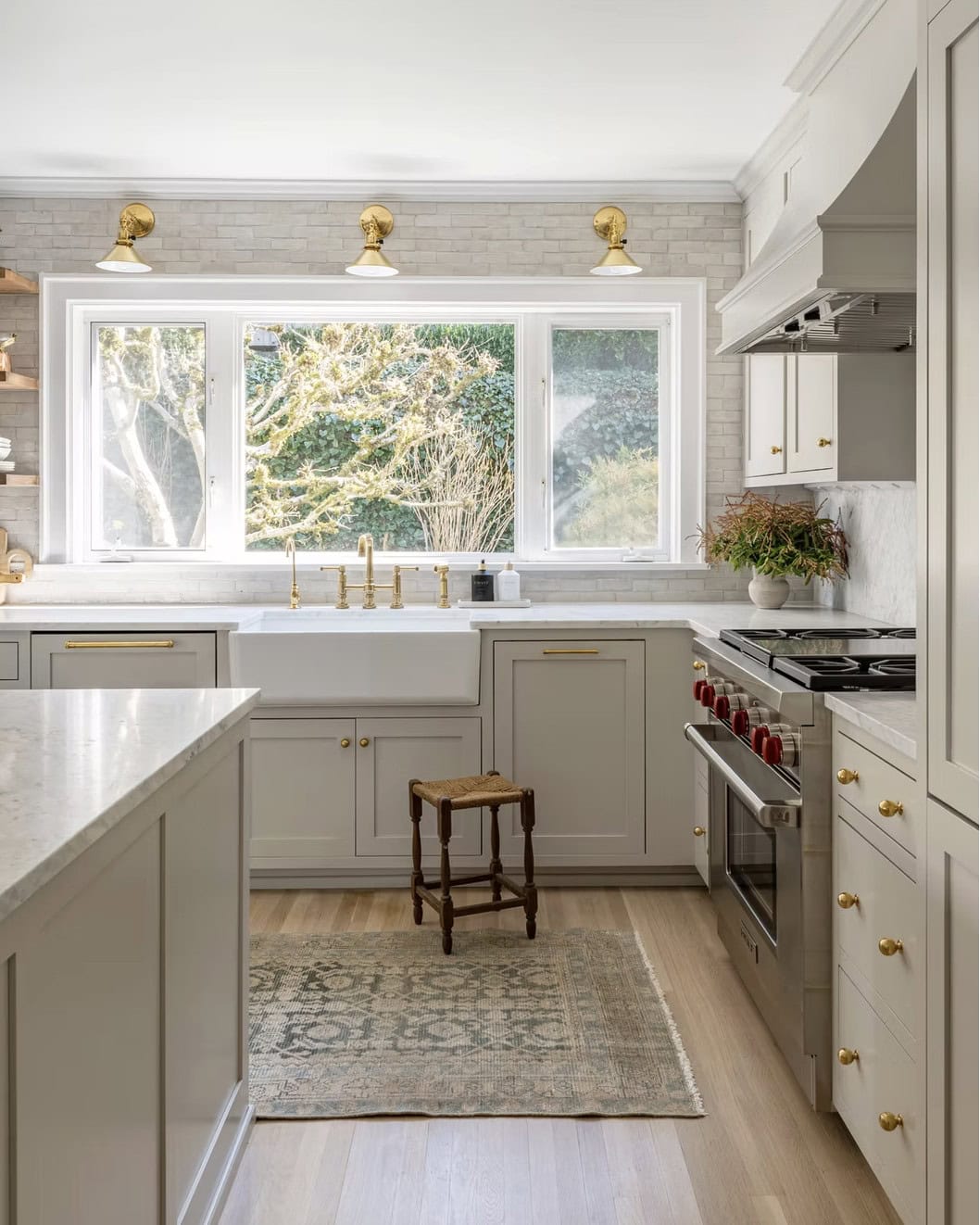
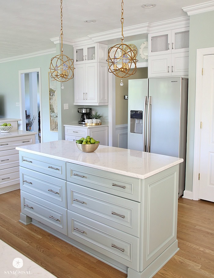
- Agreeable Gray SW 7029 — A perfect mix of warm tones and gray undertones, creating a soft, balanced shade that complements many cabinet designs. It looks beautiful under any natural lighting, helping your kitchen feel grounded and calm without looking too dark or dull.
- Repose Gray SW 7015 — This shade offers a slightly cooler touch with gentle gray undertones that pair nicely with white trim or marble countertops. This shade looks especially lovely in kitchens with plenty of sunlight, where it adds subtle depth and a smooth, modern feel.
- Creamy SW 7012 — A soft off-white with warm tones that make kitchens feel cheerful and timeless while matching perfectly with wood or tile floors. It’s ideal for anyone who wants their painted kitchen cabinets to feel comforting and inviting without looking yellow or outdated.
- Accessible Beige SW 7036 — A neutral with gentle gray undertones that make it feel both warm and sophisticated in different natural lighting. It works beautifully in transitional kitchens where you want a calm background that lets other design details shine.
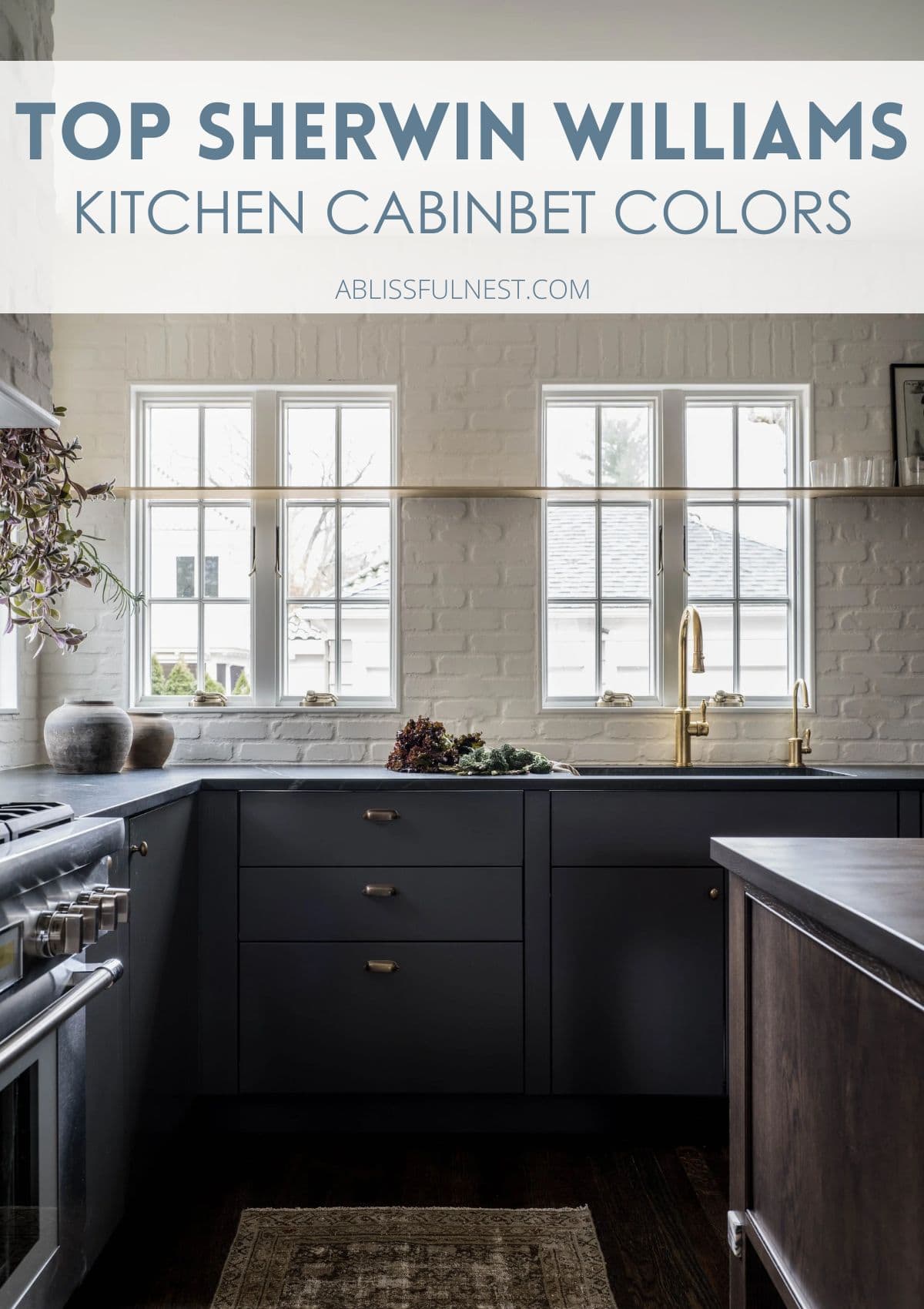
- Naval SW 6244 — A deep navy blue that feels rich and elegant, adding personality while still being versatile and easy to decorate around. Its gray undertones help balance the depth of the color, making it work beautifully with brass, gold, or white accents in your kitchen.
- Iron Ore SW 7069 — A moody charcoal with cool gray undertones that create stunning contrast on lower cabinets or kitchen islands. It fits perfectly in modern or industrial kitchens where you want a bold, polished look that still feels inviting under soft natural lighting.
Best Finishes for Sherwin Williams Kitchen Cabinet Colors
Choosing the right finish for your cabinets is just as important as picking the perfect paint colors, especially when it comes to lasting beauty and easy upkeep.
Each finish affects how the color looks in your space, especially when natural lighting hits your cabinets during the day.
A satin finish gives off a soft glow with just enough shine to resist smudges, making it a popular choice for busy kitchens with kids or pets.
Semi-gloss is another great option because it’s super durable and wipes clean without much effort, which helps keep cabinets looking fresh every day.
If you want your cabinets to reflect more light and feel polished, a gloss finish might be the best match for your kitchen design.
Glossy cabinets can make pure white and other light shades look extra bright, but they do show fingerprints and dust more easily than other finishes.
Satin finishes tend to soften gray undertones and warm tones, helping your cabinets look smoother and more balanced in both daylight and evening lighting.
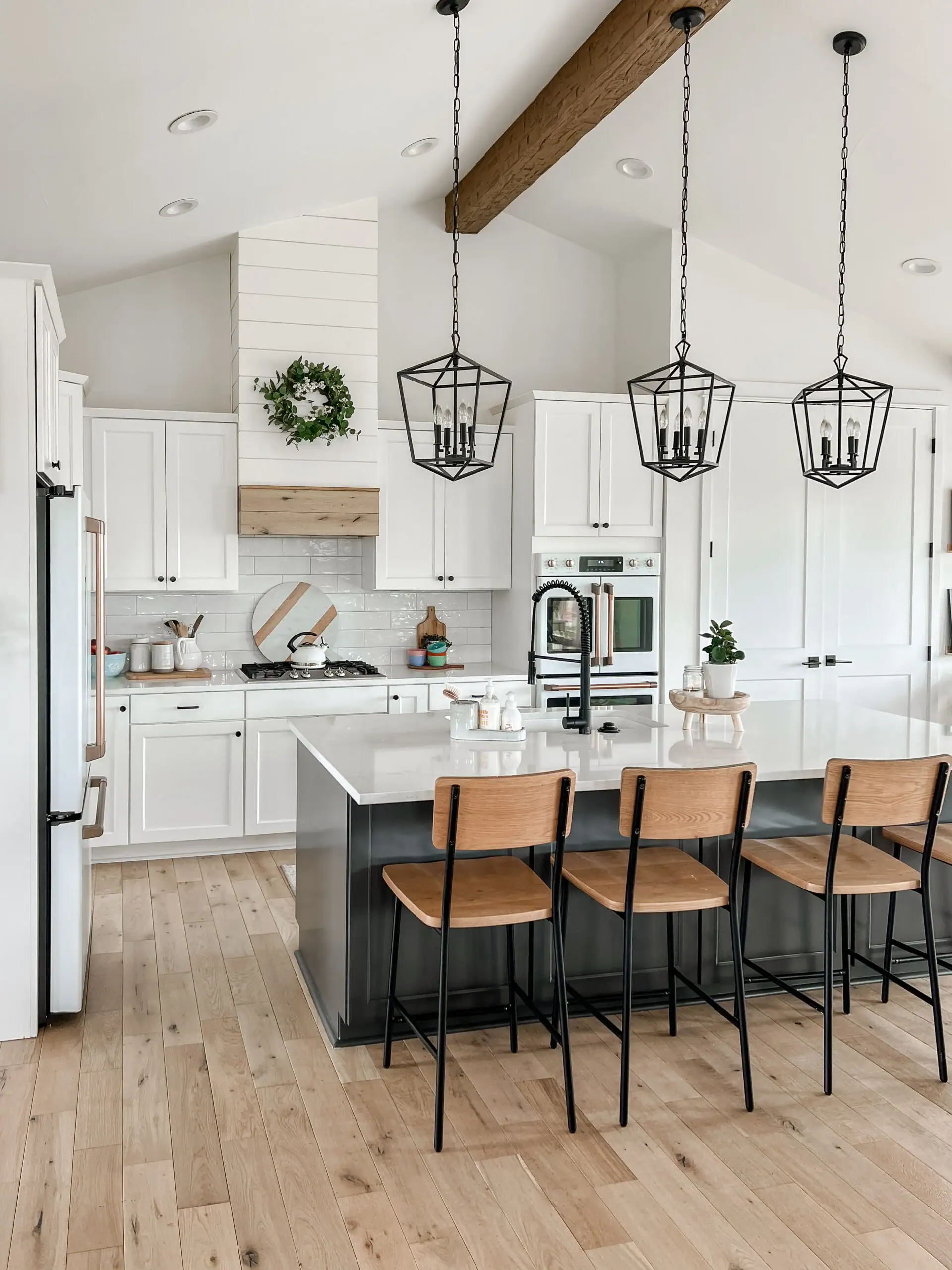
Semi-gloss works great with bold shades like Naval or Iron Ore, adding a little shine that brings out depth and richness without feeling too flashy.
If your kitchen gets a lot of sunlight, a satin or semi-gloss finish will help keep your painted kitchen cabinets looking even and vibrant all day.
Think about how often you cook, clean, and entertain, then pick the finish that gives you the look you love with the care level you can handle.
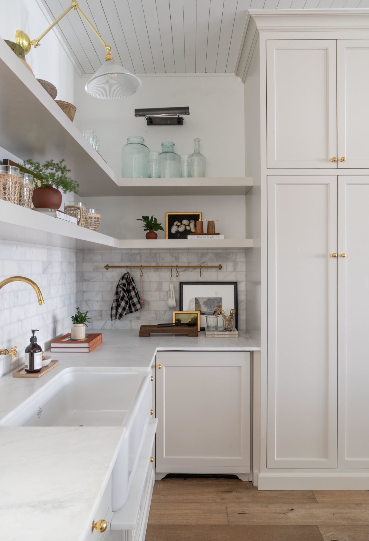
Favorite Decor To Use For Kitchen Cabinets
Little touches like simple accessories can bring out the warmth in your cabinets and make the kitchen feel more inviting.
So, I’ve rounded up some fun and easy decor pieces that pair beautifully with popular Sherwin Williams kitchen cabinet colors in any home.
These small details help balance your space, adding personality and comfort without needing a full makeover or spending too much time decorating.
Tap Photos To Shop

Best White Sherwin Williams Kitchen Cabinet Colors for a Clean Look
White paint kitchen cabinets always feel fresh, bright, and timeless, no matter the size or style of your space.
Would you like to save this post?
They help reflect natural lighting, making kitchens feel bigger, cleaner, and more welcoming throughout the day.
Sherwin Williams has several trusted white shades that pair beautifully with both light and dark accents, giving you tons of decorating flexibility.
- Pure White SW 7005 — A soft, clean feel with just a touch of warmth, which keeps it from feeling too sharp or flat. It pairs well with stainless steel or black hardware and works beautifully in kitchens with steady natural lighting throughout the day.
- Extra White SW 7006 — A bright white with cool tones that gives cabinets a crisp and modern finish without feeling too harsh. This color looks great with silver or chrome hardware, especially in kitchens that get plenty of sunlight or bright task lighting.
- Snowbound SW 7004 — A cozy off-white with gentle gray undertones that help it look calm and balanced under shifting natural lighting. It’s a favorite in farmhouse and transitional kitchens, especially when paired with matte black or antique brass hardware.
- Alabaster SW 7008 — This paint color brings soft, warm tones that feel calming and familiar, perfect for kitchens with wood floors or natural stone countertops. Its creamy finish helps brighten the room gently, giving cabinets a welcoming look without appearing too yellow or too stark.
- Greek Villa SW 7551 — A classic white with subtle warmth that softens your cabinets and gives your kitchen an inviting and polished look. This shade works well with both dark and light finishes, making it a go-to choice for all types of design styles.
Neutral Sherwin Williams Kitchen Cabinet Colors for Modern Homes
Neutral cabinet colors with soft gray undertones bring a clean and balanced look that works beautifully in both modern and transitional kitchens.
These calming shades adapt well to different natural lighting conditions, keeping your kitchen feeling fresh and easy on the eyes all day long.
They’re also great at blending with wood floors, stone countertops, and a variety of hardware styles without clashing or feeling too bold.
- Accessible Beige SW 7036 — A warm neutral with soft gray undertones that shift gently in different natural lighting, making it feel calm and cozy. It pairs well with light granite counters or wood-look floors, helping everything come together in a smooth, relaxed way.
- Agreeable Gray SW 7029 — A go-to shade for modern homes, thanks to its perfect balance between warm tones and cool gray. This color blends easily with both white and wood countertops, creating a soft background that feels clean without being too plain.
- Repose Gray SW 7015 — A cooler neutral that gives cabinets a sleek and airy look, especially in kitchens with bright natural lighting. It looks amazing with marble surfaces and brushed nickel hardware, adding quiet elegance without stealing the attention from other design elements.
- Balanced Beige SW 7037 — This shade offers a richer tone with gentle gray undertones that work well in kitchens with lots of natural wood or earthy tile floors. The color stays grounded and welcoming, even when sunlight moves through the space during different times of day.
- Modern Gray SW 7632 — A soft and light neutral that feels polished and calm, especially under steady daylight from windows or skylights. It blends smoothly with quartz countertops and lighter flooring styles, giving the whole kitchen a clean and open feel.
Best Earthy Sherwin Williams Kitchen Cabinet Colors
If you love cozy kitchens that feel warm and grounded, earthy cabinet colors are the perfect way to bring a natural touch indoors.
These warm tones create a welcoming space that pairs beautifully with wood, stone, and woven textures you already love.
Each shade brings comfort and style together, helping you build a kitchen that feels relaxed, lived-in, and connected to the outdoors.
- Natural Linen SW 9109 — A soft beige with warm, sandy undertones that give kitchens a light and breezy feel without looking too plain. It pairs nicely with rattan accents, oak wood, and light-colored stone for a calm and nature-inspired look.
- Balanced Beige SW 7037 — This paint color creates a grounded, earthy feel that works great in kitchens with rustic beams, wood-look floors, or natural tile backsplashes. Its subtle depth makes your space feel warm and layered without pulling too much focus.
- Dover White SW 6385 — A creamy off-white with warm tones that adds softness and comfort to your kitchen cabinets. It looks lovely with bronze hardware, butcher block counters, or handwoven baskets on open shelves.
- Nomadic Desert SW 6107 — This shade brings a rich, desert-inspired warmth to your cabinets that feels both bold and natural at the same time. This earthy tone pairs beautifully with terracotta pots, aged brass, or darker wood finishes like walnut or mahogany.
- Kilim Beige SW 6106 — A soft tan with cozy warm tones that make kitchens feel bright but never cold or too modern. It works well with white subway tile, black hardware, or exposed brick for that relaxed, lived-in look.
Bold Sherwin Williams Kitchen Cabinet Colors That Make a Statement
Bold cabinet colors bring energy, depth, and personality to kitchens that need something more than soft neutrals or basic whites.
Shades like navy, charcoal, and deep green can turn simple cabinets into eye-catching focal points that still feel warm and inviting.
These richer colors add drama without being too loud, helping your kitchen feel cozy, creative, and full of life.
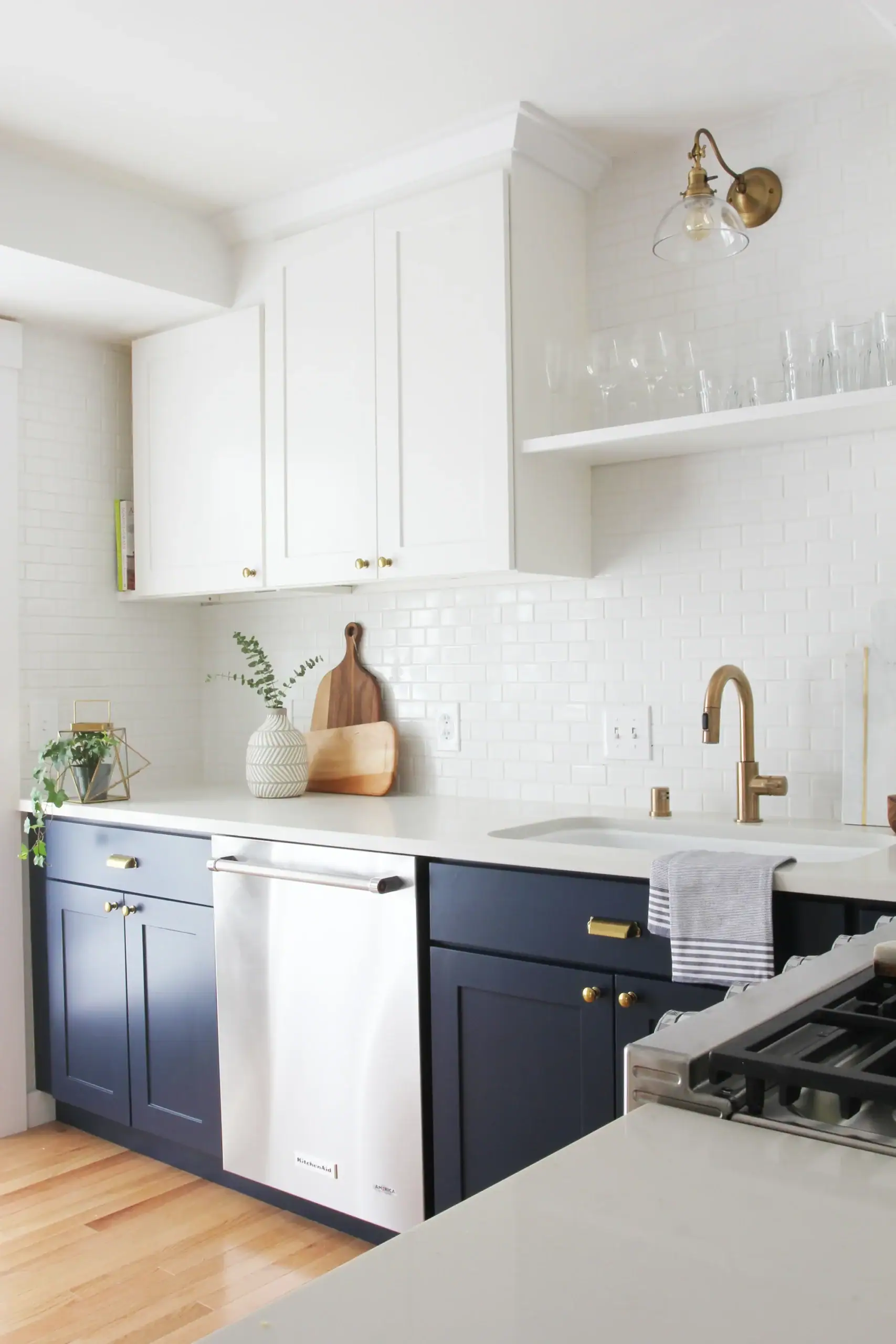
- Naval SW 6244 — A deep navy blue with gray undertones that gives cabinets a rich, classic feel without making the room feel heavy. It works beautifully with brushed gold hardware, white counters, or natural wood accents for a clean yet dramatic look.
- Iron Ore SW 7069 — A dark charcoal that adds bold contrast and modern style, especially on lower cabinets or kitchen islands. Its deep tone feels elegant and grounded, pairing well with lighter countertops, soft natural lighting, and sleek hardware finishes.
- Hale Navy SW 6241 — This shade offers a touch more softness than other navies, giving your cabinets richness while keeping things warm and inviting. It blends nicely with wood floors, white tile, or open shelving to create a cozy yet sophisticated space.
- Billiard Green SW 0016 — Billiard Green SW 0016 is a moody forest green that brings nature indoors while still making your cabinets feel polished and bold.
This shade pairs well with copper accents, butcher block counters, or light oak floors for a warm and earthy touch. - Cyberspace SW 7076 — A deep slate blue that feels sleek and modern, perfect for kitchens that lean industrial or minimalist. Its bold color plays well with clean lines, simple decor, and plenty of natural lighting to keep the space feeling balanced.
Soft Blue and Green Sherwin Williams Kitchen Cabinet Colors
If you want your kitchen to feel calm, fresh, and a little bit dreamy, soft blue and green shades are always a cheerful choice.
These colors remind people of peaceful mornings and open windows, filling the space with an easygoing, breezy kind of energy.
They look lovely with both wood and metal accents, making it fun to mix in baskets, shelves, or your favorite cozy touches.
- Sea Salt SW 6204 — A soft green with gentle gray undertones that shift slightly blue depending on the natural lighting. It pairs beautifully with white oak cabinets, brushed nickel hardware, or open shelves for a light and airy feel.
- Rainwashed SW 6211 — A blue-green mix with a peaceful, cool tone that brings a soft, coastal feel into your kitchen. It shines in bright spaces with white trim, wood countertops, or even small touches of black metal for contrast.
- Oyster Bay SW 6206 — A muted green with gray undertones that gives cabinets a calm, earthy feel without being too dark or dull. It works well with natural wood floors, bronze finishes, or even light-colored tile for a balanced, grounded look.
- Comfort Gray SW 6205 — A cool greenish-blue that feels clean, relaxed, and refreshing, like a soft breeze running through your kitchen. It pairs nicely with maple wood, soft white accents, or woven textures for a casual and cozy space.
- Halcyon Green SW 6213 — A dusty green with a blue touch that brings a soft pop of color while still feeling calm and collected. This shade looks great with warm wood accents, brushed brass hardware, and creamy walls that help it stand out gently.
Painting Tips to Get the Best Finish with Sherwin Williams Paint Colors for Kitchens
Before you even open a paint can, make sure your cabinets are clean, dry, and free of grease so the paint sticks well and lasts longer.
Give everything a light sanding to smooth out the surface and help the primer and paint colors grip better without peeling later on.
Always use a good-quality primer to create a strong base, especially if you’re switching from dark cabinets to light colors like pure white or SW 7008.
Work in a space with steady air flow and the right temperature (not too humid or cold) to help the paint dry smoothly and evenly.
Use a small foam roller or soft brush and apply thin coats so you don’t end up with drips or thick, uneven spots on the cabinets.
Let each coat dry completely before adding the next one, even if it looks like it’s ready sooner under your kitchen’s bright natural lighting.
Stick to two or three light coats instead of one thick coat, since layering gives you a smoother finish and deeper color without streaks.
Check your cabinets from different angles and lighting before calling it done to make sure the finish looks even all around.
Keep a little extra paint on hand for small touch-ups down the road in case life happens and a drawer gets scuffed.
Most of all, enjoy the project, take your time, and feel proud knowing your refreshed kitchen now reflects your style, energy, and creativity.
Frequently Asked Questions
What are the top Sherwin Williams kitchen cabinet colors for a timeless look?
Popular timeless choices include Pure White SW 7005, Alabaster SW 7008, and Accessible Beige SW 7036. These soft shades work in every kitchen style and look clean, warm, and inviting for years to come.
How do I choose the best Sherwin Williams paint finish for kitchen cabinets?
Most people choose satin or semi-gloss for cabinets because they’re easy to clean and hold up well in busy kitchens. These finishes also bring out the beauty of Sherwin Williams paint colors without making them too shiny.
Which Sherwin Williams white paint is best for kitchen cabinets with natural light?
Pure White SW 7005 and Alabaster SW 7008 both reflect natural lighting beautifully, keeping kitchens bright without feeling too harsh or cold. They’re great choices for sunny kitchens or spaces with lots of windows.
Are bold Sherwin Williams kitchen cabinet colors hard to maintain?
Not at all! Bold shades like Naval SW 6244 and Iron Ore SW 7069 look great with semi-gloss finishes that are easy to wipe clean. Just use thin coats and let each layer dry fully for a lasting, smooth finish.
What’s the difference between warm tones and gray undertones in Sherwin Williams cabinet colors?
Warm tones feel cozy and soft, while gray undertones give colors a cooler, more modern feel. Sherwin Williams offers both, so you can find a shade that fits your kitchen style and lighting perfectly.
Choosing the right paint can feel like a big step, but it’s also one of the most fun and rewarding ways to update your space.
The top Sherwin Williams kitchen cabinet colors are loved for a reason. They’re easy to work with and look beautiful in every kind of home.
These shades bring warmth, brightness, and balance, helping your kitchen feel more inviting, lived-in, and full of everyday joy.
Whether you lean toward soft neutrals, bright whites, or bold, rich tones, there’s a color that fits both your taste and lifestyle.
So grab those samples, roll up your sleeves, and start your painting project with a big smile and a whole lot of excitement!