This is a long overdue post seeing as our house is going to be done in the next few months and though I have been sharing a lot on Instagram, there is not as much here on the blog for you. So let’s change that!
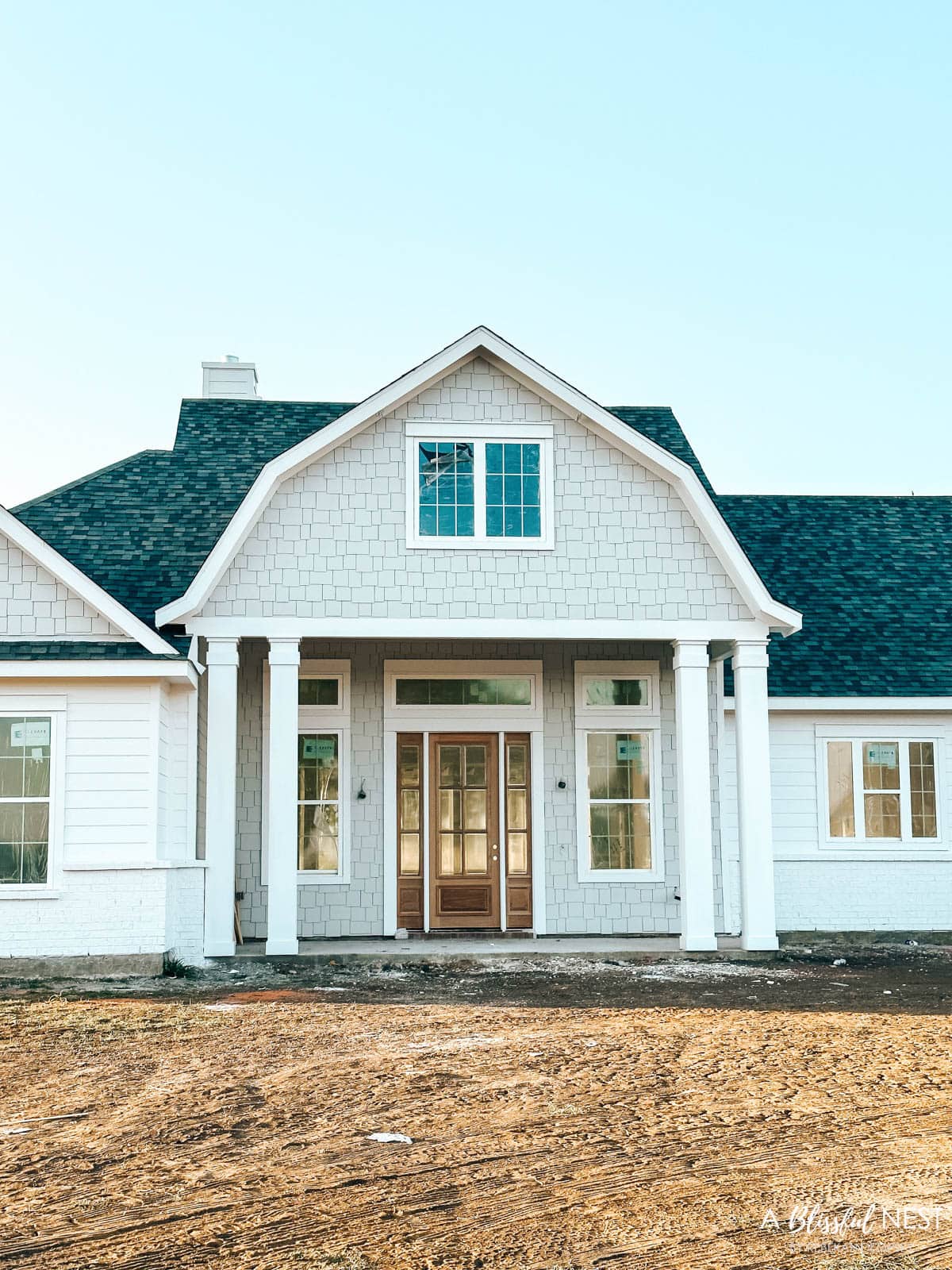
A little while back I shared the exterior elevation plans and inspiration. I have always of course loved the coastal look and wanted something that felt it was out of the Hamptons. This shingle-style home is a classic and I went with soft paint colors for the outside which is reflected inside as well.
I will share more specific material details shortly but wanted to start sharing my design boards for the majority of the house. These are a labor of love to create but I love seeing it all put together and it will give you a good idea of the design direction I am going in for the interior.
This post may contain affiliate links. As an Amazon Associate and a participant in other affiliate programs, I earn a commission on qualifying purchases at no additional cost to you.
More New House Updates:
Entryway Design Plans
The entryway is actually part of the living room space so I have created separations in these two spaces with furniture. We didn’t do a formal entryway because we wanted guests as they came in to enjoy the trees and horses in the back right away.
I haven’t not had a designated entryway in a long time and this definitely tested me. I ordered this cane console table and plan to have the sofa on the backside facing the windows to the back. We had our contractor add a floor plug so we could easily have table lamps here without dragging the cords across the room.
The front door has glass sidelights with transom windows on top as well as flanking tall windows. This creates lots of light and I am planning on adding some bamboo shades to these two windows for privacy.
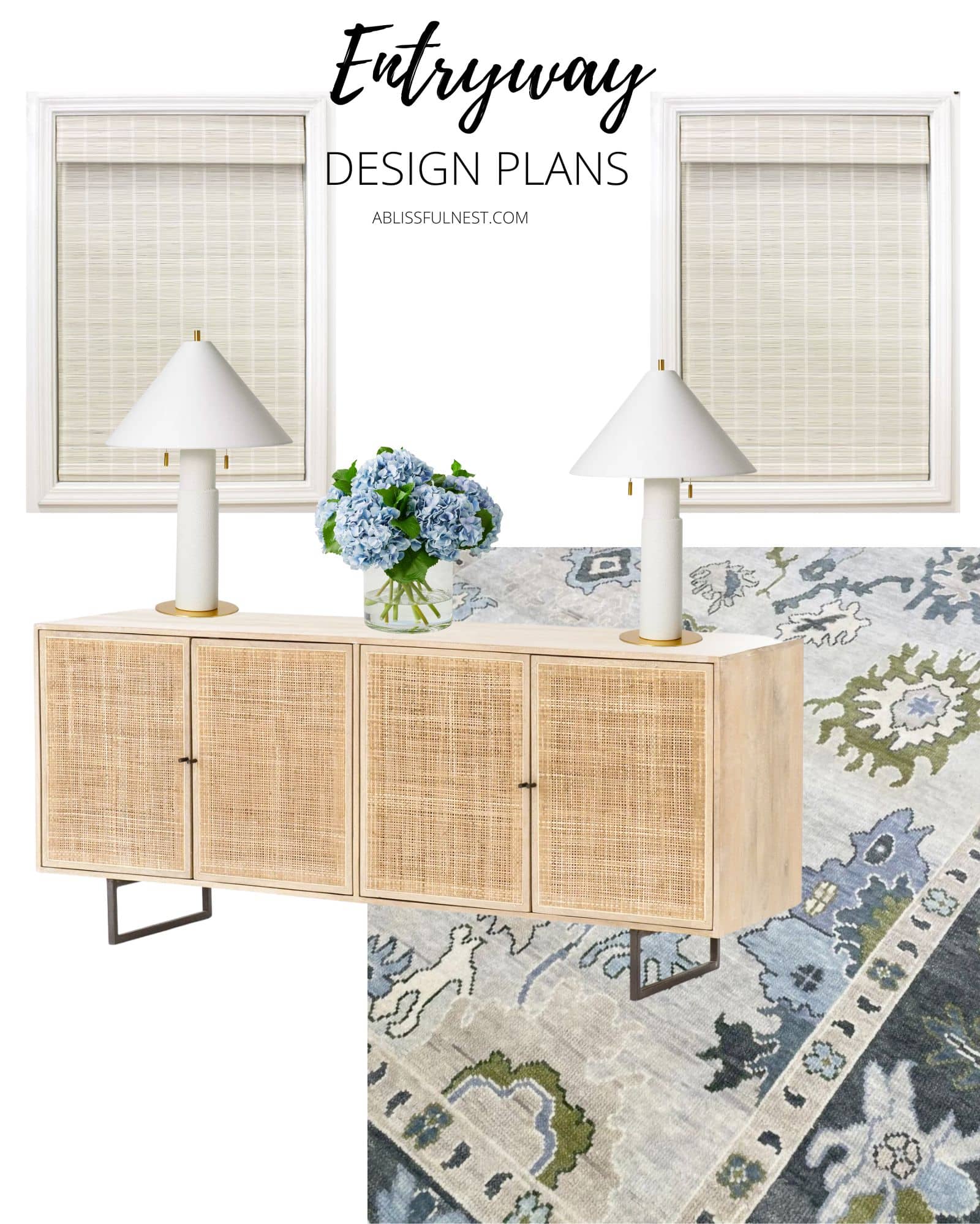
Sources: Bamboo Shades | Console Table | Table Lamps| Area Rug
Living Room Design Plans
The living room plans seem to keep changing but this is where I am as of now. We have 19′ ceilings in here with white beams. The fireplace is to the left of this space and has white brick all the way up with a simple modern frame around the fireplace box. Lots of white on white which I love because it creates depth but moves your eye to the large picture windows to the back of the property.
I love this tiered chandelier and I keep playing with it in here or in the dining room. So we will see where it ends up.
I wanted an area rug with color but that was subtle enough that it wasn’t too bold. I settled on this various shades of blue one with touches of green. I love the pattern and it will look gorgeous with the hardwood floors.
This is the current sofa we have and I want to eventually put a sectional in here. So for now I am keeping it and adding in some of these white barrel style chairs and ottomans for extra seating. I am also keeping our current coffee table. It is such an easy piece that goes with lots of design styles.
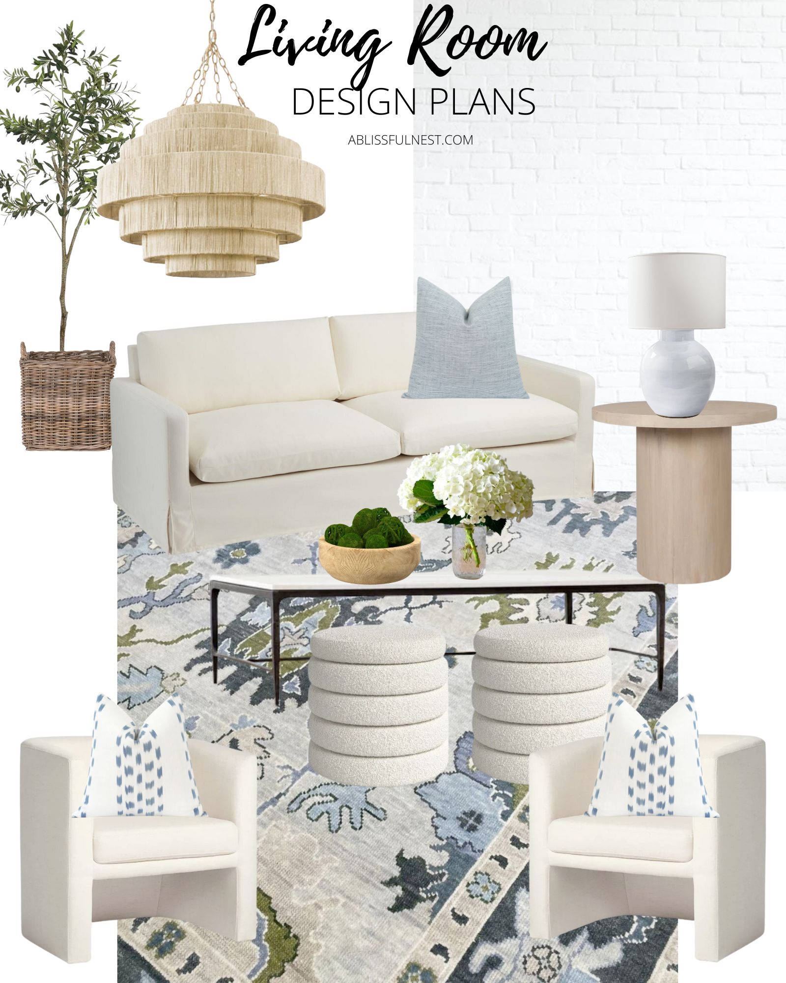
Sources: Faux Olive Tree | Basket | Chandelier | Sofa | Blue Pillow | Side Table | Table Lamp | Area Rug | Coffee Table | Ottomans | White Chairs | Blue + White Throw Pillows
Kitchen/Dining Room Design Plans
To the right of the living room is the kitchen and dining room. I love how open everything is and so these spaces really need to work together.
I love our barstools still from the last house so they are staying. We have had them for over 4 years and they have held up amazing. I have a full review on them if you are considering buying them.
I have been obsessed with these pendant lights for a long time now and think they will add a touch of glam to the kitchen so I am going to add gold knobs and pulls to tie it together. The whole house fixtures are all in chrome but the decorative accents like cabinet hardware and some lighting will have touches of gold.
The cabinets will be shaker style and the kitchen is white except for the island and the lower cabinets in the walk-in pantry. They are a soft gray blue and gorgeous! I am doing a marble subway tile for the backsplash with Calacutta Bianco for the countertops.
I got this cane table on sale months ago and can’t wait to finally unbox it! I love how simple it is and gives that modern coastal look I am going for. I am thinking of these white simple spindle chairs.
I snagged this wood bead chandelier on sale and go back in forth where I am going to put it. So far I am thinking here in the dining room.

Sources: Barstools | Gold Knobs | Gold Pulls | White Pendant Lights | Runner | Vase | Faux Greenery | Wood Bead Chandelier | Table | White Chairs
Laundry Room Design Plans
I am so excited about the laundry room plans! I am in LOVE with this floor tile and actually did it in another color for Lauren’s bathroom (see below). It is a soft shade of gray blue so I am using the same color as the kitchen island for the cabinets in here too.
I have a thing for wood beaded chandeliers so I am adding another one in here and putting bamboo shades on the window in here for some privacy since this faces the front of the house.
Would you like to save this post?
I may add some decorative wood floating shelves which will add a little warmth to the space.
I haven’t picked the final cabinet hardware in here but think I will be going with a gold similar to the kitchen.
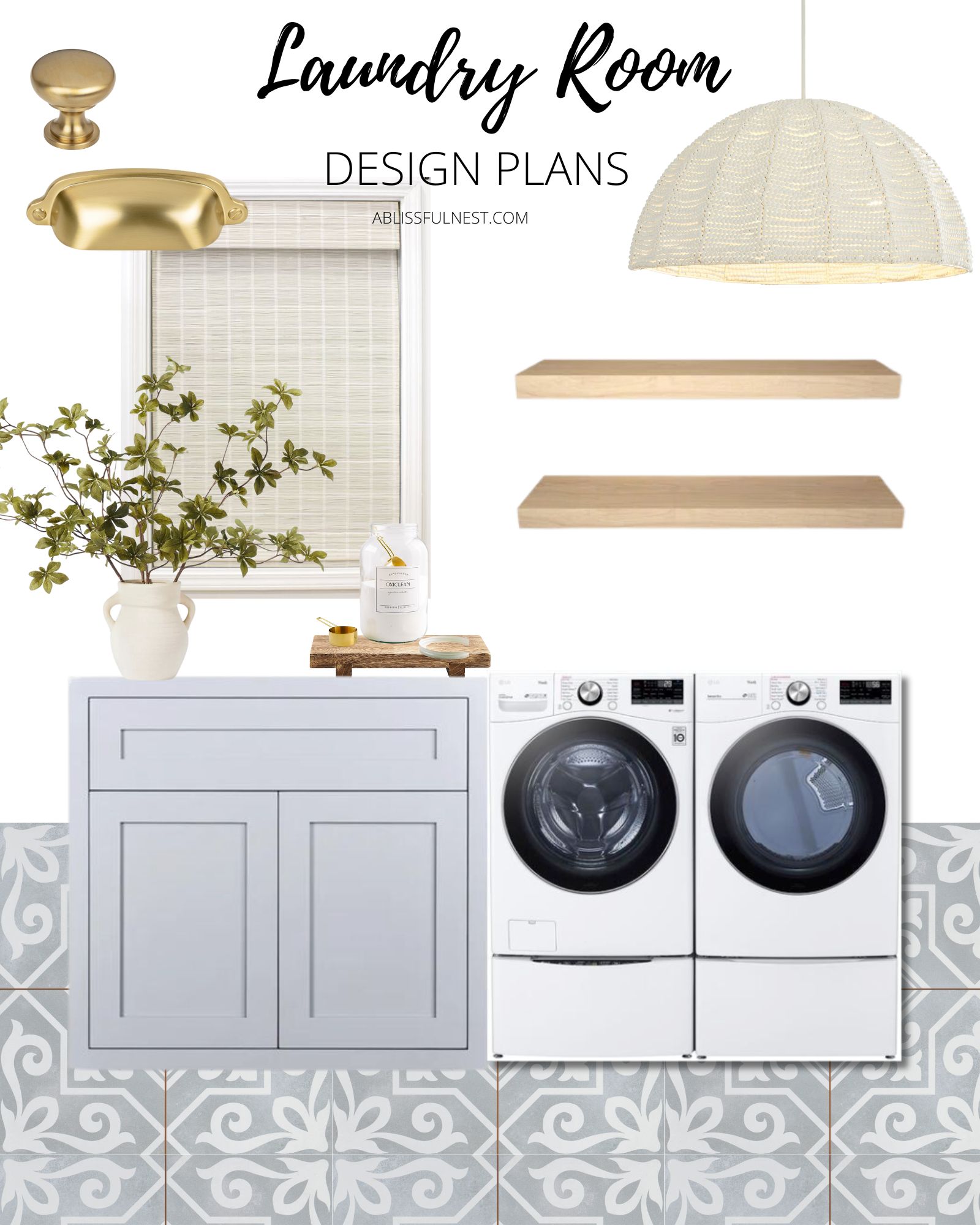
Sources: Gold Knob | Gold Pull | Bamboo Shade | Wood Tray | Greenery Vase | Wood Floating Shelves | Wood Bead Chandelier
Powder Room Design Plans
I definitely brought on the coastal vibes for the powder bathroom and it all started with the blue star floor tile. It reminded me of my honeymoon to Portugal and love the geometric pattern.
I plan on doing shiplap in here eventually so for now the walls will be white. I am reusing our white washed arch mirror from the last house in here and flanking it with these beautiful white sconces.
The cabinet will be in a deep navy color and I am undecided what color the cabinet hardware will be so stay tuned.
I am thinking to accessorize with a cute beachy print and some monogrammed towels.
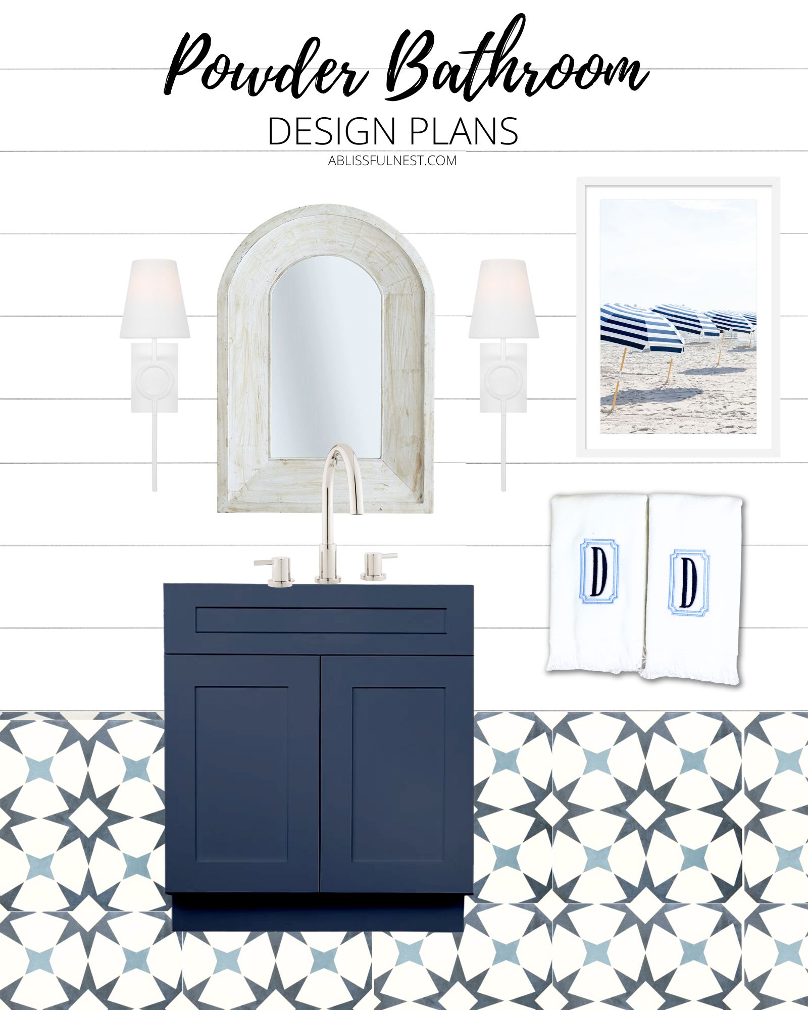
Sources: White Sconces | Mirror (similar) | Umbrella Art Print | Monogram Towels
Master Bathroom Design Plans
I can’t get over how long it took me to settle on a design for our master bathroom. I wanted something serene, elevated, and simple but not generic with white cabinets, etc.
So I settled on these large floor tiles that look like marble and popped the vein color from the tile into the cabinet paint color so it is a beautiful deep gray color.
I love these beautiful tiered sconces and paired them with these arched beveled mirrors. Above the tub, I plan on doing this white tiered beaded chandelier and beautiful gray towels.
Eventually, I want to add some board and batten in the same gray as the cabinets. I think this space will definitely evolve after we move in.
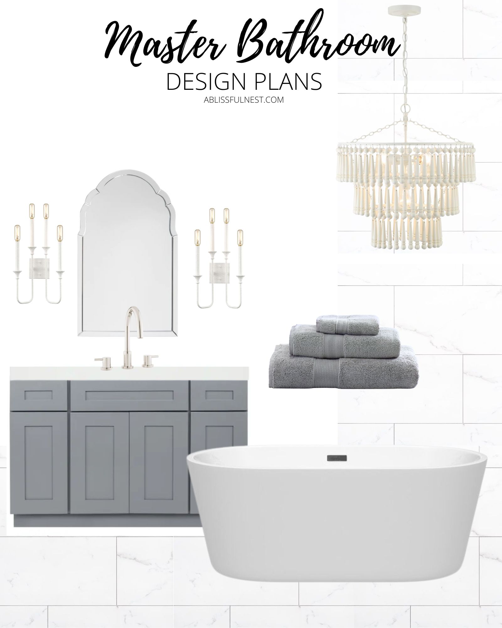
Sources: Sconces | Mirror| Chandelier | Towels
Guest Bathroom Design Plans
This guest bathroom is in between my office and the guest bedroom so it is really open to the two spaces. Which is why I did it in this slate gray and white color scheme.
I am adding black touches with the mirror and I love these cage gold sconces for a little glam.
When we were in California this summer we went and visited where my husband lived in college and I snapped a picture of the lifeguard stand at the end of his street. I plan on blowing it up and framing it for this bathroom. I love that it reminds me of when we met.

Sources: Gold Sconces | Mirror | Lifeguard Stand Art Print | Towels
Lauren’s Bathroom Design Plans
I am so excited for Lauren’s bathroom because if you remember I loved the tile from the laundry room so much that I chose it in an ocean blue for her bathroom. It really became the jumping point for the design of the room.
I added a little band of blue tile at the top of her shower to pop the color from the floor. So pretty!
We are also doing some gold accents and settled on these white and gold sconces and gold arched mirror.
I am adding some oatmeal color towels as well as some fun beach art for her. I am sure she is going to personalize this in her own way but we both love this initial design.
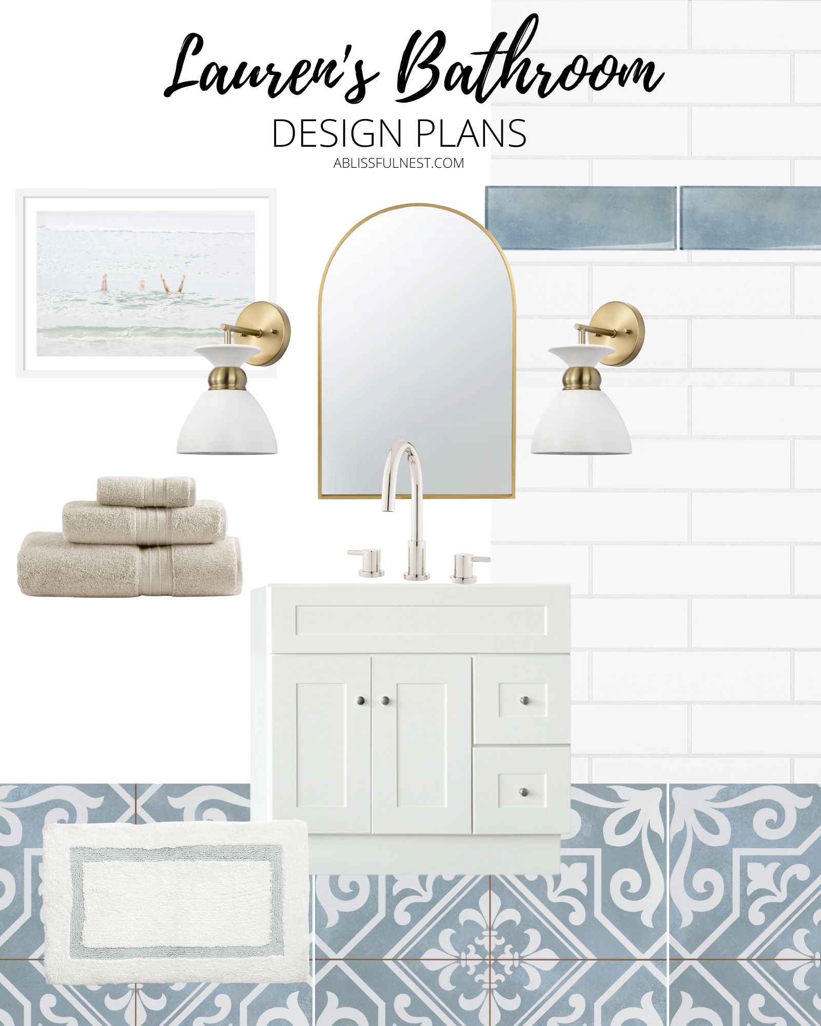
Sources: Beach Art Print | Sconces | Mirror | Towels| Bathmat
And there you have it! I am still working on the office, bedrooms, outdoor patios, and media room designs and promise to share those when I have them done. You can follow along on the more day-to-day build process on Instagram!


