Choosing Benjamin Moore kitchen cabinet colors sounds simple until you’re staring at dozens of paint chips, each looking different under every type of light.
These kitchen cabinet colors shape the entire space, and picking the wrong shade can leave your kitchen feeling off no matter how clean it is.
Most people want a classic look, but the range of warm, cool, dark, and light tones makes it hard to know where to begin.
What looked soft beige in the store can turn green or yellow in your kitchen once the sun or ceiling lights hit it.
Some colors feel cold or sterile, while others seem too dark and make the room feel smaller than it really is.
Cabinet paint is not cheap, and making a color mistake means spending more money and time on a full redo.
It’s easy to feel pressure and pick a trendy shade that doesn’t match your counters, floors, or kitchen layout.
This post may contain affiliate links. As an Amazon Associate and a participant in other affiliate programs, I earn a commission on qualifying purchases at no additional cost to you.
Once you add in paint finishes like satin or matte, the decision gets even more confusing and harder to feel confident about.
Painting old wood cabinets adds another challenge because you have to prep well, or the paint won’t stick evenly or last long.
So, I’m going to share my top Benjamin Moore paint colors that offer reliable, stylish shades that look great on real kitchen cabinets, not just on tiny samples.
Why Choose Benjamin Moore for Kitchen Cabinets
Benjamin Moore is trusted for its rich color formulas that cover cabinets well, often with fewer coats than other paint brands on the market.
These paints stand up to daily kitchen use, including heat, splatters, and regular wiping, which is exactly what busy home kitchens go through daily.
Homeowners want products they can count on, especially when painting cabinets is a big commitment of both time and money.
The colors feel bold without being too loud, allowing them to work well in both sleek modern kitchens and more traditional, cozy setups.
There are cabinet paint options that pair with granite countertops, natural butcher block surfaces, or even clean and polished concrete counters.
The variety of available colors makes it easier to coordinate with your flooring, backsplash tile, and wall paint without second guessing yourself constantly.
Choose from satin or semi-gloss finishes that are easy to clean and maintain without making the cabinets look too shiny or too flat.
Benjamin Moore cabinet paints dry smoothly and evenly, helping to avoid visible brush strokes that can make a project look rushed or uneven.
Whether you plan to paint them yourself or hire a contractor, these paints apply well with proper priming and surface preparation.
With Benjamin Moore, you get long-lasting color that helps your kitchen feel clean, updated, and ready to handle daily life with style.
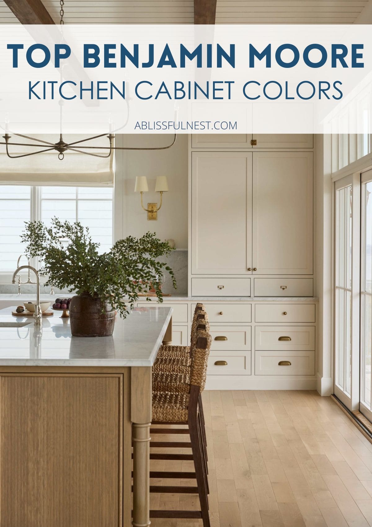
Best White Benjamin Moore Paint Colors for Kitchen Cabinets
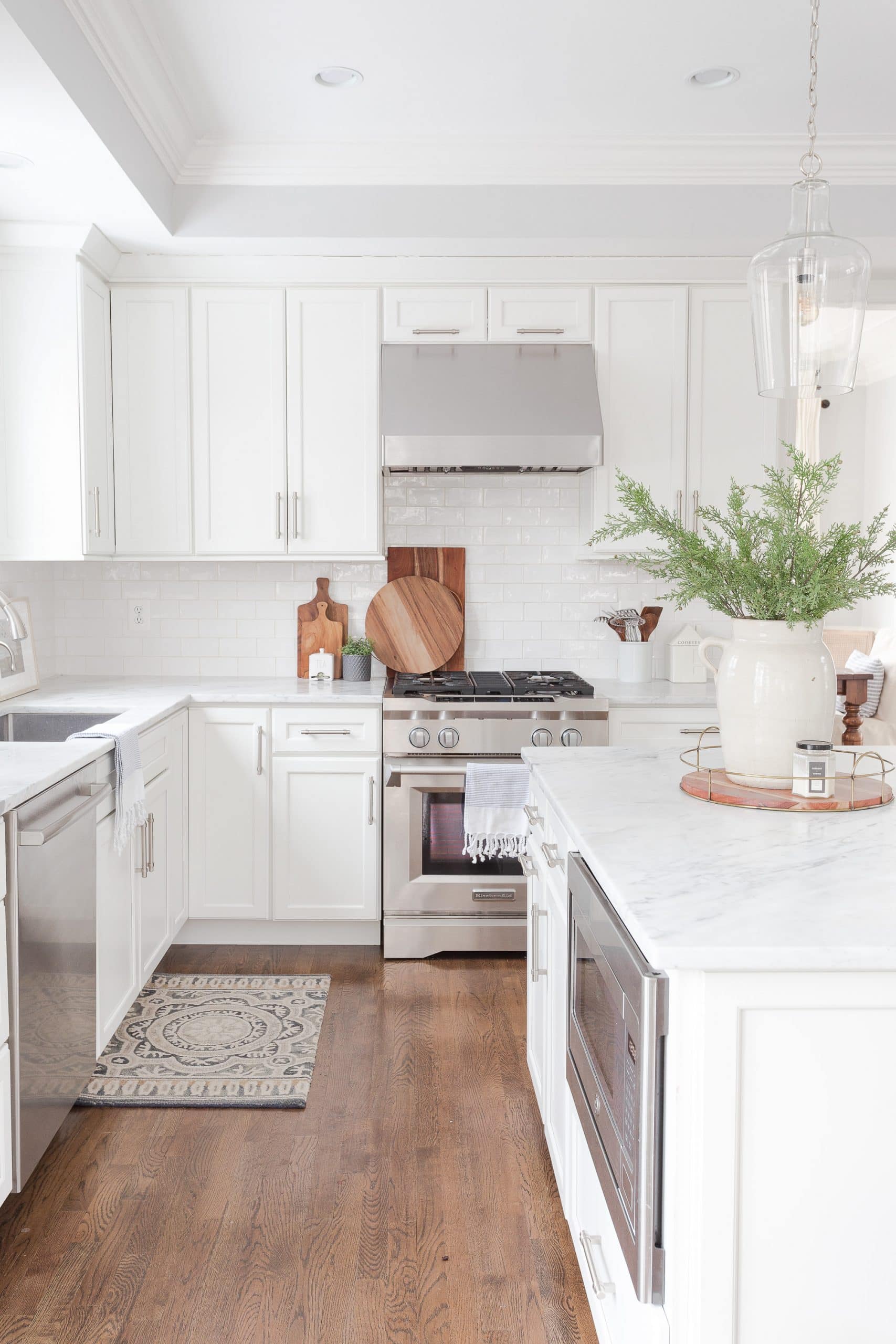
White Dove remains a top choice because its creamy warmth feels soft but never turns yellow or harsh, even under bright or natural kitchen lighting.
It brings a gentle look to wood cabinets and fits beautifully in both sleek modern kitchens and more classic, traditional kitchen spaces.
Chantilly Lace is bright and crisp, ideal for anyone who prefers a clean, fresh look in a kitchen with plenty of natural light.
This clean white works beautifully with marble countertops, open shelving, and brushed metal fixtures like knobs, handles, or drawer pulls.
Simply White offers a subtle glow that adds warmth to the room without turning beige or taking away from your kitchen’s overall brightness.
It works well in small kitchens with limited light and also blends seamlessly in large, open-concept homes with shared wall colors.
Always test your chosen white paint in morning and evening light to make sure it doesn’t shift too blue or too creamy.
Cooler whites look best in kitchens that get full sun, while warmer whites add softness to rooms with less natural light exposure.
Pay attention to the tone of your overhead lighting, as yellow bulbs can make some whites appear dull or off balance.
No matter which white you choose, painted cabinets bring a clean, airy feeling that instantly brightens and opens up your kitchen.
Don’t Forget To Order Paint Samples!
No matter what a photo looks like or description, every paint color will look different in your own space. It is so important to test a paint color before you commit to it.
That’s why I love buying these peel & stick samples.
It makes it so easy & affordable to test colors!
Most Popular Greige and Neutral Kitchen Cabinet Colors
Revere Pewter is a balanced greige that complements kitchens with rustic wood, clean lines, or mixed materials without overwhelming the overall design.
It adds subtle depth and softness without making your space feel too dark, cramped, or weighed down by strong color.
Balboa Mist is smooth and airy with a soft warmth that tones down sharp lines and blends well with both classic and modern features.
This gentle neutral pairs beautifully with light wood floors, beige tile, or creamy stone countertops for a relaxed and polished finish.
Edgecomb Gray offers a quiet, cool undertone that still feels welcoming and lived-in without looking too plain or washed out.
It fits easily into kitchens that feature brushed nickel hardware, sleek cabinets, or stainless steel appliances and neutral backsplash tile.
Greige and soft neutrals give you flexibility when choosing rugs, open shelving accents, and wall art without clashing or looking mismatched.
These shades also work well with natural elements like exposed wood beams, earthy backsplash designs, or hand-thrown pottery.
Would you like to save this post?
You can trust that these tones won’t go out of style and will remain classic no matter how trends shift.
They help kitchens feel relaxed, balanced, and easy to decorate no matter your design style or choice of materials.
Top Blue and Green Benjamin Moore Cabinet Colors
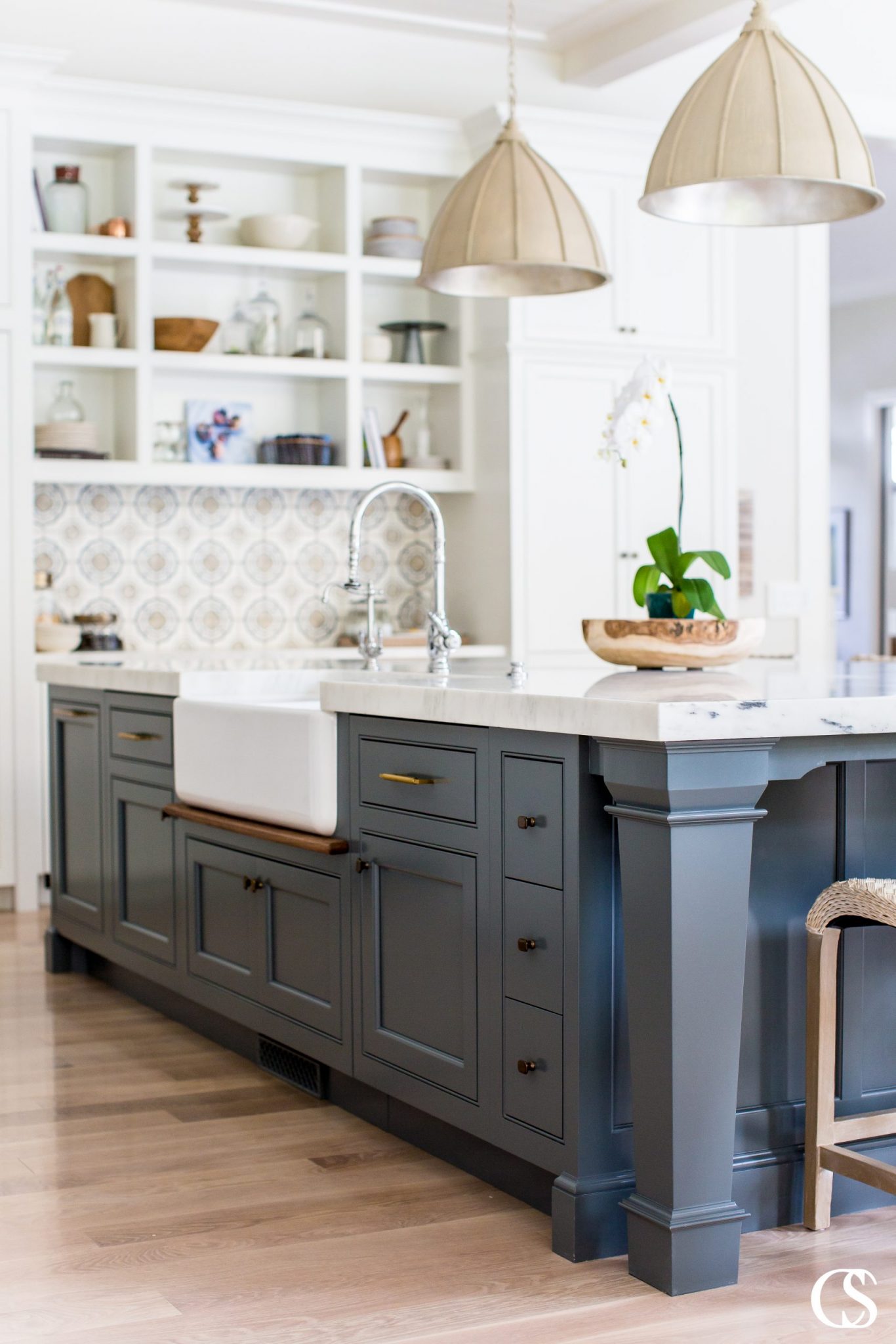
Hale Navy is a deep navy blue that brings bold contrast to kitchen cabinets while still feeling polished, grounded, and timeless across different styles.
This strong shade pairs well with white countertops and brass or gold-toned hardware for a high-end, balanced look that feels both classic and fresh.
Boothbay Gray is a soft gray-blue that gives your kitchen a relaxed, breezy feel without overpowering other design elements like wood or tile.
This coastal-inspired color blends nicely with white subway tiles, butcher block counters, or open shelving made from reclaimed or natural wood.
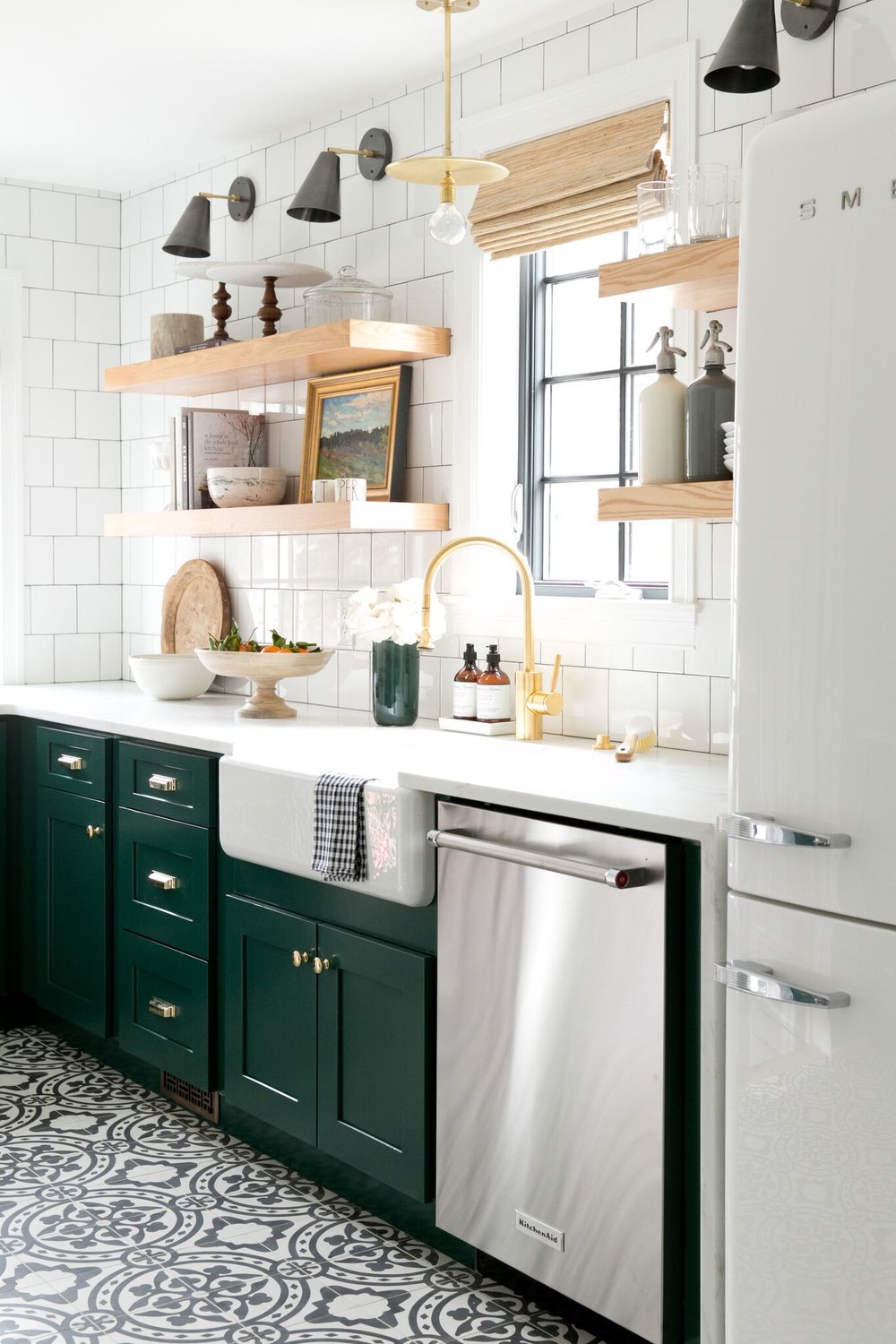
Backwoods is a deep, earthy green that creates a moody, dramatic kitchen atmosphere that feels warm, cozy, and full of personality.
It pairs best with soft lighting, matte finishes, and warm-toned counters or natural stone backsplash materials for a grounded, rustic feel.
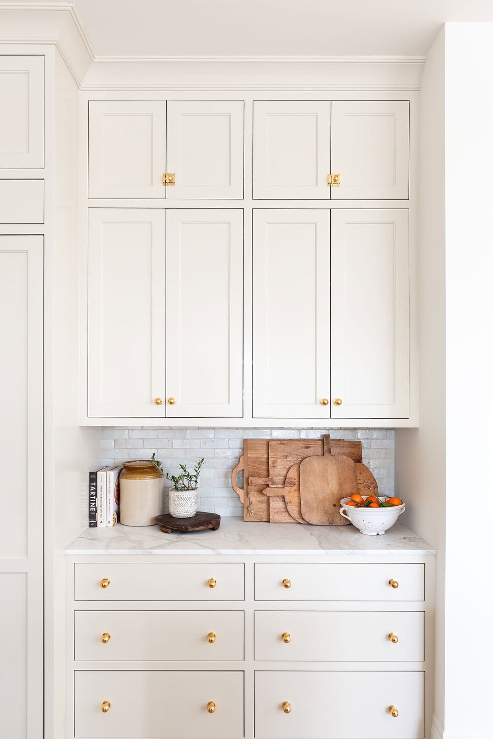
Pale Oak is a warm off-white with a slight green-gray undertone that gives a subtle, layered look without feeling too dark or too bright.
This versatile neutral fits beautifully into cottage kitchens or farmhouse spaces filled with vintage pieces, woven baskets, and soft linen textiles.
All of these colors work well when mixed with natural wood finishes, neutral wall paint, or industrial hardware for a layered, custom look.
Blue and green cabinet tones feel restful, grounded, and expressive, ideal for anyone who wants their kitchen to stand out without feeling too bold.
Warm and Earthy Kitchen Cabinet Colors from Benjamin Moore
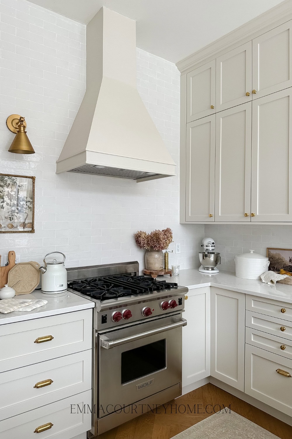
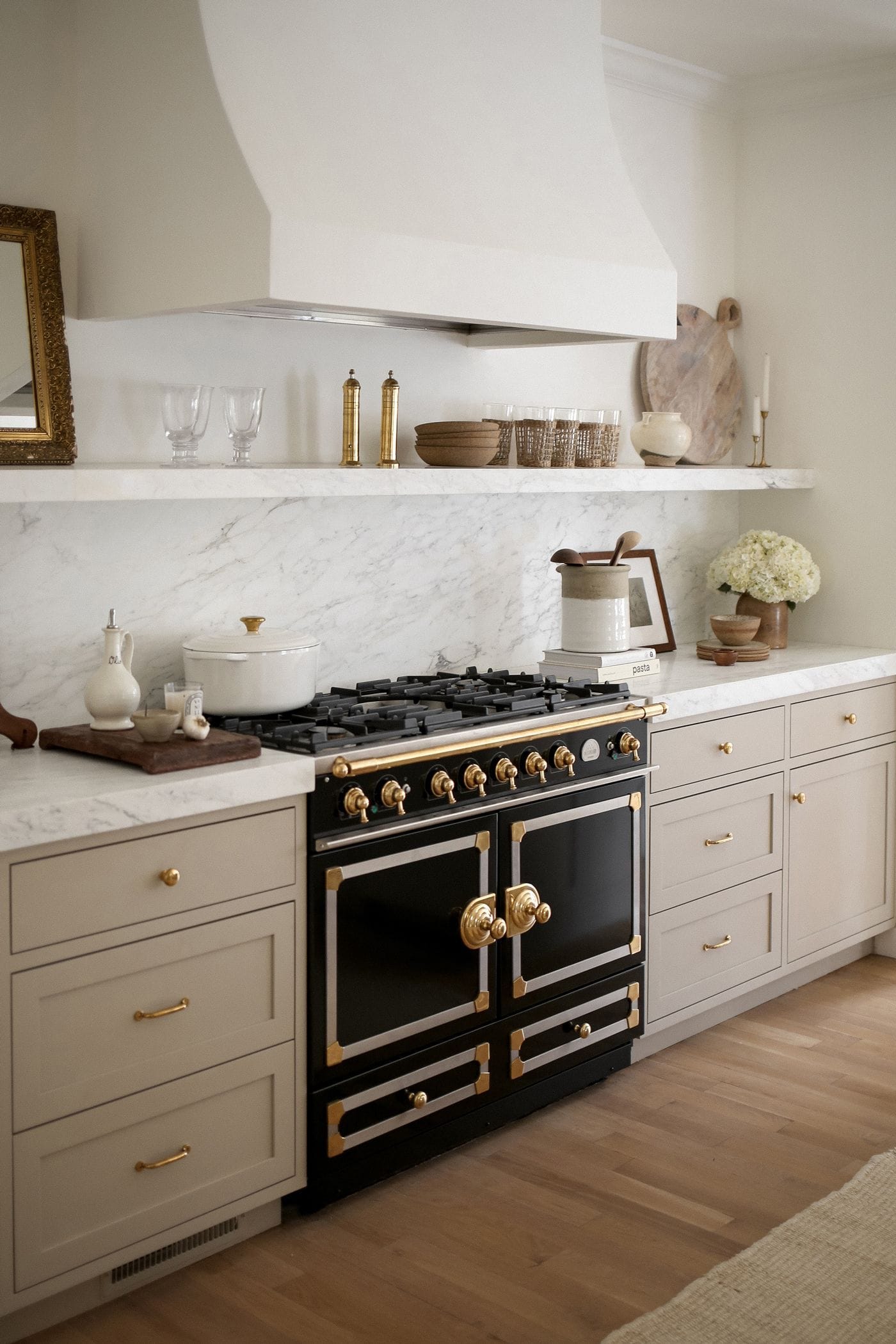
Pashmina is a warm taupe paint that adds a cozy, welcoming feeling to kitchen cabinets without making the space feel dark or overly dramatic.
It works beautifully with soft cream walls, natural wood floors, or butcher block countertops for a calm and well-balanced kitchen style.
Tapestry Beige offers a soft, timeless feel that suits kitchens with neutral palettes, natural materials, and soft finishes like cotton or stone.
This beige tone is easy on the eyes and blends well with various styles without clashing or competing for attention.
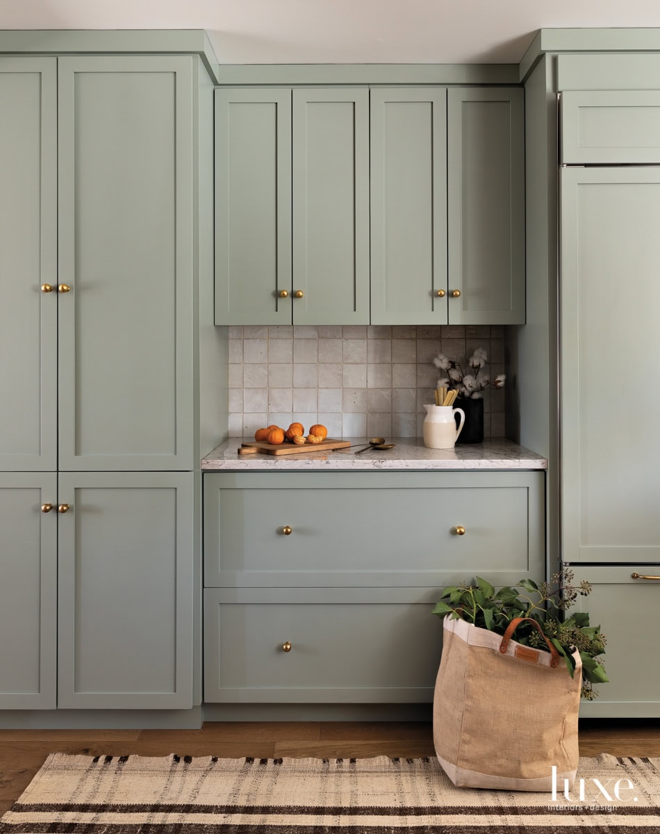
Sage Wisdom brings a muted green tone that feels grounded and slightly vintage, perfect for relaxed kitchens with classic details and wood finishes.
It fits beautifully in kitchens with plenty of natural light, open shelves, and simple trim painted in creamy or off-white tones.
Earthy paint colors work best when your kitchen needs warmth and softness without bold color or bright, high-contrast finishes.
These tones create a soothing space that feels easy to live in and makes cooking or gathering with others feel more relaxed.
They pair well with hand-thrown pottery, natural linen window treatments, wood accessories, and muted metals like brushed brass or matte black.
If you want to give your kitchen a more natural look, these earthy cabinet colors are an ideal starting point.
Tips for Choosing the Right Benjamin Moore Cabinet Color
Always apply paint samples directly to your cabinet surface and observe how the color shifts in morning, afternoon, and evening lighting conditions.
Compare how the sample color works alongside your countertops, backsplash, flooring, and nearby walls to avoid surprises after the cabinets are fully painted.
Give yourself time to live with the color samples for a few days so you can watch how they shift in different lighting.
Light neutrals and soft whites help smaller kitchens feel open, while deeper shades add richness and contrast in larger kitchens with more natural light.
Consider how bold or subtle you want your cabinets to look, and whether the color will stand out or flow with nearby surfaces.
Choose a paint tone that complements your home’s style to create a unified kitchen that fits seamlessly with the rest of the house.
Warm cabinet tones work better with red or golden wood floors, while cooler tones suit gray tiles, concrete, or lighter wood planks.
Satin and semi-gloss finishes protect cabinets from grease, splatters, and daily cleaning while still offering a smooth, polished look without excess shine.
Cabinet hardware can influence the final look. Brushed brass adds warmth, matte black creates contrast, and chrome finishes feel modern and sleek.
If you’re unsure where to begin, ask a local paint expert who understands lighting, finishes, and how different colors behave in real homes.
Frequently Asked Questions
Yes, Benjamin Moore offers excellent coverage, smooth application, and durable finishes that hold up well in high-use kitchen spaces. Their wide range of colors works with nearly any kitchen style, from clean modern designs to cozy, natural-inspired spaces with layered textures.
Satin or semi-gloss finishes are best because they resist moisture, clean easily, and stand up to frequent cooking and cabinet use. These finishes offer just enough shine to reflect light without highlighting every fingerprint, smudge, or small scratch on the surface.
Start by comparing paint samples with your existing counters, backsplash, and flooring under both natural and artificial lighting conditions. Live with the samples for a few days to see how each color changes throughout the day before making a final decision.
Yes, priming is essential for a smooth and long-lasting finish, especially when painting over stained wood or previously coated cabinets. Primer helps the paint stick better, prevents peeling or uneven coverage, and improves the final look of the cabinet color overall.
Picking the right paint color can feel overwhelming, but Benjamin Moore kitchen cabinet colors offer options that simplify the process and give reliable, beautiful results.
These kitchen cabinet colors add depth, warmth, and personality to your cooking space while blending well with both modern and traditional kitchen styles.
The paint holds up well through daily cooking, cleaning, and heavy use, keeping your cabinets looking fresh and polished for years.
With careful planning and the right shade, your cabinets can completely change how your kitchen feels without needing a full renovation.
Choose a color that fits how you live every day, not just what looks good under bright store lights or in photos.