This is a sponsored post written by me on behalf of Floor & Decor. All opinions are 100% mine.
Last fall I had the privilege of working with Floor & Decor on the design plans for my laundry room. You can check that out HERE. I loved how easy it was to pull everything together right there in the store and work with one of their instore design professionals.
So when I heard they were opening a new store in Fort Worth, I had to go check it out and get inspired! Though this is far from me, Floor & Decor is so worth driving to with the amount of time and money you save shopping with them.
I have had a new project on my mind and thought it would be a great opportunity to see the new store and nail down some of my design ideas for this space.
I shared many of my design ideas for the house this year but the guest bathroom was not on my radar a few months ago until we started having more and more guests recently come stay with us. Right now the room is literally all white. It’s kind of boring and I want it to feel warmer and inviting.
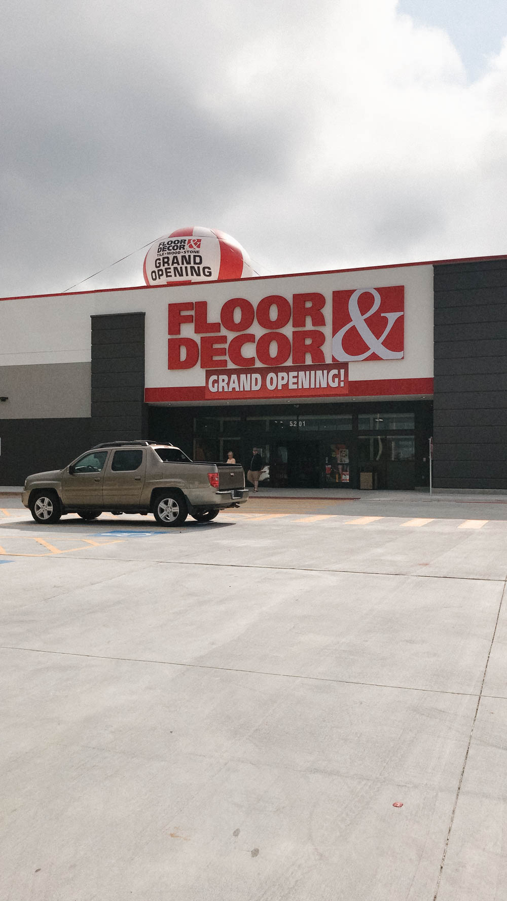
What I love about Floor & Decor is it is a one-stop-shop for all the materials you need to redo a space. From grout to tile and stone, countertops and flooring, they have it all. They are the leading specialty retailer in the hard surface flooring market, offering the broadest in-stock selection of tile, wood, stone, related tools, and flooring accessories at amazingly low prices.
I also talked to them this time about not having the trades to do the work I am looking at doing.
They have a service where they can align you with an industry professional in your area that they work with. I loved this because then I knew I would have a qualified individual and someone who would really know the products I am going to use.
This particular time I used their free design service to help me with our guest bathroom design plans. This is so helpful because they not only know where everything is but are trained design professionals who can bring your vision to life.
First I have to tell you how great the new store is laid out! One of the main differences in this store from the others is it is broken up by not only material but color. So when you are looking at cararra then they are all in the same area. I am such a visual person so if you are like me it makes it so much easier to see what you want and make a decision quicker in my opinion.
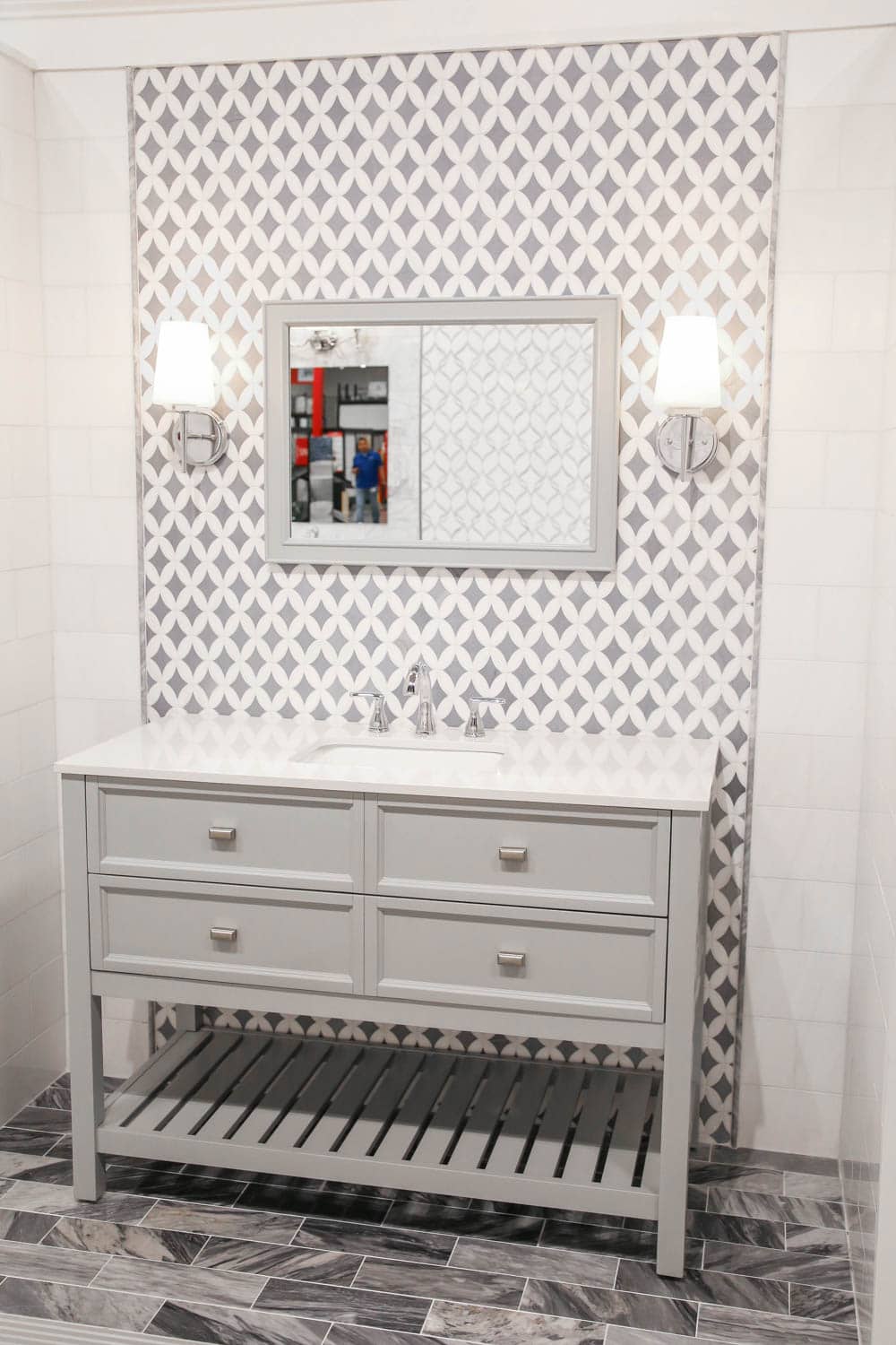
Off to the left as you walk in are the showroom areas with examples of kitchen, bathroom and laundry areas. Again if you are a visual person like me then this is the spot to check out first. I found the flooring for the guest bathroom here.
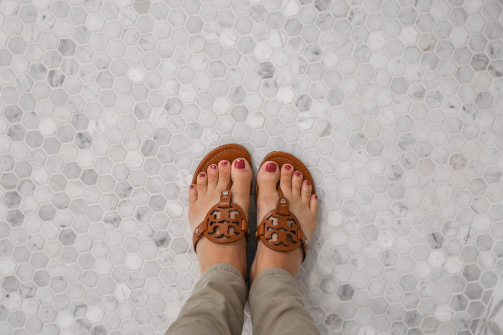
I am in love with this Bianco Carrara Polished Hexagon Marble Mosaic pattern and it was the jumping off point for my design.
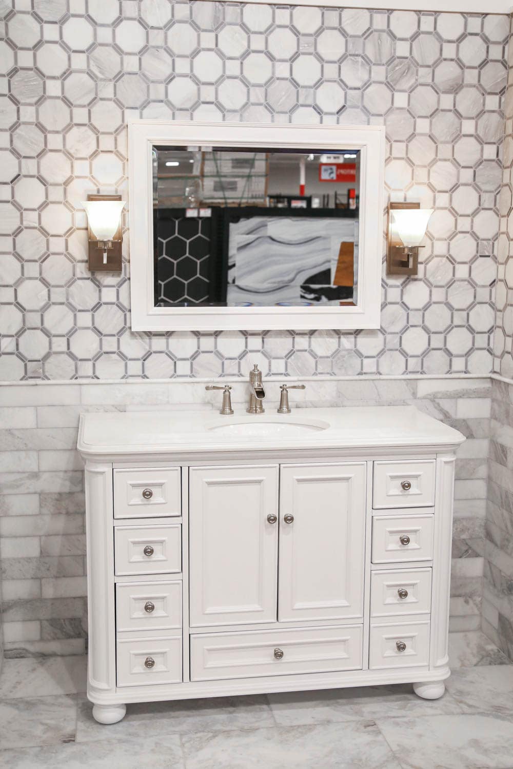
I loved the way this bathroom used a decorative tile pattern to break up the subway tiles, which got me thinking that I would like to do something like this on the shower walls with a border.
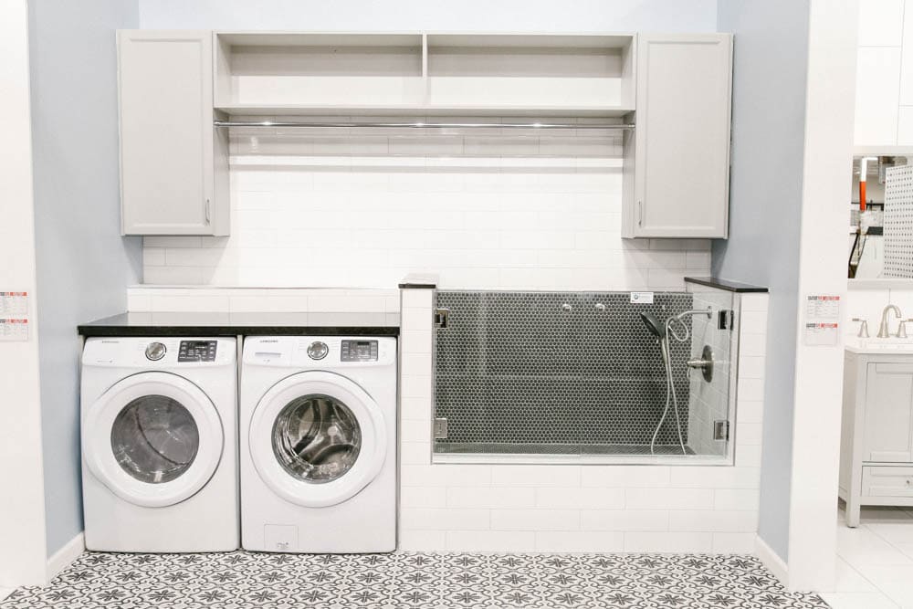
Okay and just how amazing is this laundry room set up?! The little dog bath is adorable! I seriously wish we had a laundry room big enough to have one of these.
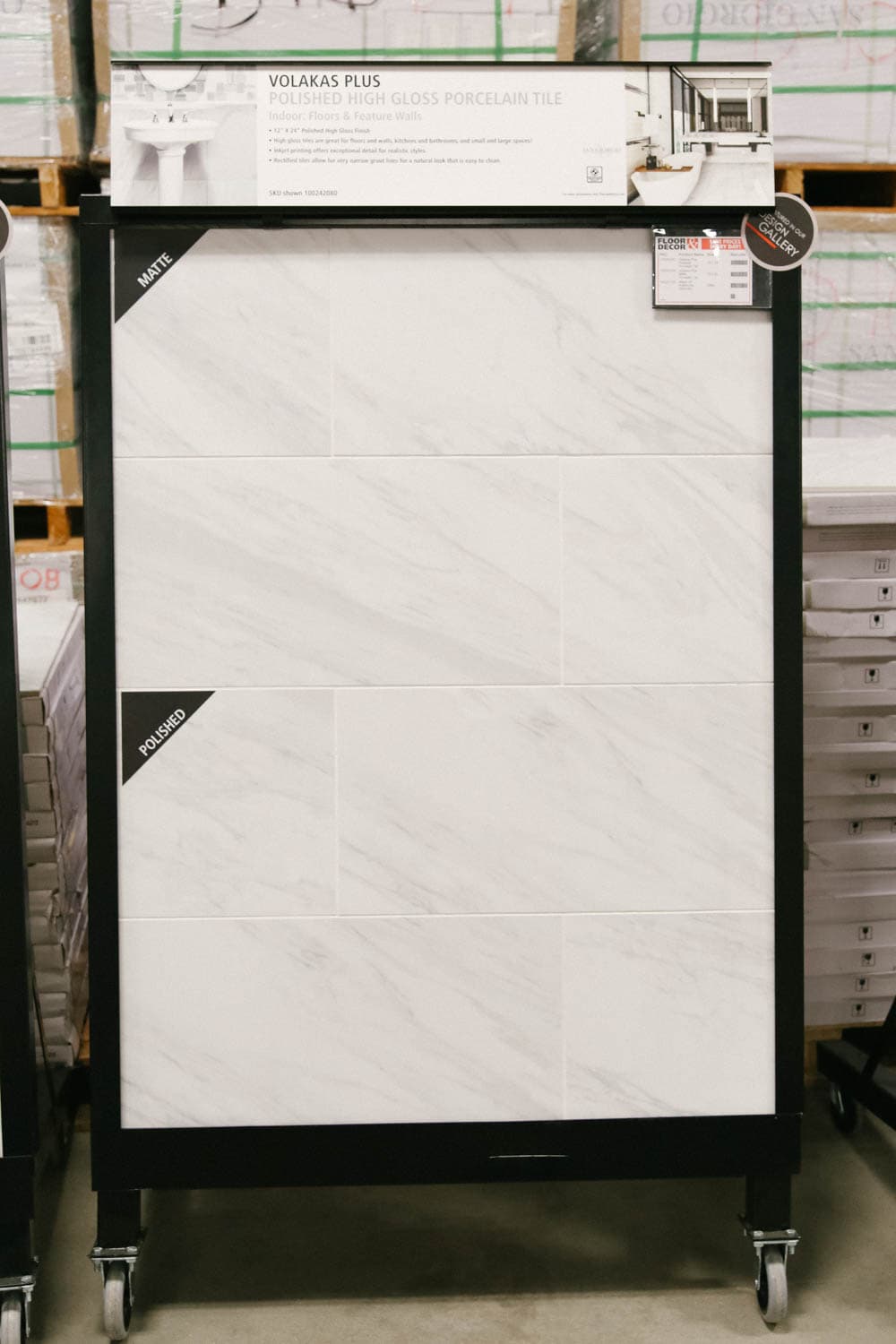
After selecting the flooring, I walked the vast aisles of large format tiles. They are displayed where you can see them in a matte finish, polished finish, etc. I landed on the Volakas Plus Polished Porcelain Tile. I love that the finish is so close to the marble that I love but this will be way more durable.
Would you like to save this post?
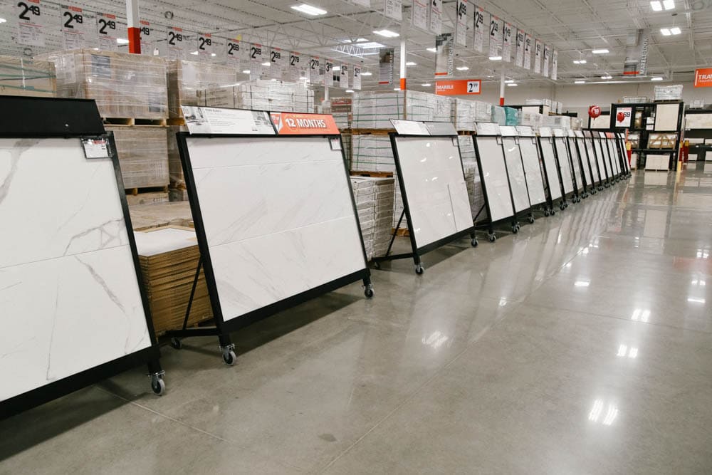
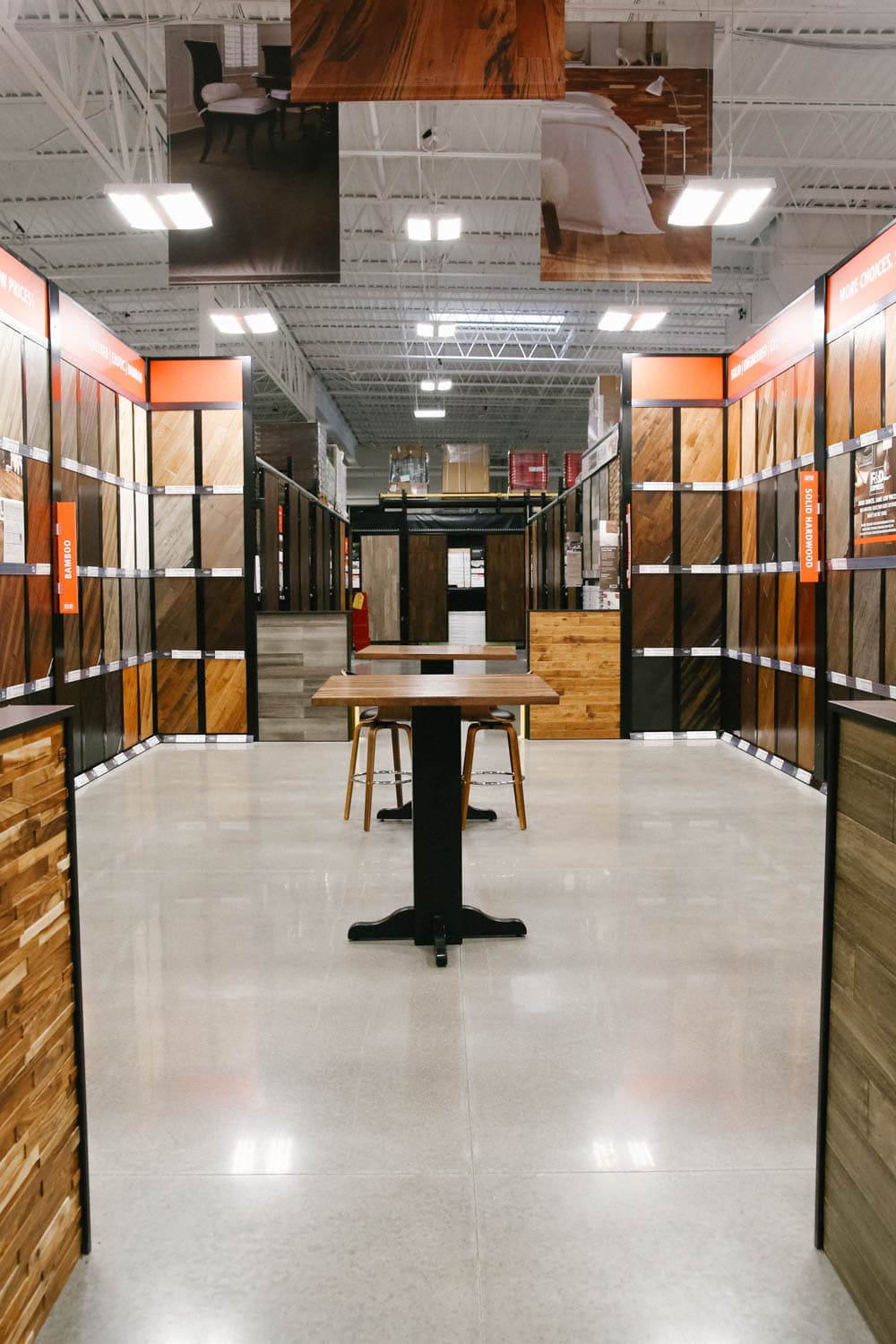
Okay, and I have to just take a minute and show you the huge selection of flooring they have to choose from. I was not shopping for this today but it was so impressive that I took a slight detour just to check it all out.
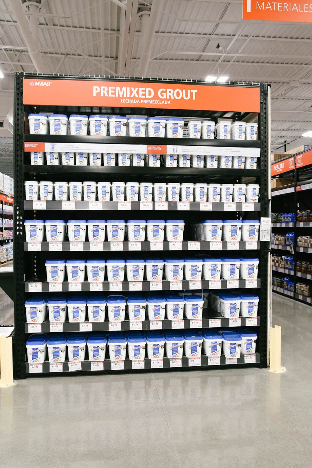
I was also impressed with the assortment of grout and project materials available.
As you all know I have had some issues with the grout in our master bathroom and after a detailed conversation with the store manager, found an easy solution so it doesn’t happen again. I just shared it on IG stories and when I use it I will share a quick tutorial on stories.
Okay back on task!
After picking my flooring and shower wall tile, I need to pick out the decorative border for the shower.
I fell in love with the water jet cut tiles of course! Their patterns are much more complex and precise, attained by how they are cut. I’ll share the one I picked in just a minute!
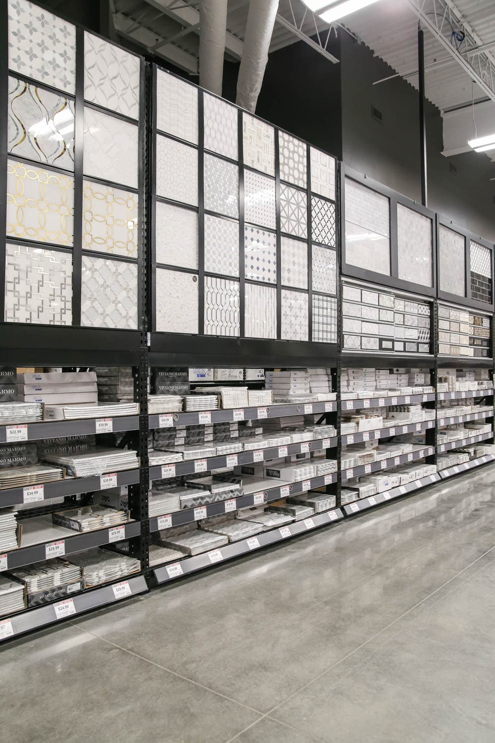
Literally, there is every pattern you can think of in just about every color combo and you are not limited to size in the patterns. From large scale to smaller scale patterns, the choices are endless.
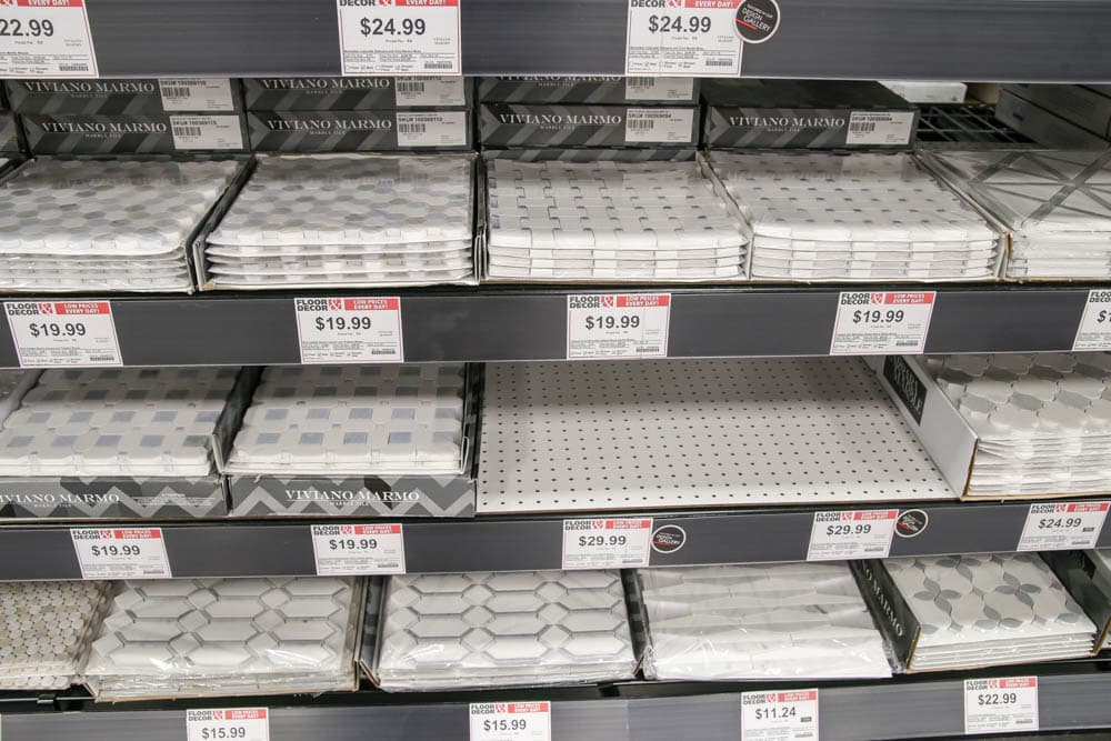
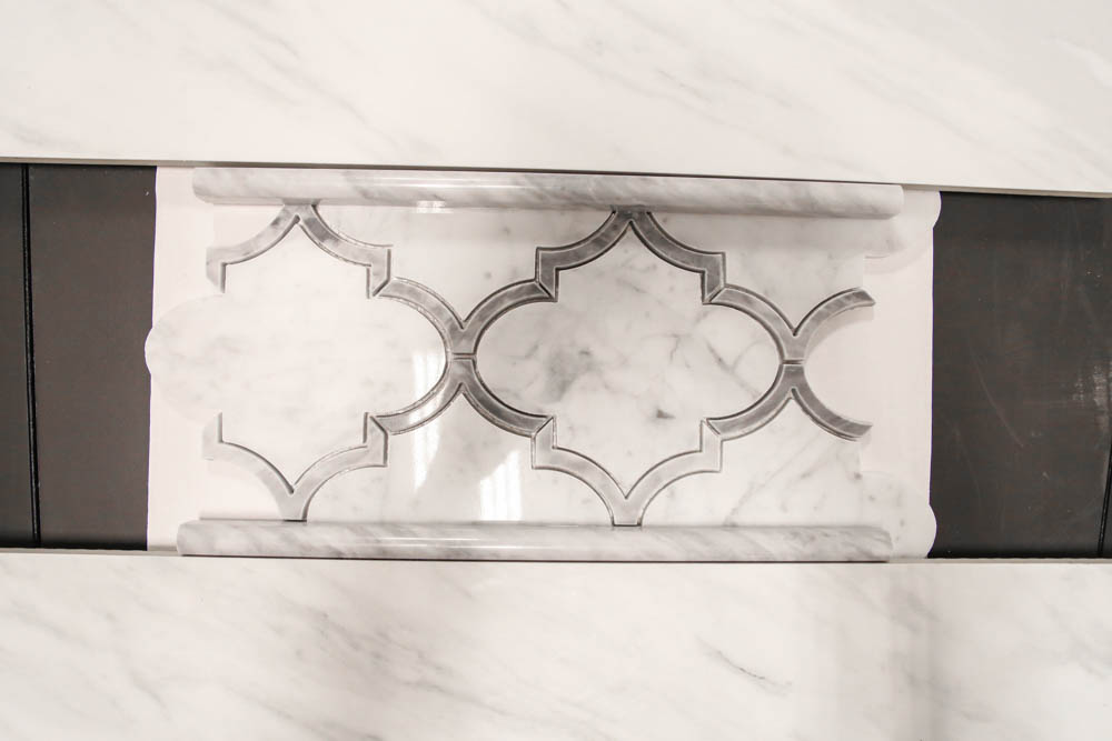
I picked this larger pattern called Provence Carrara Waterjet Marble Mosaic since the floor would be in the smaller hexagon pattern.
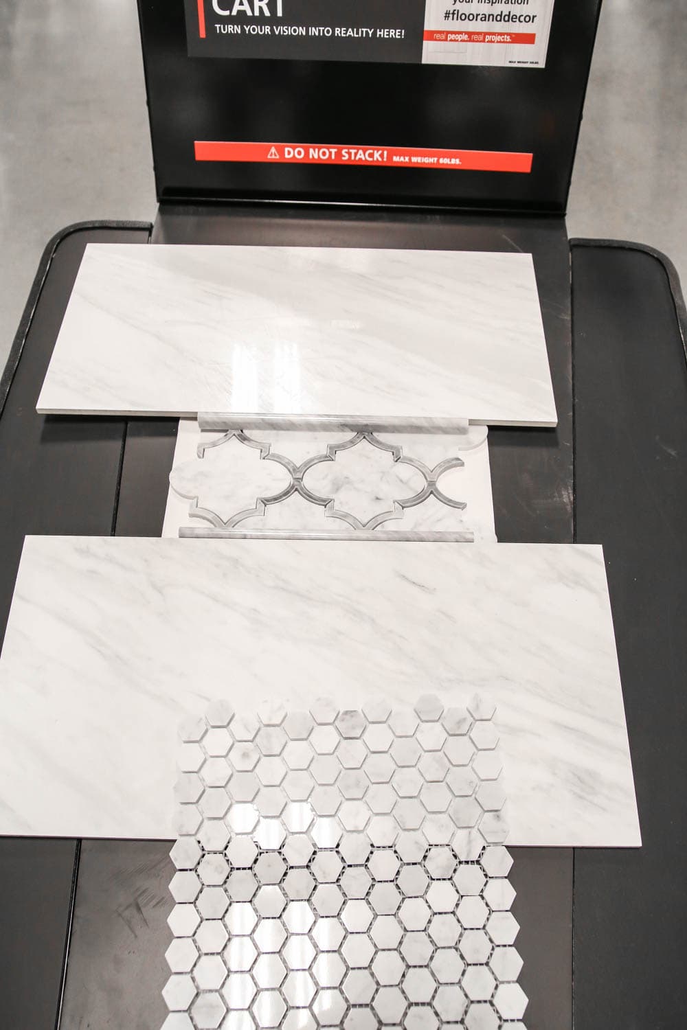
Once all my pieces were selected for the project, we laid them out on a design cart to really see how they would work altogether. I love how the border has a darker shade of marble for the inside edge to give it some depth and stand out.
Once I got home since I had my main design elements done at Floor & Decor, I was able to create the final design plans for the space. I love how clean, crisp yet warm and inviting it all feels!
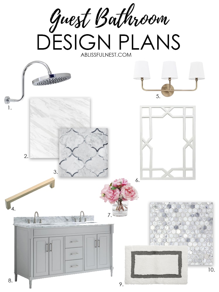
I hope you love my design plans for our guest bath and if you have not shopped at Floor & Decor yet then you are missing out! Trust me. You will not want to go anywhere else after going to one of their stores.
You can check out where one is closest to you HERE and contact a designer.
THIS IS A SPONSORED POST. A BLISSFUL NEST HAS RECEIVED PAYMENT, TRADE, AND/OR PRODUCTS FROM FLOOR & DECOR IN EXCHANGE FOR PROMOTING. HOWEVER, ALL OPINIONS STATED ARE OUR OWN.


