Choosing the right mid century kitchen paint colors can feel frustrating when every shade seems either too trendy or completely out of place with your home.
Browsing different paint color guides often leaves you with even more questions because many suggestions fail to create an authentic mid-century modern look.
Without a clear direction, it becomes easy to combine colors that make your kitchen feel disconnected instead of balanced and welcoming.
Many color palettes look amazing in photos but look completely different once natural light and cabinet finishes change the overall appearance once installed.
Picking cabinet and wall colors without a plan can create visual clutter that takes away from the timeless style you want.
Even small color choices can make your kitchen feel dated instead of reflecting the warm and welcoming personality found in classic mid-century homes.
Trying to match paint with countertops, flooring, and wood finishes often creates unnecessary stress when every element competes for attention.
This post may contain affiliate links. As an Amazon Associate and a participant in other affiliate programs, I earn a commission on qualifying purchases at no additional cost to you.

That’s why I’m going to share practical color ideas, decorating tips, and simple combinations to help you create a timeless mid-century kitchen much more easily.
From cabinet colors and wall shades to coordinated palettes that work together, I’ve got so many ideas for creating a welcoming space you will enjoy every day.
So, use my tips and ideas to help you create a kitchen that captures classic mid-century style with colors you will continue loving for years.
Quick Glance
Here are few notable things to not miss!
- Warm, earthy shades like mustard yellow, olive green, and burnt orange are the backbone of authentic mid-century color palettes.
- Always test paint samples in your actual kitchen during morning, afternoon, and evening light before committing to a color.
- Start with your fixed surfaces, countertops, flooring, and wood finishes, and let those guide your paint decisions.
- One or two statement colors paired with soft neutrals create balance. More than that tips into theme-kitchen territory.
- Cabinet color should be chosen before wall color so every decision has a clear reference point.
- Flat-front cabinetry and simple hardware let paint colors do the heavy lifting without adding visual noise.
What Makes A Kitchen Look Like Mid Century Style
The mid-century modern style remains one of the most recognizable interior design movements, and it still creates timeless kitchens that feel warm and welcoming.
Clean horizontal lines and flat front cabinets create the simple architectural foundation that gives this kitchen style its unmistakable and lasting appeal.
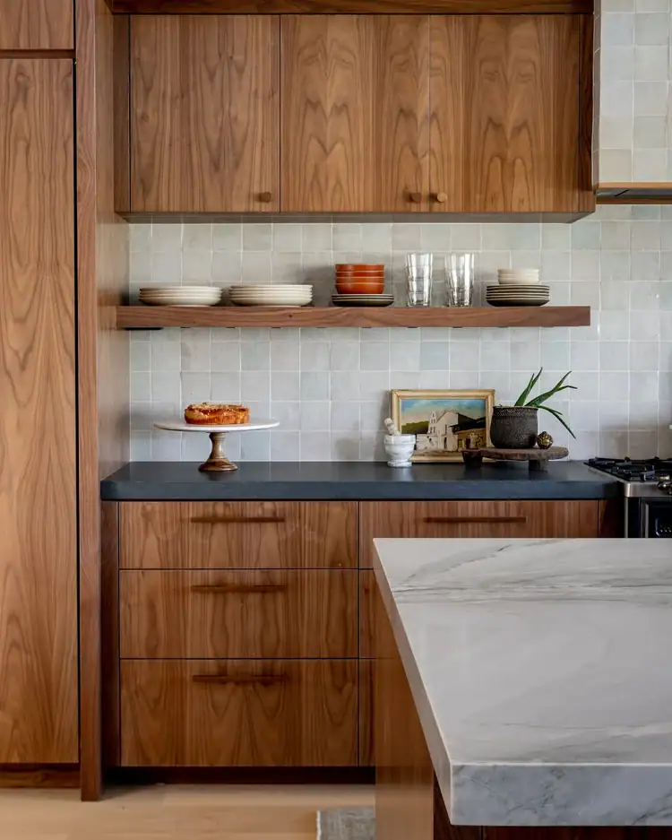
Natural materials like walnut, teak, and stone add warmth while keeping every surface practical instead of making the space feel overly decorative.
The best mid-century kitchen paint colors lean into warm, earthy shades balanced with soft neutrals that create depth without feeling dull or overpowering.
Cabinet hardware stays simple with brass or matte black finishes that complement the overall design instead of becoming the center of attention.
Open shelving and floating cabinets replace rows of upper cabinets, helping the kitchen feel brighter, more spacious, and easier to enjoy every day.
Current design trends describe these kitchens as inviting, tactile, and authentic instead of polished spaces that feel too perfect to comfortably use.
Every piece has a purpose, creating a thoughtful kitchen where practical design always comes before unnecessary decoration or visual clutter.

What Colors Are Common in Mid Century Modern Kitchens
Choosing the right color palette is one of the most important parts of creating a kitchen that feels authentic and timeless instead of outdated.
The wrong paint colors can make your kitchen feel like a themed space instead of one inspired by classic mid century design.
These timeless color ideas make it easier to create a balanced kitchen while keeping every shade feeling warm, welcoming, and true to the style.
- Mustard Yellow: This classic choice adds warmth and personality to cabinets, islands, or accent walls while creating the welcoming feel found in timeless mid-century kitchens.
- Olive Green: This nature-inspired shade pairs effortlessly with wood finishes, creating a balanced space that feels calm, welcoming, and connected to the outdoors every day.
- Burnt Orange: This bold yet grounded choice works well on cabinets or accent walls, adding vintage character without making the kitchen feel too busy.
- Deep Teal: This rich option creates a calm atmosphere while pairing naturally with stone countertops, walnut cabinetry, and other warm wood finishes throughout the kitchen.
- Mushroom and Limestone: These soft neutrals create a warm backdrop with more depth than basic beige, helping the entire space feel balanced and welcoming every day.
- Soft Ochre: This timeless favorite brings warmth to cabinets or accent walls while blending effortlessly with natural wood and other earthy finishes found in mid-century homes.
How To Select Mid Century Kitchen Paint Colors
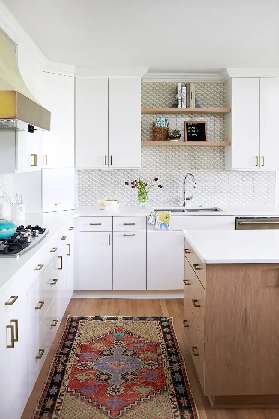
Choosing the right mid-century kitchen paint colors starts with the surfaces that will stay in your kitchen for many years after painting is finished.
Countertops, flooring, and existing wood finishes help narrow your choices because they create the foundation every new paint color should complement naturally.
If your kitchen already has walnut or teak finishes, earthy paint colors usually create a balanced look that feels natural instead of mismatched.
Always bring home physical paint samples and compare them against your largest fixed surface before making your final color selection.
Check every sample during the morning, afternoon, and evening because changing light can completely affect the way each paint color appears.
I’ve rounded up some mid century modern kitchen cabinet colors that can help you narrow cabinet options before selecting coordinating shades for your walls.
Once your cabinet color is chosen, selecting wall colors becomes much easier because every decision has a clear point of reference.
Paint at least three large sample swatches directly on the wall before purchasing your final gallon, giving yourself enough time to compare every option.
Avoiding the “Theme Kitchen” Trap
One of the most common mistakes is adding too many vintage inspired details until the kitchen feels more like a display than an everyday living space.
The goal is creating a timeless kitchen with authentic character instead of one that feels like a recreation from another decade.
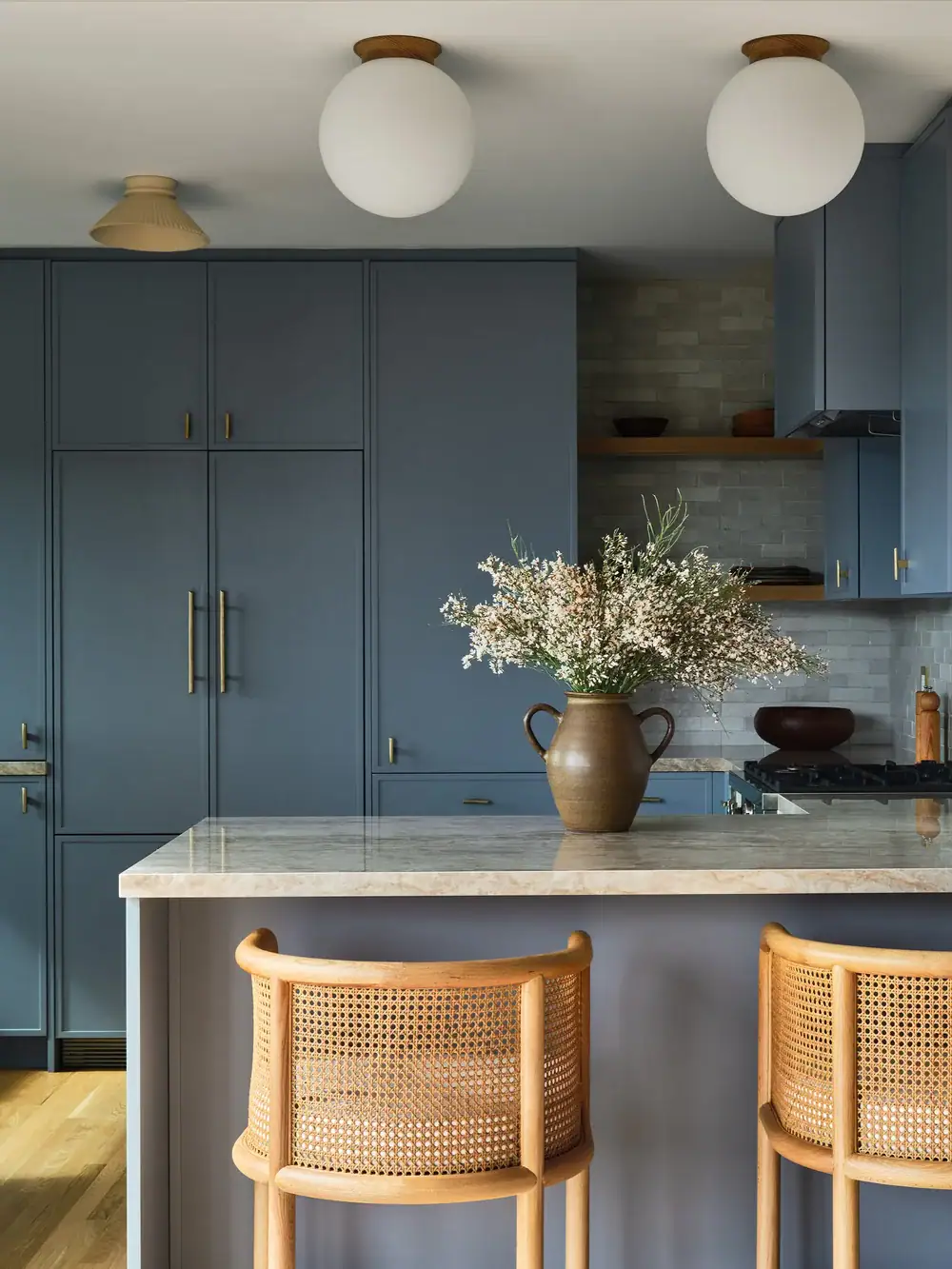
Choosing one or two statement colors while keeping the remaining palette warm and neutral creates a balanced and welcoming design.
Too many bold choices used together can compete for attention, making each design element feel less intentional and visually balanced.
Let your paint color become the foundation, then add furniture, lighting, and decorative pieces gradually as the room comes together.
Stepping back before adding another statement piece often helps you decide whether the space already feels complete without adding more visual interest.
Taking a photo with your phone can make uneven color balance easier to notice than viewing the room in person every day.
Simple choices and thoughtful layering often create the timeless mid-century look that stays inviting long after decorating trends begin changing.
Best Decor For A Mid Century Kitchen
The right decor brings your color palette together while keeping the kitchen feeling warm, balanced, and comfortable for everyday living.
Choose decorative pieces with simple shapes and natural materials so they complement the clean lines found throughout classic mid-century interiors.
Would you like to save this post?
These decorating ideas pair naturally with not just mid century but also with modern kitchen cabinet colors, creating a timeless look that feels both practical and welcoming.
Tap Photos To Shop

Best Mid Century Kitchen Paint Colors for Cabinets
Choosing the best kitchen cabinet colors can completely change how your mid century kitchen feels, especially when you are working with natural wood finishes.
The best shades often come from the era’s signature palette, including warm neutrals, earthy greens, muted blues, mustard yellows, and rich oranges.
Whether you want something subtle or bold, these Benjamin Moore, Sherwin Williams, and Behr colors can help you create that classic retro look.
- October Mist 1495 by Benjamin Moore – If you love soft greens, this gentle sage gives your cabinets an organic look and pairs beautifully with walnut, cream, and brass.
- Swiss Coffee OC-45 by Benjamin Moore – For something light and versatile, this warm off-white brightens your cabinets without feeling stark or competing with colorful mid century accents.
- Golden Retriever 2165-30 by Benjamin Moore – This rich golden shade brings instant retro warmth to cabinets, especially when you pair it with walnut accents, neutral countertops, and brass hardware.
- Evergreen Fog SW 9130 by Sherwin Williams – If you prefer a quieter green, this muted green-gray looks polished on cabinets and works wonderfully with warm woods and creamy backsplashes.
- Cavern Clay SW 7701 by Sherwin Williams – This earthy terracotta is perfect when you want cabinets with personality, warmth, and an unmistakable connection to classic mid century color palettes.
- Bosc Pear SW 6390 by Sherwin Williams – For a cheerful retro look, this golden mustard brings cabinets to life and pairs naturally with walnut, white countertops, and geometric tile.
- Adirondack Blue N480-5 by Behr – This sophisticated slate blue adds depth without overwhelming the room, making it a beautiful choice for lower cabinets or a kitchen island.
- Cider Spice S210-5 by Behr – If you love warmer shades, this caramel orange-brown gives cabinets a cozy vintage look beside cream walls, terrazzo surfaces, and dark wood.
- Thai Basil N400-5 by Behr – This deep herb green feels grounded and sophisticated on cabinets, especially when you balance it with light countertops and warm brass fixtures.
Mid Century Modern Kitchen Wall Paint Colors You’ll Love
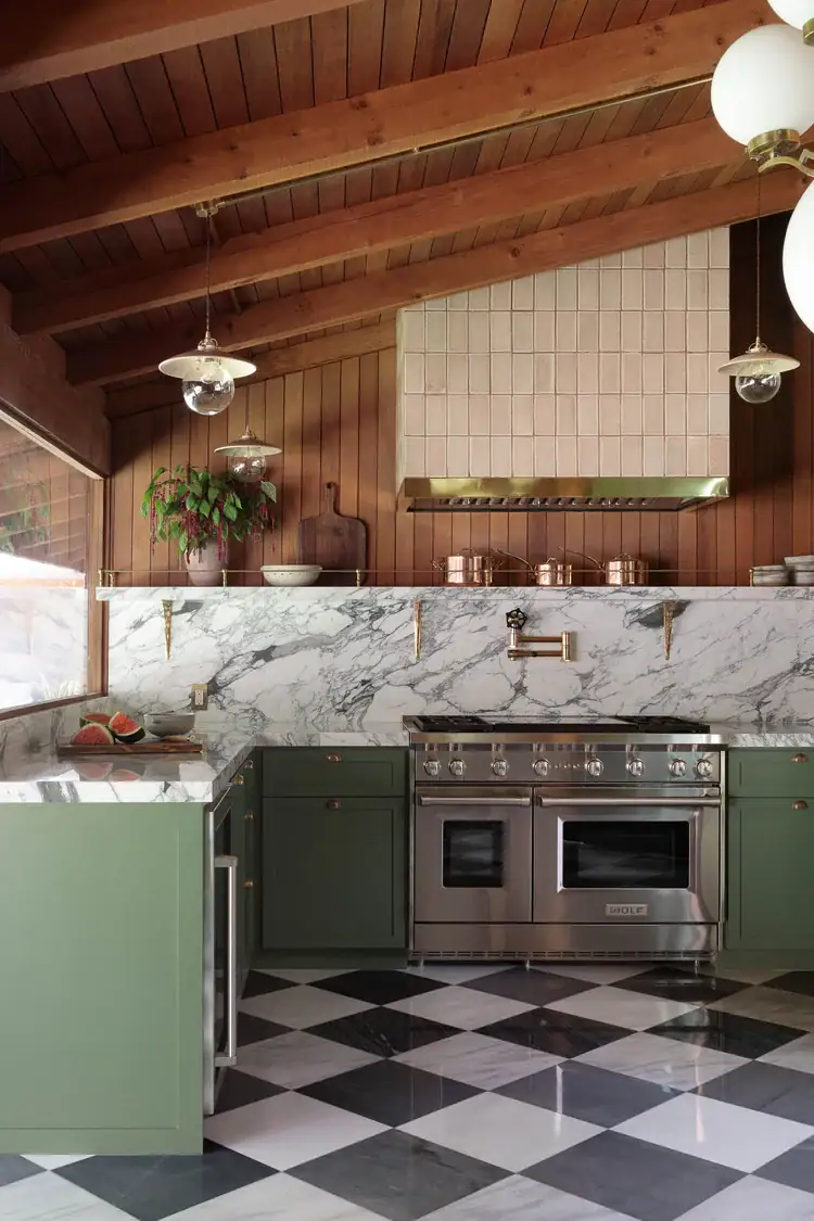
Wall paint helps tie every design element together while creating the balance that makes a mid century kitchen feel warm and inviting.
When your cabinets have deeper colors, soft warm neutrals create gentle contrast that keeps the room feeling open and comfortable every day.
Mushroom, limestone, and soft taupe create timeless backdrops that pair naturally with wood finishes while adding subtle depth throughout the kitchen.
If your cabinets have lighter finishes, choosing a slightly deeper wall color can create added warmth without making the room feel heavy.
Grounded greens and muted blues also work well when used thoughtfully because they add depth while keeping the overall design balanced.
Avoid bright white walls because they can make warm cabinet colors appear dull instead of creating a natural and welcoming contrast.
Warm cream or parchment shades blend more naturally with earthy color palettes while softening the overall look of the kitchen.
Painting the ceiling the same color as the walls or one shade lighter helps create a seamless finish that feels timeless and complete.

Best Mid Century Kitchen Color Combinations
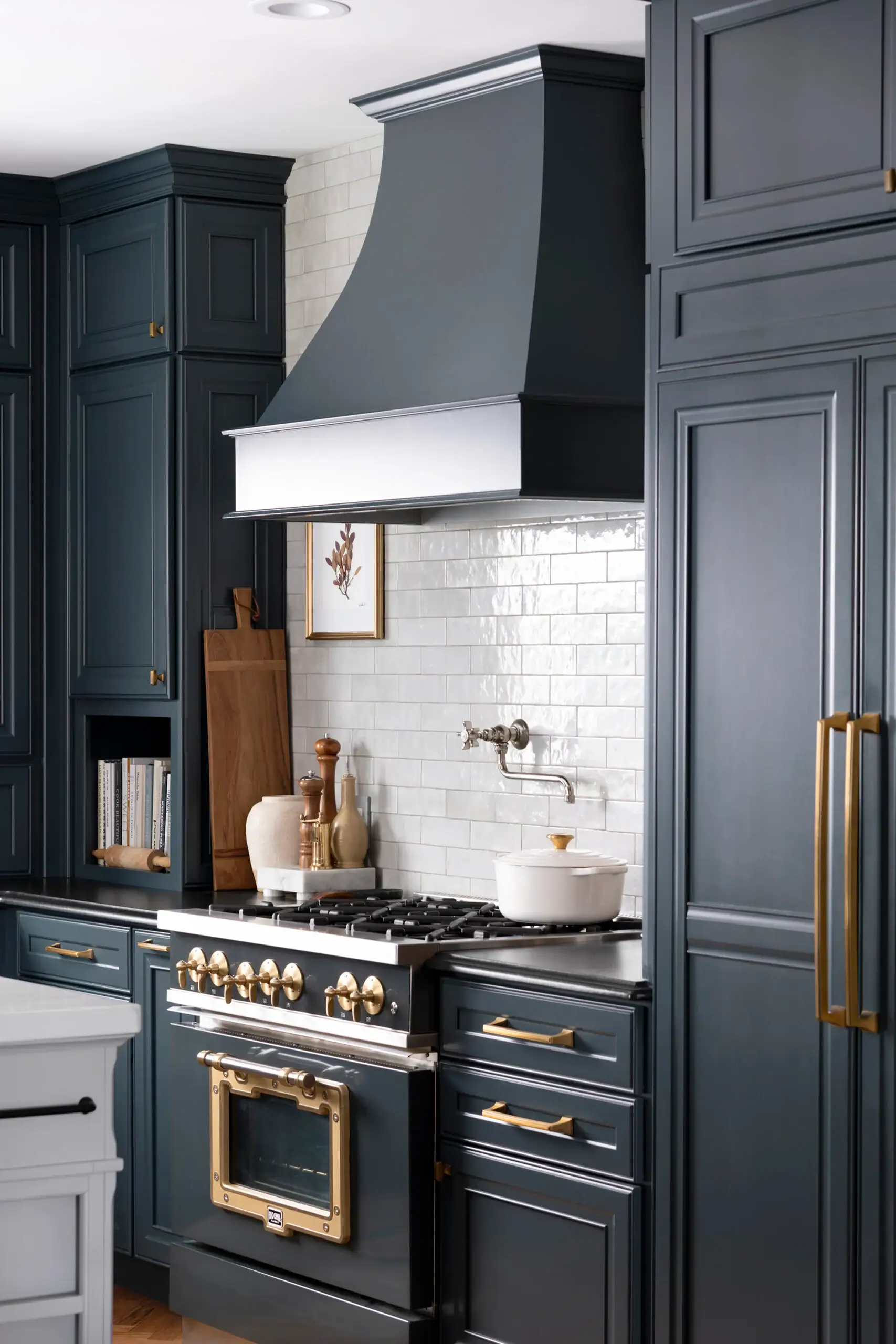
The right kitchen cabinet colors combinations create a balanced space where every finish works together instead of competing for attention throughout the space.
Pairing warm earthy shades with natural wood and soft neutrals creates the timeless look most people associate with classic mid century kitchens.
Cabinets in mustard yellow pair naturally with limestone walls and walnut accents for a warm combination that never feels outdated.
Olive green cabinets pair beautifully with creamy white walls, brass hardware, and warm wood tones for a grounded and inviting mid century palette.
For a bolder combination, mix burnt orange accents with teak cabinetry and a soft beige backsplash that keeps the overall design feeling balanced.
Muted blue cabinets create a cooler look while still feeling authentically mid century when paired with walnut finishes and simple white countertops.
If you choose two cabinet colors, keep the darker shade on the lower cabinets and the lighter shade above for a balanced appearance.
Best Mid Century Kitchen Paint Colors for Small Kitchens
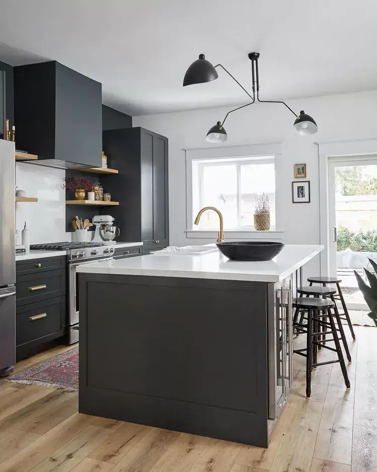
The best mid-century kitchen paint colors combine warm neutrals with earthy greens, muted blues, and nostalgic accent shades.
In a small kitchen, lighter colors can make the room feel more open, while deeper hues work beautifully on lower cabinets, an island, or a compact accent wall.
Pair these colors with natural wood, simple cabinetry, geometric tile, and brass or matte-black hardware to complete the mid-century look.
- Benjamin Moore – Aegean Teal 2136-40 – This muted blue-green captures the colorful spirit of mid-century design without overwhelming a small kitchen. It looks especially attractive on lower cabinets paired with warm white walls and walnut accents.
- Sherwin Williams – Evergreen Fog SW 9130 – Evergreen Fog is a soft, gray-green that feels both retro and sophisticated. Its restrained appearance makes it suitable for kitchen cabinets, walls, or a small breakfast nook.
- Benjamin Moore – White Dove OC-17 – This warm white reflects light and makes a compact kitchen appear larger. It also provides a clean backdrop for teak cabinetry, colorful appliances, and geometric backsplashes.
- Behr – Back to Nature S340-4 – This earthy green connects beautifully with the natural materials commonly found in mid-century interiors. Use it on cabinetry with light countertops and wood accents for a calm, grounded appearance.
- Sherwin Williams – Alabaster SW 7008 – Alabaster is a creamy off-white that brightens a small kitchen without looking cold or clinical. It works particularly well when the room includes warm wood cabinets or vintage-inspired finishes.
- Behr – Blank Canvas DC-003 – Blank Canvas is a soft, warm neutral that helps limited spaces feel airy and welcoming. It allows bolder mid-century features, such as mustard seating or turquoise accessories, to stand out.
- Sherwin Williams – Cavern Clay SW 7701 – This earthy terracotta introduces the warm orange tones associated with classic mid-century interiors. Because it has a strong visual presence, use it on an island, pantry door, or single accent wall.
- Benjamin Moore – Bryant Gold HC-7 – Bryant Gold offers the nostalgic mustard character often seen in 1950s and 1960s kitchens. In a small room, it works best as a concentrated accent rather than an all-over wall color.
- Behr – Cracked Pepper PPU18-01 – This deep charcoal adds contrast and definition to a mid-century color scheme. Reserve it for lower cabinets, trim, or a small architectural feature, and balance it with pale walls to prevent the kitchen from feeling enclosed.
Common Mistakes to Avoid When Choosing Mid Century Kitchen Paint Colors
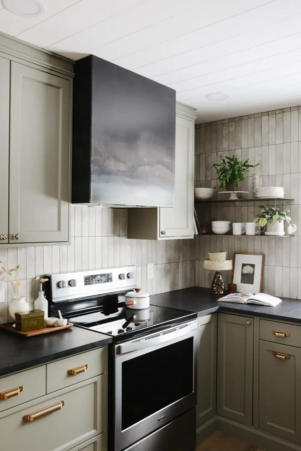
One of the biggest mistakes is choosing paint colors without considering the lighting, countertops, flooring, and wood finishes already in your kitchen.
Always test paint samples on your own walls because colors can look very different at home than they do in online inspiration photos.
Cool grays and bright white shades often compete with the warm palette that gives mid century kitchens their timeless and welcoming appearance.
Using dark colors across cabinets, walls, and countertops at the same time can make the kitchen feel smaller and less balanced.
Painting the ceiling in the same warm neutral as the walls or one shade lighter creates a more connected and finished appearance.
Skipping paint samples to save time or money often leads to costly repainting after the finished color looks different than expected.
Limiting the number of wood finishes helps the kitchen feel balanced while allowing your paint colors to remain the main focal point.
Choose your hardware and fixtures before selecting paint so every finish works together for a timeless mid-century kitchen.
Things to Know
- Testing paint swatches at different times of day is not optional. It is the most important step in this entire process.
- Earthy mid-century tones pair best with matte or eggshell finishes rather than gloss.
- If you are repainting cabinets, a high-quality primer coat makes a big difference in how the final color reads.
- One bold color choice is usually enough. Two can work if they are carefully balanced. Three is where most kitchens start to feel crowded.
- Soft neutrals like mushroom and limestone are not boring choices. In mid-century design, they are often the most sophisticated ones.
Frequently Asked Questions
What is the most popular mid century kitchen paint color right now?
Mustard yellow and olive green are currently the most popular mid century kitchen paint colors among designers and design-forward homeowners. They pair naturally with walnut wood tones, which are also experiencing a major resurgence in American kitchen design.
Can I use white in a mid century kitchen?
Yes, but it needs to be a warm white or cream rather than a stark, bright white to stay true to the aesthetic. Pure cool whites conflict with the earthy warmth that defines mid century style. A parchment or off-white with yellow or red undertones is the right call for walls or upper cabinets.
How many colors should I use in a mid century kitchen?
Stick to two or three colors maximum, including your wall color, cabinet color, and one accent tone. More than three colors starts to compete visually and pushes the design into that “theme kitchen” territory you want to avoid. Balance is the foundation of a well-executed mid century kitchen.
Are bold colors like teal and burnt orange hard to resell?
Bold mid century colors can be slightly less neutral for resale, but kitchens with a coherent design story often hold their value well. If resale is a concern, consider using bold colors on cabinets (which can be repainted) rather than on tile or permanent surfaces. A well-executed design almost always performs better than a bland one.
What wall color goes with olive green cabinets?
Warm off-white, soft parchment, or a warm greige are the best wall color options to pair with olive green cabinets in a mid century kitchen. These neutrals let the olive read as rich and intentional rather than dark. Adding brass or matte black hardware completes the combination in a way that feels polished and period-appropriate.

Choosing the right color palette gives your kitchen a timeless style that feels warm, welcoming, and easy to enjoy every single day.
The right mid century kitchen paint colors create a balanced space by blending earthy shades, soft neutrals, and natural wood finishes with ease.
Carefully selecting cabinet colors, coordinating wall shades, and using thoughtful color combinations helps create an authentic mid-century inspired kitchen.
Testing paint samples, avoiding common mistakes, and adding simple decor make it much easier to achieve a finished look that feels balanced.
Put these tips and ideas into action to create a kitchen you will love spending time in for many years ahead.