It’s that time again when Pantone announces their Pantone color of the year. I always look forward to this! Why you ask? Well, I like to know what will be the hot trend in interiors and see if I am ahead of the game and already have it in my home. Last year the color they selected was less than favorably received and I made a attempt at designing a room around it. Though y’all loved the room I designed many still could not wrap their heads around the color and welcome it into their own home.

Well you are never going to believe this but for the first time ever they have selected 2 colors: Rose Quartz and Serenity. They are soft and beautiful and feel a bit like a boy vs girl color combo when paired together in my opinion. BUT when used right they can really compliment each other beautifully. Take a look and here are some design tips on how to use them.
Pantone color of the year design tips:
Use as a wall color
Because these are such soft tones, they are used beautifully as a wall color especially like this below on a gallery wall.
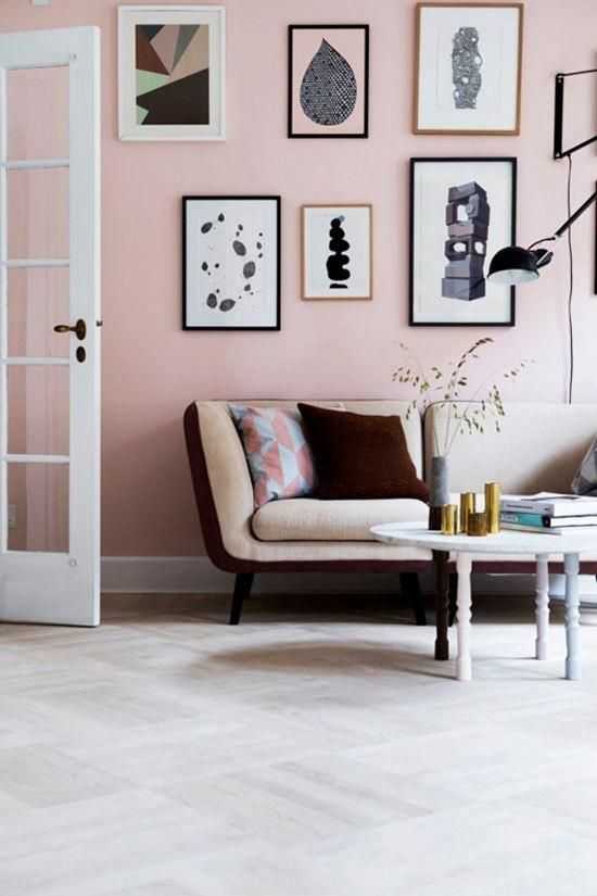
{ via Style Caster }
Use as a accent
Aren’t these drapes just gorgeous?!! I love how soft and feminine it makes this otherwise tone on tone room look.
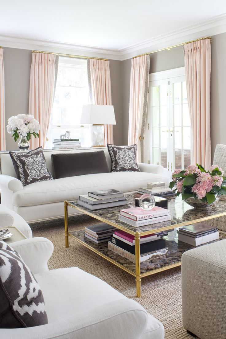
{ via Virginia Macdonald }
Another great accent use is to use it in a furniture piece. This creates a great focal point for the room if used with neutrals.
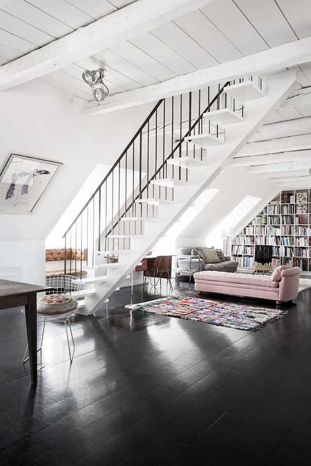
{ via French by Design Blog }
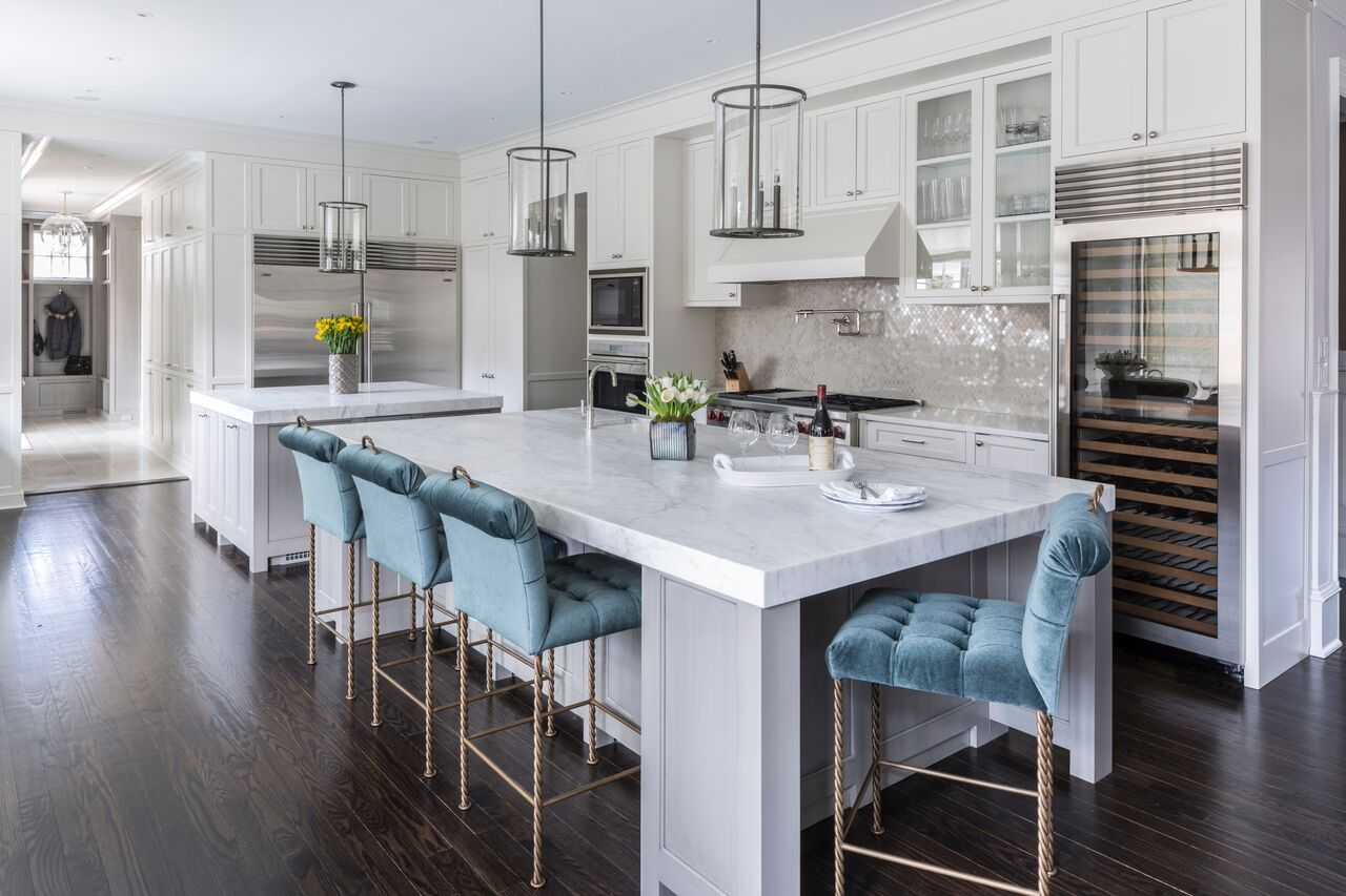
{ via Lydia Marks & Lisa Frantz }
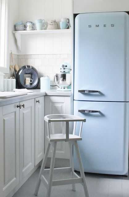
Pop it in appliances
This is a more retro look to go in but so pretty in this farmhouse kitchen. I love that the bowls and cups to the left pick up the same color and make it feel seamless.
{via Mias Interior }
Use them together
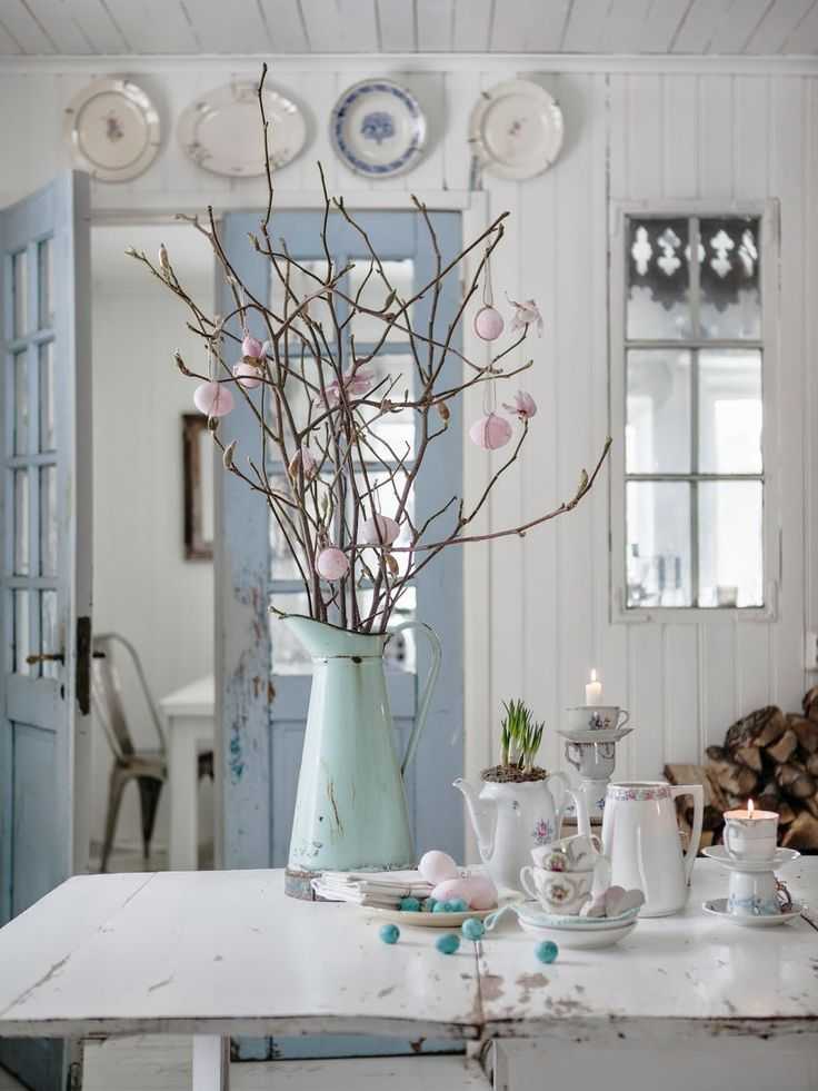
This can be easier said than done but look how beautiful this floral arrangement in rose quartz looks off of the door in the serenity shade. Soft and subtle with hints of chippy equal a perfect combination!
{ via Johanna Vintage }
Use in entertaining
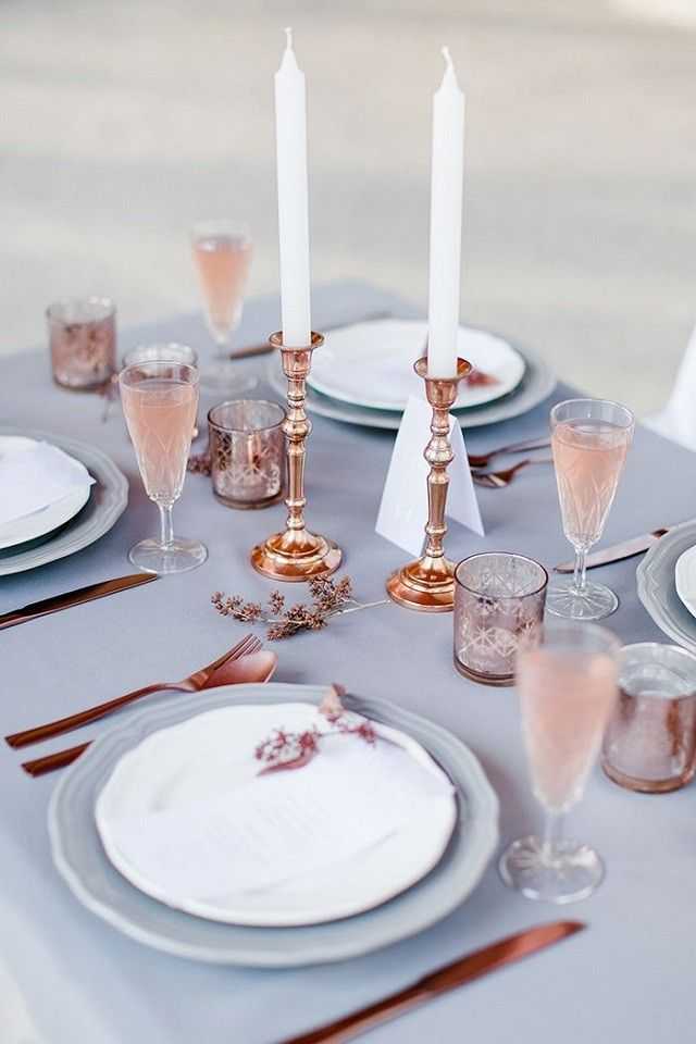
Not ready to take the plunge to use them in your home? How about in your next dinner party? I love this gorgeous table top decor using both of Pantone color of the year colors. It is rich and serene looking. I could just see this for a wedding too!
{ via Brabbu }
So now that you have seen examples of some of my favorite ways to use these colors, here are some of my favorite accessories for you and your home to shop to add a little rose quartz and serenity into your life!


The pink curtains! Oh my gosh. Where can I buy them right now?? 🙂 Gorgeous!
I’m lusting after the wall color gracing the room with those fabulous drapes…and wondering if it could work in my 100+ year old home …
They are very nursery like colors, but I do like them used as accent colors separately. Those pink curtains are really pretty!
Wow, interesting selections they made this year once again! I love that room with the rose colored drapes – how serene!