A lot of people are curious about the hottest 2021 paint color trends because they want fresh ideas that could instantly update their homes.
Many turned to paint color guides, but found themselves overwhelmed with so many options and no clear direction on what would actually look good.
It’s frustrating when a shade looks perfect on a sample card but ends up too dark, dull, or clashing with furniture once applied.
Some colors look soft and inviting online but turn cold or lifeless when painted on walls under natural or artificial lighting.
You might even paint an entire room and then feel disappointed when it doesn’t create the atmosphere you imagined.
Choosing from endless options without guidance often wastes time and money, leaving you second-guessing every decision.
The hottest 2021 paint color trends focused on warmth, comfort, and natural tones, making it easier to create rooms that felt cozy and timeless.
These shades worked well in both modern and traditional spaces, giving homeowners more confidence in their choices.
So, I’ve rounded up the most popular 2021 colors and practical tips on how to use them in simple, approachable ways for any room.
With these tips, you’ll feel more prepared to decorate with confidence and bring out the best in your home!
2021 Paint Color Trends
2020 was all about moody hues, which looking back (isn’t hindsight always…20/20?), seems even more fitting than anyone realized at the time. And after all the craziness and unpredictability of 2020, the color trends for 2021 are all about restoring calm and serenity. Here are the hottest trending colors, and I just know you’re going to love them.
Neutrals Paired with Bright Colors
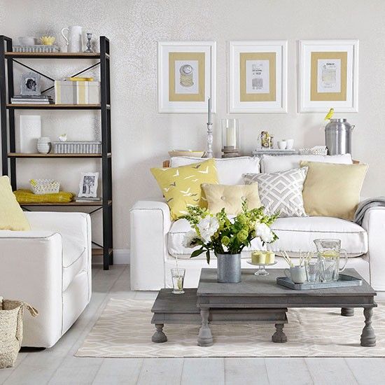
First on the list is the 2021 Pantone Color of the Year, and this year we get a special 2-for-1 deal. That’s right, this year’s color pick is actually two colors. Gray, specifically Pantone’s Ultimate Gray (17-5104 TCX), has been used in living rooms and bedrooms for several years now. This year, Pantone is adding a pop of bright, cheerful color with Illuminating (13-0647 TCX) yellow to help boost the mood and look forward to the brighter days ahead.
This post may contain affiliate links. As an Amazon Associate and a participant in other affiliate programs, I earn a commission on qualifying purchases at no additional cost to you.
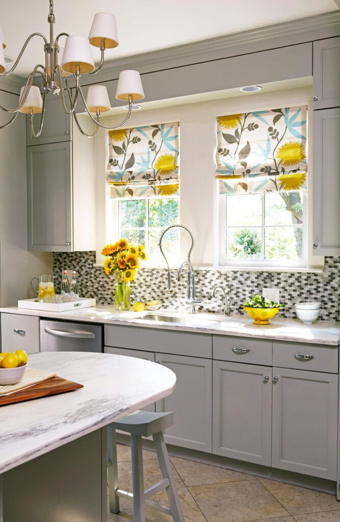
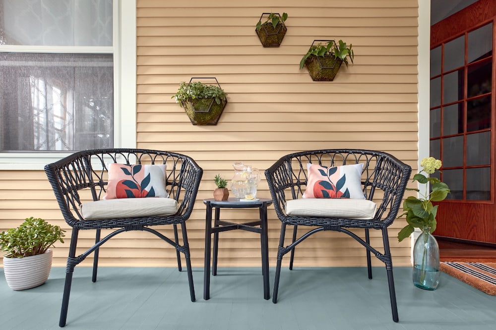
Another way to use this in a more toned-down look would be like this.
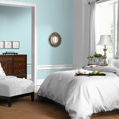
PPG’s Misty Aqua (PPG1147-3) is another bold pop of color with a note of tropical personality that would also pair well with gray. It balances the earthier and neutral tones of other trending hues. Pair it with grays or cooler whites for a serene blue that brings to mind cloudless skies.
Nature-Inspired Hues
Sherwin Williams picked Urbane Bronze (SW 7048) as its 2021 Color of the Year to convey a sense of coziness and safety. This color conveys a contemporary simplicity that makes it a powerhouse in the world of neutrals and confidently complements natural materials such as wood, woven textiles, metals, and stone.
Try using it in any space you consider as a sanctuary or retreat. Valspar’s Maple Leaf (2008-8B) is a muted uplifting hue that reflects that seasonal change of color. It pairs really well with green, so using this paint color for your wall(s) and offsetting it with indoor house plants will give your space a very welcoming feel.
Grounding Neutrals
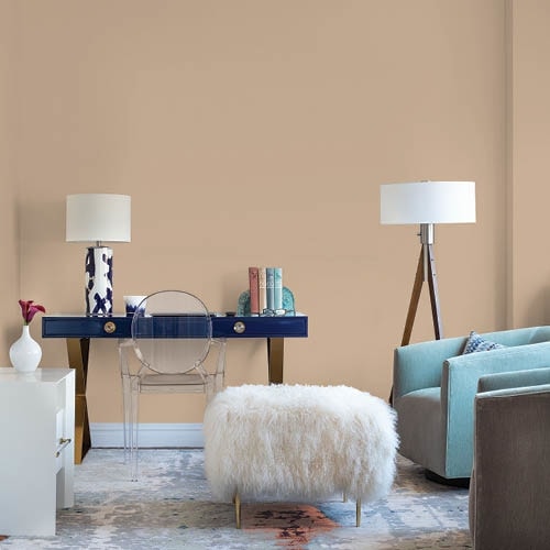
Designers expect people to seek out grounding, restful colors to create stillness within the noise. Our homes are now where everything happens: work, school, and relaxation, which means that hue will have an even larger impact on our lifestyle. Neutrals are still king, but instead of the typical grays and greiges, expect to see a trend toward warm earthy beige neutrals that mimic nature. The grounding neutral paint color trends for this year include PPG’s first-ever palette of the year (called “Be Well”): a collection of 3 organic hues that embrace the simplicity of nature. Transcend (PPG1079-4) is an oatmeal-colored hue that is reminiscent of warm sand on a summer day. Big Cypress (PPG1062-5) adds a little earthy spice with this warm ginger shade with persimmon undertones. Misty Aqua (PPG1147-3) is a muted tropical turquoise that adds a note of freshness with the earthy tones. These three colors, when used together, produce a restful, calming effect that’s also fresh, as demonstrated in this image.
Would you like to save this post?
Jewel Tones
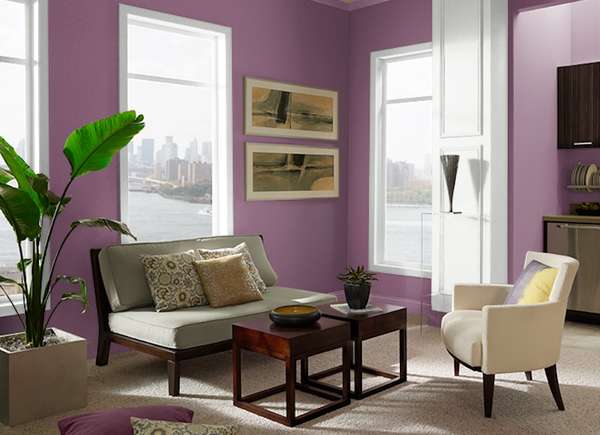
Jewel tones add some personality and inspiration. and a lift in mood during all the hours at home, but painting the house is a fab project to stay active and feel productive in the winter months. Behr’s 2021 paint palette includes Euphoric Magenta (M110-7), a warm, purple-infused magenta. It’s a rich color that pairs well with charcoal, greys, creams, turquoises, and golds to lift your spirits as in this living room.
Midtones
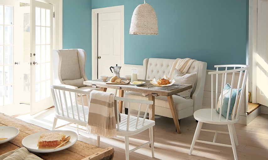
Benjamin Moore’s 2021 paint color of the year, Aegean Teal (2136-40) is a beautiful blue-green-gray that creates harmony and serenity. It works in nearly every room of the house and pairs well with grays, creamy whites, blush, and earth-tones as shown in this example.
How to Use These 2021 Color Trends in Your Home
Sometimes it can be difficult to know how to use some of these colors in your own home. Here are a few simple ideas to help you incorporate these 2021 paint color trends if you’re looking for a refresh.
Add Small Pops of Color
Layering fabrics, using throw pillows, vases, and artwork are all ways to add in small pops of color (especially bold colors) without committing to whole walls painted in a color you may not end up liking. This image shows how you can liven up a fairly neutral room with pops of color in many different ways yet still not commit to painting the room or even an accent wall. 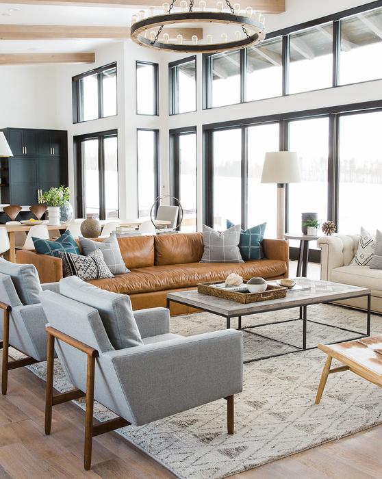
Paint an Accent Wall
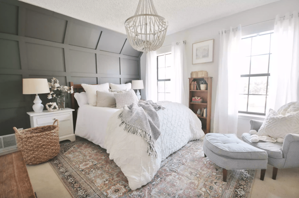
When it comes to deeper hues, sometimes painting an entire room can be too much. However, painting an accent wall completely changes the feel in the room (and takes less time!) without being overwhelming, as you can see in this bedroom.
Paint Smaller Items
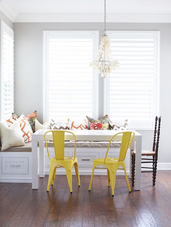
Items such as kitchen chairs are quick and easy to paint to give the room a fresh feel and a pop of color. Here, the 2021 Pantone Colors of the year are on full display with the cabinets as Ultimate Gray and the chairs painted Illuminate for a fun pop of color.
Paint Your Front Door
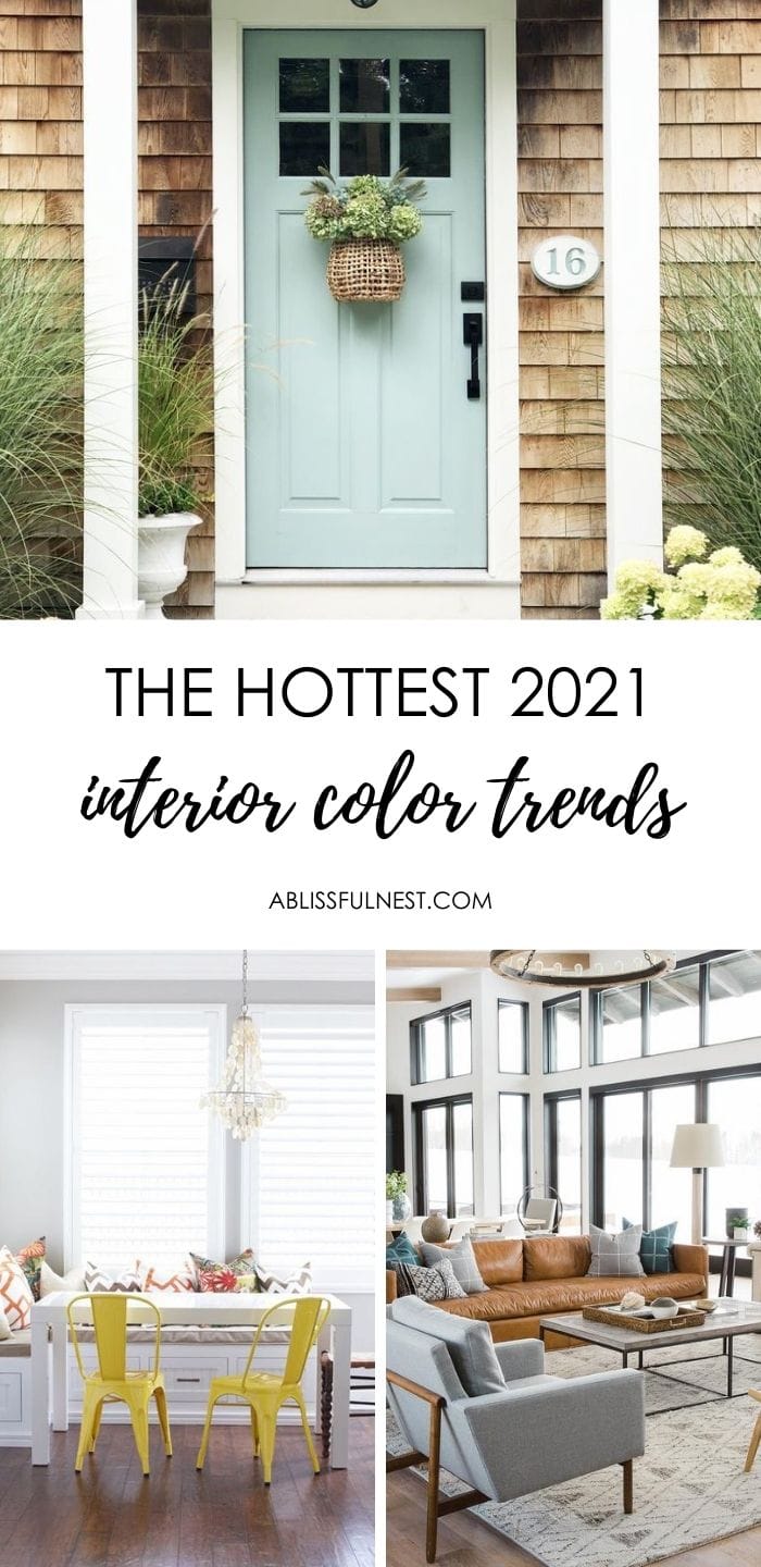
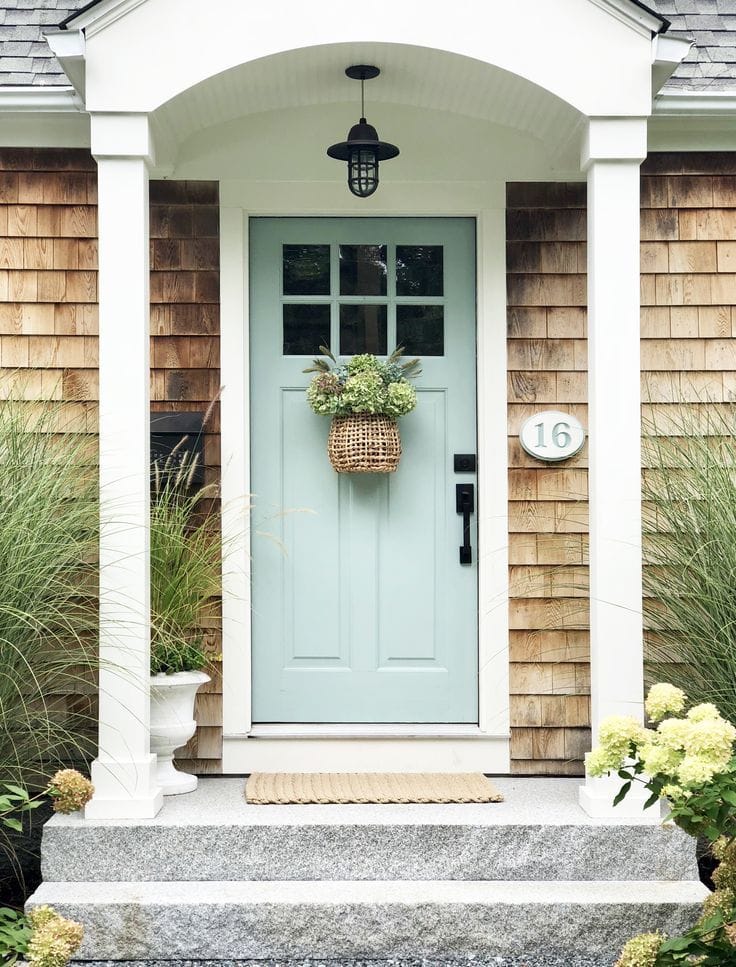
Painting the front door with one of the trending paint colors for 2021 is a fun way to make a statement with a bold color. It’s also a small way to enjoy a pop of color that’s easy to swap out when you get tired of it, like the aqua door on this house!
Frequently Asked Questions
The color of the year for 2023 is Viva Magenta, a bold red with pink undertones that feels lively and full of energy. It was chosen to reflect strength, optimism, and creativity in design.
Start with smaller accents like pillows, rugs, or artwork to test how Viva Magenta works in your space without overwhelming it. If you’re ready for a bigger impact, try it on an accent wall or in a statement piece of furniture.
Yes, Viva Magenta pairs beautifully with soft whites, grays, and beiges because the contrast keeps the color bold but still balanced. It also works well with natural textures like wood and stone for a grounded look.
You can definitely use Viva Magenta in smaller spaces, but it works best in moderation so the room doesn’t feel crowded. Try using it for trim, textiles, or decor pieces instead of full walls.
Pantone selected Viva Magenta because it represents confidence, joy, and a push toward bold self-expression in design. It encourages people to be more adventurous with color choices in their homes.
I’m really enjoying the 2021 paint color trends and seeing them in action in these images makes me like them even more! Which color(s) will you add to your home first? Now that you’ve seen all the latest interior color trends for 2020 and ways to incorporate these fun colors in your own home, I hope you have a blast updating your home in ways that make you love it again. Remember, using these 2020 paint trends isn’t a forever commitment, so have fun experimenting and give a few ideas a try!
Need to bookmark this for later?
Pin Our Image:
