A while back I shared the design plans for our new entry. You can take a look at it HERE. I had been dreaming of this space over the last 10 months of us building our new home and had it pretty set in my mind what it was going to look like. But things are funny aren’t they? It is close but has some changes and ultimately I think I love it more. I think maybe my tastes have changed slightly and well some of it was out of stock and I just didn’t want to wait. LOL. I can be a bit impatient if you can’t tell.
Our entry is a small and narrow space. Since we did a semi-custom build, which means you are kind of tied into some design elements unless you want to pay to change them, I decided to just work with the space in the floor plan we selected rather than trying to make it a bigger space. So today I wanted to talk about some small entryway ideas to help inspire you if you have a small entry and how to get a gorgeous space your guests will love when they walk in the door.
Coastal Entry Reveal:
Entryway Design Process:
So here is where we were when we were building. You can read more about our building process HERE. Since this is a 2 story home we had a very tall ceiling in here but as you can see it is very narrow. One thing that really helps add light to this narrow space is that window you see where the upper ledge is. I love that design element as I walk down the stairs.
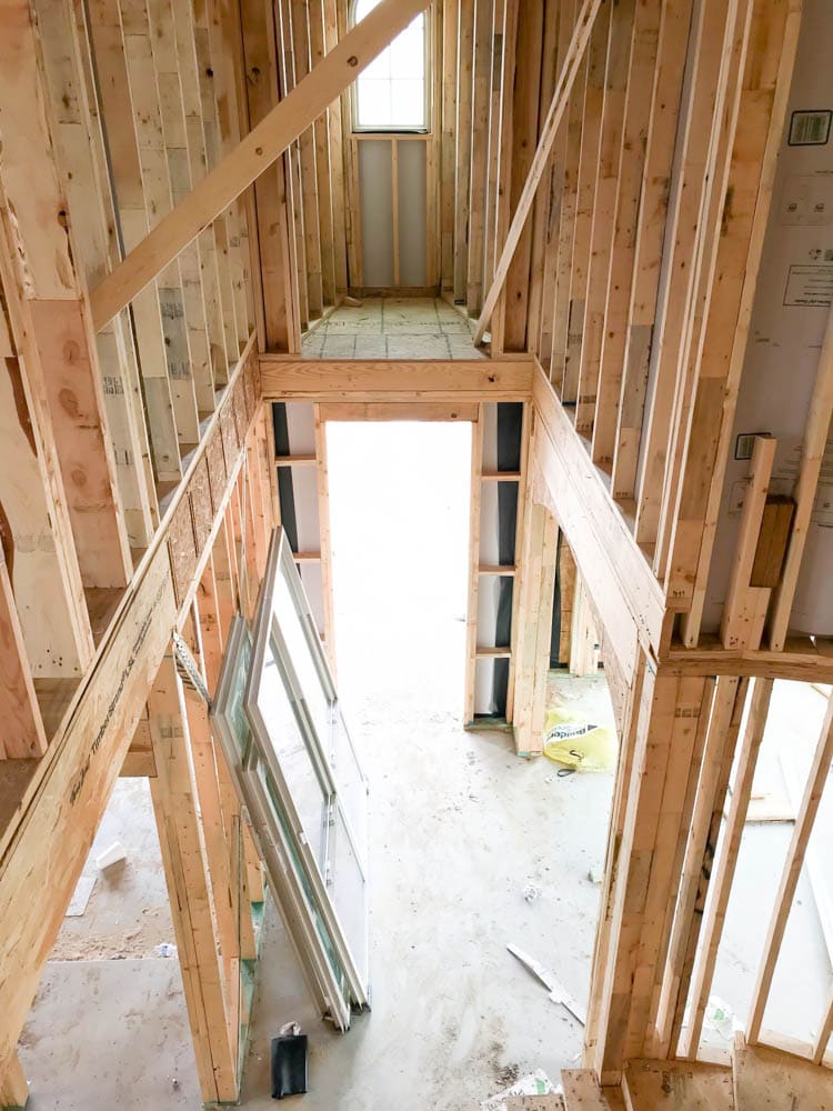
Also, on the left hand side you can see where the door is to go in and out of the garage. Ultimately I would have loved a mud room but next to that is the powder room and my office and those are 2 things I just couldn’t do with out.
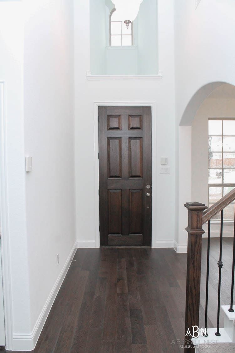
So here are the 3 elements I needed to address and work with.
- Narrow walkway as you enter from the front door
- Something to help as a catch all, take off your shoes, sit down as you come in through the garage door area
- The curved space under the stairway as you walk up the stairs so it doesn’t become a dead space
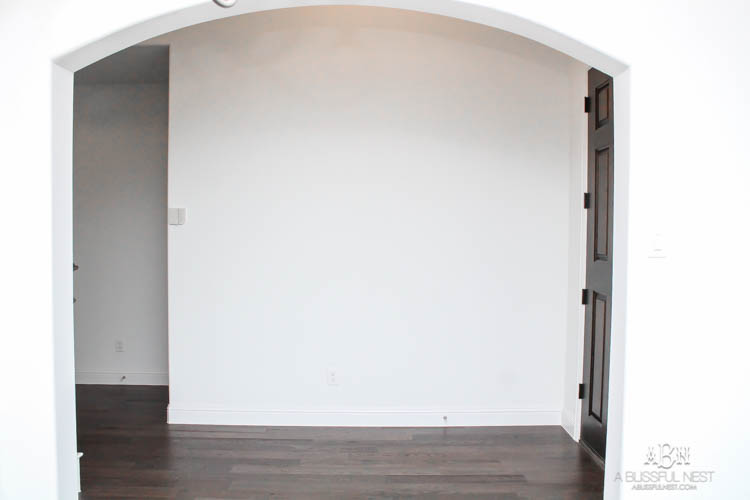
This last view is look at the front door which is on the right from the dining room.
Entryway Design Reveal:
And here is that same view from the dining room now. I wanted something a bit modern and still in the lake/coastal aesthetic that I love. Of course that meant blue and white, driftwood, plants and design books.
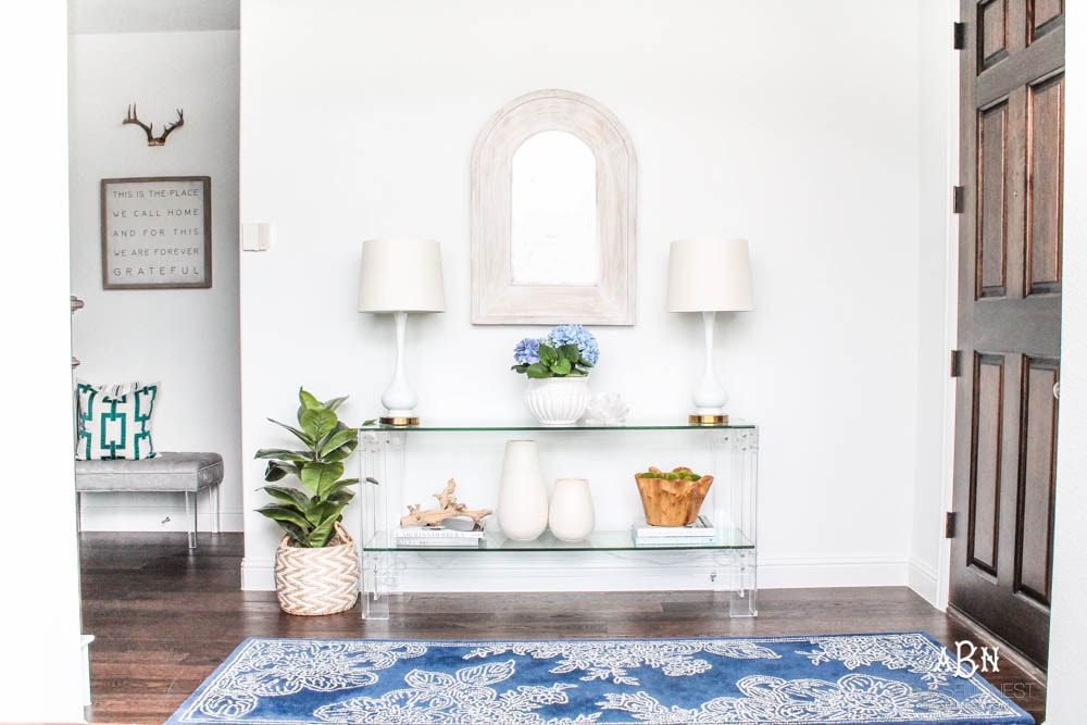
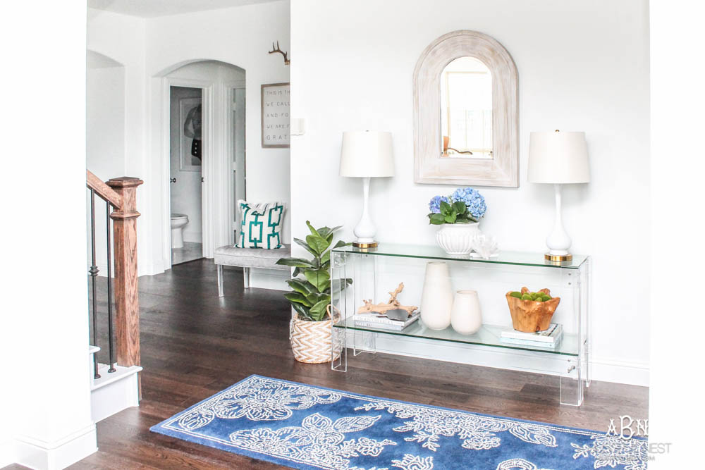

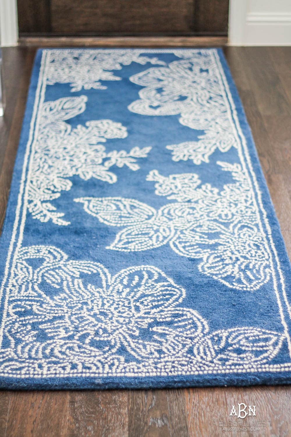
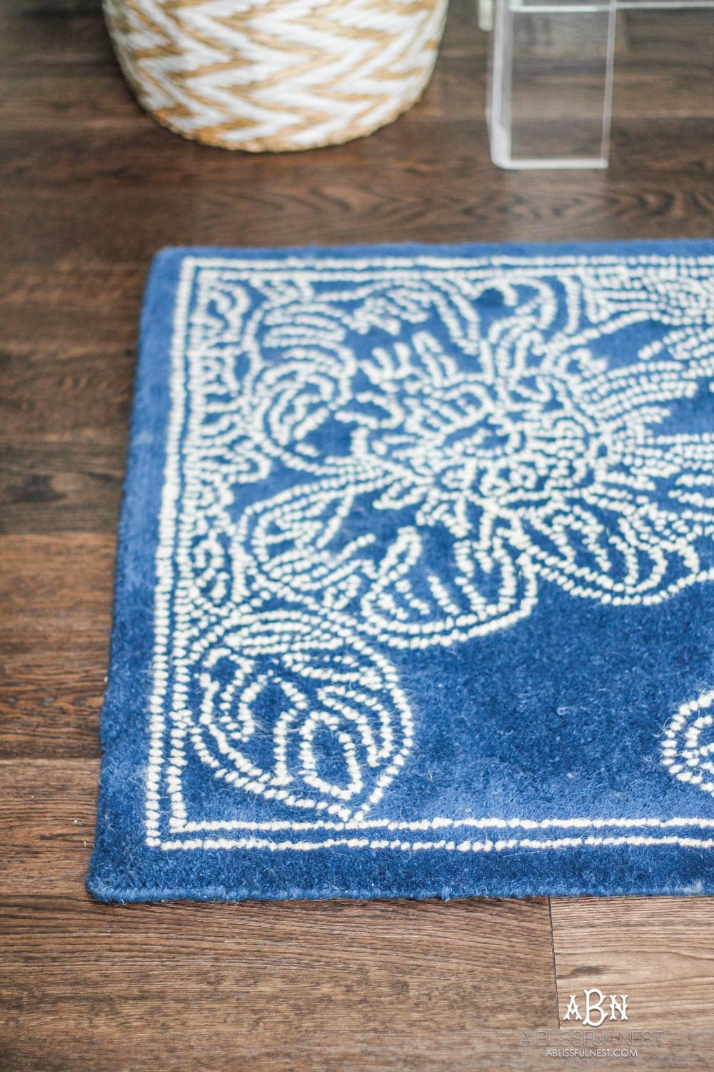
It feels light and airy as you walk in and that punch of color in the rug is a great contrast.
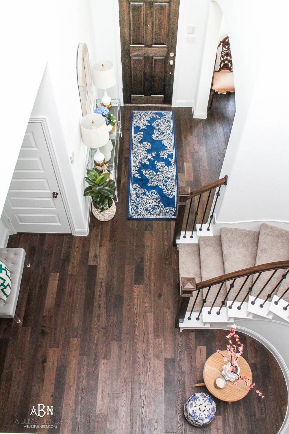
The first thing when designing an entryway for a small space is to pick furniture that won’t make it feel dark and heavy.
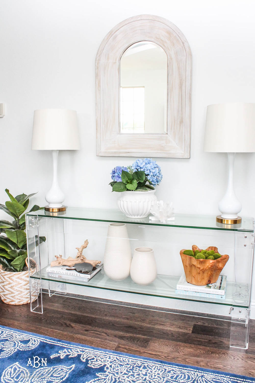
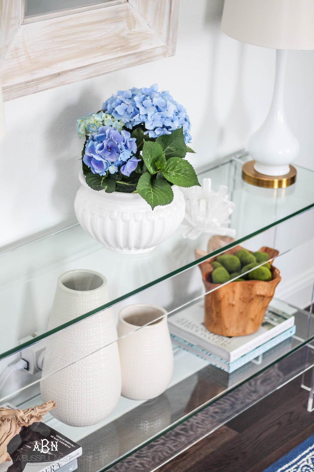
The last thing you want when designing a small narrow space like this is to have people walk in and feel like they are walking into furniture. I selected this lucite console table (similar) because it is not very deep and the lucite makes it feel light and airy. I love the 2 shelves which are made out of glass and it is really easy to put together when it comes.
If you are looking for a modern entryway idea yet want a classic feel, then this is your piece. Another concern I originally had was keeping it clean from fingerprints but I have been using a swiffer for daily dusting (more like weekly!) and then glass cleaner on the glass panels when I need to deeper clean.
I can’t tell you how gorgeous this piece is in person!
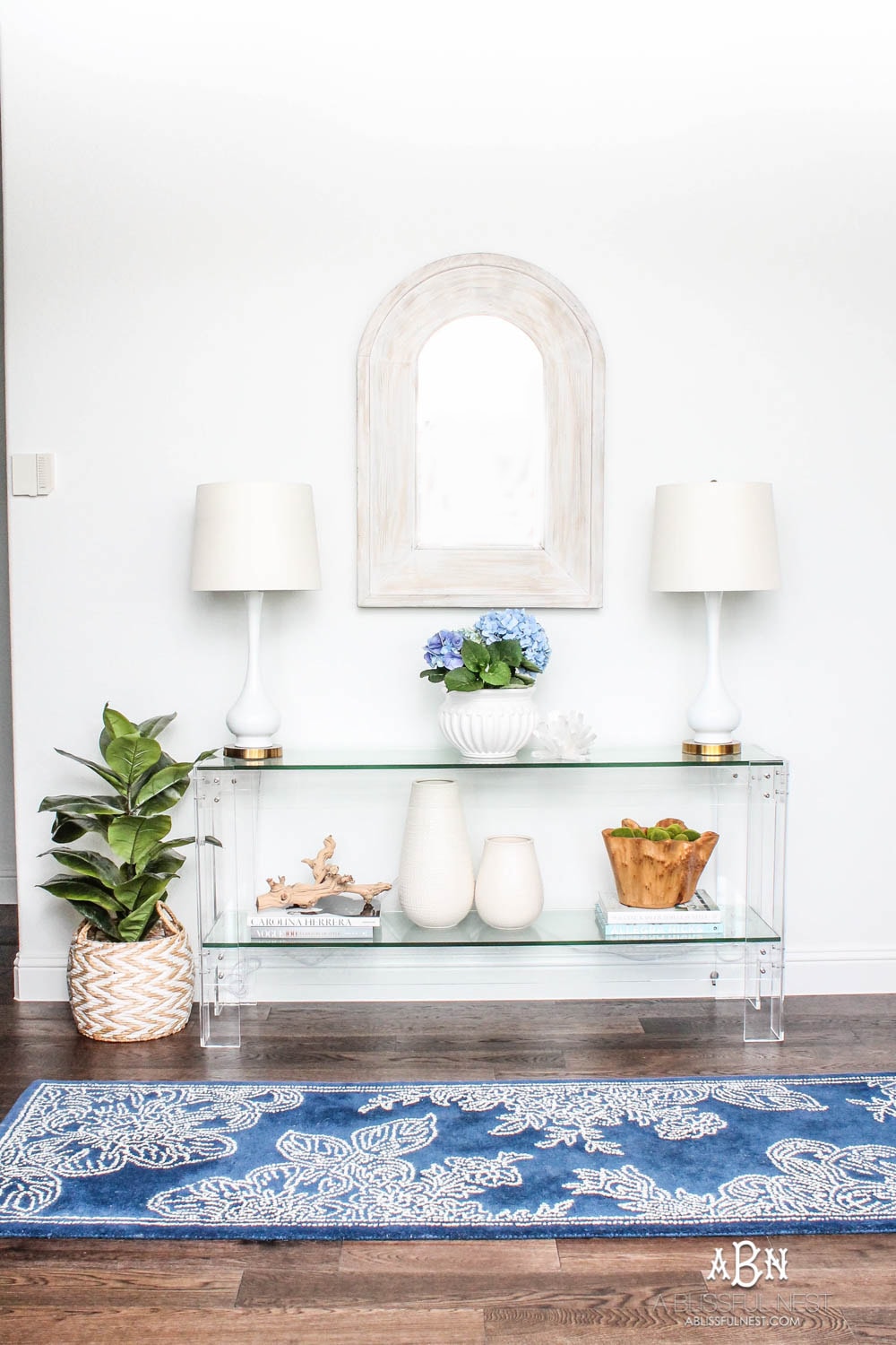
Lucite Table (similar) | Wood Mirror (similar) | Table Lamps | Rug (similar)

The mirror I originally selected was gorgeous. I even ordered it and pulled it out of the box to put up. You can check it out HERE. But then my husband and I looked at it and it was crazy heavy. I had not planned on that and had not reinforced this wall. Now typically you would just find the studs and nail into them to hang something this heavy. But the way they made this arched mirror would not work. They had put the eye rings on either side of the highest points on the sides of the arch which was much more narrow than our studs. Another idea I had was to mount a board on the wall between the studs and hand it on that. But because it is arched you would see the board. I was SO frustrated. I had had my heart set on this mirror.
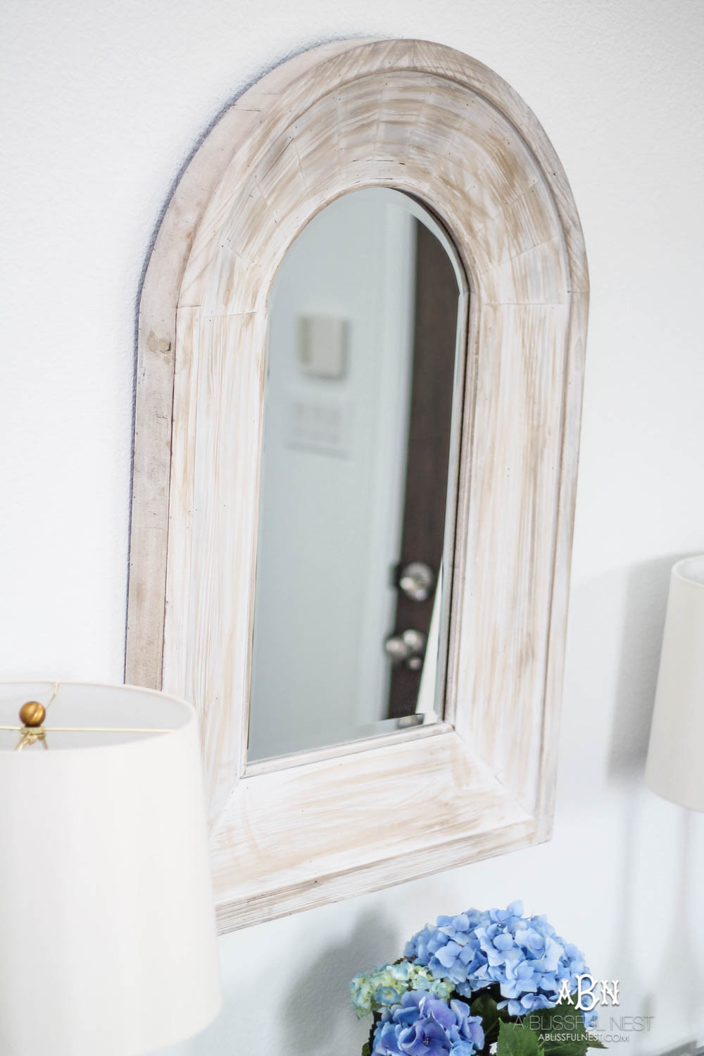
But then one day I saw once of my favorite brands having a sale on mirrors and I saw this white washed one. It’s funny because it is from the same place as the table and I never noticed it in their catalog photo being shown together. But I love it and think it is actually even better than the other one now. The original one had a heavy black iron frame and potentially could have looked too heavy and big for my narrow space. This one is light and airy and adds a touch of texture.
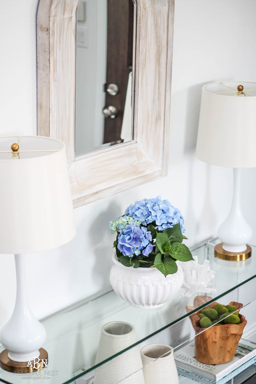
If you follow me on Instagram then you saw me sneak peek these new table lamps a few weeks ago. I just couldn’t wait to share them. They are 28-1/2″ high with the shade so they are pretty tall. I love the subtle gold details on the shade top and the base. And currently, they are under $100 FOR BOTH. Yep, you heard that right. You would think with pricing like that there was something cheap about them or wrong but I can tell you I was pleasantly surprised by the price. They feel heavy and the shades are so pretty.
I also added a wall timer so they go on and off at night. If you do not have a wall outlet timer, it is life-changing. I am telling you it is the best $13 you will spend this week. I plugged both of these into it and set it to go off for a couple of hours at night. If you are traveling these are so great to have on your lamps in the house.
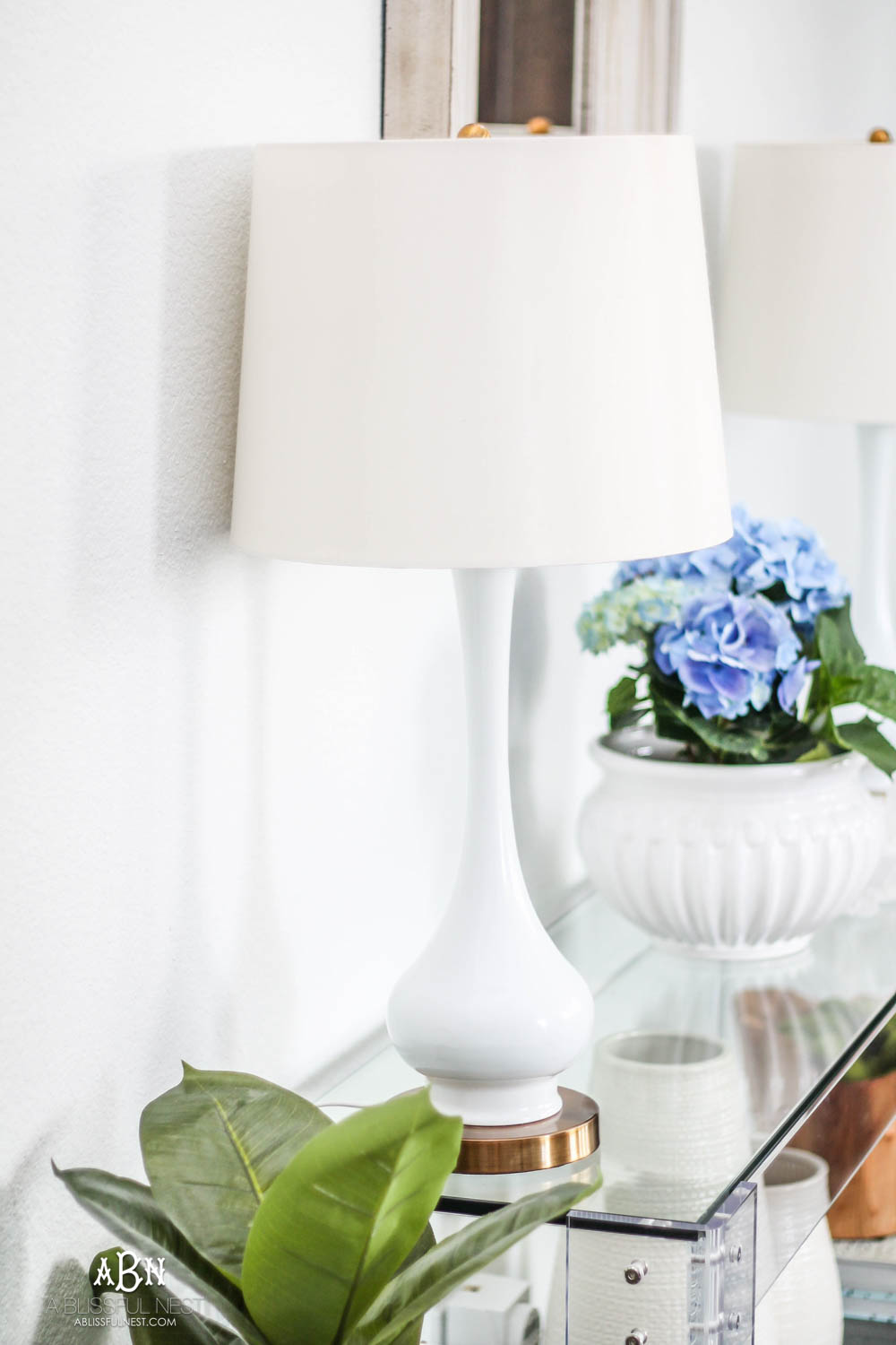
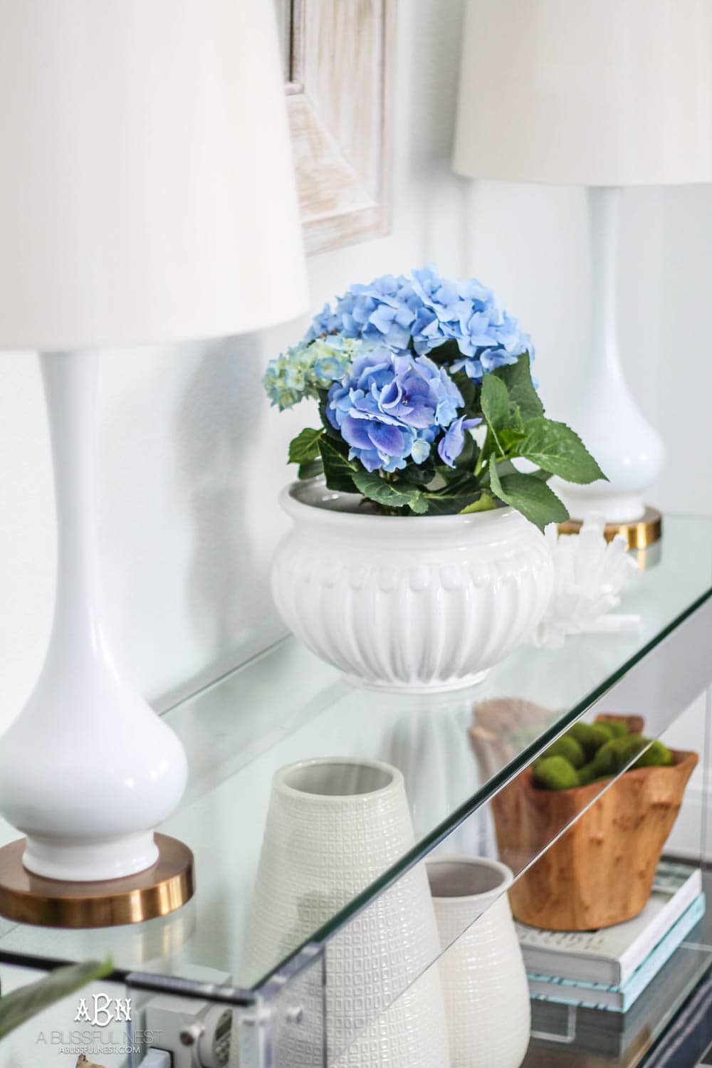
My love for hydrangeas is strong and I got these gorgeous blue ones at Trader Joe’s a few weeks ago. So the real test will be to see how long I can keep it alive.
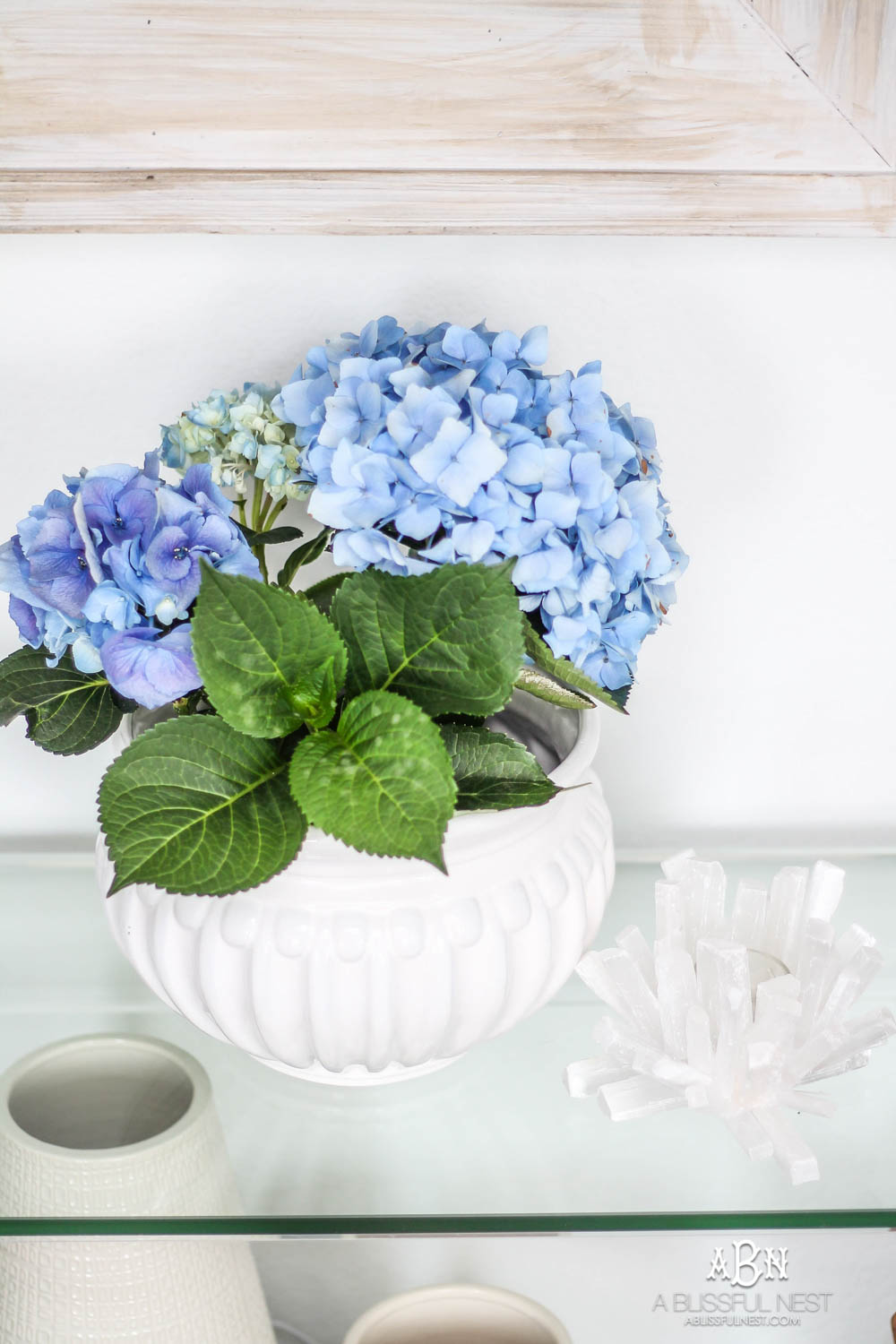
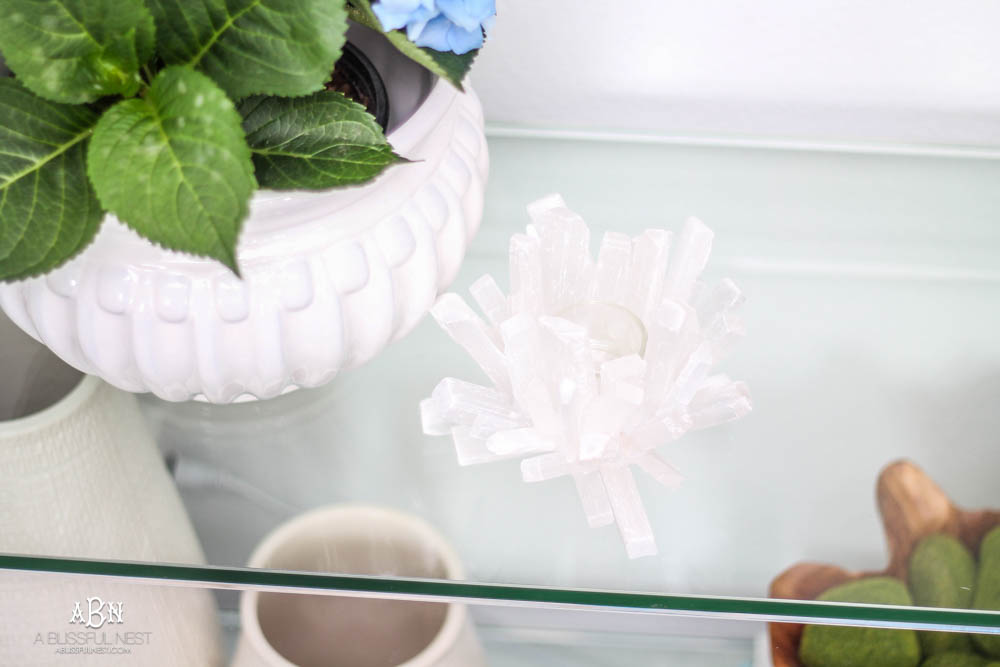
I also recently found this crystal candle holder. It holds a votive and I need to pick up some of the battery/timer ones. It’s on my to do list. I love the modern flare it gives and when a candle is in there, it is such a pretty glow. I found a similar one for you HERE .
Would you like to save this post?
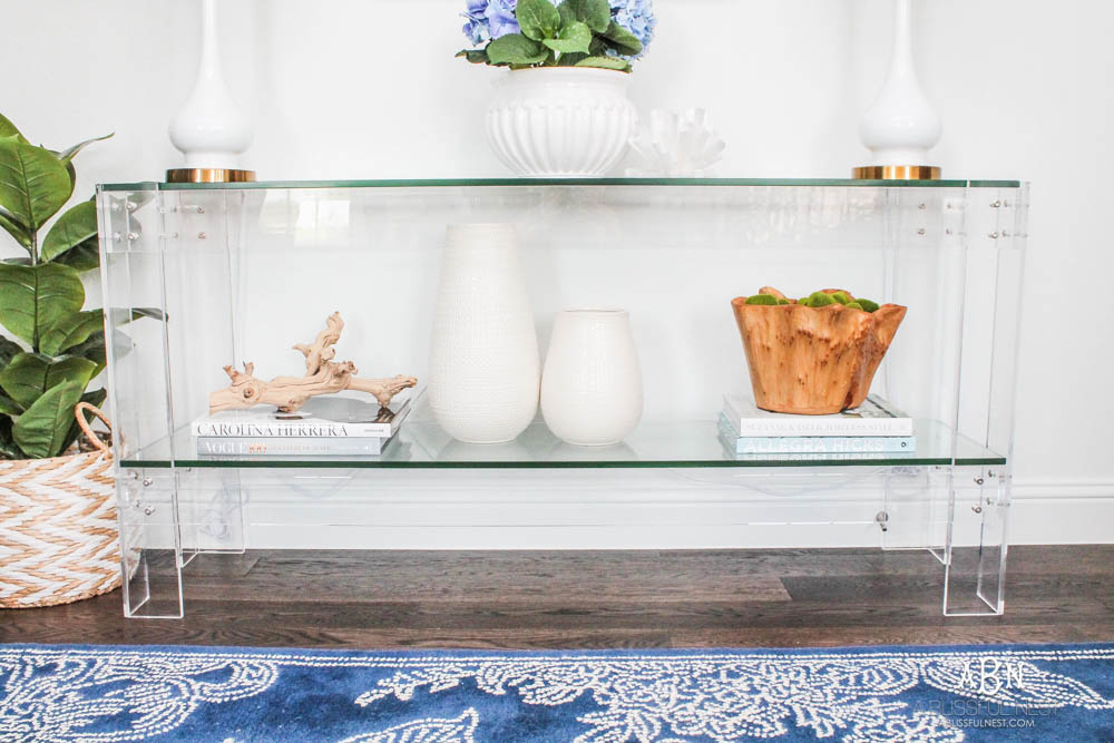
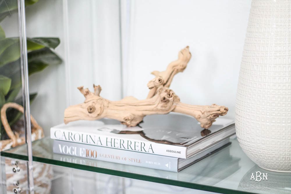
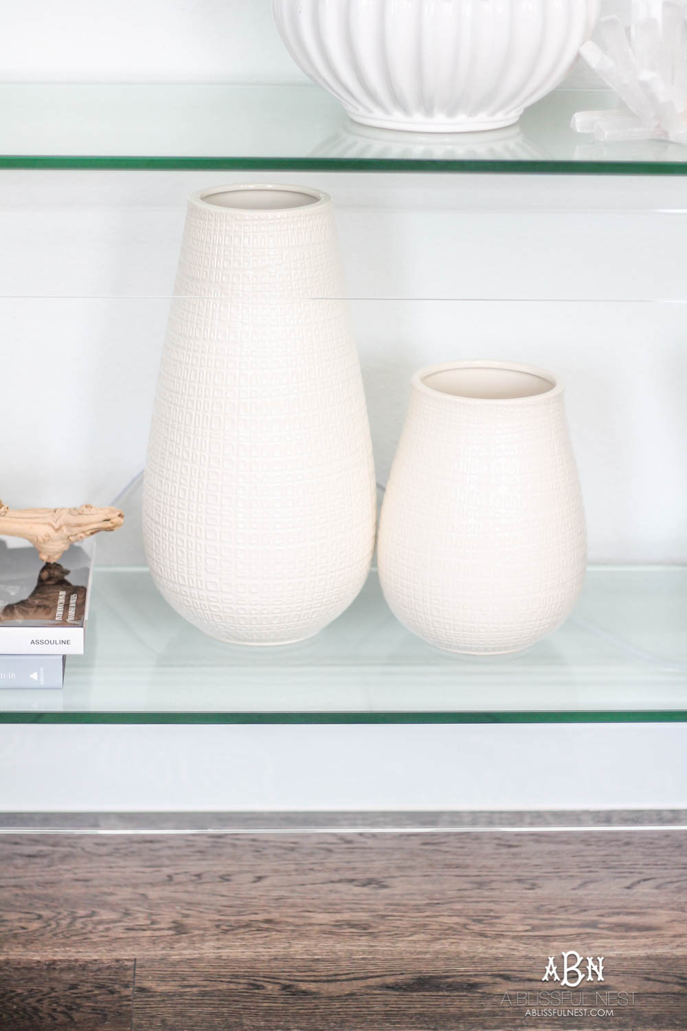
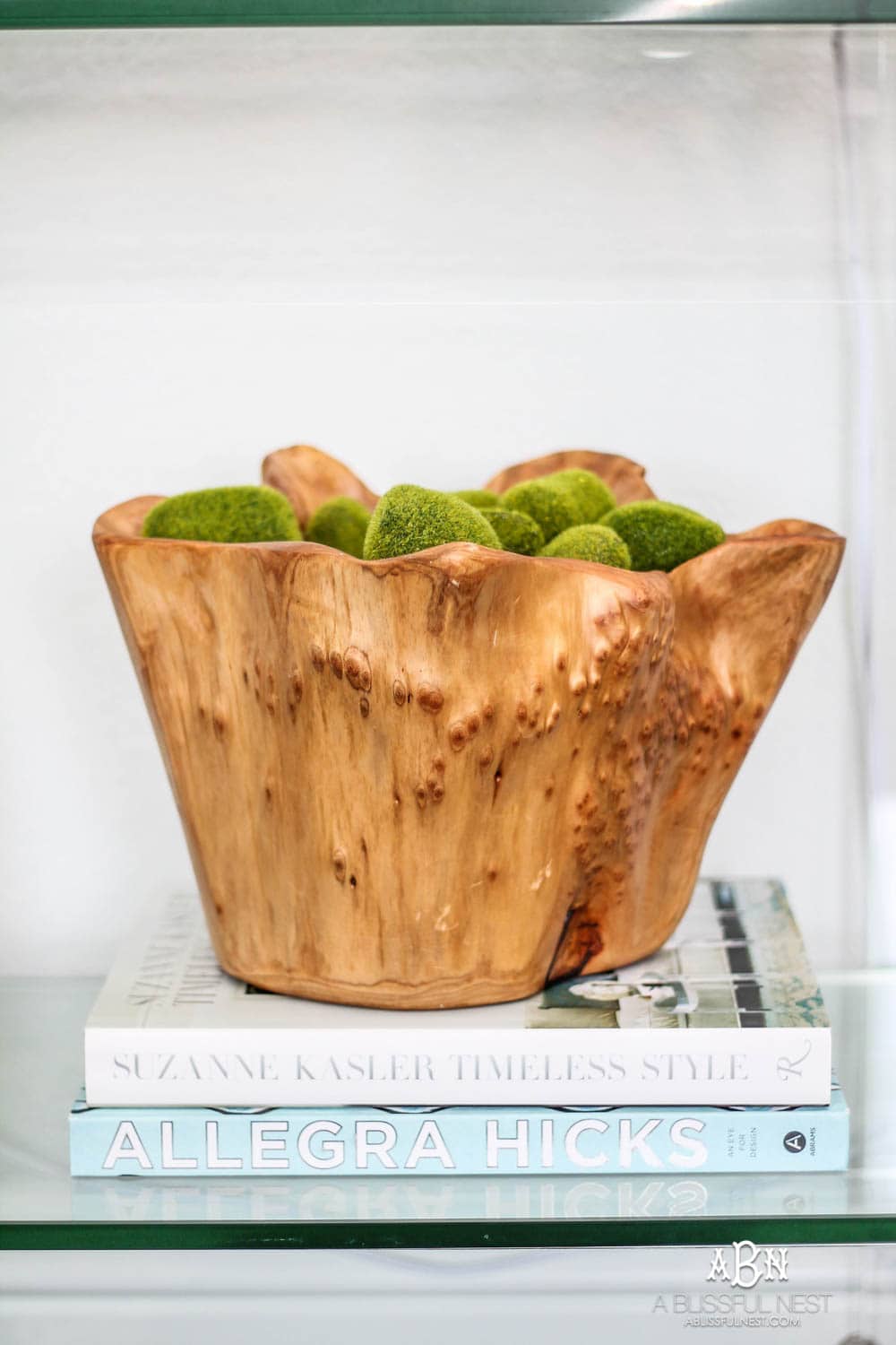
Branch | Tall White Vase (similar) | Small White Vase | Wood Bowl | Moss Balls
For the bottom of the console table, I added a few simple pieces I already had laying around. I have had this grape branch forever and my design books are always my favorites to decorate with. It also makes it easy to pull them out for some home decor inspiration when I have my afternoon coffee.

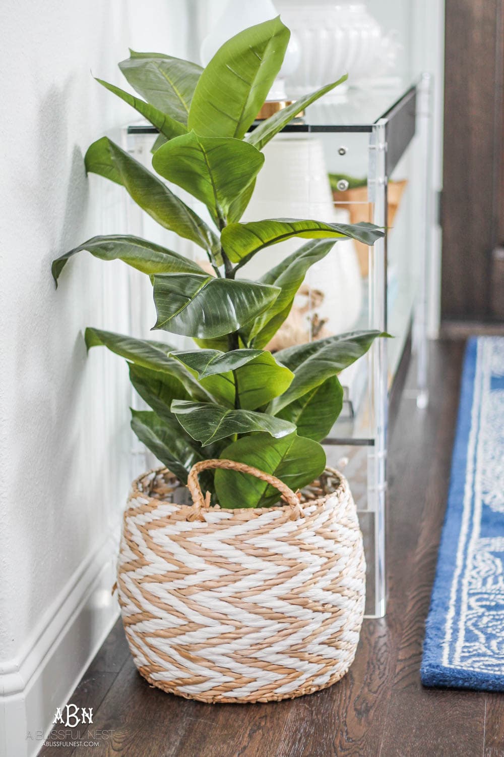
Add indoor plants to bring the outdoors in.
So you know how much I love indoor plants and have a hard time keeping them alive. Well, this little faux fiddle fig (similar) has been amazing to add in some greenery without the maintenance. I popped him into this little basket and I tend to move it around from one room to another from time to time. But for now he is going to stay right here.
Create a functional space even when it is small.
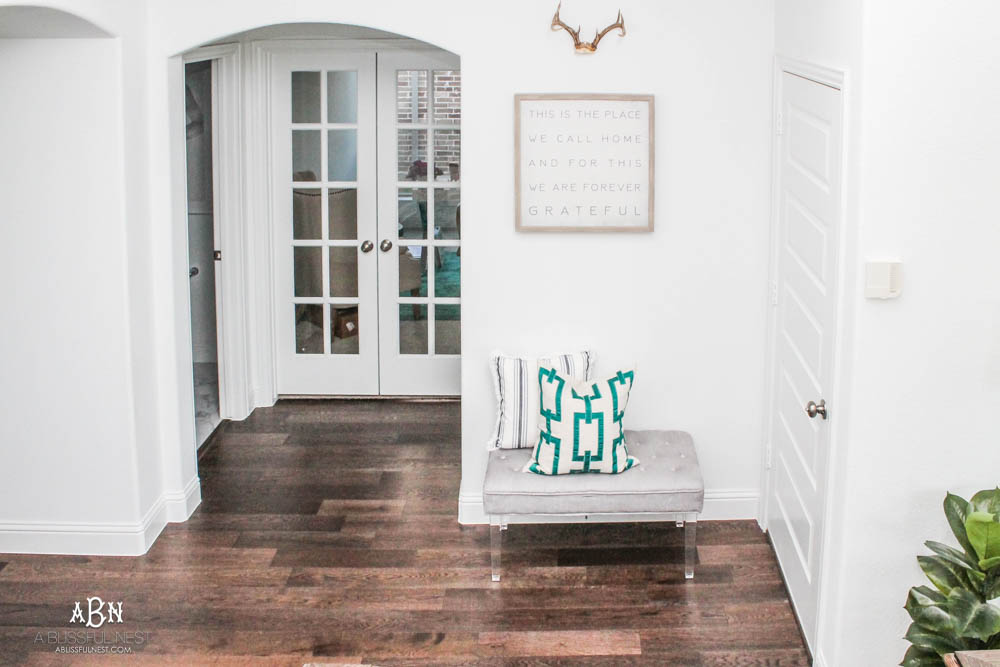
So here was the second area I needed to address. The garage door is on the right, those double french doors is my office and the door on the left goes into the powder room. This may just be the most used door in our house. As I said earlier, I wish we could have had a mudroom but I did not want to sacrifice those other spaces. So I used this bench from the old house as a spot to put on shoes, drop my purse and anything else that temporarily needs to be dumped when you come in. It is a tight fit but for now it is working.

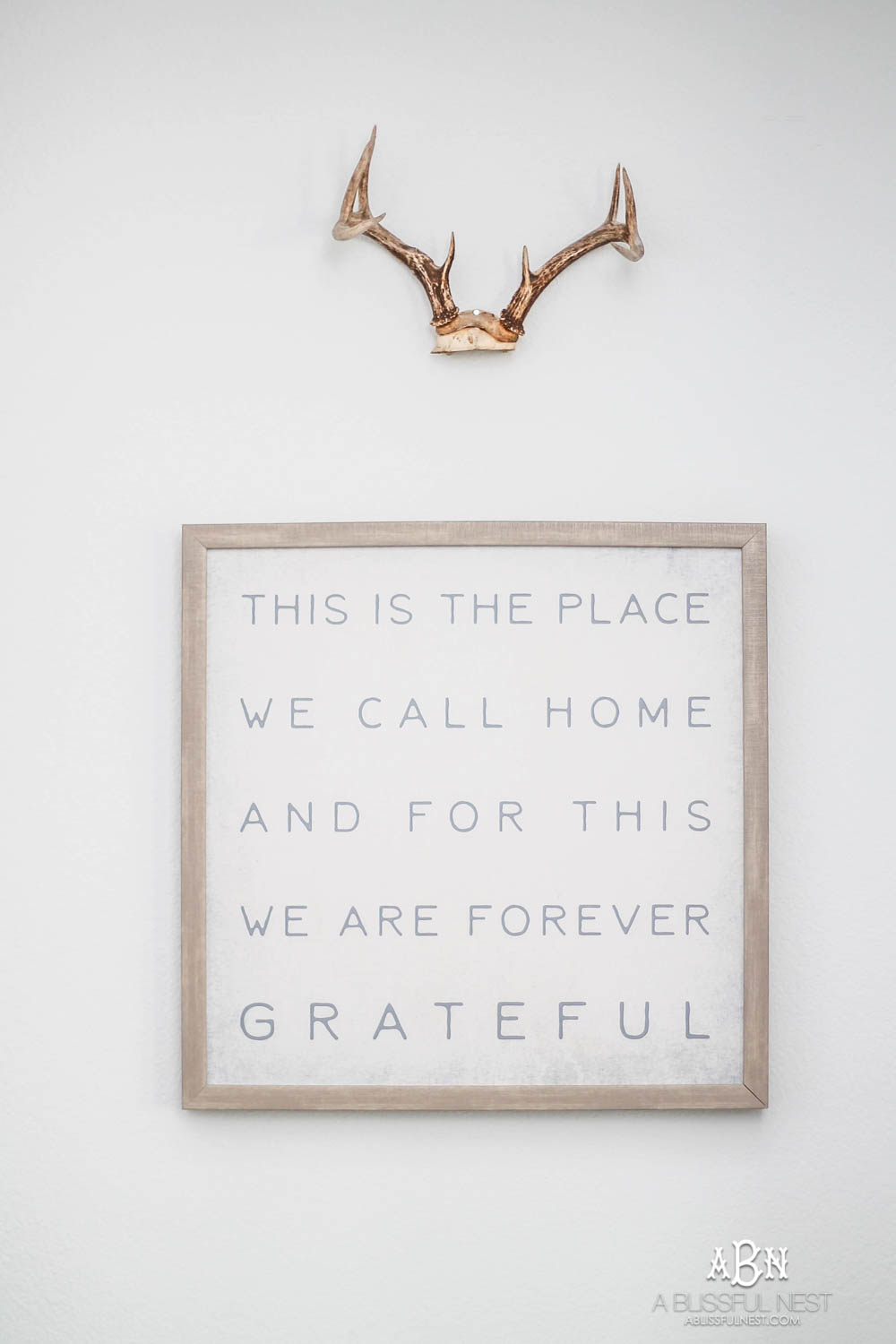
I got this cute little art print from Hobby Lobby and I love the beautiful reminder on it. I look at it every time I come down the stairs.
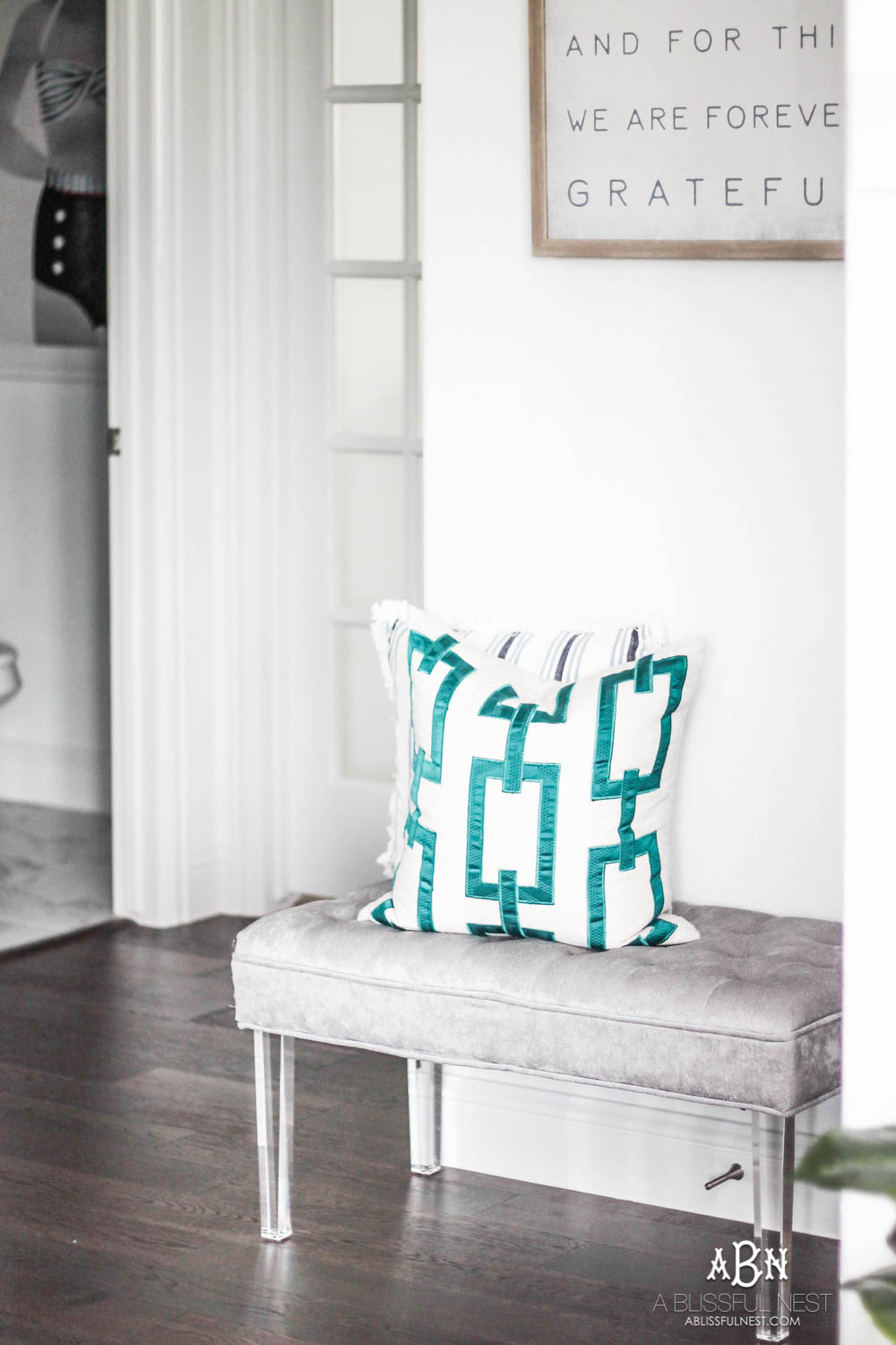
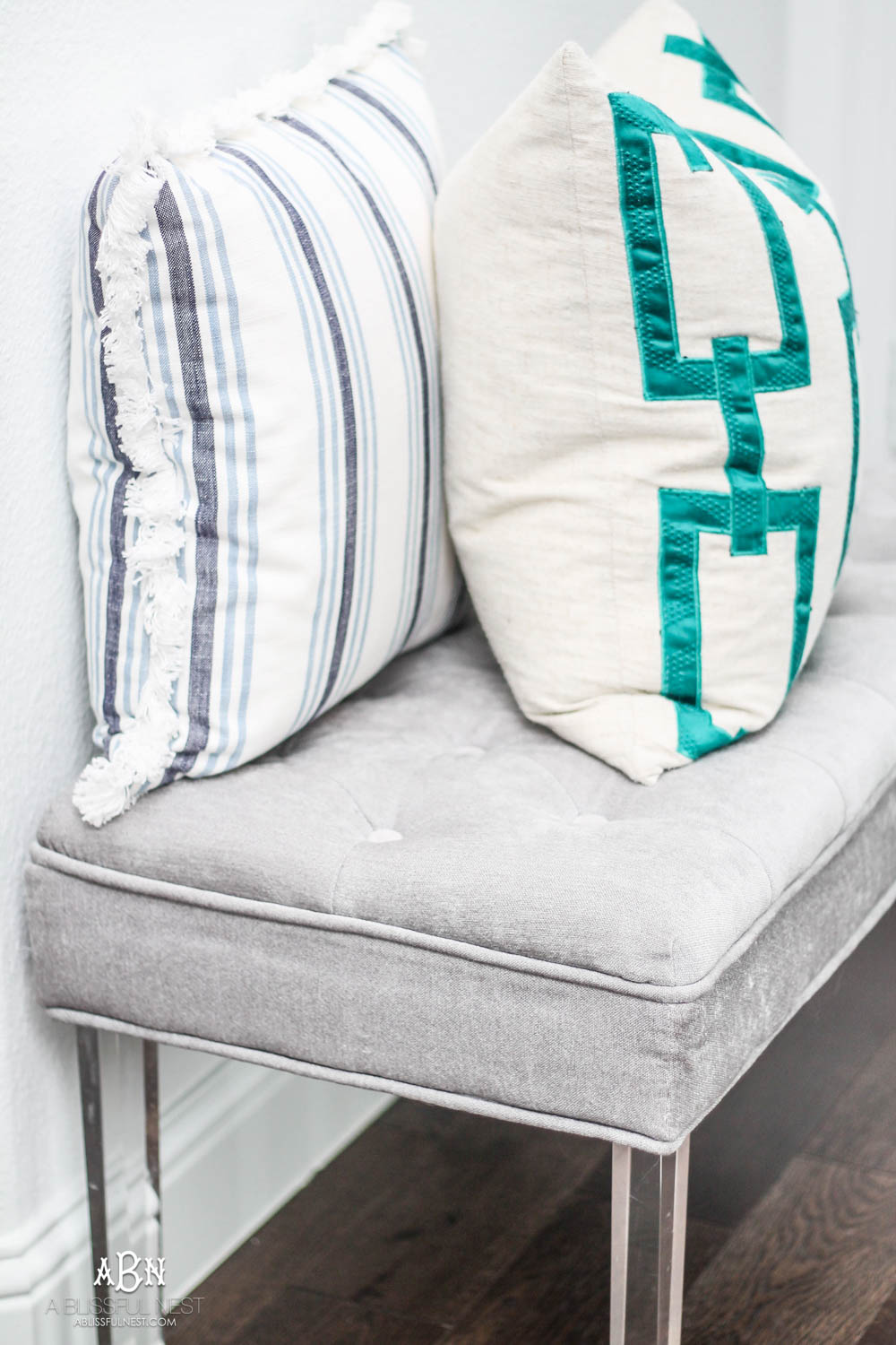
The pillow game at Target is strong right now and I love this 2 toned blue and white one. It is a perfect staple striped pillow to have on hand. It is also less than $20 so it is such a score!
Brighten your space with artwork and flowers.
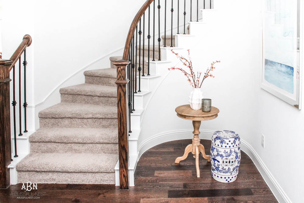
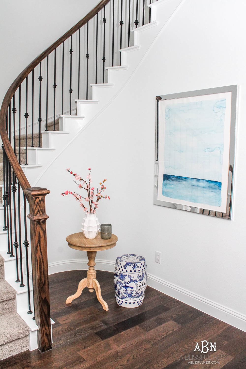
Lastly was this space under the stairs. It is like a hidden little hole. I hung my favorite art from my dear crazy talented friend Kori Clark. This faces the front door and I love that you see it right when you walk in.

I had been wanting this wood beaded chandelier FOREVER and finally decided I wanted to use it in the stairway. This is the view of it from the top of the stairs. It is a bit rustic and has an elegant touch to it. It is also pretty large. It really fills up this space. Thankfully it also comes with the beads on so you do not have to string them. Trust me this is such a big deal. I have sat at clients houses for hours before stringing on beads and crystals on chandeliers before they were installed. It is not fun!
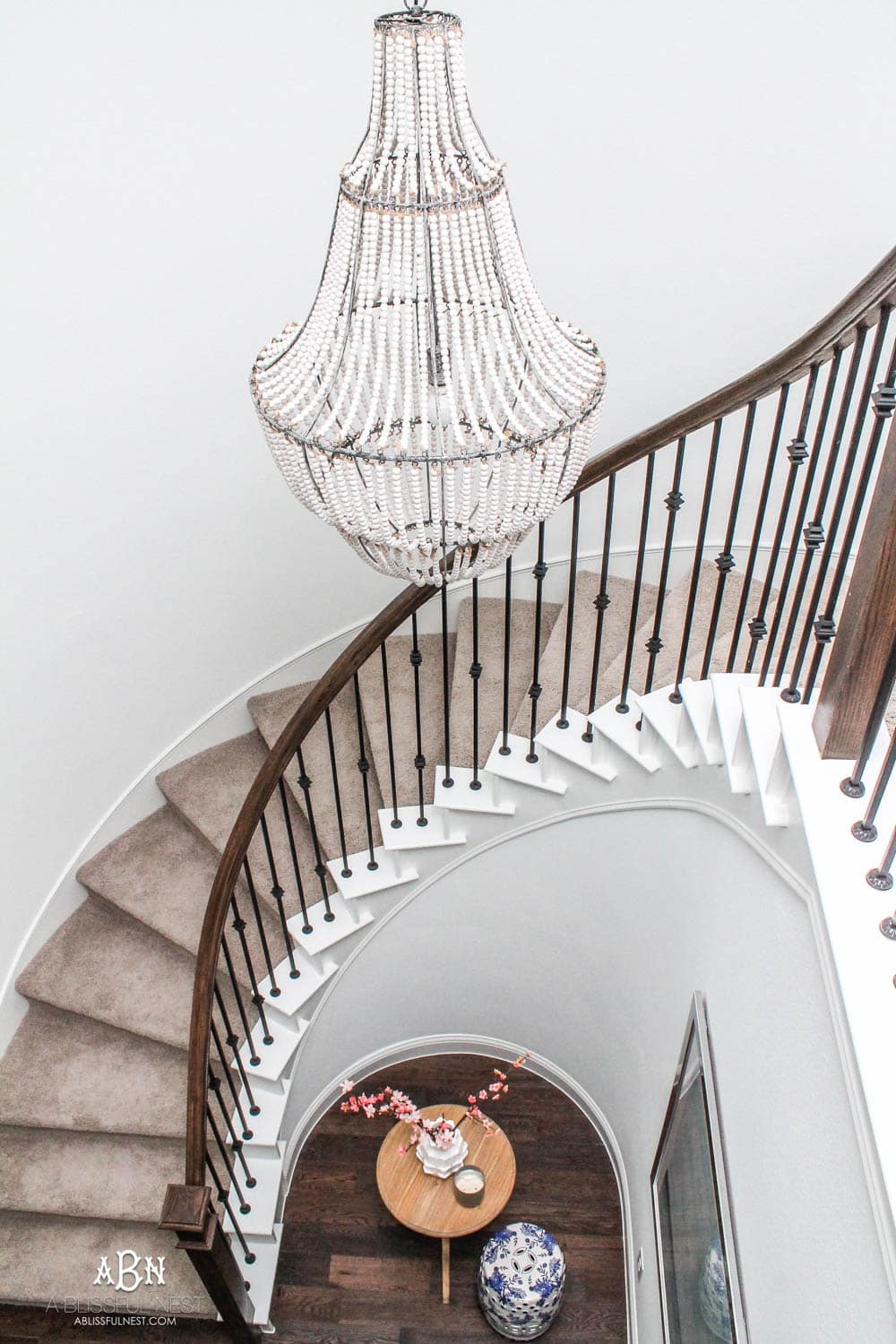
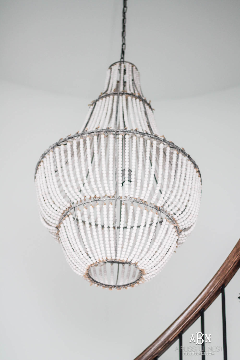
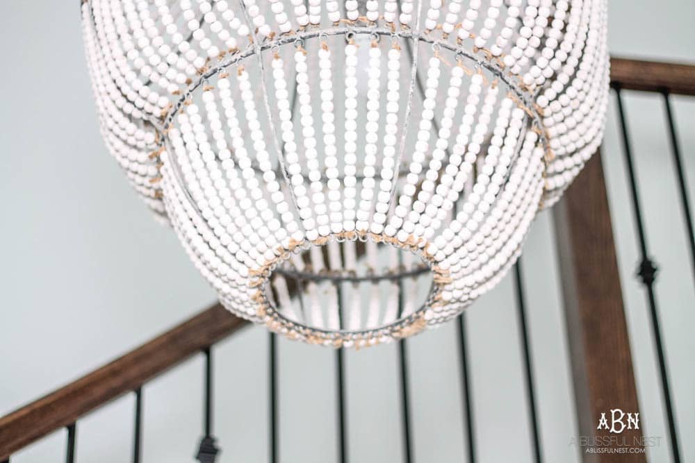
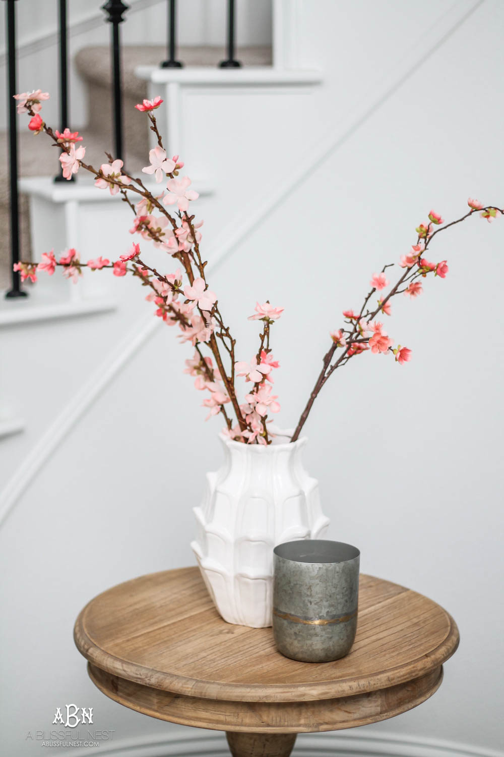
I recently got some pretty pink cherry blossoms to brighten this space up too. They actually are the same ones I used on my front porch wreath. You can see that HERE. I popped them into this vase I got from Homegoods a while back and have my current favorite candle next to it. The flavor is sugared birch and I can not even begin to tell you how amazing it is. I have it in the kitchen too.
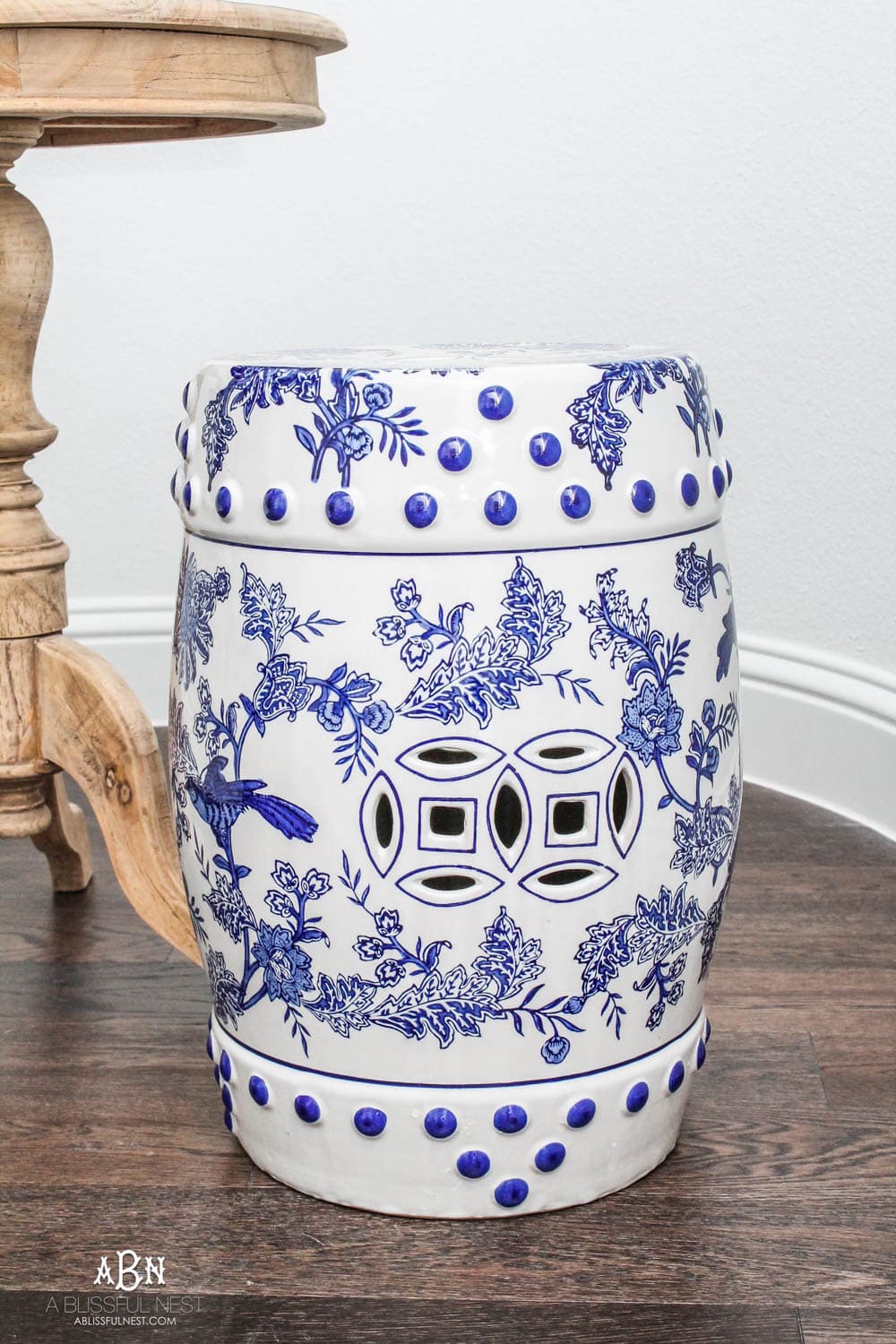
I have a thing for garden stools that I told you about the other week when I shared our new coastal living room. I can’t believe I only have 2 but I think this one might be my favorite. They really are inexpensive and I move them around my house all the time. They are so fun to decorate with and use as a little side table. I found a similar one for you HERE.
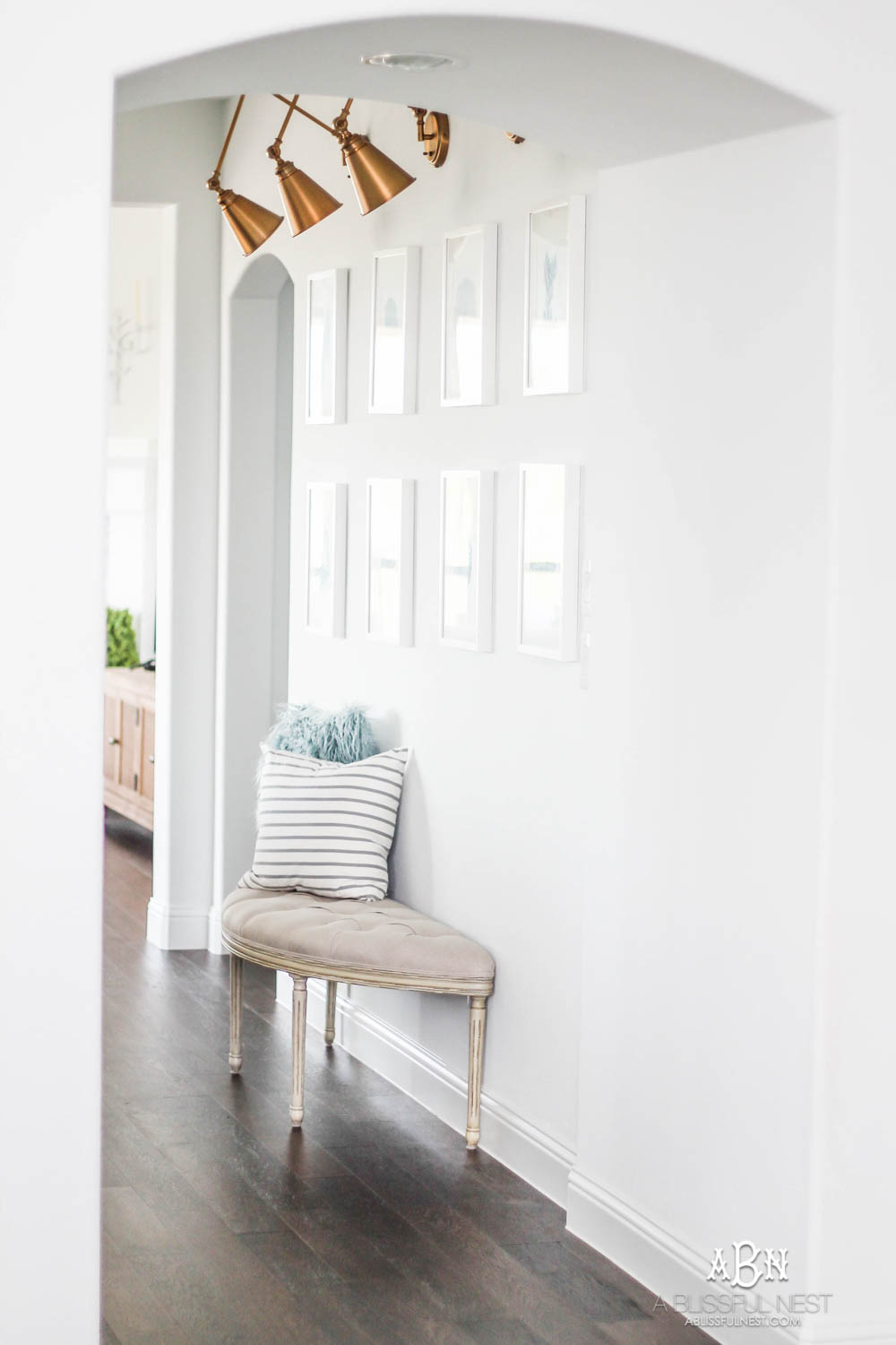
I also wanted to share what is farther down the haul on the other side of our narrow entry. I have been sneak peeking this area and will be revealing it soon. This leads right into our kitchen and living room and this wall is one of my favorites! Okay that’s all I am going to say until I reveal it real soon! There will be a freebie given with it too!
So I hope you got some entryway ideas for small spaces if you are struggling with a spot like this and need some guidance on how to address your space. Every home has its shining features and then ones that are just plain tough to decorate. This one was not the easiest for me but I got the look I wanted and love how it turned out!
YOU CAN SHOP ALL THE SOURCES FROM THIS SPACE BELOW.
{scroll and tap the photos below to shop them}





I love the look of this, but when I click on the links, I get an error message. Can you tell me where to find the console table, please? It will be perfect in my foyer!
Thanks!
This is absolutely beautiful I can’t wait to do my foyer it is on my to do list thank you so much for the inspiration and have an amazing evening
Thank you and you too!
I love this! My entryway is small and I need to decorate it – this is great inspo, and you don’t even need very much! I’m also interested in the picture that’s hanging in the bathroom! Where is it from/who is the artist?
Thanks!
It is from Aaron Brothers!
Oh that looks great! I love the colors and how open and airy it feels. Who would have thought to use a clear entry table? But it works perfectly in that space. I had an “a-ha” moment when I saw your rug! I’ve been searching for the right rug for our front door for months and nothing ever seems right. I suddenly realized that I don’t have to restrict myself to a standard size right in front of the door, but something a little longer that extends into the room may be perfect for the space.
Again – everything looks fantastic. Hope you enjoy the space for years to come!
Love it all!
Your lucite table is killer!?I used a “ghost chair”
In my small office and love it. Glad to see your table has the same effect.
Have you tried the plant on the other side of the table?? Is it narrow enough not to impede the door opening? Since the whole arrangement could not be centered on the wall, possibly the plant on the other side would visually correct that. Or maybe a bentwood umbrella stand or something would serve the same purpose and have a utilitarian function?
I also love your two table lamps. Great lines for your entry!
I always enjoy your posts !
Lovely.? Especially that console table.
Thank you Carrie!