Picking popular paint colors for bedrooms can be a tough decision when every shade seems beautiful in the store, yet completely different once you finally paint your own walls.
I have spent a lot of time looking through paint color guides, trying to figure out what actually works versus what just looks good on a chip at the hardware store.
The problem is there are so many options that it is easy to get stuck and end up either going with plain white out of fear or making a bold choice that you regret in a week.
Sometimes the color looks totally different once it is on the walls with your actual lighting, furniture, and bedding.
It can also feel like trends change so fast that by the time you finally commit to a color, it is already on its way out.
Then there is the whole issue of not knowing whether to go light and airy or rich and moody, and both can look amazing or terrible depending on the room.
Choosing a color that actually helps you sleep, relax, and feel good in your own space is not as simple as it sounds.
This post may contain affiliate links. As an Amazon Associate and a participant in other affiliate programs, I earn a commission on qualifying purchases at no additional cost to you.

So, I’m excited to share some of my favorite picks, practical tips, and real color recommendations that will help you figure out exactly what will work in your bedroom.
Whether your room is small and dark or large and sun-drenched, there is a color out there that will make it feel like a true retreat.
Use my tips and ideas to create a bedroom that feels comfortable, welcoming, and exactly the way you have always wanted!
Why Bedroom Paint Color Matters More Than You Think
The color on your bedroom walls does much more than look nice because it influences how you feel every time you step inside after a busy day.
Warm earthy colors like chocolate brown and dusty rose can help create a calming atmosphere that feels comfortable, relaxing, and easy to enjoy before bedtime every evening.
According to Zillow’s 2026 Paint Color Analysis with Sherwin Williams, bedrooms painted in Turkish Coffee brown may attract buyers willing to offer more than rooms painted white.
That tells me paint color is more than a personal style choice because it can also affect how people see the value of your home later.
The same study also found that sage green bedrooms may help increase a home’s estimated value, making this calming shade an appealing option for many spaces.
Beyond resale value, the right paint color helps create a bedroom that feels peaceful, welcoming, and comfortable after long days filled with work and everyday responsibilities.
A color that does not fit your room can make the space feel colder, smaller, darker, or simply less inviting each time you wake up every morning.
Your wall color also changes how your furniture, bedding, rugs, and decorations look together, helping the entire room feel balanced instead of disconnected or awkward.
I always recommend starting with paint because changing your wall color can completely refresh your bedroom without replacing the furniture you already enjoy using every day.
Choosing the right color from the beginning helps you avoid repainting later, making the entire decorating process feel easier, less stressful, and much more enjoyable overall.
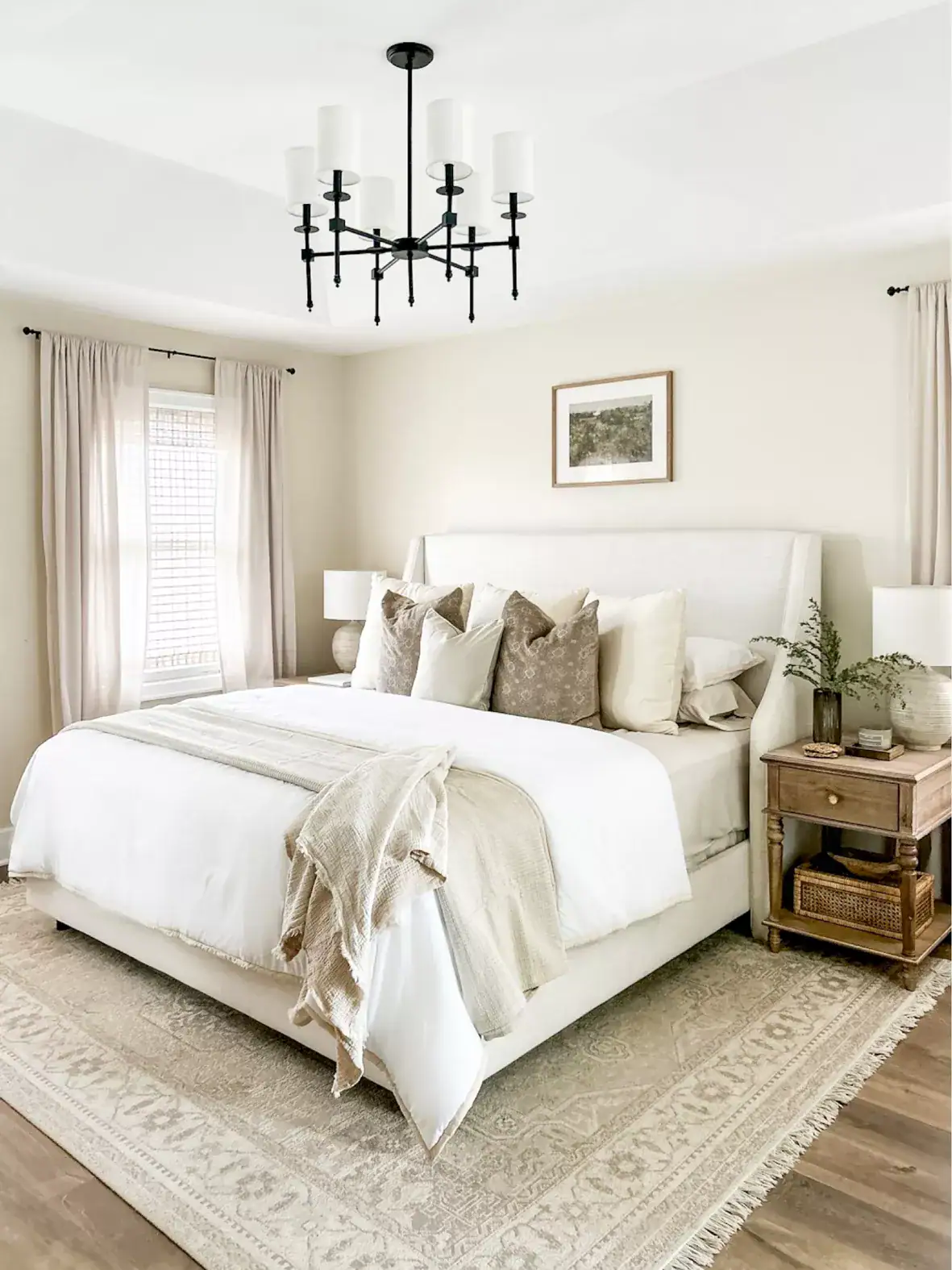
More Paint Color Ideas + Inspiration
Tips for Choosing the Right Paint Color for Your Bedroom
Before you even open a paint chip, it really helps to think about how the room is used and what feeling you want when you are in it.
If you want a calming, sleep-friendly space, colors like soft sage, warm greige, or dusty plum tend to work much better than bright, high-energy shades.
Always test paint swatches directly on your walls and look at them at different times of day before committing to a full gallon.
The size of your room matters too, because dark colors can feel cozy in large spaces but make a small room feel like a box if not done thoughtfully.
Think about your existing furniture and bedding colors, because your paint needs to complement what is already in the room, not fight against it.
I personally love looking at ways on how to decorate a bedroom before I choose a color because it helps me see how everything works together in a real, styled space.
If your bedroom gets a lot of natural light, you can get away with deeper, richer colors without the room feeling dark or heavy.
North-facing rooms tend to read cooler, so warmer paint tones help balance out that blue-gray cast that natural light brings.
Matte finishes are generally my top pick for bedrooms because they absorb light softly and hide any minor wall imperfections.
Sampling two or three colors side by side on the same wall is the single best thing you can do before making a final decision.
Don’t Forget To Order Paint Samples!
No matter what a photo looks like or description, every paint color will look different in your own space. It is so important to test a paint color before you commit to it.
That’s why I love buying these peel & stick samples.
It makes it so easy & affordable to test colors!

Most Popular Paint Colors for Bedrooms Right Now
Right now, the bedroom colors getting the most attention are warm, grounded, and full of personality without being loud or hard to live with.
You can find some really beautiful bedroom ideas to see how these trending shades actually look in real, styled rooms.
Here are some of the top paint picks that are trending in 2026:
- Sherwin Williams – Turkish Coffee SW 7695: A rich chocolate brown that feels incredibly warm and sophisticated, making bedrooms feel like a cozy retreat you never want to leave.
- Sherwin Williams – Clary Sage SW 6178: A soft, muted sage green with earthy gray undertones that creates an incredibly calm and grounded atmosphere perfect for restful sleep.
- Benjamin Moore – Dusty Mauve 2115-40: A muted, plummy rose tone with earthy depth that adds personality and sophistication without feeling overpowering or too feminine.
- Behr – Smoky Blue N510-3: A soft, cool blue with smoky depth that brings a sophisticated, airy moodiness that still feels open and breathable in most bedroom sizes.
- Sherwin Williams – Burgundy SW 6300: A deep, wine-inspired red that adds drama and richness to a bedroom wall, working beautifully as an accent or full-room color.
- Benjamin Moore – Pale Oak OC-20: A warm, creamy greige that reads cozy and inviting, hitting that sweet spot between white and beige without looking flat or boring.

Best Decor to Decorate with Popular Bedroom Paint Colors
Once you have chosen your bedroom paint color, the decorations you bring into the space are what help everything feel finished, comfortable, and beautifully put together every day.
If you choose a rich color like burgundy or deep blue, warm brass or gold accents can make the room feel cozy, elegant, and carefully styled without looking too formal.
Lighter paint colors like sage green or soft mauve look especially beautiful when paired with natural materials like linen, rattan, and wood for a relaxed and welcoming atmosphere.
I have gathered some of my favorite bedroom decorating ideas that pair beautifully with these popular paint colors and can help you create a space you will enjoy spending time in.
Tap Photos To Shop

Popular Paint Colors for Small Bedrooms
Small bedrooms often feel harder to decorate because the wrong paint color can make the space look tighter, darker, and less comfortable than you expected.
Choosing softer and lighter versions of popular colors usually helps the room feel brighter, more open, and easier to enjoy every day without making it look plain.
Would you like to save this post?
Here are some popular paint colors for small bedrooms that can help your space feel more comfortable, welcoming, and visually open without making decorating feel complicated.
- Sherwin Williams – Antique White SW 6119: A warm, creamy white with soft yellow undertones that makes tight spaces feel bright and airy without looking stark or clinical.
- Benjamin Moore – Pale Smoke 2108-60: A barely-there lavender gray that adds the faintest hint of color while keeping the walls light and visually receding.
- Behr – Silver Drop N520-1: An incredibly soft, cool gray-blue that reflects light beautifully and makes a small room feel larger than its actual square footage.
- Sherwin-Williams – Accessible Beige SW 4028: A warm neutral that never feels flat or boring, giving small rooms a cozy and welcoming feel without closing them in.
- Benjamin Moore – White Dove OC-17: A soft off-white with gentle warm undertones that helps small bedrooms feel brighter, calmer, and more open while pairing easily with almost any furniture or decorating style.
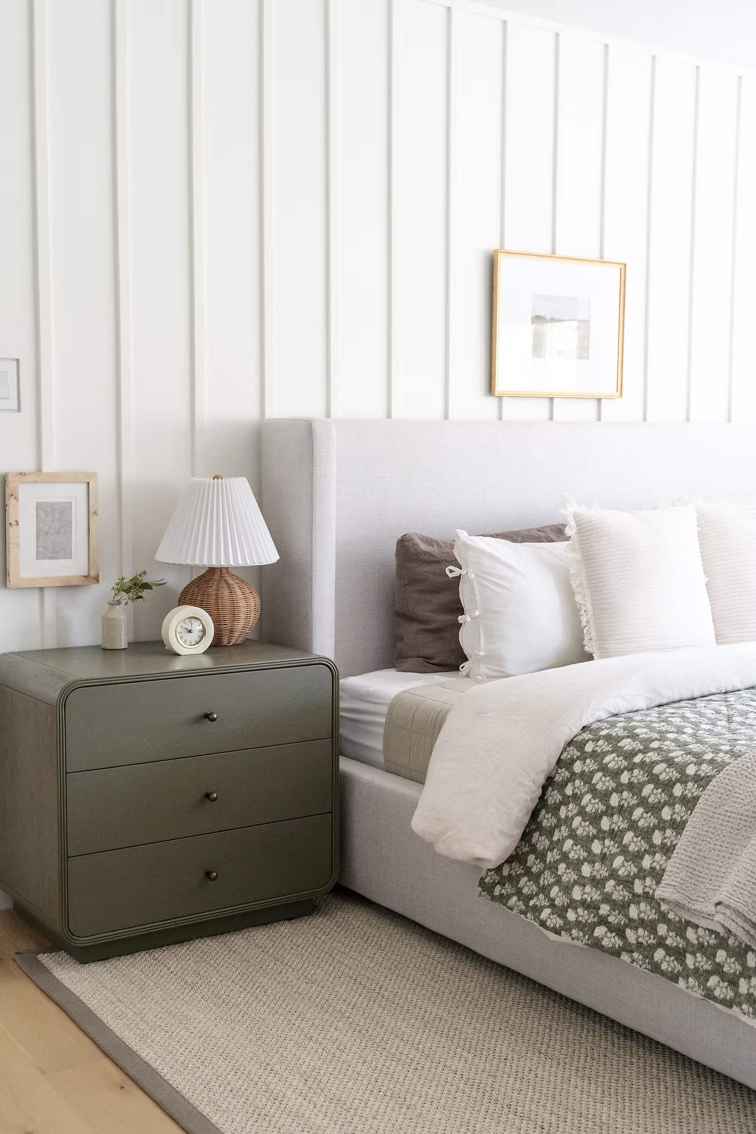
Best Paint Colors to Make a Bedroom Feel Bigger
If making your bedroom feel larger is your main goal, choosing the right paint color can help the space look brighter, more open, and much more comfortable every day.
You can also browse the best neutral paint colors for bedrooms for more color ideas that work beautifully in bedrooms of different sizes and decorating styles.
Here are some of the best paint colors to make your bedroom feel bigger while creating a light, relaxing, and welcoming atmosphere.
- Sherwin Williams – Alabaster SW 7008: A creamy off-white with the softest warm undertone that makes walls feel expansive and clean without the harshness of bright white.
- Benjamin Moore – White Dove OC-17: A classic warm white that reflects light evenly across the room, making ceilings feel higher and walls feel farther apart.
- Behr – Cameo Rose W110-1: A soft, barely-pink neutral that adds just enough warmth to feel cozy while keeping the room feeling open and fresh.
- Sherwin Williams – Repose Gray SW 7015: A perfectly balanced gray with just enough warmth to avoid feeling cold, making rooms feel clean, spacious, and effortlessly modern.
- Benjamin Moore – Classic Gray OC-23: A soft warm gray with subtle beige undertones that reflects natural light beautifully, helping bedroom walls feel farther apart while creating a bright, calm, and welcoming space.
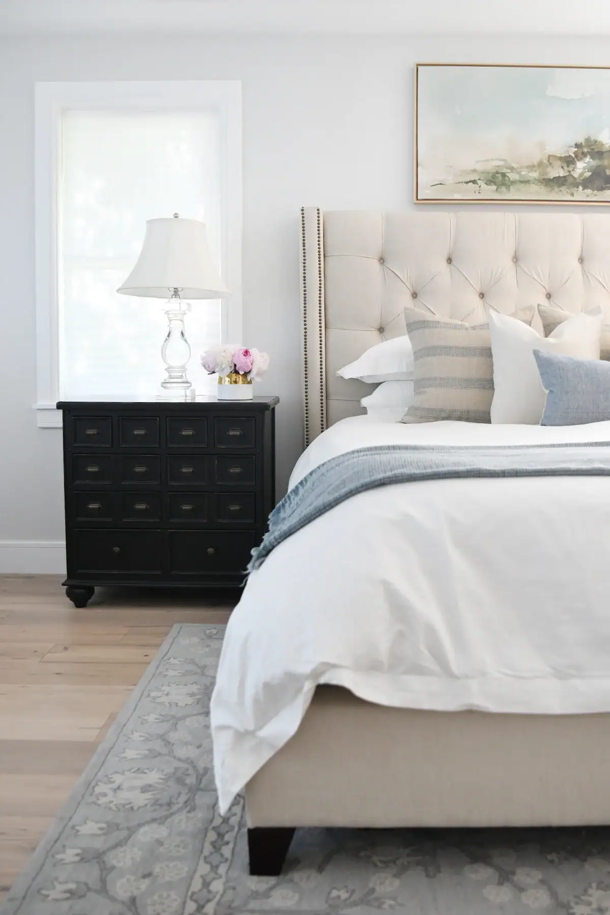
How Lighting Affects Bedroom Paint Colors
Lighting is honestly one of the most overlooked factors when picking bedroom paint, and it can completely change how a color reads on your walls.
I always look at a paint swatch under my bedroom’s actual light source before deciding, because daylight, incandescent bulbs, and LEDs all shift colors in different directions.
Natural north-facing light tends to make colors look cooler and slightly bluer, so I always recommend going one shade warmer than you think you need.
South-facing rooms get the warmest, brightest light all day, meaning even darker paint colors can look beautiful without feeling heavy or depressing.
East-facing bedrooms get gorgeous, warm morning light but shift to a cooler, softer tone by afternoon, so mid-tone warm neutral bedroom ideas tend to perform really well.
West-facing rooms are bathed in warm golden light in the evening, which can make already-warm tones feel even richer and more inviting than the paint chip suggests.
Artificial lighting also changes the appearance of paint because warm LED bulbs make earthy colors feel softer while cooler bulbs can make blues and greens appear crisper.
Adding dimmer switches lets you adjust the lighting throughout the day, making it easier to create a relaxing atmosphere while seeing how your paint color changes naturally.
I always paint large sample sections directly on the wall and watch them during the morning, afternoon, evening, and nighttime before making my final decision.
Living with a paint sample for several days gives you enough time to see how the color changes naturally, helping you choose with much more confidence before painting the entire room.

How to Coordinate Bedroom Paint Colors with Bedding and Decor
The wall color and the bedding in a bedroom need to work together, and getting that relationship right is what makes a room look intentional and pulled together.
I always start with the largest anchor piece, usually the bedding, and build the paint color around it rather than the other way around.
If your bedding is a mix of neutral creams and warm tans, earthy paint colors like greige, sage, or soft brown will feel completely cohesive and connected.
Bold bedding with patterns or jewel tones actually pairs really beautifully with softer, more muted wall colors that let the textile take center stage.
If you have dark wood furniture, warm paint tones like cream, warm gray, and soft caramel work better than cool whites, which can make wood look orange in comparison.
You can check the best Sherwin-Williams neutral bedroom colors to help you find wall shades that are neutral enough to work with almost any bedding.
The 60-30-10 rule is really useful here: 60% dominant wall color, 30% secondary color in bedding and furniture, and 10% accent color in pillows and accessories.
Metallics work as a bridge color in most bedroom palettes, pulling together paint, fabric, and wood tones in a way that feels finished.
Keeping the overall palette to three colors maximum tends to give a bedroom a calm, cohesive look rather than a busy, chaotic one.
When everything in the room feels like it belongs together, the space just naturally feels more relaxing and restful.

Common Mistakes When Choosing Bedroom Paint Colors
One of the biggest mistakes I see is choosing a paint color straight from a tiny chip under fluorescent store lighting, which almost never matches how it looks at home.
Another common error is skipping the sample step entirely and going straight to a full gallon, which is an expensive way to discover you picked the wrong shade.
Painting only one small test patch is also a problem, because a color reads very differently in a large area than it does in a two-inch square.
Choosing a trendy color without thinking about whether it works with your specific furniture and flooring is another way to end up with a room that feels disconnected.
Going too dark in a small room without proper planning is a mistake that makes tight spaces feel suffocating rather than cozy and intimate.
Another mistake is forgetting about the ceiling color because it has a bigger effect on the overall look of the bedroom than many people expect.
Painting the ceiling the same color as the walls creates a cohesive and intentional look, while leaving the ceiling as an afterthought can make the room feel incomplete.
Matching the paint too perfectly to one item in the room, like a pillow or a rug, often results in a flat, boring look that lacks any depth or visual interest.
Using a finish that is too shiny, like semi-gloss on large bedroom walls, can highlight every bump and imperfection instead of creating that smooth, restful look.
Picking a color because it looked amazing in someone else’s home without considering the differences in your lighting, size, and furniture is a trap that catches a lot of people.
Learning how to decorate a bedroom properly from the start saves you the cost, frustration, and extra weekend of repainting over a color you never loved.

Frequently Asked Questions
What is the most calming paint color for a bedroom?
Soft sage green, muted blue-gray, and warm greige are consistently rated as the most calming bedroom colors. These shades have low saturation and warm to neutral undertones that make your nervous system settle rather than stay alert. Sherwin Williams Clary Sage and Benjamin Moore Pale Oak are both popular picks for creating a relaxed, sleep-friendly atmosphere.
Should bedroom walls be light or dark?
It depends on room size, lighting, and personal preference, but both light and dark shades can work beautifully with the right approach. Light colors make small rooms feel larger and brighter, while darker shades create a cozy, intimate feel in bigger spaces. Testing swatches on your actual walls is the only way to know for sure what works in your specific room.
What paint colors make a bedroom feel bigger?
Soft whites, warm off-whites, and pale neutral shades like greige and barely-there blue all help a bedroom feel larger than it actually is. These colors reflect light around the room and visually push the walls back, making the space feel more open. Keeping the trim and ceiling a similar light tone amplifies the effect even more.
Are gray bedrooms still popular in 2026?
Cool, dark gray is falling out of favor, but warm, balanced grays with slight beige or greige undertones are still widely used and well-liked. The key shift is away from stark, cool-toned grays toward grays that feel warmer and more inviting. Sherwin Williams Repose Gray is a great example of a gray that still feels current and versatile.
What is the best white paint color for a bedroom?
Warm whites like Sherwin Williams Alabaster or Benjamin Moore White Dove tend to look much better in bedrooms than stark, bright whites. Bright whites can feel cold and clinical, especially in rooms with cool north-facing light. A warm white with soft yellow or pink undertones creates a cleaner, cozier look that still reads as white without the harshness.

Choosing the right color for your bedroom walls is one of the simplest and most impactful changes you can make to improve how the whole space feels every single day.
The popular paint colors for bedrooms in 2026 lean toward warmth, comfort, and personality, moving away from sterile whites and cold grays and toward earthy, grounded tones you actually want to spend time surrounded by.
From rich Turkish Coffee brown and dusty sage green to soft plum and smoky blue, there are beautiful options for every taste, room size, and lighting situation.
The key is always to test before you commit, think about how the color works with everything else in the room, and trust your instincts about what genuinely makes you feel relaxed and at home.
Pick two or three colors, grab some sample pots, and get them on your walls this weekend… because the bedroom you have been picturing is closer than you think!