Choosing the best interior neutral paint colors can feel like one of the hardest decisions you will ever make for your home.
So many of us buy samples and test them on the wall only to feel confused by all the different paint color guides.
You hold up one swatch in the morning light, and it looks perfect, but then by evening it has completely changed into something else.
The undertones start playing tricks on you, and suddenly that soft beige looks pink or that pretty gray has turned kind of green on your walls.
You thought you found the perfect shade at the store, but now it looks totally different once you get it home and on the wall.
Sometimes the lighting in your room makes the color look completely wrong, and you wonder if you should just start all over again from scratch.
Maybe your samples look beautiful next to your furniture during the day, but feel cold and unwelcoming when you turn the lamps on at night.
These little surprises can make picking paint feel stressful and, honestly, a bit disappointing when you just want your home to feel warm and beautiful.
This post may contain affiliate links. As an Amazon Associate and a participant in other affiliate programs, I earn a commission on qualifying purchases at no additional cost to you.

But here is the good news, because the best interior neutral paint colors I am sharing today work beautifully in almost any room you can imagine.
These shades will make your space feel calm and pulled together while giving you the flexibility to change your decor whenever you feel like it.
I will also walk you through some helpful tips on how to choose neutral paint colors so you can feel confident and excited about your decision.
Why Neutral Paint Colors Are Always in Style
Neutral paint colors never go out of style because they create a beautiful backdrop that works with just about any decorating idea you love.
These shades give you the freedom to switch up your throw pillows or artwork without worrying that everything will suddenly clash with your walls.
When you choose a neutral paint color, you are making a smart decision that will look good today and still feel fresh years from now.
Neutrals work beautifully whether your style leans modern and clean or cozy and traditional because they adapt to whatever vibe you are going for.
They make your furniture and personal treasures stand out instead of competing with busy or bold walls that might feel tired after a while.
A neutral palette helps your whole home flow together nicely, so walking from room to room feels smooth and calming instead of jarring or mismatched.
These paint colors are also forgiving when it comes to decorating mistakes because they blend well with almost any accent color you decide to try.
Neutrals make small rooms feel bigger and bright rooms feel softer, so they really are like a magic trick for any space in your house.
They create a sense of peace and comfort that makes coming home at the end of a long day feel like wrapping up in a warm blanket.
Choosing neutral paint colors means you are investing in a timeless look that will make your home feel welcoming and beautiful for many years to come.

Understanding Undertones: Warm vs Cool Neutral Paint Colors
Understanding undertones is one of the most important parts of picking the right neutral paint color because they completely change how a room feels overall.
Warm neutral beige paint colors include shades like soft beiges and rich taupes, along with those popular greige tones that blend gray and beige together so nicely.
These warmer shades have hints of yellow or red, or even orange in them, which makes a room feel cozy and inviting, like a hug!
Cool neutrals lean more toward soft grays and crisp off-whites, along with those muted tones that have blue or green, or purple undertones hiding inside.
These cooler shades can make a space feel fresh and airy, and a little bit more modern, depending on how you style the room.
The undertones in your paint will interact with your lighting and your furniture, so you really need to pay attention to them before committing.
One simple trick is to hold your paint sample next to a piece of pure white paper so you can see the undertone peeking through.
When you compare them side by side, the white paper will help you notice whether your neutral leans warm or cool pretty clearly and quickly.
Testing your samples in different lighting throughout the day is also super important because morning light will look totally different from afternoon or evening light.
Understanding whether you want warm or cool undertones will help you create the exact mood and feeling you are dreaming about for your space.

How To Choose The Best Interior Neutral Paint Color For Your Space
Choosing the best interior neutral paint color for your space starts with understanding how much natural light your room gets throughout the entire day.
North-facing rooms tend to get cooler and softer light, so they often need warmer neutrals to keep them from feeling cold or gloomy inside.
South-facing rooms get tons of warm and bright sunlight, which means cooler neutrals can balance out all that golden light streaming through your windows.
The direction your room faces really does make a big difference in how your paint colors will look once they are up on the walls.
You also need to think about your furniture tones because if you have warm wood pieces, then a warm neutral will tie everything together beautifully.
Your flooring color matters too because carpet or hardwood with orange or yellow undertones will influence how your wall color reads in the whole room.
Take a good look at your natural light levels at different times, like morning and afternoon, and evening, to see how the light changes things.
Always test your samples on the actual wall and live with them for a few days before making your final decision, so you avoid any surprises.
Paint a big enough patch so you can really see how it looks in different lighting conditions, instead of just a tiny little square.
Trust your gut feeling and pick the shade that makes you smile when you walk into the room, because that is the one that is right.

Would you like to save this post?
Choosing the Right Neutral Paint Finish for Interiors
The finish you choose for your neutral paint color is just as important as the actual shade because it changes how the color looks completely.
Matte finishes have no shine at all, and they create a soft and velvety look that hides wall imperfections really well in most rooms.
This finish works beautifully in low-traffic areas like bedrooms or formal living rooms, where you want a cozy and sophisticated feeling on your walls.
Eggshell finishes have just a tiny bit of shine, and they are a great middle ground because they are easier to clean than matte.
You can use eggshell in living rooms and dining rooms, and hallways where you need something that can handle a little bit more wear.
Satin finishes have a nice, subtle glow that reflects light gently, and they work perfectly in busier spaces like kitchens and bathrooms, and kids’ rooms.
This finish is more durable and easier to wipe down when life gets messy, so it is super practical for families with little ones running around.
Semi-gloss finishes have the most shine, and they are best for trim and doors, and cabinets because they are the toughest and easiest to clean.
The shinier your finish is, the more it will reflect light and show texture, so keep that in mind when you are making your decision.
Choosing the right finish helps your neutral paint color look its absolute best while also making sure it can handle whatever your daily life throws at it.

Top Interior Neutral Paint Colors Designers Love
Interior designers keep coming back to certain neutral paint colors because these shades have proven themselves in all kinds of homes and decorating styles over time.
These beautiful paint colors create perfect backdrops that work with any furniture style while making rooms feel calm and welcoming every single day.
Designers love these interior neutral paint colors because they adapt beautifully to different lighting conditions and work with any decorating style you can dream up, especially as living room paint colors.
- Benjamin Moore – White Dove OC-17 — A soft, warm white that feels clean and bright without ever looking too stark or cold in any room you decide to paint beautifully.
- Sherwin Williams – Accessible Beige SW 7036 — This shade brings warmth with its perfect greige tone that works beautifully in open floor plans and helps spaces flow together naturally and effortlessly.
- Behr – Whisper White PPU18-07 — A gentle creamy white that adds subtle warmth while keeping rooms feeling light and airy all day long, no matter what season it happens to be.
- Benjamin Moore – Revere Pewter HC-172 — The greige that designers absolutely adore because it shifts beautifully between gray and beige depending on your lighting throughout the entire day and evening.
- Sherwin Williams – Agreeable Gray SW 7029 — This color lives up to its name by being one of the most versatile warm grays that works in literally any room in your whole house.
- Behr – Classic Silver PPU18-17 — A soft gray with warm undertones that never feels cold or uninviting, even in north-facing rooms with limited natural light coming in through windows.
- Benjamin Moore – Balboa Mist OC-27 — A beautiful light gray beige that creates such a serene and peaceful atmosphere in bedrooms and living spaces where you want ultimate relaxation and comfort.
- Sherwin Williams – Alabaster SW 7008 — This paint is a creamy white with just enough warmth to feel inviting while still giving you that crisp, clean look designers love in spaces.
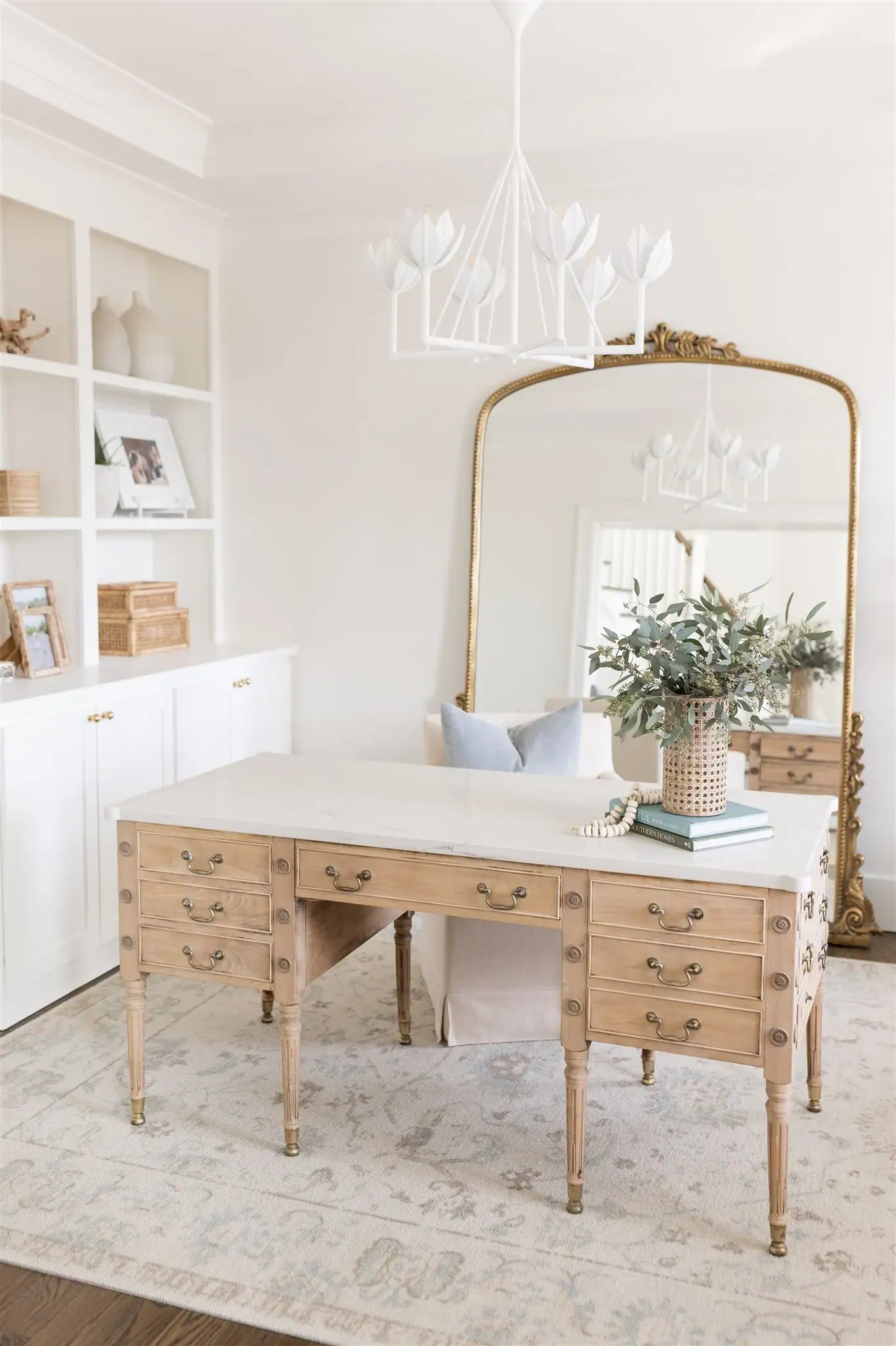
Beautiful Neutral Decor to Add Warmth to a Neutral Space
Once you have painted your walls with one of these gorgeous neutral paint colors, you will want to layer in some beautiful decor pieces.
Adding the right accessories and furniture can bring so much warmth and personality into a room that might otherwise feel a little bit plain.
So, I’m going to share some lovely items that will help you create a cozy and inviting space you absolutely love coming home to.
Tap Photos To Shop

Tips for Layering Texture and Decor with Neutral Wall Colors
Layering different textures is the secret to making a room with neutral wall colors feel rich and interesting instead of flat or one-dimensional.
You can start by mixing soft linen curtains with chunky knit throw blankets and smooth velvet pillows to create depth that makes your space feel cozy.
Natural materials like wood and rattan, and jute bring warmth into a neutral room while adding that organic feel that makes everything seem more inviting.
A beautiful woven rug on the floor adds another layer of texture that grounds your furniture and makes the whole room feel pulled together nicely.
Try adding some ceramic vases or stone bowls to your shelves because these natural finishes create visual interest without adding any distracting colors to your space.
Layering different fabric weights and weaves in your throw pillows and blankets gives your sofa or bed that lived-in look that feels so welcoming.
You can also bring in some textured wall art or a macrame hanging to add dimension to your walls without competing with your beautiful paint color.
Mixing matte finishes with subtle shine, like brushed brass or aged bronze hardware, creates balance and keeps your eye moving around the room in a pleasing way.
Don’t forget about plants because they add life and texture while their green leaves look absolutely stunning against any neutral paint color you choose.
The key is to keep adding layers until your space feels warm and personal and like a true reflection of your style and personality.

Best Neutral Colors for Small Spaces That Still Feel Airy
Small spaces need neutral paint colors that make them feel open and breathable instead of cramped or closed in like a tiny little box.
The right neutral light beige paint colors with balanced undertones will reflect light beautifully and trick your eye into thinking the room is actually much bigger.
These light neutral paint colors create an airy atmosphere that transforms even the smallest bedroom or bathroom into a calm and comfortable retreat you love.
- Benjamin Moore – Swiss Coffee OC-45 — A creamy, warm white that bounces light around small rooms beautifully while keeping the space feeling cozy instead of cold or sterile at all.
- Sherwin Williams – Pure White SW 7005 — This crisp, clean white opens up tight spaces instantly and makes ceilings feel higher while walls seem to push outward for maximum airiness.
- Behr – Ultra Pure White PPU18-06 — A soft white with just enough warmth to keep small bathrooms and closets feeling welcoming while still maximizing that bright and open feeling.
- Benjamin Moore – Cloud White OC-130 — This gentle white has subtle warm undertones that make cramped spaces feel larger and more inviting without any heaviness weighing the room down.
- Sherwin Williams – Snowbound SW 7004 — A beautiful light neutral with cool undertones that works perfectly in small north-facing rooms where you need to maximize every bit of light.
- Behr – Bit of Sugar PPU18-08 — This pale creamy shade adds warmth to tiny spaces while reflecting natural light in a way that makes square footage feel doubled, somehow magically.
- Benjamin Moore – Simply White OC-117 — A clean white with balanced undertones that helps small kitchens and entryways feel fresh and open instead of tight and closed off completely.
- Sherwin Williams – Greek Villa SW 7551 — This soft, warm white creates breathing room in compact spaces while maintaining that cozy, welcoming vibe you want when you walk through the door and is one of the popular paint colors for living rooms.

Frequently Asked Questions
What is the most popular neutral paint color for interiors right now?
Warm greiges like Benjamin Moore Revere Pewter are incredibly popular right now with designers everywhere. They balance modern gray with cozy beige undertones perfectly for any style you love.
How do I know if a neutral paint color is warm or cool?
Hold your paint sample next to pure white paper to see the undertones clearly. Yellow or beige means warm while blue or gray means cool tones.
What are the best interior neutral paint colors for a whole house?
Soft whites and warm greiges work beautifully throughout an entire home for flow. They adapt to different lighting in each space while keeping everything cohesive.
Do neutral paint colors make a room look bigger?
Light neutral paint colors help small rooms feel more open and airy always. They reflect natural light around instead of absorbing it like darker shades.
Should I use the same neutral paint color in every room?
Using one neutral throughout creates beautiful flow and makes decorating much easier overall. You can also use different neutrals in each room for variety.

Picking the perfect paint for your home should feel exciting and fun instead of stressful or confusing when you know what to look for.
The best interior neutral paint colors I shared today will help you create a beautiful foundation that works with any style you love in your space.
These timeless shades bring comfort and calmness into every room while giving you the freedom to change your decor whenever you feel like it.
Neutral paint colors help any room feel inviting and peaceful, whether you are relaxing with family or welcoming friends into your home for a visit.
I hope this guide gives you the confidence to choose a gorgeous neutral that makes your space feel exactly the way you have always dreamed about!