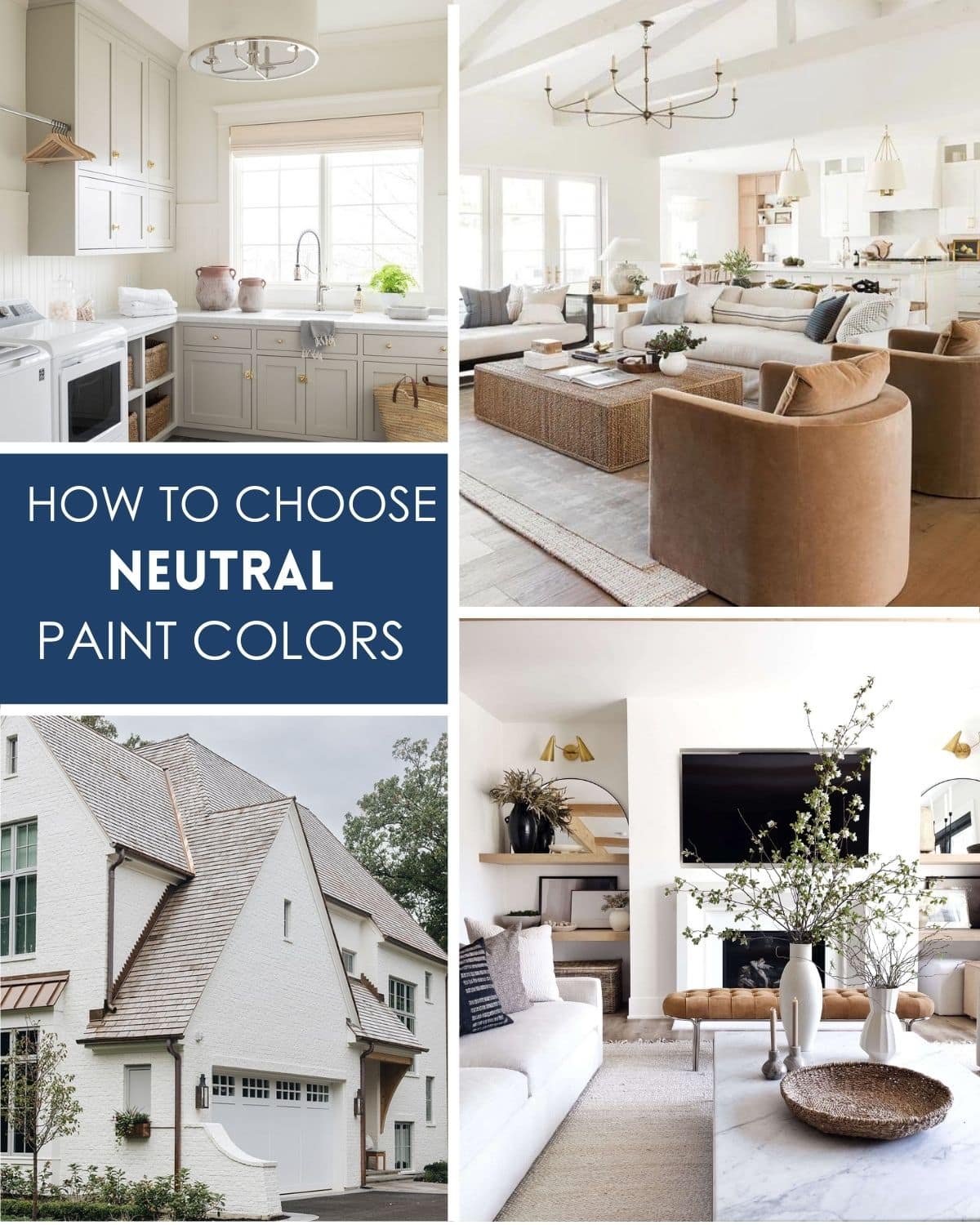
Picking the right neutral paint colors sounds easy until you see how many shades of beige, gray, and white are sitting on the shelf.
Many people turn to paint color guides for help, but those tiny swatches rarely match how the color looks on your wall at home.
It’s frustrating to paint a sample, wait for it to dry, then realize it feels too dark, too cold, or totally wrong with your lighting.
You might think beige is beige, but undertones like green, pink, or yellow can sneak in and change the whole mood of the room.
Trying to match trim, furniture, or flooring adds another layer of stress, especially when everything looks different in natural and indoor light.
Sometimes you repaint a wall more than once just to get a color that feels calm and not too bold or boring.
People often assume neutral shades are safe, but the wrong one can make your space feel flat, dull, or disconnected from the rest of your home.
This post may contain affiliate links. As an Amazon Associate and a participant in other affiliate programs, I earn a commission on qualifying purchases at no additional cost to you.
If you follow trends too closely, you may end up with a color that looks dated or doesn’t match your style a year from now.
Finding a neutral that works in every season and with different decor takes patience, and that process can be exhausting without a clear plan.
Once you understand how to choose neutral paint colors, it becomes easier to create rooms that feel warm, bright, and truly comfortable to live in.
What Are Neutral Paint Colors
Neutral paint colors are perfect for creating a calm and welcoming atmosphere in any room. But what exactly are neutral colors?
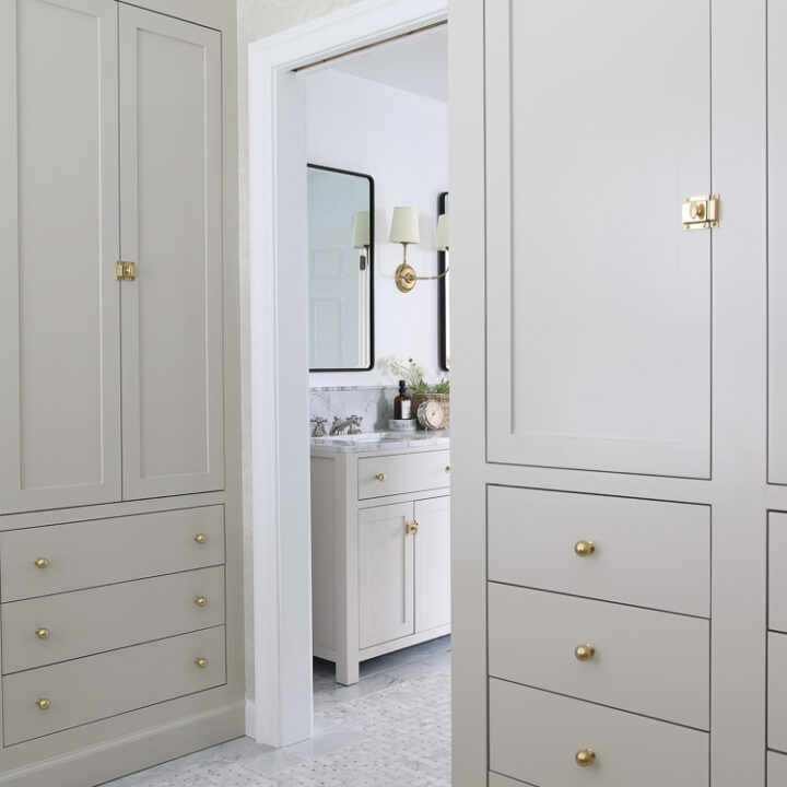
Neutral colors like white, beige, and gray come in a variety of undertones, such as warm beige and cool gray.
It’s important to choose a shade with the undertone that best complements your space and personal style.
These colors can be used in any style of home décor, from traditional to contemporary and everything in between.
The beauty of neutral colors is that they complement any accent color that you introduce to the space.
So if you’re looking for a low-risk way to add some style and sophistication to your home, consider painting your walls with a classic neutral shade.
What Is A Warm Neutral Color
So, you’ve probably heard of the term “warm neutral” before, but what exactly does it mean? Essentially, it’s a color that falls somewhere between warm (think: red, orange, yellow) and neutral (gray, beige, white).
Warm neutral hues typically have undertones of brown or taupe, which gives them a cozy, welcoming feel.
They’re the type of colors that make you want to curl up with a good book and a cup of tea.
Think of colors like tan, khaki, or even soft pink. While they might not necessarily be shades you lean towards, they’re incredibly versatile and can work in a variety of color palettes and design styles.
If you’re looking for a soft, inviting color for your home or wardrobe, a warm neutral paint color might just be the way to go.
What Is The Best Neutral Color For A House
Choosing the right paint color for your house can seem overwhelming.
Would you like to save this post?
But if you’re looking for a color that will never go out of style and complements any decor, then neutral is the way to go.
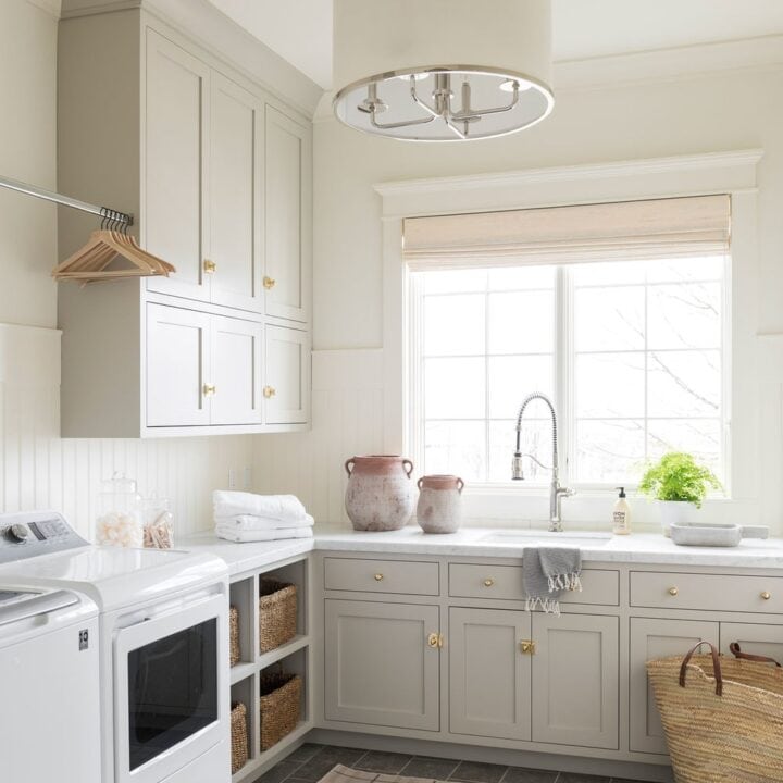
One of the best neutral colors for a house is greige, a combination of gray and beige.
This color gives off a warm and inviting atmosphere while still providing a modern and sophisticated look.
Plus, it’s versatile enough to pair with any accent color, whether it’s a bold pop of color or calming earth tones.
Best Neutral Wall Color To Go With Everything
When it comes to choosing a wall color for your home, neutral shades are always a safe bet.
But with so many options out there, it can be tough to pick just one.
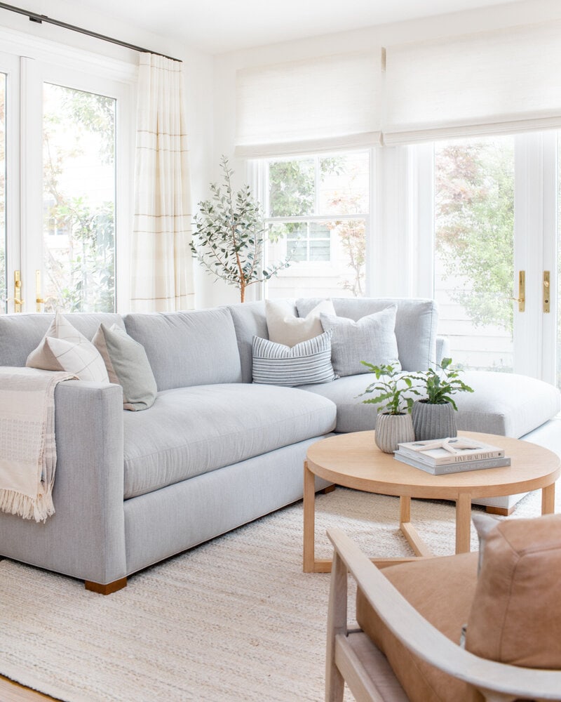
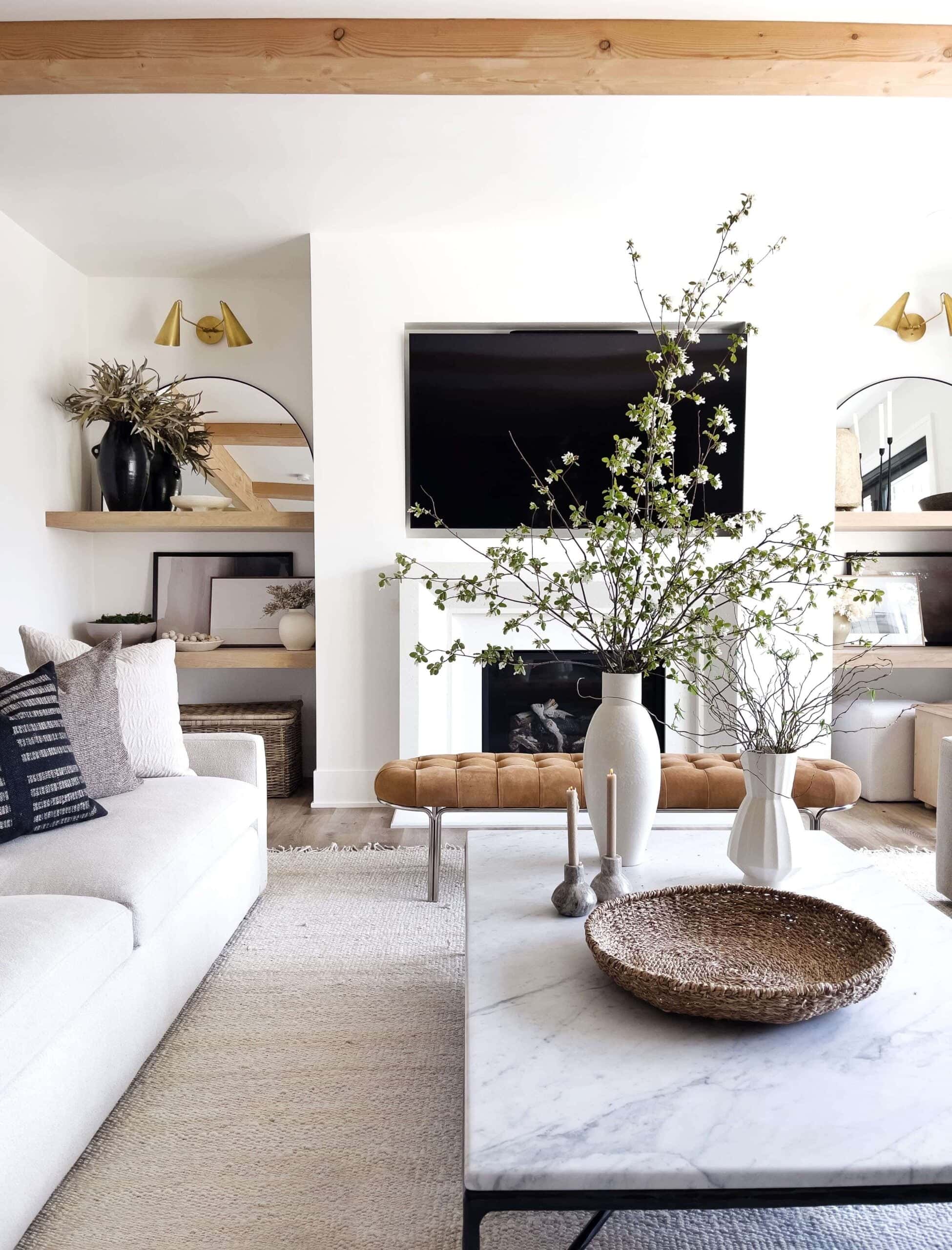
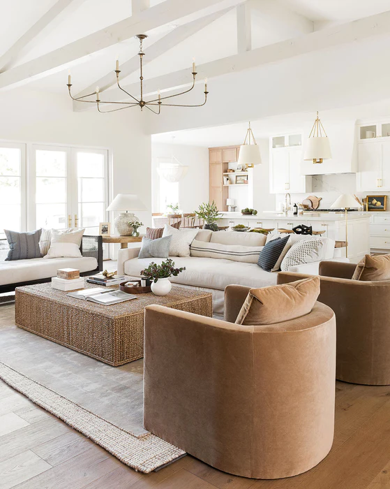
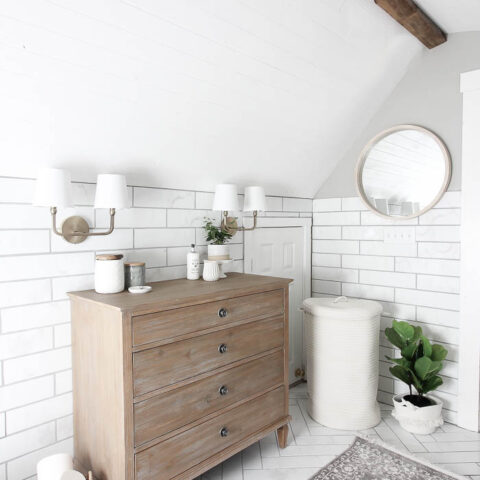
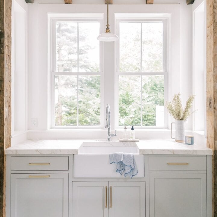
Generally, the best neutral wall colors are greige, cream, white, and soft grays.
A warm neutral, such as beige or taupe, can add coziness, while a cool neutral, like gray or white, can give off a more modern and sleek vibe.
These versatile hues can work with just about any style, from traditional to modern, and they look great with both warm and cool accent colors depending on your lighting.
Whether you’re going for a modern, minimalist look or a cozy, farmhouse vibe, these shades are the perfect backdrop for any space.
Don’t Forget To Order Paint Samples!
No matter what a photo looks like or description, every paint color will look different in your own space. It is so important to test a paint color before you commit to it.
That’s why I love buying these peel & stick samples.
It makes it so easy & affordable to test colors!
How To Select The Best Neutral Paint Color
I know it can be overwhelming to pick a paint color, but here are some tips to help you choose the right one for your space:
- Lighting: Lighting can have a big impact on the way a paint color looks in a room. Before selecting a color, observe how natural and artificial light affect the space. Some colors may look different under various lighting conditions.
- Determine the undertones: Neutral colors can have undertones of different colors such as beige, gray, yellow, green, blue, etc. Determine what undertone would work best in your space based on your existing decor and preferences.
- Observe the existing decor: Consider the existing colors and textures of your furniture, flooring, and accessories in the room. Pick a shade that complements your decor and creates a cohesive look.
- Decide on the mood: Neutral colors can create different moods based on the shade you choose. Cooler tones like gray and blue can create a calming, soothing environment, while warmer tones like beige and cream can create a cozy and inviting atmosphere.
- Test the color: It’s always best to test the color on a small area of the wall before committing to a full paint job. Observe how the color looks in different lighting and at different times of the day to ensure it’s the right fit for your space.
Favorite Neutral Paint Shades
Neutral Paint Colors
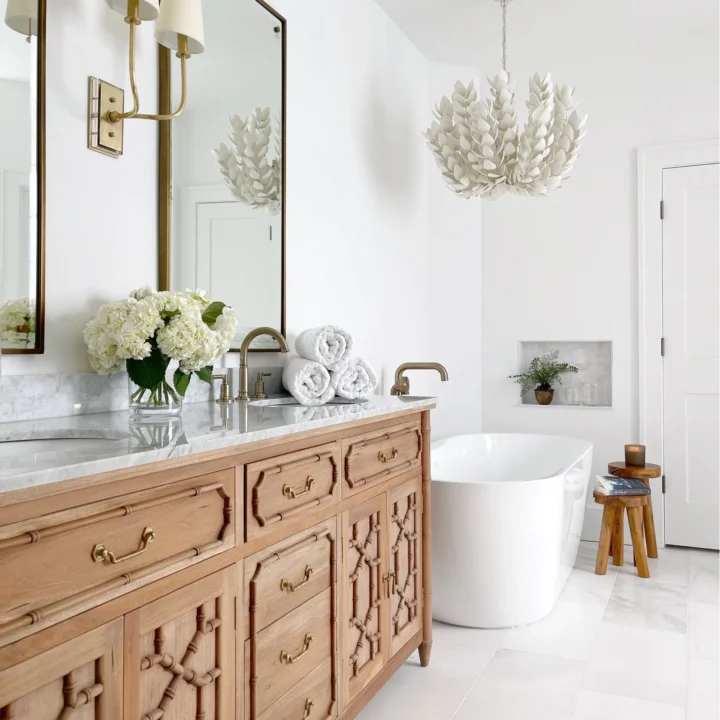
Sherwin Williams Accessible Beige is a warm, neutral paint color with a subtle greige undertone.
It's a versatile color that can work well in a variety of spaces, from living rooms and bedrooms to kitchens and bathrooms.
Accessible Beige has a soft and calming effect, creating a cozy and welcoming atmosphere.
This color pairs well with warm wood tones and white trim, but can also be used with bolder accents for a more dramatic look.
Sherwin Williams Mindful Gray is a popular and versatile paint color that falls in the greige (gray-beige) category.
It's a warm, mid-tone gray that has a hint of brown undertones, making it a softer and more neutral color than cooler grays.
This color can appear slightly different depending on the lighting conditions, sometimes appearing more gray and other times more beige.
Revere Pewter is a warm, light-to-medium gray with subtle beige undertones, which makes it a soft and calming neutral color that complements a variety of decor styles.
It has become a go-to choice for many homeowners and designers because it pairs well with both warm and cool colors, making it a versatile option for any space.
Revere Pewter can appear more gray or more beige, allowing it to adapt to different environments.
Repose Gray is a warm, light-to-medium gray with a subtle hint of beige undertones, which makes it a soft and calming neutral color that complements a variety of decor styles.
It is a popular choice for many homeowners and designers because it pairs well with both warm and cool colors.
Repose Gray can appear more gray or more beige depending on lighting and furnishings in the space.
Benjamin Moore Gray Owl is a popular and versatile paint color that falls in the cool gray category.
It's a light-to-medium gray with a slight blue-green undertone, which gives it a fresh and airy feel.
Depending on the lighting conditions, Gray Owl can appear more blue or more green, which makes it adaptable to different environments.
It pairs well with white trim and warm wood tones, as well as bold accents for a more dramatic look.
Agreeable Gray a warm, light-to-medium gray with a subtle hint of beige undertones, which makes it a soft and calming neutral color.
it pairs well with both warm and cool colors, making it a versatile option for any space.
Depending on the lighting conditions, Agreeable Gray can appear more gray or more beige.
It's a timeless and sophisticated color choice that adds warmth and depth to any room, and it works well as both a wall color and a trim color.
Benjamin Moore Swiss Coffee is a popular and versatile paint color that falls in the off-white category.
It's a warm, creamy white with a slight yellow undertone.
It's a light enough white to be used as an overall wall color, but also has enough depth to be used as an accent color.
Swiss Coffee is often used as a trim color to contrast darker wall colors, or as a ceiling color to create a bright and airy feel.
Benjamin Moore Chantilly Lace is a popular and versatile paint color that falls in the pure white category.
It's a bright, crisp white with no discernible undertones, which makes it a clean and modern neutral color.
It's a light enough white to be used as an overall wall color, but also has enough depth to be used as an accent color.
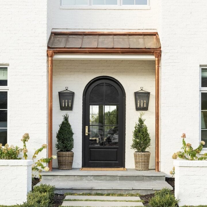
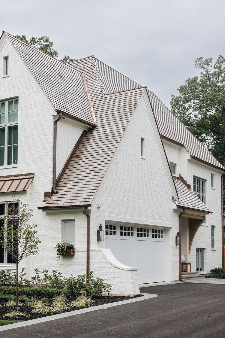
Benjamin Moore's White Dove is a warm, creamy white with a slight yellow undertone.
White Dove is often used as a trim color to contrast darker wall colors, or as a ceiling color to create a bright and airy feel, but it is stunning on the exterior of this home
Choosing the perfect neutral paint color for your home does not have to be overwhelming.
Neutral colors can create a versatile backdrop that allows you to add pops of color or bold patterns without overwhelming the room.
Whether you are looking for a warm neutral or a cool tone, there are a variety of options to choose from.
Be sure to consider the undertones of each color to ensure it complements your existing decor. Use swatches to see how the color will look in different lighting and be sure to test your top choices on the wall before committing to a final color.
With these tips and a little bit of patience, you can transform your space into a cohesive and stunning space.
Happy painting!


Our house is yellow now but we’re painting it soon. I want to more white or neutral than yellow. Any suggestions?
Hi, They all looked wonderfull, But Im thinking of some other Neutrals for my Living Room and Dining Room Elegant Ivory Cream By Benjamin Moore . Kitchen and Family Room Wickham Gray By Benjamin Moore. and all my floors will be close too A medium to dark wood and Cabints a Cream or White. And In the Floyer Im thinking maybe Edecomb Gray and it going up the stairs and Hall, By Benjamin Moore, What do you think? The Bathroom downstairs it has Brown Tile looks like wood and Shower Tile is Cream with a little Gold /Tan swirls looks almost like marblethinking, Light Revere Pewter By Benjamin Moore, what do you think? Master Bedroom Healing Aloe By Benjamin Moore and Master Bath Sea Breath I want like light teal but very light both of them to compliment each other. 2nd Bathroom upstairs Gray Owl By Benjamin Moore it will have Dark Gray Shower Tile and it has Light Gray Floor Tile looks like wood or something with a very light Blue very light Blue, Blue Bonnet or something lighter?The Vanity is Black.Ok the other 2 Bedrooms are already Painted one is Blue I may change everyone likes it, Second bedroom is a Mist Gray a very Pretty color Both By Benjamin Moore . The carpet is a Gray ,Cream ,Brown not to light not to dark. Laundry Room thing Balaloa Mist By Benjamin Moore. Let me know what you think of my Ideas, and if you have any that you thing my be better please let me know my design is Traditional French.Thank For Your. Well I look farward to hearing from you Soon. Have A Wonderful Day
Sincerely,
Betty Dunn
Would love to have the LRV numbers and the brand name of the colors. Thanks for a good article.
Thanks for sharing this post. It”s really informative