Choosing popular farmhouse paint colors can feel frustrating when the wrong shade leaves your space looking cold, dated, or not even looking like the farmhouse style at all.
Paint color guides can help narrow your choices, but finding warm, grounded shades that truly suit farmhouse spaces takes careful consideration.
A color that looks soft and creamy on a store sample can appear completely different once it reaches your walls.
Natural light, artificial lighting, flooring, and nearby furnishings can all shift how a paint color looks throughout your home.
It is easy to choose a trendy shade today, only to see that later it no longer goes with your farmhouse look you are after.
The wrong undertone can also make your furniture, textiles, wood finishes, and fixtures feel disconnected instead of working together naturally.
Choosing colors based only on inspiration photos can make you disappointed when those same shades look different inside your own rooms.
This post may contain affiliate links. As an Amazon Associate and a participant in other affiliate programs, I earn a commission on qualifying purchases at no additional cost to you.

You can avoid these common mistakes by learning how different farmhouse shades work together across kitchens, bedrooms, bathrooms, living rooms, and entryways.
I’m excited to share practical color combinations, room-by-room ideas, and simple tips for creating a farmhouse palette that feels warm and timeless.
So, use these ideas to choose your favorite shades with greater ease and create a farmhouse home that feels inviting, cohesive, and true to your style.
Quick Glance
If you are trying to find a farmhouse palette that feels warm and timeless, this guide will help you choose shades with less guesswork.
- See why neutral, earthy shades continue to work so well with relaxed farmhouse interiors.
- Learn what to consider when comparing shades for your lighting, furniture, and overall style.
- Discover the qualities that help a paint color stay appealing as your home and decor change.
- Find room-by-room color ideas for creating a cohesive farmhouse look throughout your home.
- Get ideas for pairing farmhouse shades together without making your rooms feel too busy.
- Learn how your existing finishes, natural light, and architectural details can guide your choices.
- Find simple trim and ceiling shades that work naturally with your farmhouse wall colors.
- See how furniture, textiles, wood tones, and accessories can work with your chosen palette.
- Try easy decorating ideas that help your new paint colors feel connected throughout the room.
- Learn about common color mistakes that can leave your space feeling unbalanced or dated.
Why Farmhouse Paint Colors Are Still a Popular Choice
Farmhouse style has stayed popular because it creates a home that feels comfortable, relaxed, and easy to live in every day.
The neutral colors often used in this style can make a room feel calm without taking attention away from the rest of your decor.
Whites, creams, warm grays, and earthy greens work especially well with the natural wood tones often found in farmhouse spaces.
You can also bring in nature-inspired shades like sage green and classic navy when you want a little more color.
One reason this palette continues to work so well is how easily these shades can fit different rooms and decorating styles.
Neutral farmhouse colors also tend to look good through changing seasons, different lighting conditions, and updates to your furniture.
They give you a flexible starting point when you want to refresh your space without completely changing everything around it.
There is also something special about choosing colors that feel connected to the original character and natural elements of a farmhouse home.
That sense of authenticity helps these paint colors stay appealing even as other decorating trends come and go over time.
If you want a home that feels warm, relaxed, and timeless, these farmhouse shades are a wonderful place to start.

How to Choose the Most Popular Farmhouse Paint Colors
Choosing paint for a farmhouse space starts with looking closely at undertones, since even simple neutrals can shift depending on your room.
A soft white may look slightly blue in a north-facing room, while the same shade can feel warmer in southern sunlight.
Before committing to a color, I recommend buying sample pots and painting large swatches directly onto the walls you plan to paint.
Try making each swatch at least 12 by 12 inches so you can see the color clearly in your actual space.
Give yourself two or three days to watch those swatches as the natural light changes throughout the day before deciding.
If you are stuck between similar shades, my guide on choosing neutral paint colors can help you compare your options.
You will also want to think about how each color flows into nearby rooms, especially when your farmhouse spaces connect closely.
A simple palette of three or four colors repeated throughout your home can help everything feel connected without looking too matchy.
Start with your main wall color, then choose a trim shade, an accent color, and one deeper shade for focal areas.
Taking this approach makes it much easier to create a farmhouse palette that feels warm, balanced, and natural throughout your home.

What Makes a Farmhouse Paint Color Feel Timeless?
A timeless farmhouse paint color should still look beautiful years later, even when decorating trends and popular styles have changed.
That usually means choosing soft, muted shades instead of colors that feel overly bold, saturated, or tied to one trend.
Soft whites with warm or green undertones, muted sage greens, dusty blues, and warm charcoals continue to work well in farmhouse homes.
Sherwin Williams Alabaster (SW 7008) remains one of the most recognized choices for modern farmhouse walls, cabinetry, and exterior siding.
Its warm, creamy appearance gives spaces a softer look than a stark white while still keeping the room feeling fresh.
Benjamin Moore White Dove is another dependable favorite because its gentle warmth works well across different rooms and lighting conditions.
These softer whites also photograph beautifully and can continue looking appealing as your home, furnishings, and decorating preferences change.
Farmhouse interiors are also moving away from completely stark white palettes and embracing warmer shades with more depth.
Colors like Swiss Coffee and Shoji White bring warmth to walls, while Urbane Bronze offers a softer alternative to pure black accents.
Choosing these timeless shades can help your farmhouse home feel comfortable while still looking fresh and inviting years from now.

Beautiful Farmhouse Paint Colors for Every Room
Different rooms need slightly different farmhouse shades, so choosing colors based on each space can help create a comfortable flow throughout your home.
The right paint can work with cabinetry, tile, wood finishes, and natural light while keeping the relaxed farmhouse feeling consistent.
Here are some tried-and-true shades by room to help you create a warm palette without making every space look exactly alike.
Kitchen
Farmhouse kitchen colors should feel fresh and welcoming while complementing cabinetry, countertops, and natural wood.
This is a collection of warm whites, muted greens, and soft blue-green shades that provide character without making this hardworking space feel busy.
- Sherwin Williams – Alabaster (SW 7008): This creamy off-white brings warmth to kitchen walls while pairing naturally with white cabinetry, wood accents, and darker finishes.
- Benjamin Moore – White Dove (OC-17): This soft white creates a gentle backdrop that works especially well with natural wood, warm metals, and traditional farmhouse cabinetry.
- Sherwin Williams – Sea Salt (SW 6204): This muted blue-green adds subtle color without feeling overpowering, making it especially lovely for islands, lower cabinets, or surrounding walls.
- Benjamin Moore – Saybrook Sage (HC-114): This gentle green brings an earthy feeling into the kitchen while complementing butcher block, natural wood, and warm white finishes.
Bathroom
A farmhouse bathroom benefits from soothing colors that reinforce its clean, comfortable atmosphere.
I love to use light greiges, warm whites, and quiet blue-green shades that pair particularly well with tile, wood vanities, and black or brushed-metal fixtures. Here are some of my favorite shades.
- Sherwin Williams – Shoji White (SW 7042): This warm neutral creates a soft backdrop for subway tile, natural wood vanities, brushed metals, and other farmhouse bathroom finishes.
- Benjamin Moore – Pale Oak (OC-20): This light greige brings subtle warmth to bathroom walls without making smaller spaces feel heavy or visually crowded.
- Sherwin Williams – Sea Salt (SW 6204): This calming blue-green works especially well with white tile, natural wood, black fixtures, and simple farmhouse accessories.
- Benjamin Moore – Gray Owl (OC-52): This gentle gray keeps the bathroom feeling light while offering enough depth to complement white trim and natural materials.
Bedroom
The best farmhouse bedroom colors create a restful setting while allowing layered linens, wood furniture, and woven textures to stand out.
From gentle greens, muted blues, and warm neutrals, these shades bring softness into a bedroom, without sacrificing its relaxed, natural character.
- Sherwin Williams – Comfort Gray (SW 6205): This soft green-gray creates a restful atmosphere while pairing beautifully with white bedding, natural wood, and woven farmhouse textures.
- Benjamin Moore – Gray Mist (962): This warm, understated neutral gives bedroom walls gentle depth while maintaining an airy feeling alongside cream textiles and wood furnishings.
- Sherwin Williams – Stardew (SW 9138): This muted blue brings a cozy, relaxed feeling to bedrooms without becoming too bright or competing with natural materials.
- Benjamin Moore – October Mist (1495): This gentle green creates a peaceful backdrop that works beautifully with warm whites, natural wood, linen bedding, and simple accessories.
Living Room
Because the living room often connects several areas of the home, its paint color should provide a versatile foundation for the overall farmhouse palette.
Warm beiges and balanced greiges are my favorite colors to make a living room feel inviting while coordinating easily with rustic wood, neutral upholstery, and vintage accents. Here are some of my go to colors to choose from.
- Sherwin Williams – Accessible Beige (SW 7036): This warm neutral creates an inviting backdrop for natural wood furniture, cream upholstery, woven textures, and farmhouse accessories.
- Benjamin Moore – Edgecomb Gray (HC-173): This soft greige adds gentle warmth while working beautifully with white trim, wood finishes, neutral textiles, and vintage-inspired furnishings.
- Sherwin Williams – Natural Linen (SW 9109): This warm beige brings a relaxed feeling to living rooms while complementing creamy whites, natural fibers, and rustic wood details.
- Benjamin Moore – Revere Pewter (HC-172): This balanced greige offers enough depth for larger living rooms while pairing easily with warm whites, wood tones, and muted accents.
A cohesive farmhouse palette does not require repeating the same paint color in every room to create a comfortable, unified home.
Would you like to save this post?
Instead, choose shades with similar warm or muted undertones so each space feels distinctive while still connecting naturally to the rest of the home.

Popular Farmhouse Paint Color Combinations
A single paint color can set the mood, but combining the right shades is what makes a farmhouse room feel thoughtfully pulled together.
One classic pairing is Sherwin Williams Alabaster walls with Tricorn Black trim, creating a crisp contrast that still feels warm and welcoming.
Benjamin Moore White Dove with Black Beauty trim offers a slightly softer contrast for anyone who prefers a gentler look around doors, windows, and other details.
You can also use warm white walls with Urbane Bronze on a fireplace surround or kitchen island when you want a broader accent without using pure black.
Sage green cabinetry paired with White Dove walls creates a relaxed combination that feels especially natural with brass hardware and warm wood tones.
For a cozier alternative to stark white, try Benjamin Moore Vanilla Ice Cream or Sherwin-Williams Dollop of Cream with medium walnut wood finishes.
These warmer combinations can make kitchens, living rooms, and dining spaces feel more inviting while still keeping the farmhouse palette simple.
When choosing your farmhouse kitchen colors, consider how the wall color, trim, cabinetry, and wood finishes will look together throughout the room.
With a few thoughtful pairings, you can create a farmhouse color palette that feels balanced, welcoming, and easy to carry throughout your home.

How to Choose Farmhouse Paint Colors to Match Your Home
Matching your paint color to the elements already in your home is an important step that can make your final palette feel much more natural.
Your flooring, cabinetry, countertops, and permanent fixtures already bring certain undertones into the room before you add any paint.
If your floors have warm undertones, modern farmhouse colors such as creamy whites and warm greiges can help everything feel connected rather than visually mismatched.
Cooler flooring, such as gray tones or white oak, gives you more flexibility with cooler whites and muted blue-green shades.
Natural light matters just as much because the direction your windows face can change how a paint shade looks throughout the day.
South-facing rooms receive warm, golden light, so slightly cooler whites can work well without making the space feel dull.
North-facing rooms receive cooler light, so warm-toned whites can help prevent the walls from looking flat or overly gray.
East and west-facing rooms can change noticeably from morning to afternoon, making it especially important to test your swatches at different times.
Taking time to consider your existing finishes and natural light can help you choose farmhouse colors that feel balanced from morning through evening.
The Best Trim and Ceiling Colors for Farmhouse Homes
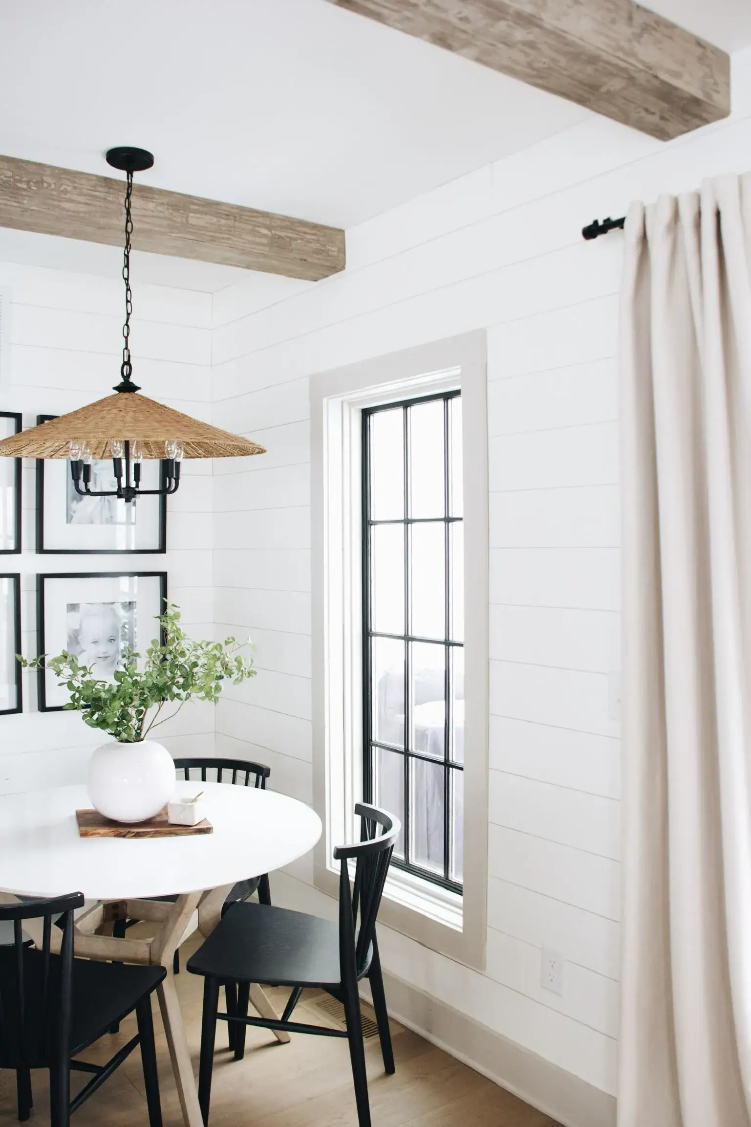
Trim color is one of those small details that can quietly make your farmhouse palette feel either polished or slightly off.
Using bright, cool white trim against warm-white walls can create a harsh contrast that makes both shades look less natural.
A simple approach is choosing trim one or two shades brighter than your walls while keeping the same warm or cool undertones.
Sherwin Williams Alabaster walls pair naturally with Pure White (SW 7005) trim for a soft contrast that still feels cohesive.
Benjamin Moore White Dove walls also work well with Simply White (OC-117) trim when you want a fresh but gentle combination.
For ceilings, I usually recommend using your wall color in a flat finish at about 50 percent strength for a subtle lifted effect.
If your room has shiplap or beadboard ceilings, using the same color on the ceiling and walls can create a cozy, seamless farmhouse look.
These small color choices can tie the entire room together while keeping the farmhouse style relaxed rather than overly coordinated.

Best Decor to Pair With Trending Farmhouse Paint Colors
Now that you have your farmhouse paint colors picked out, it is time to bring those shades to life with the right decor.
The best farmhouse decor adds warmth, texture, and personality while helping your chosen paint colors feel naturally connected to the rest of the room.
From natural wood accents to woven baskets and vintage-inspired pieces, these decor ideas can help you create a relaxed farmhouse look without overdoing it.
Tap Photos To Shop

Simple Decorating Ideas That Bring Farmhouse Paint Colors to Life
Once your paint is on the walls, a few simple decorating choices can help bring those farmhouse shades to life throughout your space.
The key is to let your wall color guide the rest of your decorating choices instead of trying to coordinate everything separately.
Here are a few practical ideas I use when pulling a farmhouse room together.
Start with your wall color, then choose furniture, textiles, and accessories that complement it rather than competing for attention.
Using one consistent trim color throughout your home can also help each room flow naturally into the next without jarring transitions.
For added texture, try an accent wall in a slightly deeper version of your main color or use matching paint on shiplap.
Layer natural fiber rugs, such as jute or sisal, to ground the room while adding warmth and subtle texture beneath your furniture.
Switching cool-toned bulbs for warm-white bulbs between 2700K and 3000K can also change how your paint color looks throughout the day.
Keep your artwork simple with botanical prints, black-and-white photography, or neutral abstract pieces that complement your farmhouse palette without competing.
With these easy decorating ideas, your paint color can become the foundation for a farmhouse space that feels warm, cohesive, and lived-in.

Farmhouse Paint Mistakes to Avoid
Even with a great farmhouse color palette, a few common paint mistakes can leave your rooms looking less cohesive than you expected.
One of the easiest mistakes is choosing a color from a small paint chip instead of testing a large swatch under your home’s actual lighting.
Very cool whites can also look gray and flat in north-facing rooms, so warmer shades usually work better in those spaces.
Using too many accent colors can make the room feel busy, so try keeping your farmhouse palette to one or two true accent shades.
Glossy or semi-gloss finishes on walls can create a modern, clinical appearance instead of the soft, cozy feeling farmhouse spaces are known for.
You will also want some contrast between your walls and trim because matching them exactly can make architectural details disappear.
Do not forget about the ceiling either, especially when your walls have a warm cream or neutral shade that clashes with builder-grade white.
Taking time to test your colors, finishes, trim, and ceiling together can help your farmhouse space feel warm, balanced, and thoughtfully finished.

Things to Know
- The most popular farmhouse paint combinations for farmhouse exteriors are Alabaster with Tricorn Black trim.
- Undertones matter more than the base color itself. Two whites can look completely different depending on their green, blue, or yellow undertone.
- Paint finish affects color perception. Flat and matte finishes absorb light and make colors look softer, while eggshell adds a slight reflectivity that can shift the tone.
- Ceiling height changes how wall color reads. Dark or saturated walls feel cozier in rooms with high ceilings and can feel oppressive in rooms under 8 feet.
- There has been a shift from pure white to warm whites like Swiss Coffee and Shoji White recently.
Frequently Asked Questions
What is the most popular farmhouse paint color right now?
Sherwin Williams Alabaster (SW 7008) is the single most-specified modern farmhouse color in 2026 for both interiors and exteriors. It is a warm, slightly creamy off-white with just enough warmth to feel cozy without pulling yellow. Paired with Tricorn Black trim, it creates the clean, high-contrast farmhouse look that has dominated design for several years.
Are popular farmhouse paint colors only white and gray?
No. While whites and warm neutrals are the foundation, sage greens, dusty blues, warm charcoals, and soft greiges all belong to the farmhouse palette. Colors like Sherwin-Williams Urbane Bronze and muted sage tones are increasingly common on cabinetry, accent walls, and exteriors. The key is keeping saturation low and warmth high.
What paint color should I use on my farmhouse kitchen cabinets?
Warm whites like Benjamin Moore White Dove or Sherwin Williams Alabaster are the most popular choices for farmhouse kitchen cabinetry. For a two-tone kitchen, a muted sage or soft navy lower cabinet paired with white uppers is a widely used combination. Both approaches photograph well and age gracefully.
How many paint colors should I use in a farmhouse home?
A cohesive farmhouse palette typically uses three to four colors: one main wall color, one trim color, one accent, and one deeper shade for focal points. Using too many colors breaks the calm, unified feeling that makes farmhouse interiors so restful. Consistency between rooms is what makes the home feel intentional rather than scattered.
Should farmhouse exterior paint be the same as the interior?
Not necessarily, but the colors should belong to the same warm-neutral family so the transition from outside to inside feels natural. Sherwin Williams Alabaster works on both exterior siding and interior walls, which is one reason it is so popular. If you use a slightly warmer or cooler shade outside, make sure the undertone matches your interior palette.

Choosing the right paint can make your home feel warmer, more cohesive, and refreshed without replacing your furniture or starting from scratch.
These popular farmhouse paint colors work so well because they create a soft, grounded backdrop that feels welcoming and easy to live with.
From warm whites and muted greens to soft blues and broader accents, the right shades can complement natural wood, cozy textiles, and everyday decor.
With the room-by-room ideas, color combinations, decorating tips, and common mistakes covered here, you have a practical starting point for your next paint project.
Grab your sample pots, test those swatches in your own space, and use these ideas to create the farmhouse look you have been dreaming about.