A few weeks back, I shared my spring decor touches in our new home but have not had the chance to share the sources and design of the room with you yet. I feel like the last 6 weeks have flown by being here and I am JUST starting to get a handle on everything and get settled. A lot of you have reached out for individual pieces you saw that you were interested in and thank you for doing so! But I also wanted to create a post that you could reference and find sources whenever you needed them. So I will tag this post on the top menu bar under home tour for you too so you can easily find it. Of course if you have any questions of things I missed to share, please send me a message or comment below and I am happy to answer them.
Coastal Living Room Reveal:
Living Room Design Process:
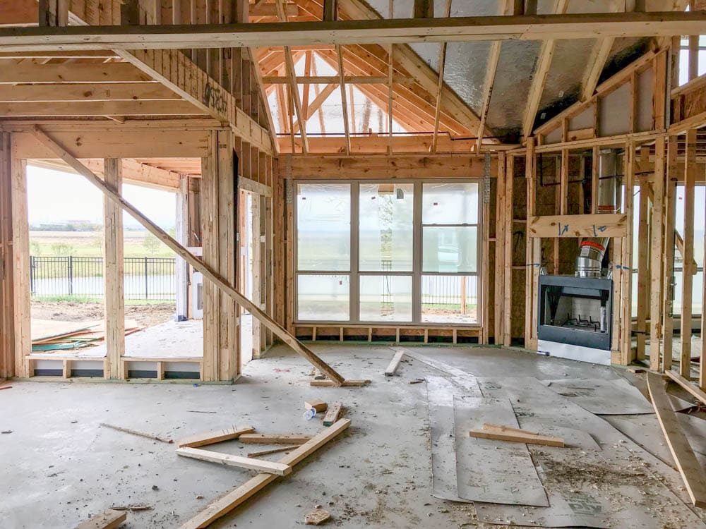
So here is where we began. This was last September. I can’t believe it has been a year this May since we decided to build our home. We chose this particular lot for the lake view and love how peaceful it felt when standing out here. You can read more about our building process HERE.
We wanted to optimize this lot to best fit our family too. It is not a large lot so really talking about how we would be spending our time and what our day to day life is like was important to nail down on the forefront.

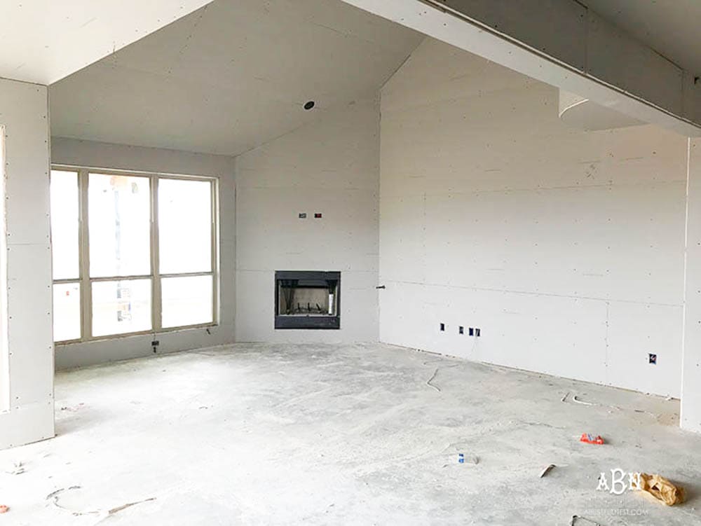
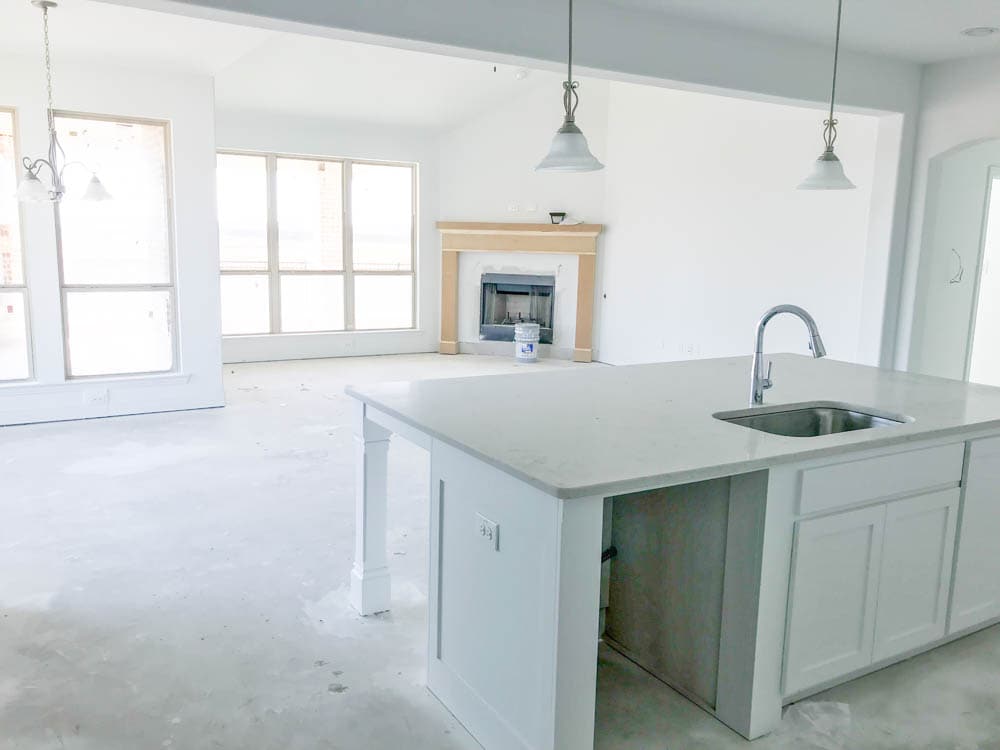
Above everything, we wanted the most used (aka: important to us) rooms in the house to face this view. For us that is the living room, kitchen, breakfast room and our 2 main bedrooms. As you can see below this is the view from the kitchen through the living room on the right and the breakfast room is on the left. All 3 rooms are open into each other making our main living spaces flow together. They are delineated by the ceiling heights. Each area has a different height with the living room being a vaulted ceiling. I have dreams of some day doing some beam work in here.
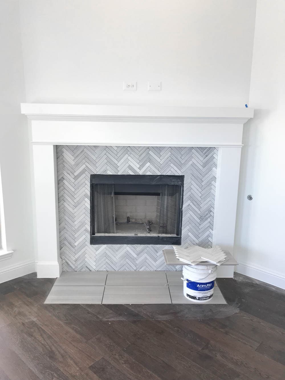
Off to the right side is our fireplace. We blocked and wired above it for the option to hang our television. More on this below.
I wanted a simple design for the fireplace but that would tie in the kitchen design. I went for everything white; the walls, the fireplace surround, etc. I did this on purpose and promise we will not be living in a white box forever! I wanted a blank slate so I could come in and add color and wallpaper as I slowly designed and decorated with decor. We honestly did not have a massive budget to design the house to the nines when we moved in and I think most people are that way. We focused on good bones to the house and function where my decorative designs could follow. Rather than commit to wall colors, I went with a blank palette for now. It will stay white (in the meantime) but I ideas to changing things up a bit in the kitchen soon.
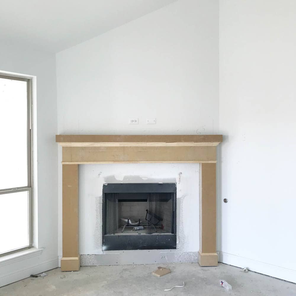
I chose a grey and white Carrara marble herringbone pattern for the surround to match the kitchen counter tops. I love the subtle pattern and the grey and white color combo. I do have to tell you, the installer had a bit of a hard time getting it lined up so if you do go with something like this in your home make sure it is level when installed. I promise to talk more about our tile work in the house shortly with some do’s and dont’s along with what you need to make sure your tile installer does.
Living Room Design Reveal:
And here it is decorated for spring. You can see more design details on how I decorate for spring HERE. I share a lot of our accessories and our spring color palette decision in that post.
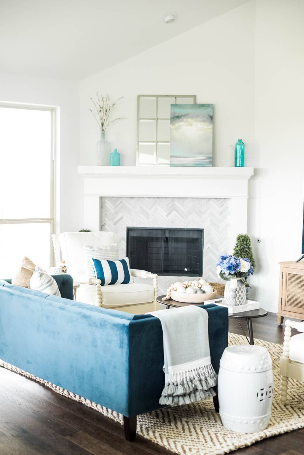

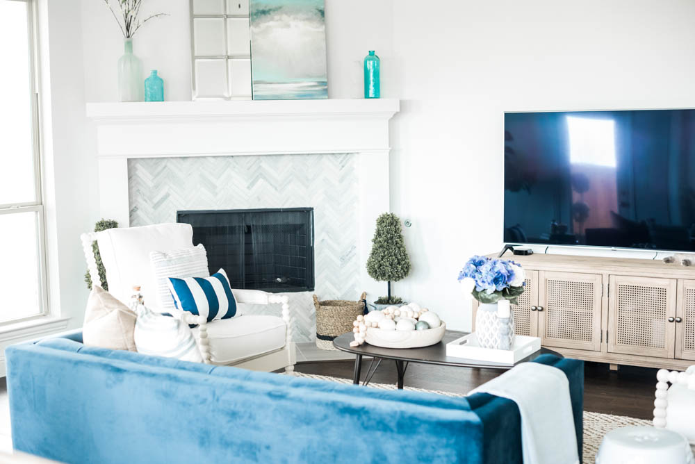
As you can see for now we decided to put the television on the console table. I really want it above the fireplace but this is the only thing my husband is fighting me on so for now we are leaving it here. I actually did not block and wire this wall and really wish we would have. I may just have someone come out and do it so we can mount the tv up on that wall. Stay tuned for our decision on that!
Color palette decision.
You all know how much I love my blues. It reminds me of my roots growing up around California beaches and it is a peaceful and calming color to me. So of course it was going to show up in this house too! You can tour our last house HERE.
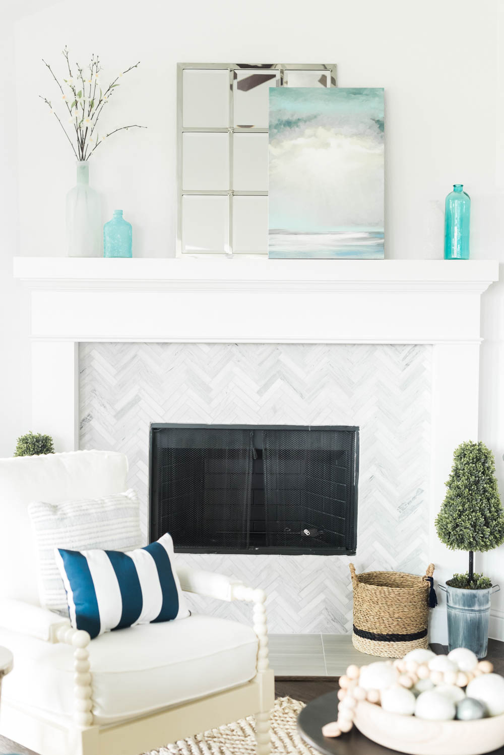
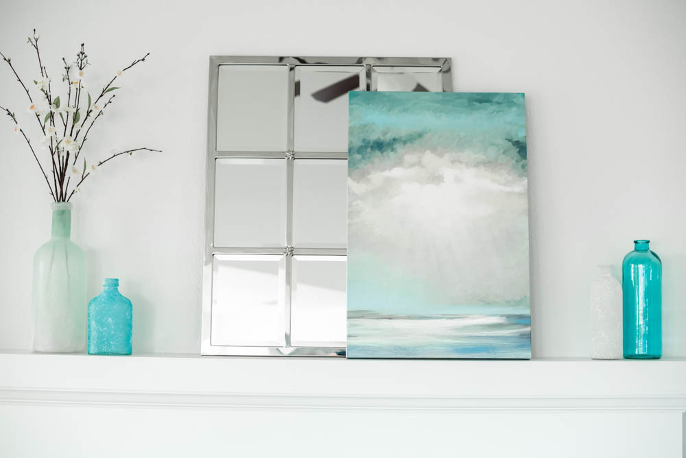
Art (similar) | Mirror | Sea Glass Bottles (similar) | Blossom Branches
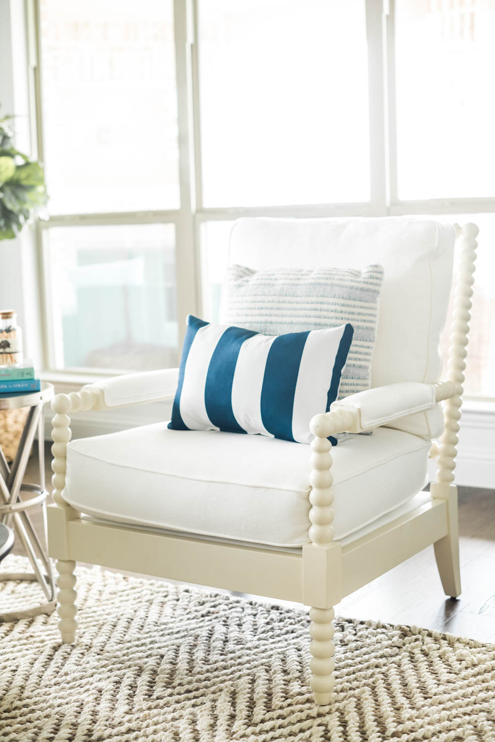
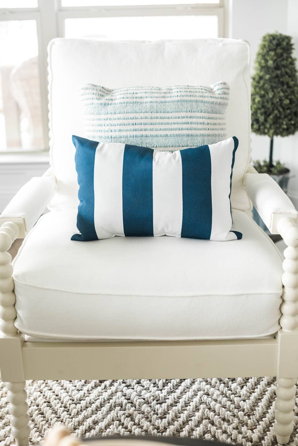
Basket (similar) | Chair | Blue and White Stripe Pillow (similar)
I used a turquoise color palette to accent my mantle for spring and I layered some pretty ocean art over this panel mirror. It has beveled glass and is just gorgeous. I originally bought it for another spot but for now, it is staying here.
Picking the perfect seating.
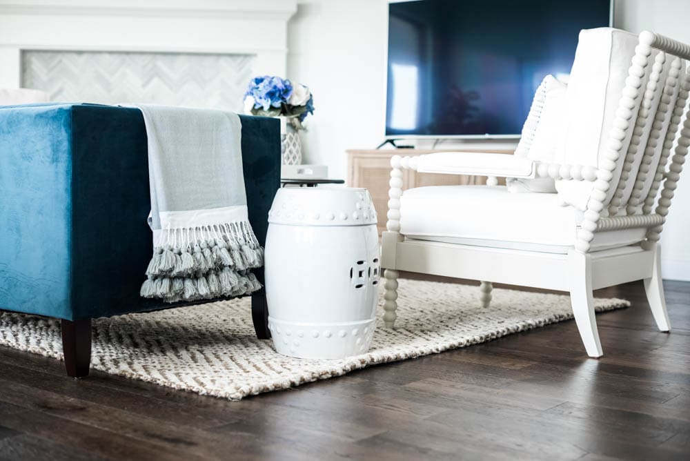
You guys I have dreamed of these white spindle chairs for years! I actually have a white spindle ottoman that I have in the game room upstairs and I have had that one for a few years. I have always loved the turned legs and thought the chairs had a perfect coastal look to them. BUT the most important feature is how comfy they are. They are more comfortable than I thought they would be. The back is cushy and it sits deep. My husband tends to sit here more when we are all watching tv together.
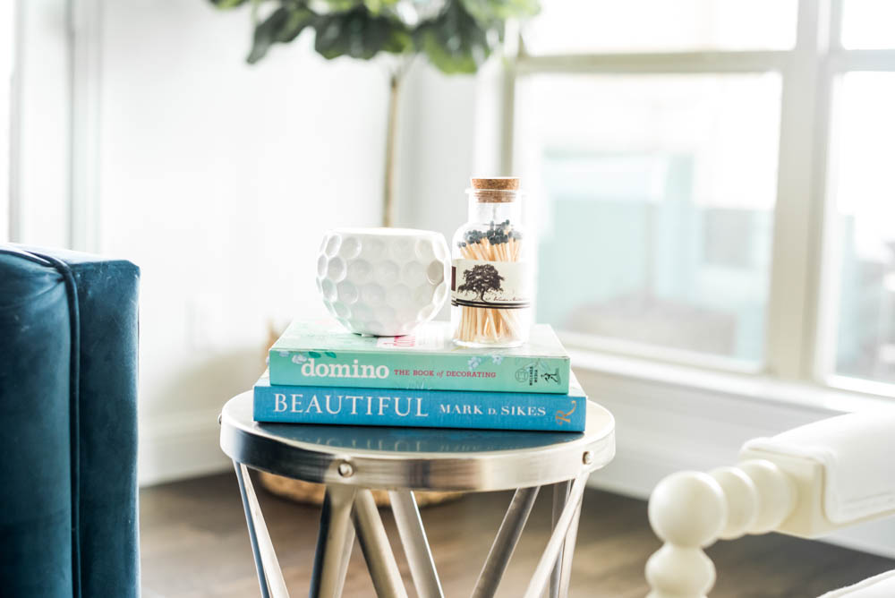
I am sure you all remember this cute little side table I have had for years. I love the metal look and it is a cute little table to stack books and a candle on. Typically we tend to put drinks down on the coffee table and not here so I added some of my design books to make it feel a little taller for when I light my candle.
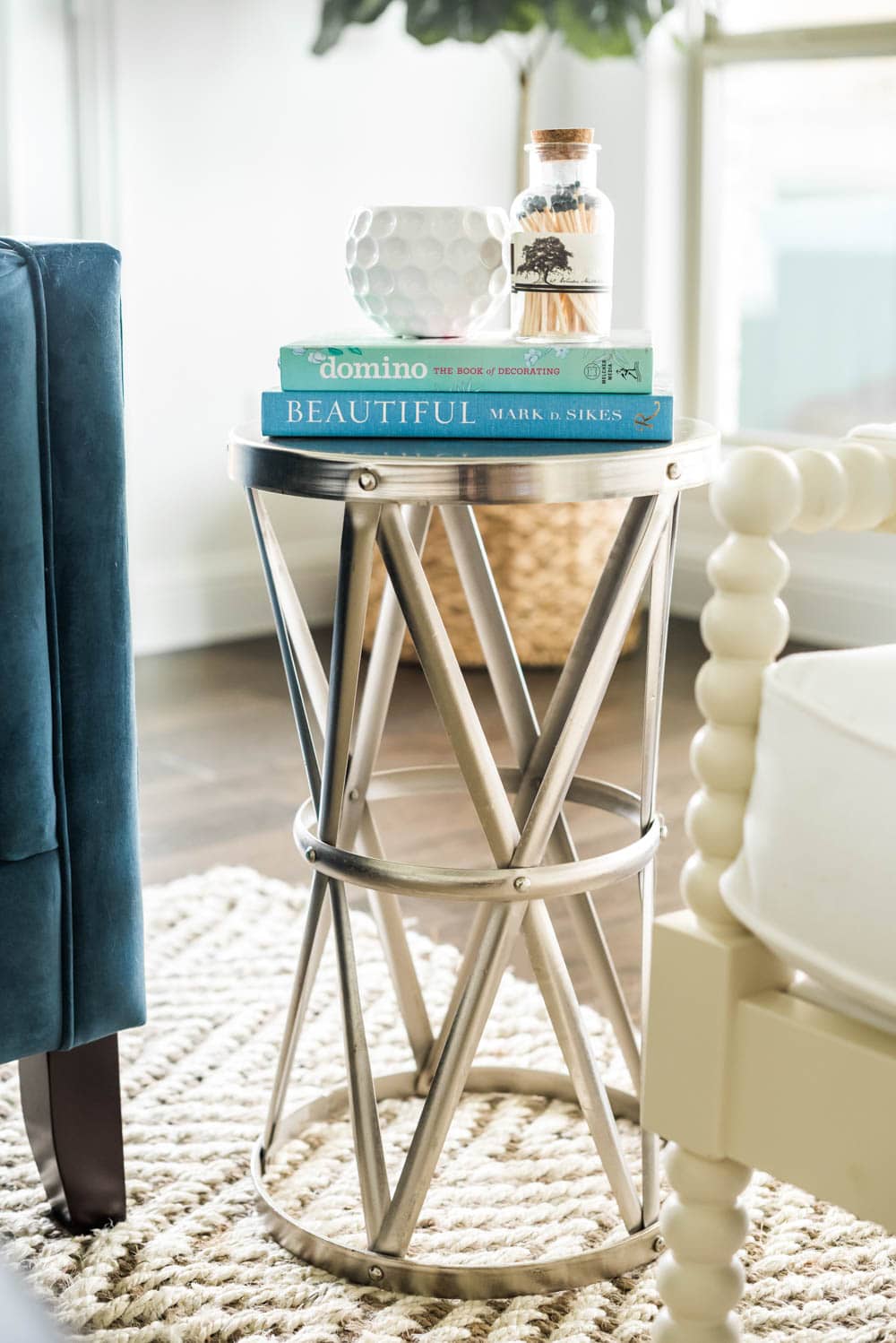
Side Table (similar) | Domino Book | Beautiful Book | Matches (similar) | Area Rug
Furniture layout.
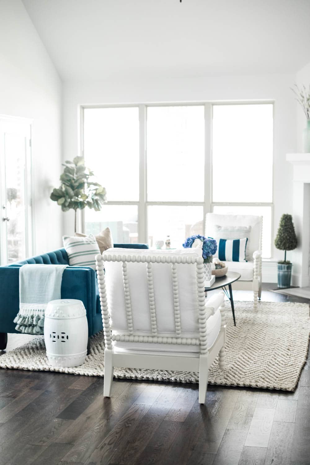
I grounded the space with this beautiful jute/sisal weave rug. I LOVE this rug. It (so far) has not shed and is super soft on your feet. Our last rug was really soft too but shed all over the place so so far I am really happy with this one. It is the perfect pop of pattern in here.
I got this gorgeous navy velvet sofa and I seriously don’t know what I have never gotten a velvet sofa before. I was so afraid I would have problems with our kitten but I vacuum it once a week and really have not had issues with her. The back is low but I actaully like it. It is sturdy on your back and the cushions are super comfy. My little one loves to do her reading time here. It is not oversized which is perfect for this space. Another reason I like the low back is so it doesn’t hinder our views out the window. I love the dark color of the sofa with the 2 white chairs too and popped the sofa color onto the chairs with these indoor/outdoor pillows (similar).
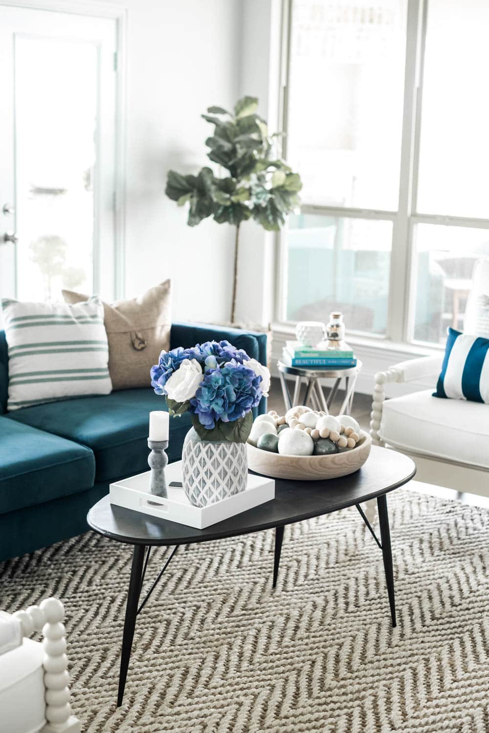
For now I have had this black mod table that I picked up at At Home on major sale. I love the style and shape but I have this coffee table coming soon that has a marble top to match the kitchen counters. I did find a couple similar ones for you HERE, HERE and HERE for you.
Would you like to save this post?
Adding in accessories.
I divided the top of the coffee table to house some of my favorite seasonal accessories with a rustic wooden bowl and a square white tray.
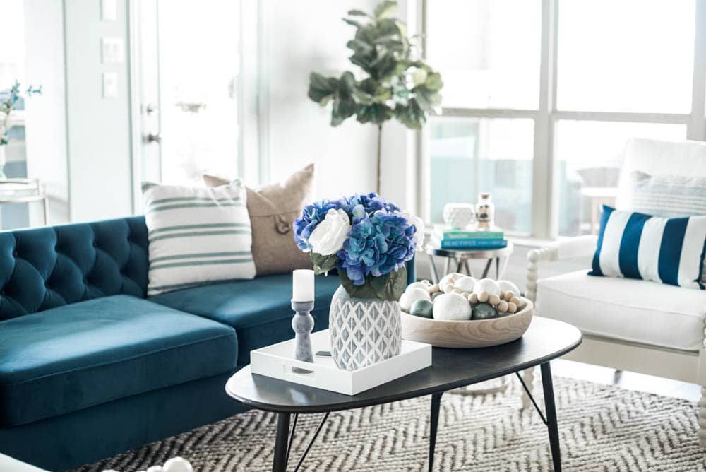
White Tray | Faux Hydrangeas (similar) | Faux White Roses (similar) | Wood Bowl
Capiz Balls | Sea Green Stripe Pillow (similar)
Camel Pillow with Button (similar) | Navy & White Stripe Pillow (similar)
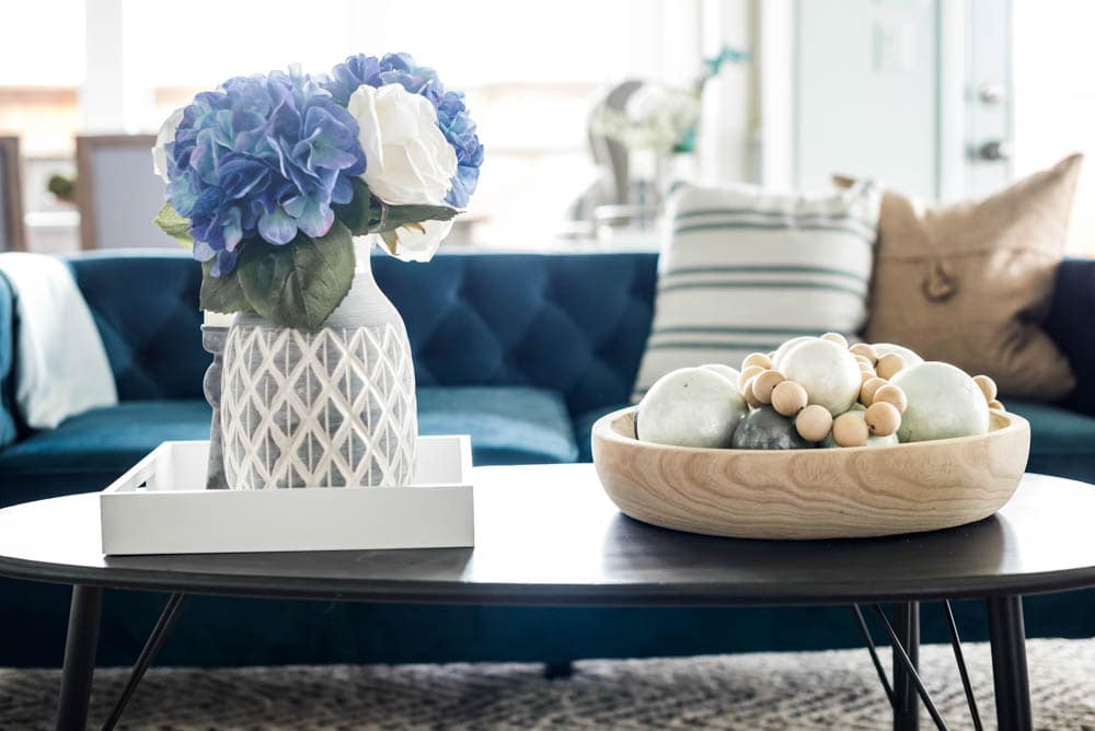
I love these gorgeous capiz shell balls and just laid my DIY farmhouse beads I made on top.

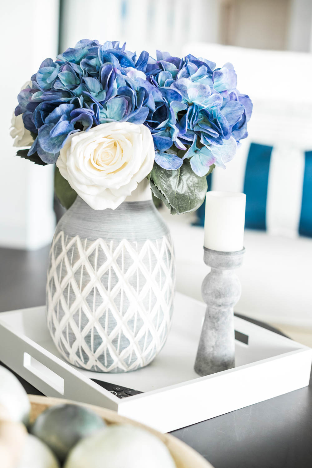
I love fresh flowers in the house but seriously never keep them alive longer than a hot minute. One of my favorites to decorate with are hydrangeas and I love these gorgeous blue/purple ones.
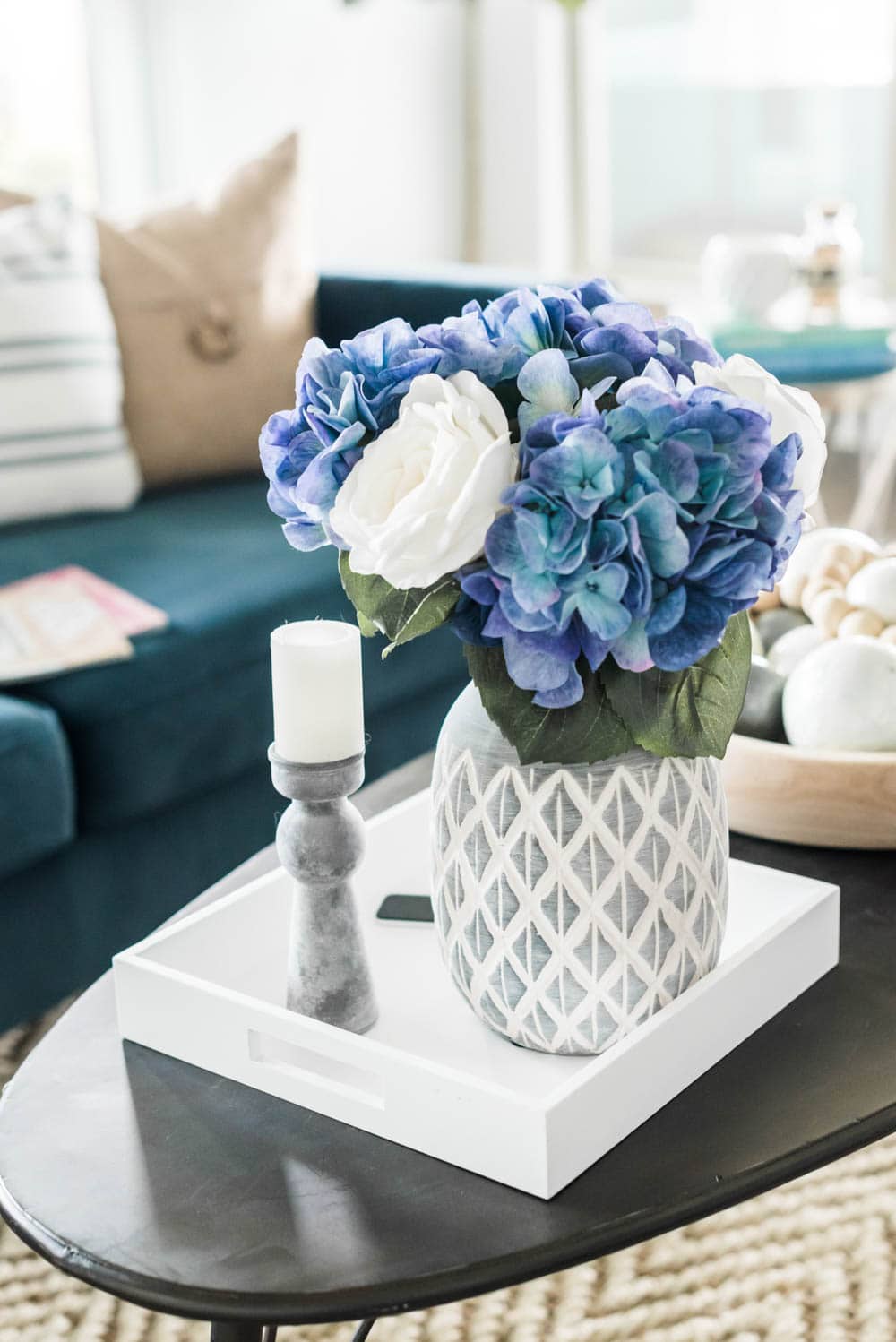
I just added in some white roses for a little pop.
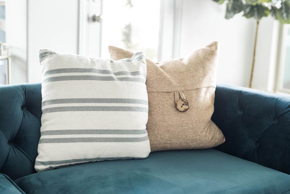
You know I am a big pillow hoarder and our guest room closet is already full. But I really do change these all the time so I think that justifies it right?! I chose this camel colored one (similar) and simple stripe one (similar) for our navy sofa. They will transition perfectly into the summer.
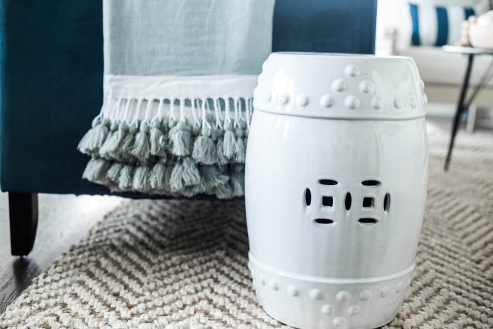
My garden stools are one of my most favorite accessories ever! I have 2 which is not enough. One is in the entry right now and then here is my second one. They are so easy to move around and we use this one a lot right here for coffee cups and to put the remote for the tv down. I have found some pretty affordable ones for you. This is one of those things I would not spend a lot of money on since they are pretty common to find. But I did all the searching for you and here are some of my favorites:

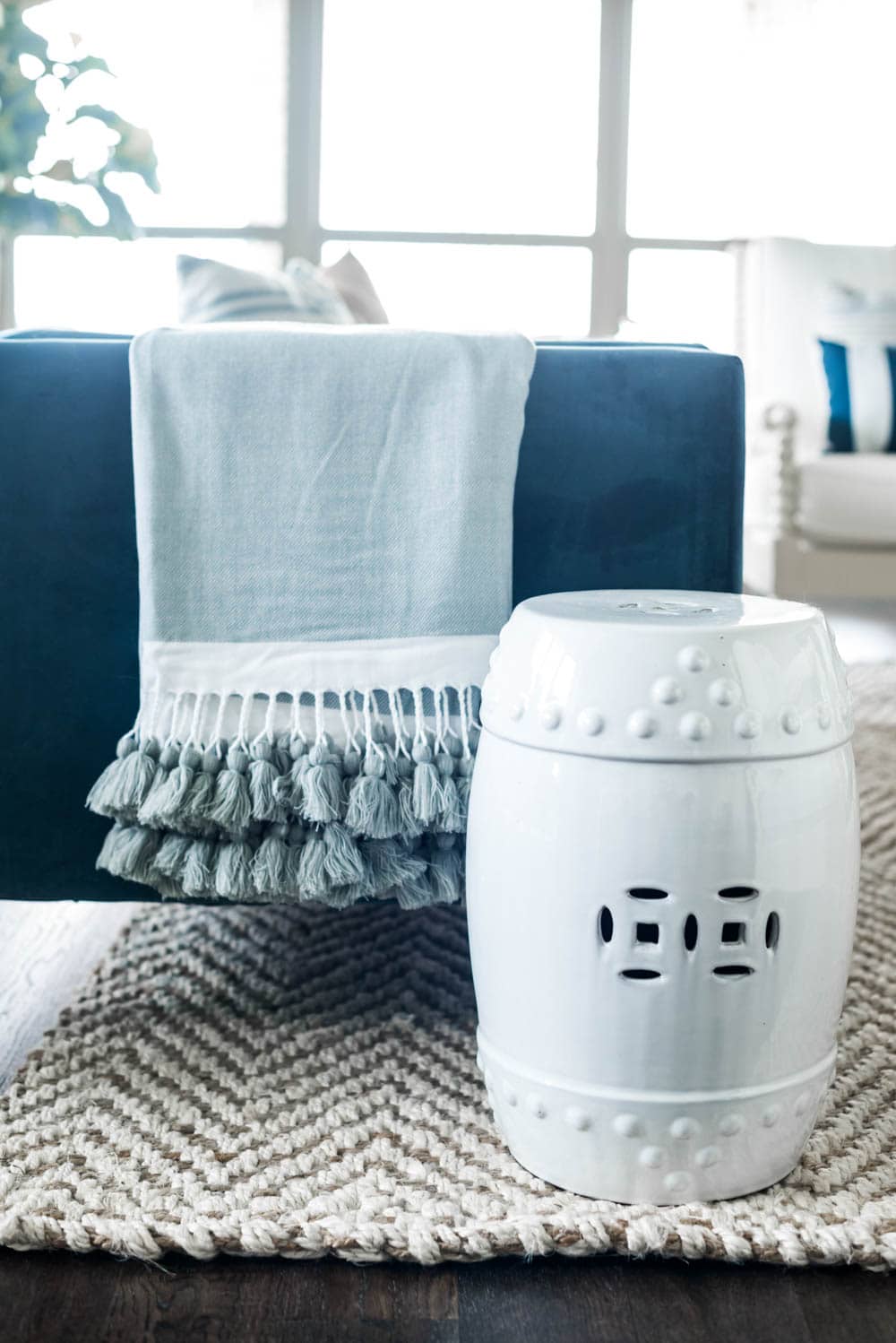
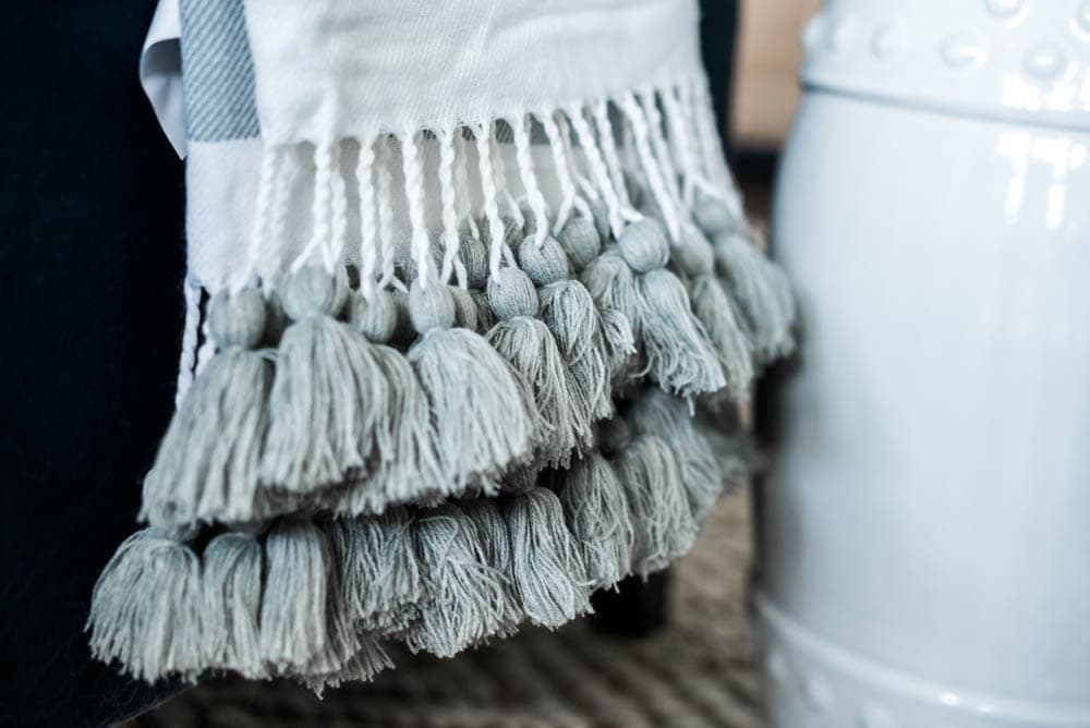
And you always need some good throw blankets. Right now I am obsessed with lightweight ones with tassels. They are so pretty draped over the sofa or a chair and easy to roll up and put in a basket. I am in love with this one right now and have it on order.
Moveable furniture pieces.
I love to have pieces of furniture that I can move (on wheels or easy to pick up) in my rooms. In here I have this bar cart that when not in use, sits off to the side and houses some of my design books. I also have a floral arrangement on top and this bowl I like to use for serving when we have guests. All these pieces serve a purpose at some point in time even though it looks just like decoration only. I can pull this bar cart over to the seating area for holding drinks or as a second side table OR use it in my breakfast room as additional space to serve food from. I have a more traditional bar cabinet that I use for bar accessories rather than using this movable piece for that.
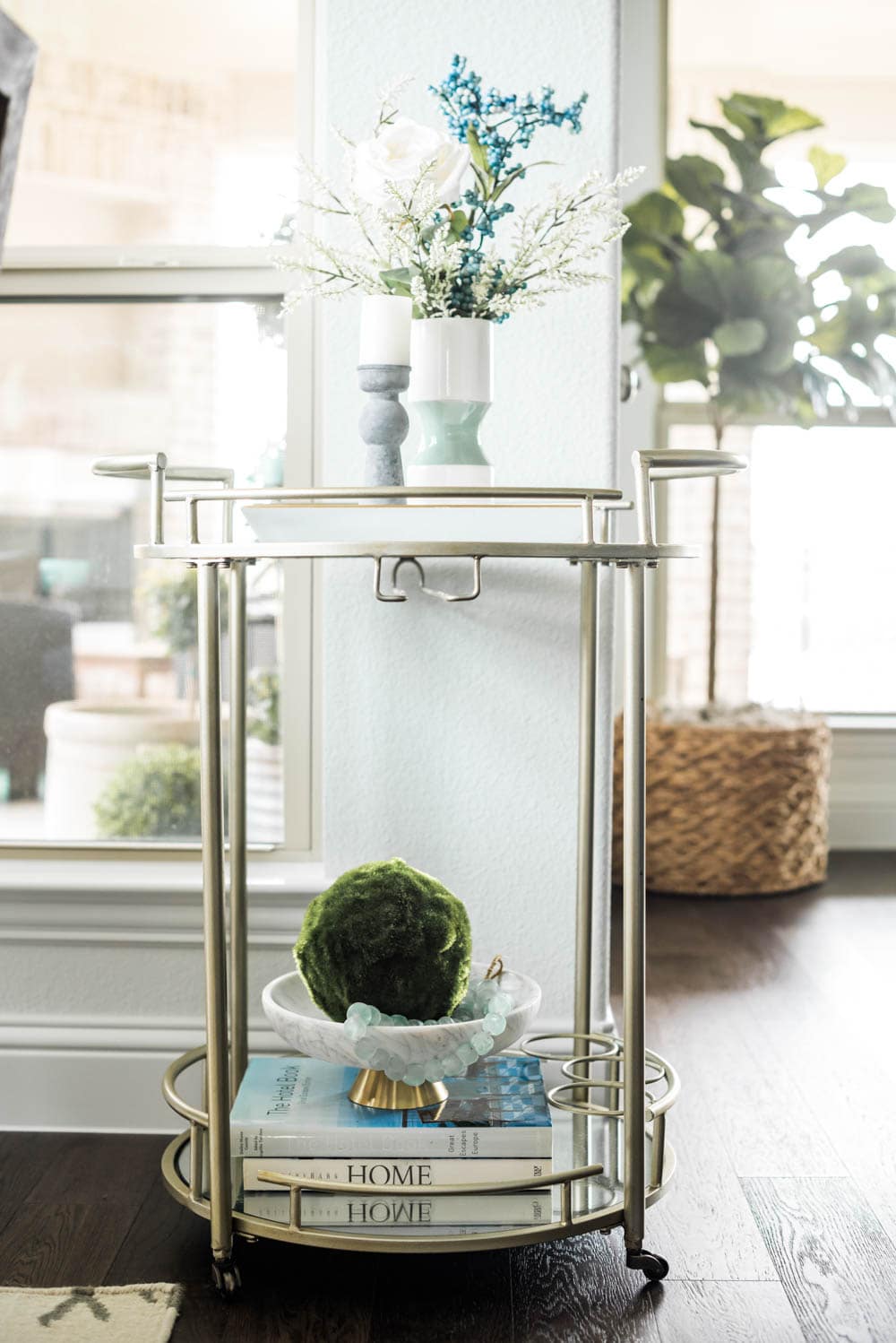
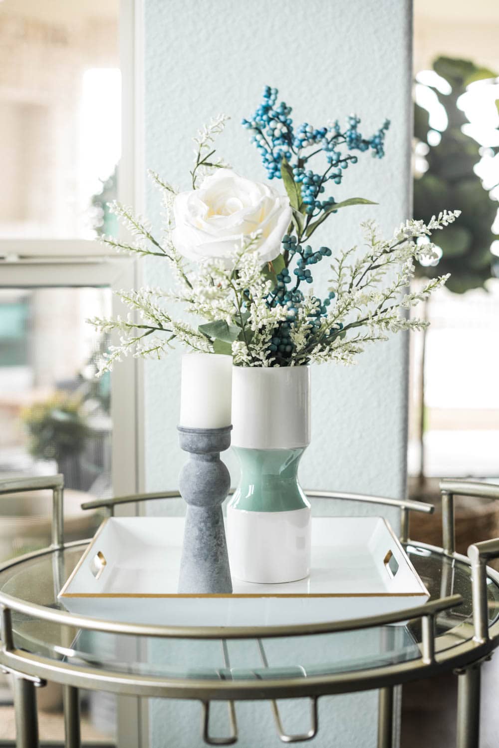
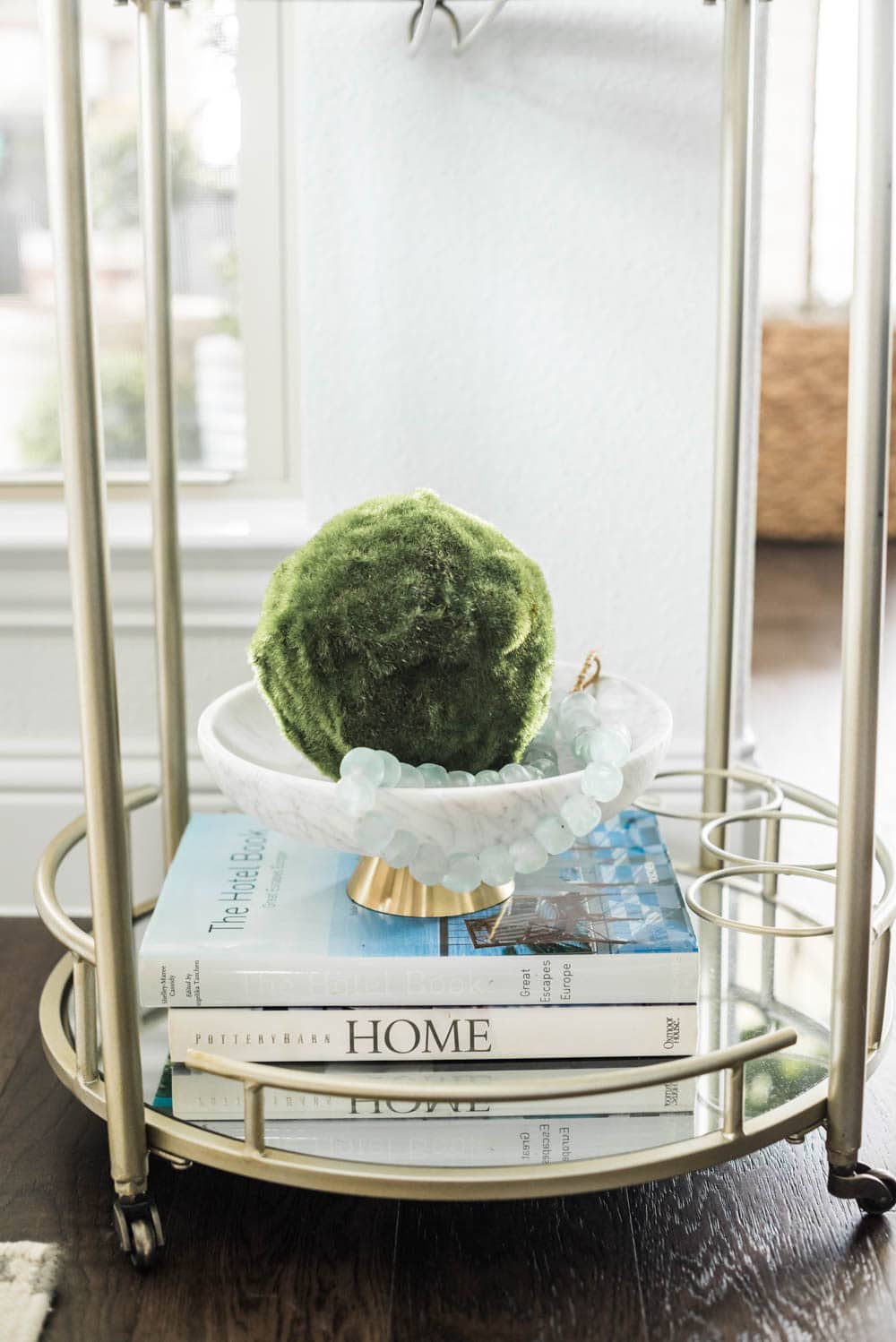
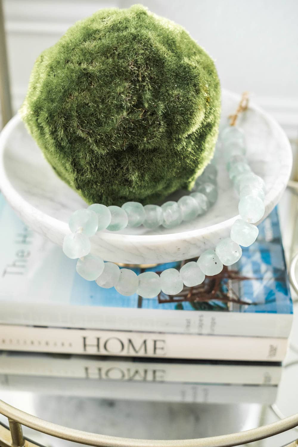
So there you have it! I hope you enjoyed this full + lengthy tour of our main living room. We love it and as always my home is always transforming but this is one loved space that is used all the time and we couldn’t be happier with it!
You can shop all the sources from this space below.
Furniture
{scroll and tap the photos below to shop them}

Accessories
{scroll and tap the photos below to shop them}

*Photography by Sweet Memory Photography





Thank you for sharing! I love this coastal theme – it’s beautiful!
My living room is also set up similarly with the fireplace in the corner. We have our tv on top of the fireplace, but I am struggling with the furniture placement because the couch is angled towards the wall vs the fireplace . If you win the debate with your husband, how would you change the layout of the furniture (if at all)?
Thanks for continuing to share your designs. I love your blog!
SWOON!! Every single detail is just gorgeous! I’ve been following along throughout the build and love all of your design choices, decor and of course, all the pretty little details. What an amazing view, for sure!
I have a question about the cabinet in your living room. I’ve tried to click on both images, however, both link up to the Pottery Barn coffee table. Would you mind source sharing for that pretty cabinet? I’ve been searching for something similar, and that one is perfect.
Thank you for sharing your home and taking the time to link all of the details! Wishing you and your family a blessed Spring and Summer on the lake, in your new HOME!! It’s absolutely gorgeous!
Oh so beautiful! I love the windows in this room that add to the brightness. The color choices are all so gorgeous together.
Joanna that is so sweet! Thank you!