Choosing the popular white paint colors for your home can feel like a challenge because every shade looks almost the same until it ends up looking completely different on your walls.
That is exactly why paint color guides can make things easier when confusing undertones, lighting, and room placement leave you second-guessing every paint sample you bring home.
I have stood in front of those paint swatches thinking they all looked identical, only to get home and realize the color felt nothing like I expected.
Even the smallest change in natural light, flooring, or furniture can make the same white paint look brighter, darker, warmer, or cooler throughout the day.
A white that feels fresh and clean in the morning can suddenly look creamy, gray, or even slightly green as the afternoon sunlight shifts inside your room.
If your room does not get much natural sunlight, some white paints can end up looking dull rather than bright and welcoming once everything has dried.
On the other hand, bright sunny rooms can make warmer whites appear much creamier than expected, leaving you wondering why the finished color feels completely different.
This post may contain affiliate links. As an Amazon Associate and a participant in other affiliate programs, I earn a commission on qualifying purchases at no additional cost to you.

So, I’m excited to share simple tips that will make picking the right white paint feel much less confusing before you spend money on another gallon.
From lighting and undertones to room style, I’ve got tips that will make it easier for you to choose a white paint that actually looks great.
Grab a few paint samples and get ready to use these ideas so you can finally create a space that feels exactly the way you pictured it.
Why Popular White Paint Colors Are So Difficult to Choose
White may seem like the easiest paint color to pick, but it is actually one of the hardest colors to get right inside any home.
There are thousands of white shades from brands like Sherwin-Williams, Benjamin Moore, and Behr, and even the smallest difference can completely change how a room feels.
White paint reacts to lighting, flooring, furniture, and nearby finishes more than almost any other color.
A cool white can look harsh against warm honey oak floors, while a warm white may appear dull beside cool gray countertops or stone surfaces.
Paint samples also look different inside the store because the tiny paint chip is surrounded by other colors that can easily fool your eyes.
Many people skip testing samples at home, then end up disappointed after painting an entire room and realizing the color looks nothing like they expected.
Natural light also changes throughout the day, so east-facing rooms get warm morning sunlight before shifting to cooler temperatures later, while west-facing rooms experience the opposite effect.
Once you understand how lighting and surrounding finishes affect white paint, choosing the right shade becomes much less confusing and a lot more enjoyable.
Understanding Warm vs. Cool White Paint Colors
The first thing I always recommend is deciding whether a warm white or a cool white fits your space before looking through hundreds of paint samples.
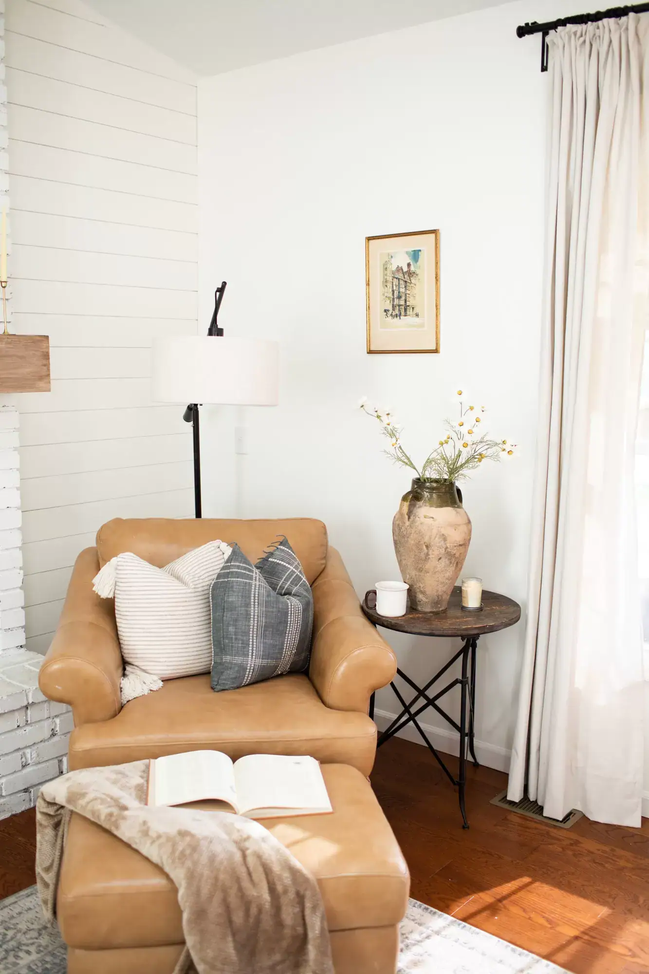
Warm whites have yellow, cream, peach, or soft pink undertones that make a room feel cozy, comfortable, and inviting without looking too dark.
Cool whites have blue, gray, or green undertones that create a brighter, cleaner look, making them a favorite for modern spaces with lots of natural light.
They usually look their best in sunny living rooms, bright kitchens, and open spaces where natural light helps the color stay fresh throughout the day.
Warm whites are often one of the popular paint colors for bedrooms, especially in north-facing rooms and traditional spaces where a softer and more relaxed feeling works beautifully.
If you love the modern farmhouse interiors, warm whites are usually the safest choice because creamy shades pair naturally with wood accents and cozy finishes.
I also like checking the LRV, or Light Reflectance Value, before picking a paint because it gives a better idea of how bright the color will look.
Greek Villa by Sherwin Williams has an LRV of 84 and gives walls a soft, creamy look without feeling too yellow or heavy.
White Dove by Benjamin Moore is another favorite because it feels fresh and clean while still keeping a warm and welcoming appearance.
Once you know whether a warm or cool white fits your room best, narrowing your choices becomes much faster and far less stressful.

More Paint Color Ideas + Inspiration
Tips for Choosing the Right White Paint Color for Your Home
The best thing I have ever done before picking paint was buying sample pots and painting large swatches directly on my walls instead of relying only on tiny paint chips.
Paint chips help narrow your choices, but they are simply too small to show how a white paint will actually look across an entire room.
I like painting at least a twelve-by-twelve-inch square, or even larger, using two or three of my favorite white paint options.
Then I check each sample during the morning, afternoon, and evening because changing light can completely change how the same white looks throughout the day.
It also helps to look through the best white paint colors for interiors before heading to the store, so you already have a few strong choices in mind.
Do not forget about the paint finish because flat and matte finishes look softer, while satin and semi-gloss finishes reflect more light and appear brighter.
I also compare my paint samples with cabinets, flooring, countertops, and larger furniture because those surfaces can change how a white paint looks after everything comes together.
If your trim already has white paint, either match your wall color or pick one that creates a clear contrast so everything feels intentional.
Spending a little more time testing samples before buying paint can save money, prevent frustration, and leave you much happier with the finished room.
Don’t Forget To Order Paint Samples!
No matter what a photo looks like or description, every paint color will look different in your own space. It is so important to test a paint color before you commit to it.
That’s why I love buying these peel & stick samples.
It makes it so easy & affordable to test colors!

Common Mistakes When Choosing White Paint
One mistake I see all the time is choosing a white paint only because it looked beautiful in a magazine or on social media, without testing it first.
Professional photos often use lighting that makes paint colors appear different, so that same white may not look anything like it does inside your home.
Another common mistake is picking a wall color that looks almost identical to your trim, making the entire room feel flat instead of well balanced.
I also see people forget about their flooring, even though warm wood floors and cool white paint can sometimes create a color combination that feels awkward.
Skipping the sample stage is another mistake because it often leads to repainting after realizing the finished color does not look the way you expected.
I always suggest buying two or three samples together since comparing them side by side makes picking the right white much easier.
Testing paint on paper instead of directly on the wall can also lead to disappointment because surrounding colors and existing surfaces change how white paint appears.
I have also picked a popular white just because everyone else loved it, only to realize it was completely wrong for my own space.
Would you like to save this post?
Before making your final choice, look at your flooring, furniture, rugs, and fabrics together because every piece affects how your white paint will look after everything comes together.
How to Pick the Best White Paint for Different Lighting Conditions
Lighting is one of the biggest reasons white paint can look amazing in one room but completely different after you use that exact same color somewhere else.
Rooms with large south or west-facing windows usually handle cooler whites well because warm natural sunlight softens gray or blue undertones throughout the day.
North-facing rooms usually look better with warmer whites because cooler daylight can make blue or green undertones stand out and leave the space feeling colder.
East-facing rooms get warm sunlight during the morning before turning cooler later, making soft warm whites feel balanced for most of the day.
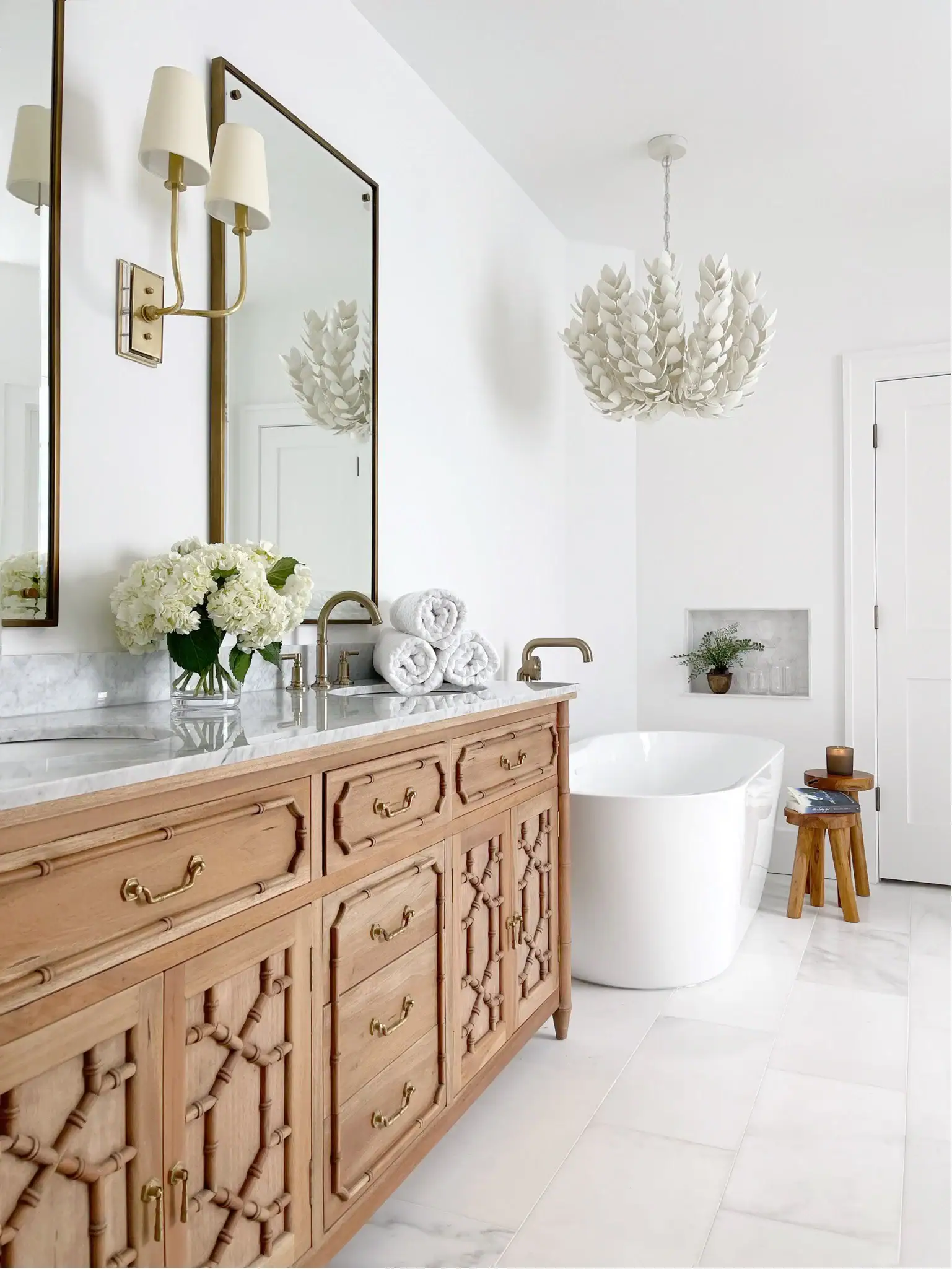
Rooms without natural light, like bathrooms or interior hallways, often look brighter with warm whites that have a higher LRV and reflect more available light.
Artificial lighting also changes everything because warm LED bulbs can make warm whites feel softer while giving some cool whites a slightly green appearance.
If you are painting a bathroom, these best bathroom paint colors can help you compare white shades that work well under limited natural light.
Daylight bulbs usually pair nicely with cooler whites, so it is always smart to think about your lighting before making a final paint choice.
Always test your paint samples under the same lighting you will use every day because that simple step helps you avoid surprises after the walls are completely painted.

Best Decor to Decorate with Popular White Paint Colors
White walls are incredibly versatile and act as a blank canvas for so many decorating styles, from modern minimalism to cozy traditional and everything in between.
The decor you layer into a white room is what gives the space its personality, warmth, and visual depth.
Here are some of my favorite decor elements that look stunning against white walls.
Tap Photos To Shop

Tips for Decorating with Popular White Paint Colors
White walls give you lots of decorating freedom, but knowing where to begin can still feel confusing when you have so many furniture and decor choices.
I like starting with one standout piece made from natural materials, like a wooden dining table or a linen sofa, so the room immediately feels warm and inviting.
Texture also makes a big difference because mixing soft fabrics, smooth ceramics, woven baskets, and metal finishes keeps white spaces from feeling plain.
Layering different textures adds depth without adding extra colors, helping the room feel comfortable and thoughtfully put together from corner to corner.
White walls also make it easy to mix warm and cool decor because the wall color naturally ties everything together without making the room feel disconnected.
Do not be afraid to add one bold chair, colorful artwork, or a statement piece because white walls make those choices stand out beautifully.
Plants are another favorite decorating trick since they add fresh color and make white rooms feel more relaxed without making permanent changes.
If your walls are painted a warm white, pairing them with warm wood, rattan, and earthy fabrics creates a comfortable and balanced look.
Keep curtains and window treatments light so natural sunlight can brighten your white walls and help the color look beautiful from morning until evening.

Best White Paint Colors for Living Rooms
Living rooms need a white that feels inviting since people spend real time there, and the color has to work in all kinds of lighting throughout the day.
A warm white is almost always a safer bet in a living room because it makes guests feel relaxed and at ease the moment they walk in.
Here are some of my top picks for living room paint colors that will help your space feel brighter, warmer, and more comfortable no matter your decorating style:
- Sherwin Williams – Greek Villa (SW 7551): A soft warm white with gentle yellow undertones that works especially well in rooms with limited natural light and creates a comfortable, welcoming feeling.
- Benjamin Moore – White Dove (OC-17): This warm white pairs beautifully with rich wood furniture and darker finishes while keeping the room feeling bright, relaxed, and inviting every day.
- Benjamin Moore – Simply White (OC-152): A brighter warm white with subtle yellow undertones that adds warmth without making the space feel overly creamy or too dark.
- Sherwin Williams – Alabaster (SW 7008): This popular warm off-white has a soft pink undertone that gives living rooms a cozy appearance without feeling too yellow or heavy.
- Behr – Ultra Pure White (PPU18-06): A fresh, slightly cool white that looks especially beautiful in modern living rooms filled with bright natural sunlight throughout the day.

Trending White Paint Colors for Kitchen Cabinets
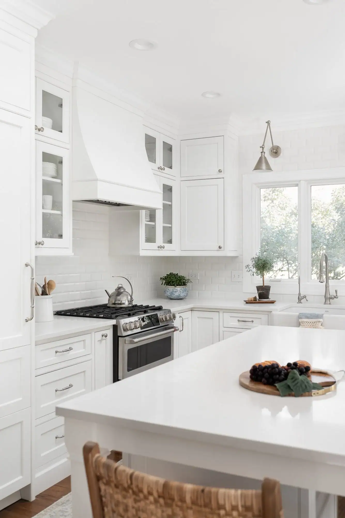
Kitchens are one of the rooms where white paint gets the most scrutiny since the cabinets are a huge focal point and people interact with them constantly.
The creamy white kitchen cabinet colors that have been trending lean warm rather than stark, which makes the kitchen feel welcoming rather than clinical.
Here are my top cabinet white picks right now that will give your kitchen a fresh, timeless look without feeling too cold or overly creamy:
- Benjamin Moore – Chantilly Lace (OC-65): A crisp, clean white with barely noticeable undertones that gives modern kitchens a bright, polished appearance without feeling too cold.
- Sherwin Williams – Alabaster (SW 7008): A warm creamy white that looks especially beautiful on kitchen cabinets in traditional, cottage, and farmhouse-inspired spaces.
- Benjamin Moore – White Dove (OC-17): This soft white keeps cabinets feeling fresh and bright while pairing beautifully with natural wood shelving and warm decorative accents.
- Sherwin Williams – Extra White (SW 7006): A bright, cool white that works well in contemporary kitchens where you want a clean, fresh, and modern cabinet finish.
- Behr – Polar Bear (PPU18-07): A soft neutral white with warm undertones that creates an inviting cabinet color and works well with many kitchen styles.
Popular White Paint Colors From Sherwin Williams and Benjamin Moore
Sherwin Williams and Benjamin Moore consistently lead the industry when it comes to trusted whites, and designers across the country rely on both brands for their consistency and color accuracy.
These two brands have some of the most thoroughly tested and loved whites in the market, and their color teams spend years developing shades that perform beautifully across different conditions.
Here are some standout white paint colors from each brand that make it much easier to find a shade that fits your style, lighting, and everyday living spaces:
- Sherwin Williams – Greek Villa (SW 7551): A warm, creamy white that feels soft and relaxing, making it a great choice for rooms with limited natural daylight.
- Sherwin Williams – Alabaster (SW 7008): This soft warm white works beautifully across traditional, transitional, and modern farmhouse spaces without feeling too creamy.
- Sherwin Williams – Pure White (SW 7005): A clean white with a subtle touch of warmth that works well on walls, trim, and cabinets throughout the home.
- Benjamin Moore – White Dove (OC-17): A timeless warm white that stays balanced under different lighting conditions, making it a favorite for many interior spaces.
- Benjamin Moore – Chantilly Lace (OC-65): A crisp true white that looks especially beautiful in modern rooms filled with bright natural sunlight.
- Benjamin Moore – Simply White (OC-152): A bright, warm white with soft yellow undertones that makes rooms feel fresh, cheerful, and comfortably inviting.

Frequently Asked Questions
What is the most popular white paint color right now?
Benjamin Moore White Dove and Sherwin Williams Greek Villa are two of the most popular white paint colors because they work beautifully in many different rooms and decorating styles. White Dove feels soft and balanced, while Greek Villa has a slightly creamier appearance that creates a warm and comfortable atmosphere.
How do I know if a white paint will look yellow on my walls?
Paint a large sample on your wall and check it throughout the day because lighting can completely change how white paint looks inside your room. Warm light bulbs, sunny rooms, and warm flooring can make warm white paints appear more yellow than they looked inside the store.
Can I use the same white for walls, trim, and ceilings?
Yes, using the same white paint in different finishes creates a clean and cohesive look that works well in almost any room. Many people use flat paint on ceilings, eggshell on walls, and semi-gloss on trim for a subtle layered appearance without changing the color.
What white paint is best for a north-facing room?
Warm whites like Sherwin Williams Alabaster and Benjamin Moore White Dove are great choices because they help north-facing rooms feel brighter and more comfortable. Cool whites can look dull in limited natural light, while warmer shades help balance the cooler daylight throughout the room.
Is white still a popular paint color in 2025?
Yes, white continues to be one of the most popular paint colors, with warmer and softer shades becoming the favorite choice for many interiors. Bright cool whites still work well in modern spaces, but warm whites are often preferred because they create a more relaxed and welcoming feeling.

Choosing the right white paint can make your home feel brighter, more inviting, and beautifully pulled together without making expensive decorating changes.
These popular white paint colors give you a starting point by helping you understand how lighting, undertones, and room style all work together.
Whether you are painting a living room, kitchen, bathroom, or bedroom, testing samples in your own space is still the best way to find the perfect match.
A little extra time comparing paint colors now can save money, avoid frustration, and leave you with a finish that looks great for years to come.
Start with the paint colors and simple tips shared in this article, then bring home a few samples and find the white that feels just right for your space.