Choosing the best mid-century modern paint colors can feel confusing when every trendy shade promises timeless style but leaves your rooms feeling flat and disconnected.
Many paint color guides make everything sound simple, yet picking shades that fit classic mid-century spaces still feels frustrating without clear direction from trusted advice.
It is easy to grab a popular color only to realize your furniture suddenly feels out of place instead of balanced and inviting every day.
Warm woods and clean lines lose their timeless appeal when cool grays or harsh colors take over every wall in your favorite living spaces fast.
Mixing too many bold shades can make carefully chosen furniture compete instead of creating a calm visual flow across each room you decorate with care daily.
Even beautiful vintage-inspired pieces look awkward beside wall colors that feel cold or disconnected from the original design style you wanted in the first place anyway.
Without a simple plan, it becomes harder to create rooms that feel comfortable, welcoming, and true to mid-century design roots every single time around the home.
This post may contain affiliate links. As an Amazon Associate and a participant in other affiliate programs, I earn a commission on qualifying purchases at no additional cost to you.

That’s why I’m excited to share trusted color ideas, practical room suggestions, and simple styling tips so every choice feels easier from start to finish today.
From smart color pairings to easy decorating ideas, I’ve got practical tips that help every space feel balanced, warm, and authentic without making you question every paint choice.
So, find your favorite MCM paint color, use my tips and decor ideas to create a space that feels timeless, welcoming, and perfectly suited to your personal style every day.
Are Mid-Century Modern Paint Colors Still Popular?
The short answer is yes, and mid-century modern paint colors are making a strong comeback as more people embrace warm, earthy palettes instead of cool minimalist shades.
Avocado green, once considered outdated, is returning on garage doors, planters, and accent pieces with a fresh look that feels stylish instead of old-fashioned.
Terracotta and clay shades like Sherwin-Williams Cavern Clay are becoming favorites because they reflect the warm desert colors that defined classic mid-century modern design.
Warm whites like Alabaster and Shoji White have replaced bright cool whites, while warm neutral beige paint colors create a softer, more authentic mid-century appearance.
Deep charcoal shades like Cyberspace work beautifully on siding and cabinetry because they add depth while keeping the overall palette warm and balanced.
Mustard yellow is also making a comeback as a front door color, bringing a cheerful personality that feels right at home with classic 1950s and 1960s style.
Olive green, sage, teal, and muted blue continue gaining attention for both interiors and exteriors because they pair naturally with wood tones and clean architectural lines.
What makes these colors work so well is their balance between earthy foundations and carefully chosen accent shades that never feel too busy or distracting.
That simple approach has stayed timeless through changing decorating trends because it creates spaces that still feel comfortable, balanced, and inviting decades later.

How to Choose the Best Mid-Century Modern Paint Colors for Your Space
Starting with the right foundation color is one of the smartest ways to create a balanced mid-century modern palette that feels warm, timeless, and easy to decorate around.
This style works best when you build your palette around three simple groups consisting of earthy tones, soft neutrals, and bold accent colors used with intention.
I always suggest choosing wall and floor colors first because they create the calm background that lets your furniture and decorative pieces stand out naturally.
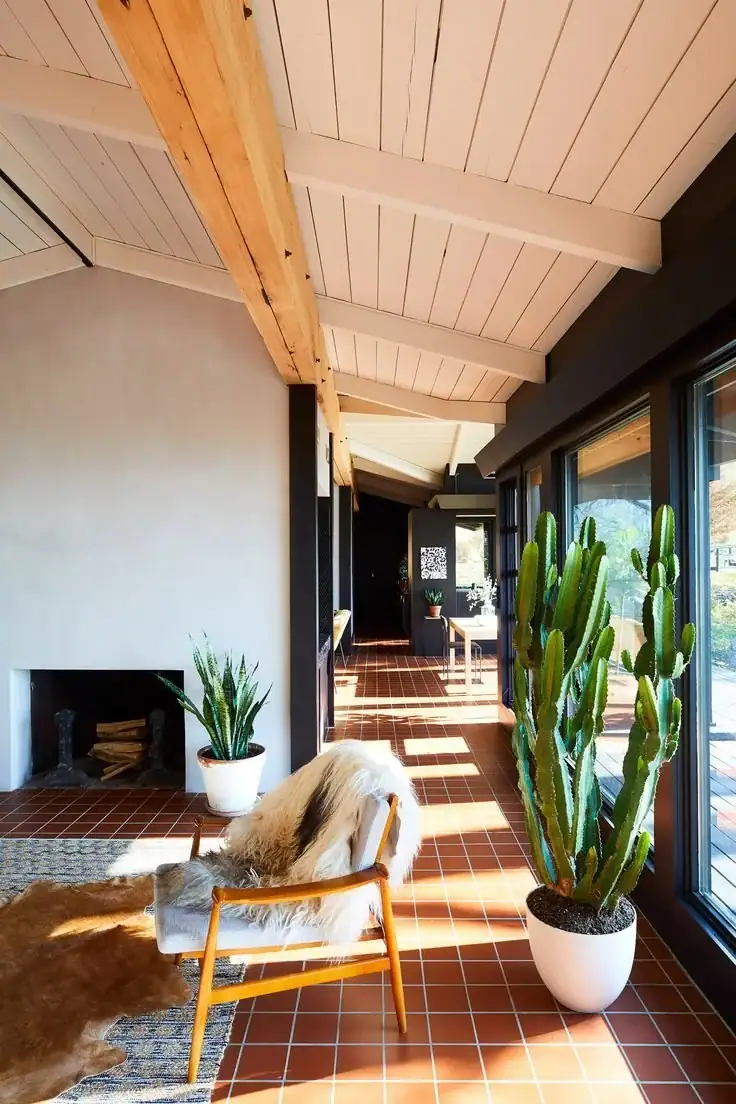
Warm desert tans, olive greens, and soft whites work beautifully beside walnut and teak furniture, creating comfortable spaces that feel true to classic mid-century design.
If your room already has rich wood furniture, a warm neutral like Camelback by Sherwin-Williams ties everything together without stealing attention from those beautiful natural finishes.
When you want extra personality, one accent wall in teal, mustard, or muted red adds energy while keeping the room balanced and visually comfortable every day.
I always stick with two main colors and one accent because adding another competing wall color makes the space feel busy instead of clean and intentional.
Looking through the best interior neutral paint colors can help you build a strong starting point if you are decorating a mid-century modern room for the first time.
The simplest palettes usually create the best results because every color has a clear purpose instead of filling empty space without adding anything meaningful.
Don’t Forget To Order Paint Samples!
No matter what a photo looks like or description, every paint color will look different in your own space. It is so important to test a paint color before you commit to it.
That’s why I love buying these peel & stick samples.
It makes it so easy & affordable to test colors!
Tips for Using Mid-Century Modern Paint Colors in Small Rooms
Small rooms can look surprisingly spacious with a mid-century modern palette when you stick with warm colors that brighten the space without feeling cold or sterile.
Light warm whites and soft taupes create an open feeling while staying true to the classic color combinations found in original mid-century modern homes.
I like painting all four walls the same warm neutral because that simple approach helps the room feel larger and more connected from every angle.
A soft sage or muted olive accent can still work well in smaller spaces, especially when natural light fills the room during most of the day.
Try to avoid very dark wall colors unless you want a cozy den or home office that feels relaxed and inspired by classic mid-century interiors.
Painting the trim and ceiling with a warm white keeps the room feeling bright while creating a smooth flow from one surface to another.
Instead of painting an accent wall, add one bold color through a chair, cabinet, or front door for extra personality without making the room feel smaller.
Natural daylight paired with layered lighting helps every mid-century modern paint color look warmer, softer, and more balanced throughout the day.
Best Decor to Decorate with the Best Mid-Century Modern Paint Colors
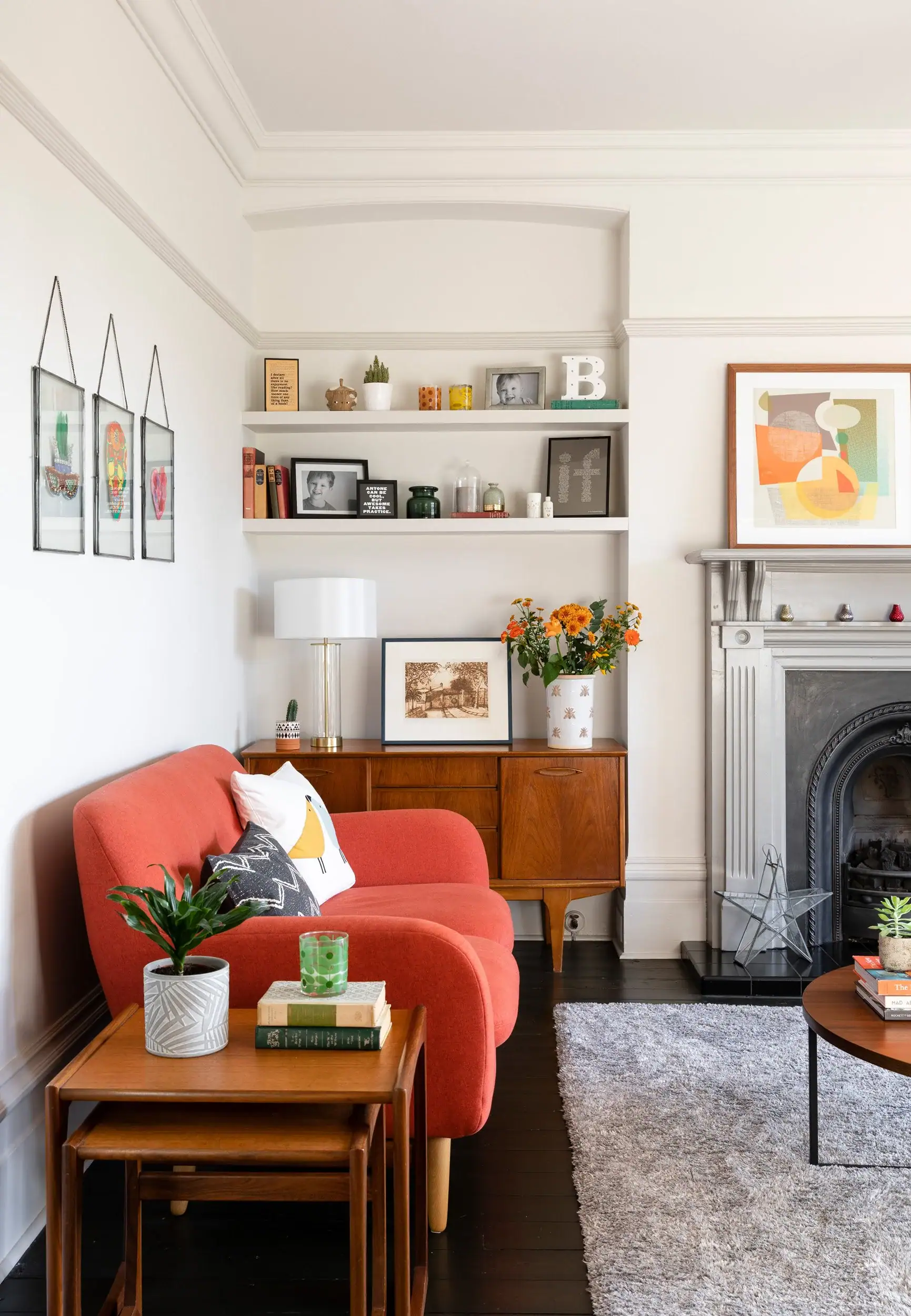
The right decor brings your paint colors together and helps every room feel like an authentic mid-century modern space instead of just another updated interior.
Furniture, lighting, and decorative accents matter just as much as your wall color because every piece works together to create that timeless mid-century modern style.
Here are the decor ideas that pair beautifully with an MCM paint palette and help every room feel balanced, warm, and thoughtfully pulled together.
Would you like to save this post?
Tap Photos To Shop

Tips for Decorating with the Best Mid-Century Modern Paint Colors in Any Room of Your Home
One of the best decorating lessons I learned was treating paint as the background while letting furniture and natural materials become the real stars of every room.
Mid-century modern furniture already has a bold personality, so your wall colors should create a warm setting instead of competing with every piece in the space.
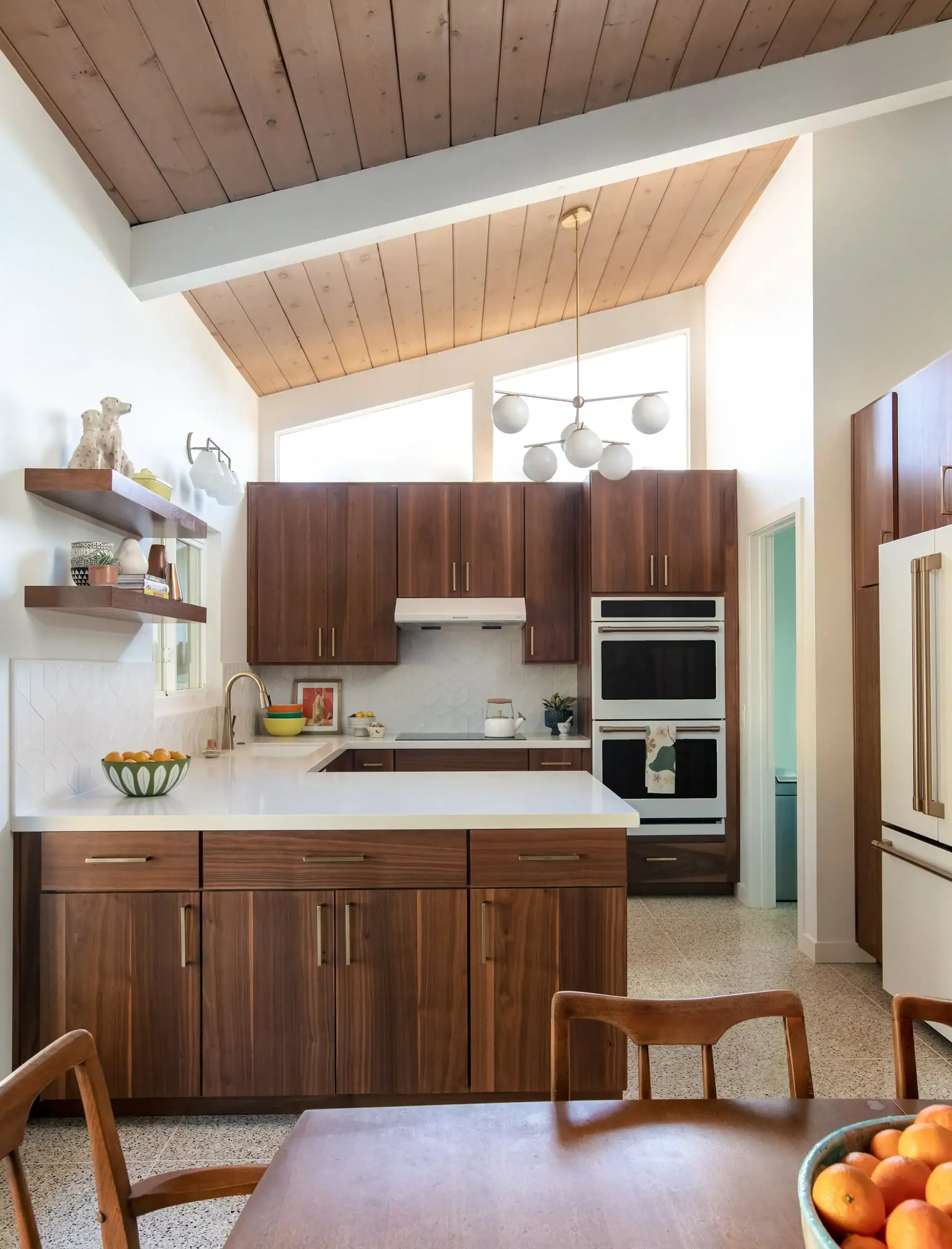
If you are updating your kitchen, earthy kitchen cabinet colors can inspire warm olive, clay, and tan shades that pair beautifully with classic mid-century wood finishes.
For living rooms, warm whites and soft taupes create a calm backdrop that lets your seating, rugs, and tables stand out, and paint colors for your living room offer more ideas.
Bedrooms feel more relaxing with softer shades like dusty sage or warm linen because these colors create a peaceful atmosphere without feeling dull or heavy.
The best neutral paint colors for bedrooms can help you narrow your choices when deciding between warm white, greige, or another soft neutral for a bedroom refresh.
Bathrooms can easily handle richer colors like teal or deep olive on a vanity wall because smaller spaces often look better with one carefully chosen bold accent.
No matter the room, sticking with the same two or three colors throughout your home creates a connected look that feels balanced, comfortable, and timeless.
Best Mid-Century Modern Paint Colors for Home Exteriors
The exterior of a mid-century modern home looks best when you keep the color palette simple and balanced with just two main colors working together.
Many original homes from the 1950s and 1960s paired a soft body color with one contrasting fascia, creating a timeless look that still feels fresh today.
A single bold front door color is usually enough to complete the design, and the best exterior house paint colors can inspire beautiful combinations for your next exterior update.
- Sherwin Williams – Pewter Green (SW 0012): A muted olive green that works beautifully on siding or stucco while staying true to classic mid-century modern style.
- Sherwin Williams – Urbane Bronze (SW 7048): A rich, warm charcoal that adds depth to modern MCM exteriors without making the home feel dark or heavy.
- Benjamin Moore – Camelback (HC-167): A warm desert tan that pairs beautifully with wood accents and captures the classic Southwest mid-century look.
- Sherwin Williams – Cavern Clay (SW 7701): A warm terracotta shade that looks beautiful on fascia boards, accent walls, or other carefully chosen exterior details.
- Behr – Cracked Wheat (N310-2): A soft, warm linen color that pairs naturally with darker trim for a timeless two-tone exterior palette.
- Sherwin Williams – Cyberspace (SW 7076): A deep charcoal that creates clean contrast on front doors, trim, or garage doors without feeling too harsh.
- Benjamin Moore – Latte (OC-15): A creamy warm beige that keeps stucco exteriors feeling bright, welcoming, and grounded throughout every season.

Best Mid-Century Modern Paint Colors for Living Rooms
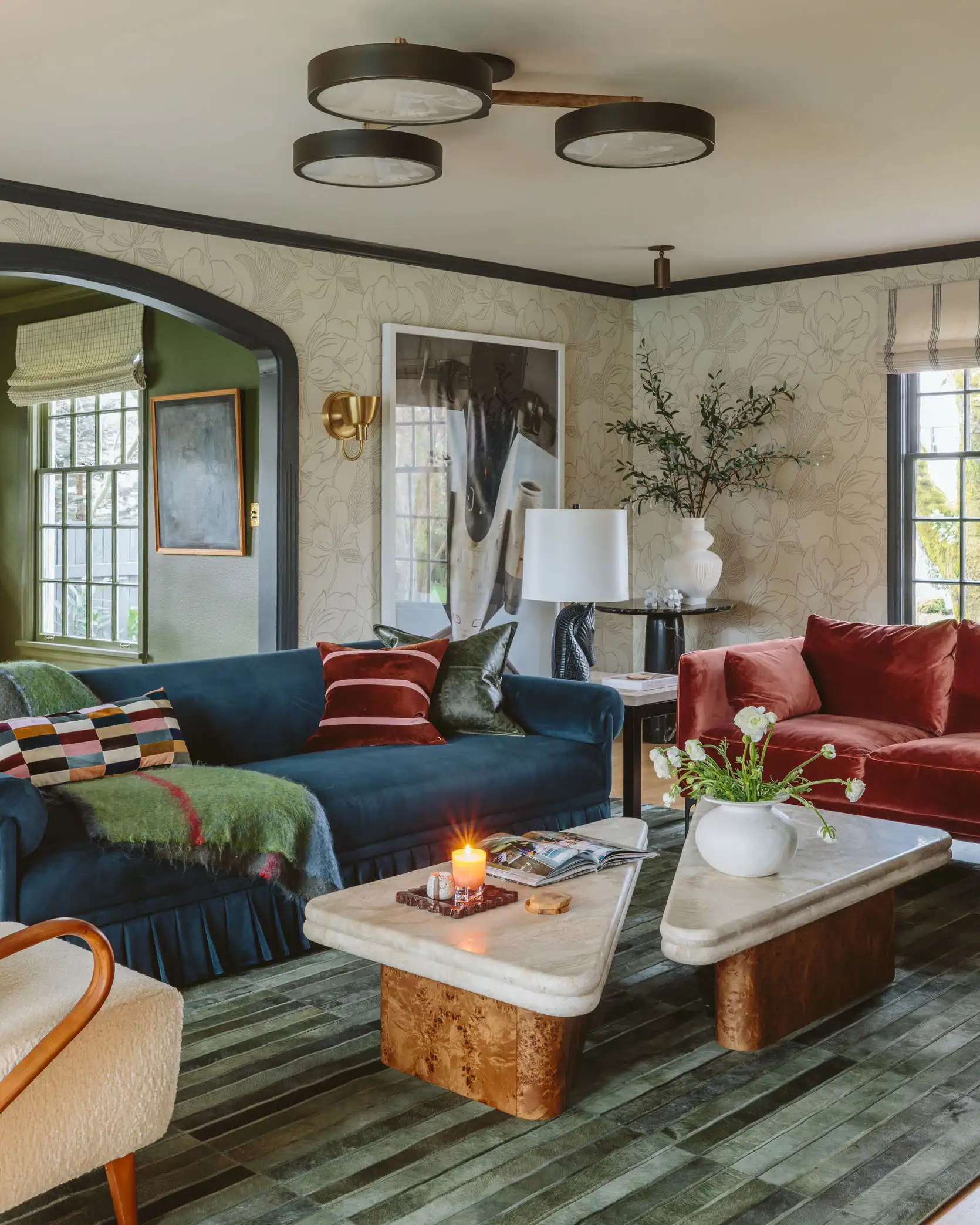
The living room is the perfect place to bring mid-century modern colors to life with a balanced mix of warm neutrals and carefully chosen accent shades.
A single statement wall in teal or muted olive paired with warm white walls creates the timeless look that made classic mid-century modern homes so memorable.
These paint colors capture that authentic MCM style and work beautifully in living rooms with both vintage and modern furniture.
- Sherwin Williams – Shoji White (SW 7042): A warm off-white with a soft gray undertone that pairs beautifully with walnut furniture and other natural wood finishes.
- Benjamin Moore – Hale Navy (HC-154): A rich navy blue that creates a striking accent wall behind a low-profile sofa or media console.
- Sherwin Williams – Dustblu (SW 6244): A muted teal-blue that captures classic mid-century modern style while pairing naturally with walnut wood and brass accents.
- Behr – Cracked Wheat (N310-2): A warm neutral that creates a calm backdrop, letting your furniture, rugs, and artwork become the main focus.
- Sherwin Williams – Olive Branch (SW 9132): A soft sage-olive green that adds earthy warmth while keeping the room balanced and relaxing.
Best Mid-Century Modern Paint Colors for Bathrooms
Bathrooms were the playground of mid-century modern design, where bold colors and playful palettes helped define an entire era.
The 1950s and 60s embraced aquas, teals, and soft pastels that created spa-like retreats in the home, and these shades are making a major comeback with today’s designers.
Whether you want to whisper mid-century charm or go all-in with a retro refresh, these best bathroom paint colors will transport your bathroom straight back to the golden age of modern design.
- Sherwin Williams – Meditative (SW 6227): A soft dusty blue-green that creates a classic mid-century modern bathroom, whether you paint one accent wall or the entire room.
- Benjamin Moore – White Dove (OC-17): A warm, creamy white that stays soft under bathroom lighting while pairing beautifully with vintage fixtures, retro tile, and brass hardware.
- Behr – Cracked Pepper (N520-7): A rich charcoal that creates an authentic mid-century look, especially beside warm white subway tile and brass vanity accents.
- Sherwin Williams – Sea Salt (SW 6204): A soft blend of blue, gray, and green that brings a relaxed 1960s feel while keeping smaller bathrooms bright and comfortable.
- Benjamin Moore – Pale Oak (OC-20): A warm neutral with a subtle green undertone that reflects the earthy color palette found in many classic mid-century modern bathrooms.

Common Mistakes to Avoid When Using Mid-Century Paint Colors in Your Home
One of the biggest mistakes is choosing cool gray paint because it often clashes with the warm wood tones that make mid-century modern spaces feel inviting and timeless.
Another common mistake is using too many bold colors at once, making the room feel busy instead of clean, balanced, and comfortable every single day.
Painting every wall with a dark color can also make your furniture disappear instead of letting those classic mid-century pieces stand out naturally.
Many people forget to test paint samples under both daylight and evening lighting, only realizing the color looks completely different after the entire room is finished.
Ignoring the undertones in your flooring, cabinets, or furniture can leave your color palette feeling disconnected even when every paint color looks beautiful on its own.
Using bright white paint instead of a softer warm white often creates a colder appearance that does not match the relaxed feeling found in classic mid-century homes.
Adding bold accent colors in every room can make your home feel scattered instead of creating the connected flow that gives mid-century modern interiors their timeless appeal.
It also helps to avoid following short-lived color trends because classic mid-century palettes have stayed stylish for decades without needing constant updates.
When you keep your colors simple, balanced, and connected from room to room, your home feels more authentic, comfortable, and true to the original mid-century modern style.
Frequently Asked Questions
What colors are most accurate to original 1950s and 60s MCM homes?
Earthy tones, warm whites, and muted accents like teal, mustard, and olive are the most authentic choices for classic mid-century modern homes.Original palettes paired warm neutral foundations with one bold accent color, and coastal bedroom furniture shows how these timeless color combinations also work beautifully with furnishings.
Can I use bold colors in a mid-century modern home?
Yes, bold colors work best as accent shades instead of covering every wall in the room. Using teal, mustard, or terracotta on one wall, a front door, or cabinetry adds personality while keeping the space balanced and true to mid-century modern style.
Is gray a good choice for mid-century modern interiors?
Warm charcoal grays work well, but cool grays usually feel out of place in mid-century modern interiors. When choosing neutral paint colors, stick with grays that have warm brown or green undertones for a more authentic mid-century appearance.
How many colors should I use in an MCM paint scheme?
Two main colors and one accent color create the balanced look that defines classic mid-century modern design. Keeping your palette simple helps every room feel connected while preserving the clean architectural style that made these homes so timeless.
What paint finish works best for mid-century modern walls?
Matte or eggshell finishes work best because they create a soft, natural appearance on mid-century modern walls. Save satin finishes for trim and cabinetry so your walls keep the relaxed look that fits classic mid-century modern interiors.

Choosing the right paint colors helps your home feel warmer, more connected, and timeless while making every room feel comfortable for years to come.
The best mid-century modern paint colors create a balanced foundation that works beautifully with natural wood, clean lines, and carefully chosen accent shades.
From warm neutrals and earthy greens to classic blues and bold accent colors, you now have practical ideas for every room inside and outside your home.
Keeping your palette simple, using the right finishes, and avoiding common mistakes will help you create an authentic mid-century modern look with confidence.
Pick your favorite colors, use these tips and decorating ideas, and start creating a mid-century modern home that feels stylish, welcoming, and true to the classic design.