Many people were surprised by the bold choice for the color of the year for 2023 and were unsure how to use it in their homes.
When flipping through paint color guides, it’s easy to feel overwhelmed by all the options and not know where to start.
Some colors feel too bright for everyday spaces, while others are hard to match with furniture or wood finishes already in place.
You might fall in love with a photo online, but that same color looks totally different once it’s on your wall.
A color that’s meant to feel bold can sometimes take over the room and make the space feel smaller or darker than expected.
It’s frustrating to spend time and money painting, only to end up with a color that doesn’t work for your lighting or style.
Even with trending colors, people still want something that fits their personality and doesn’t need to be changed every few months.
This post may contain affiliate links. As an Amazon Associate and a participant in other affiliate programs, I earn a commission on qualifying purchases at no additional cost to you.
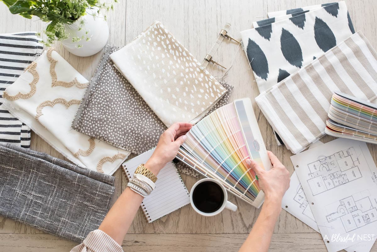
The color of the year for 2023 can work beautifully in small doses or even across an entire wall if styled the right way.
So, I’m going to share some simple ways on how to use it with confidence, whether you love bold choices or prefer a more neutral base.
These ideas and tips will make it easier to bring the trend into your space without the stress or second-guessing.
2023 Color Forecast and Themes
If you didn’t know most of the top paint brands launch their own color of the year. This is their prediction of the upcoming trend in color and paint for the new year. Generally, paint brands put out their color of the year anywhere from October to January. These trends seem to follow a lot of what has preceded in the fashion world so that is a huge indicator of what will be taking off in the home decor field.
Here is an overview of the colors and shades to look out for in home decor and interior colors for 2023.
Bold shades of red and orange
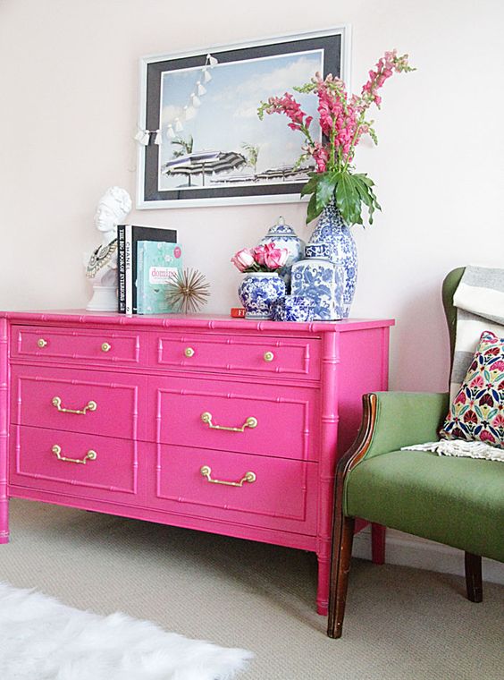
Keep your eye out for vivid shades of red and oranges either in small doses like a vase or in a bigger statement like cabinets or walls. These tones will make any space feel vibrant and full of life. Grab my tips on decorating with hot pinks and how to decorate with orange for ways to use these shades in your own home.
Warm neutral cream and whites
Neutrals are still here to stay but are warming up a bit with creamier shades. Think about layering the varying shades to create depth and even texture. Whites and creams are such an easy shade to work into any design style and really are timeless. There is an art to decorating with neutrals so follow my guide for my best tips!
Rich greens
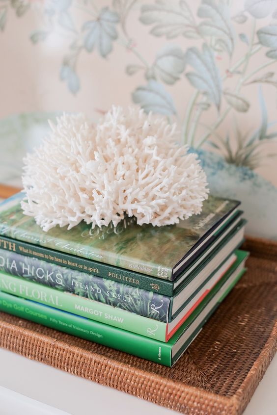
Last year it was all about these beautiful shades of green, and for 2023 green is here to stay. This time with a focus on a deeper and richer shade of green, we will see nature still play a role in interiors. There are so many ways to decorate with green so make sure to take a peek at my guide.
Don’t Forget To Order Paint Samples!
No matter what a photo looks like or description, every paint color will look different in your own space. It is so important to test a paint color before you commit to it.
That’s why I love buying these peel & stick samples.
It makes it so easy & affordable to test colors!
Color of The Year 2023 by Paint Brand
I have collected all the color of the year 2023 paint trends by the top paint experts for you in one place! See examples of each from interiors, home decor accessories, and entertaining tabletop ideas.
Viva Magenta by Pantone
The Pantone color of the year 2023, Viva Magenta is here and in charge! Talk about creating a statement and having a feminine edge to it. Viva Magenta is a deep hue of pink and red mixed together. It has a unique edge to it and this shade can pair with almost any other color depending on how bold of a look you want.
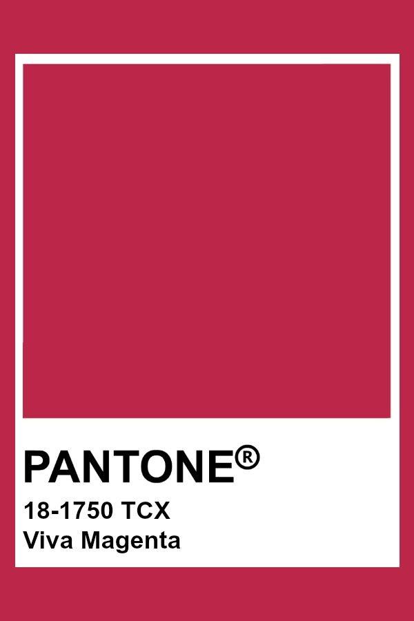
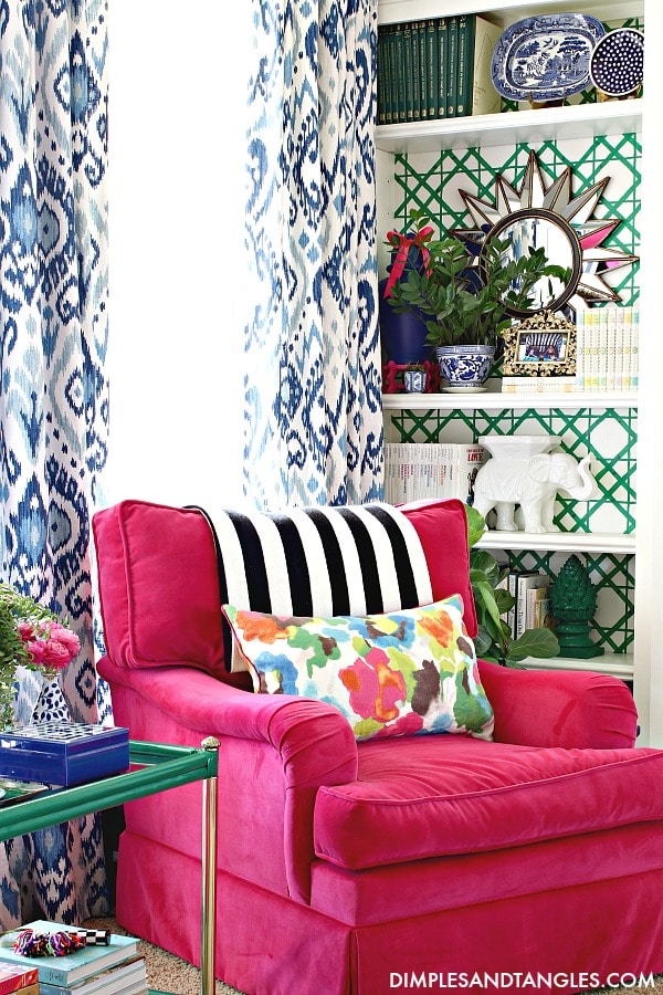
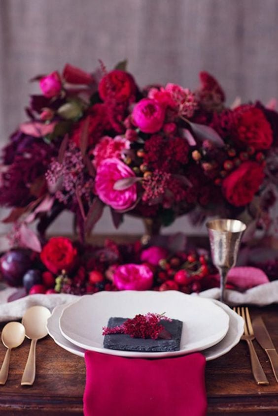
Leatrice Eiseman, executive director of the Pantone Color Institute said Viva Magenta is “inspired by the red of cochineal, one of the most precious dyes belonging to the natural dye family as well as one of the strongest and brightest the world has known.”
This color is made for all color lovers!
Raspberry Blush by Benjamin Moore
Raspberry Blush from Benjamin Moore is such a happy and bright color. Leaning towards a red-orange hue, this color is perfect for walls, trim, and even cabinets.
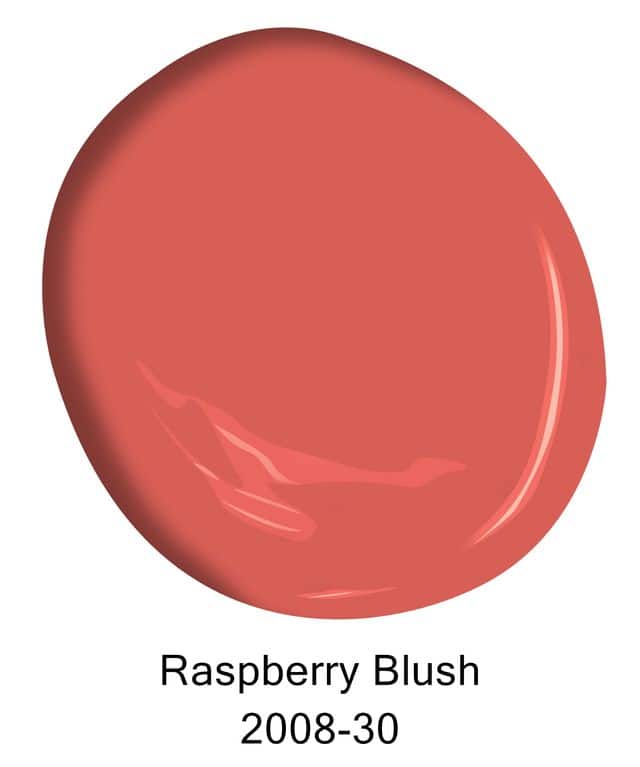
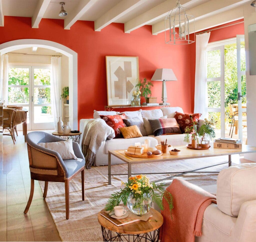
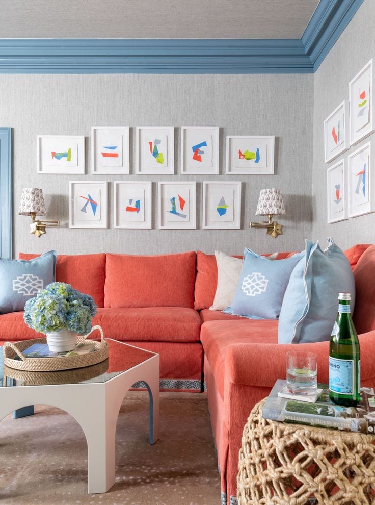
“People are ready to bring color back into the home, taking a step outside their color comfort zones,” said Andrea Magno, color marketing and development director at Benjamin Moore.
Raspberry Blush is a shade for people who want a bright pop of color to showcase a room or accessory. Use this in a throw pillow or in a bathroom as a cabinet color. Pair with neutrals or even shades of blue for a little play on color.
Redend Point by Sherwin-Williams
Redend Point by Sherwin Williams is an earthy brown tone with a hint of blush in it. This color brings warmth and feels like the outdoors are coming in. This shade definitely takes neutral to another level.
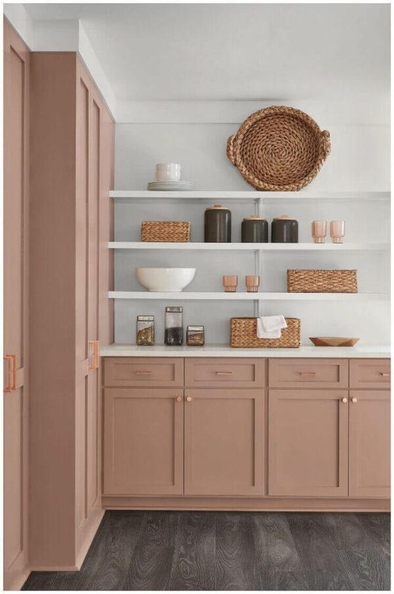
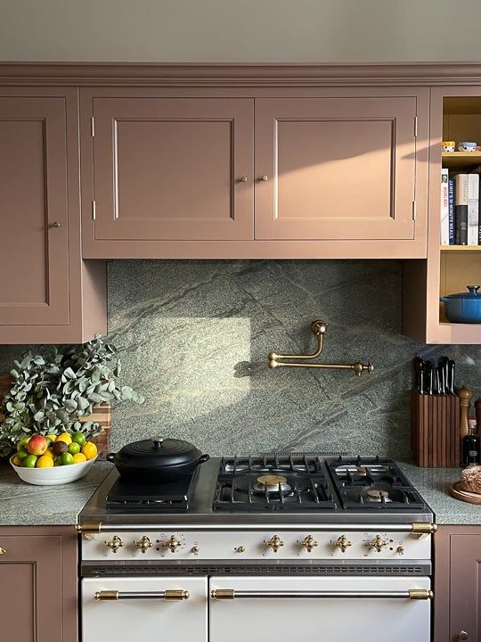
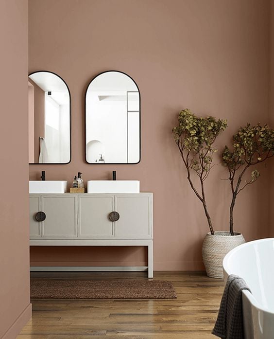
I love this color paired with black, neutral creams and whites, or even a navy blue. Redend Point would be beautiful in some side chairs paired with a creamy white sofa and a soft wood-toned coffee table.
This is a color that will take on a richer tone as the sunsets in the day and the light in the home darkens, creating a more moody vibe.
Blank Canvas by Behr
Blank Canvas by Behr is for all my neutral color lovers! As you can see it has a creamy look too it with less blue undertones. Variations in this shade create more depth in the space and even definition in the decor pieces.
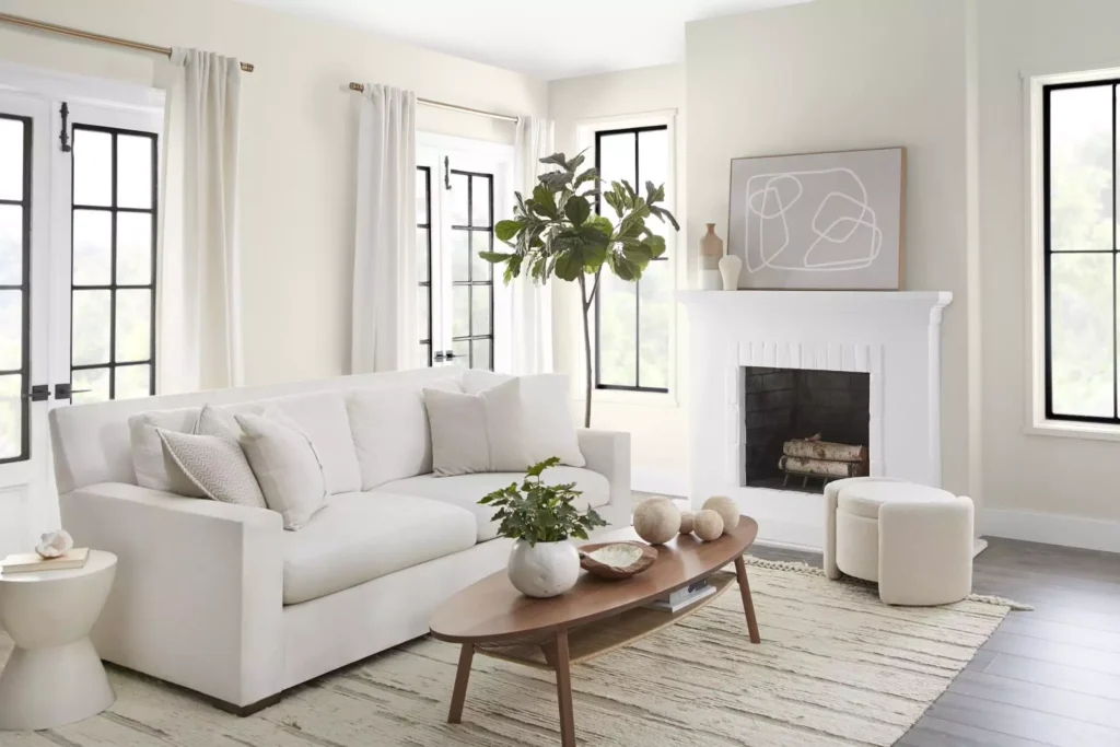
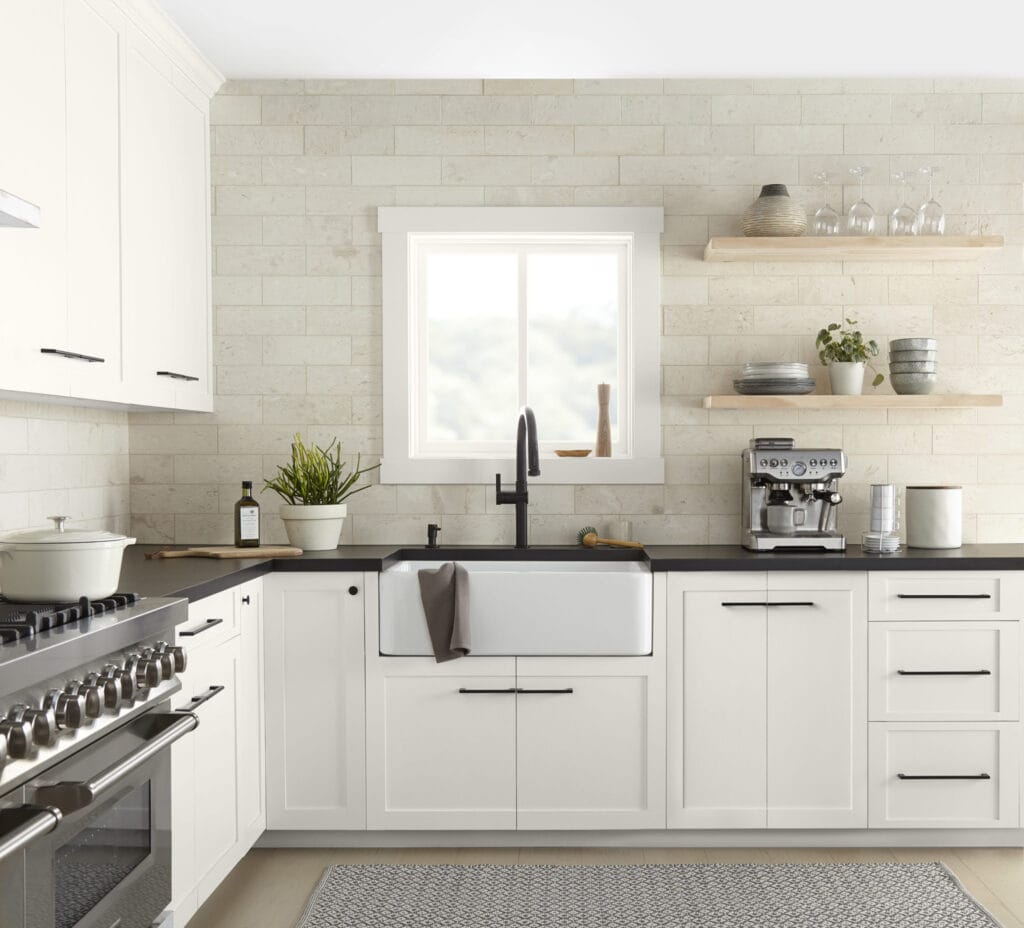
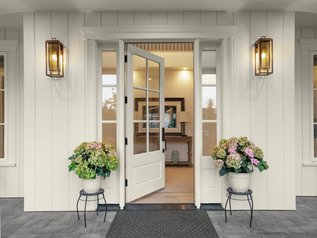
This color is easily paired with more bold color choices or creates a soft easy-on-the-eye restful feel to an interior. Regardless of which direction you go in with this color, it is an easy paint color to work with.
Terra Rosa by Dunn-Edwards
Terra Rosa by Dunne Edwards has a deep mauve pink tint to it with a mix of brown. It makes an absolutely striking color for an exterior and a beautiful welcome to an entryway.
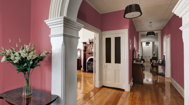
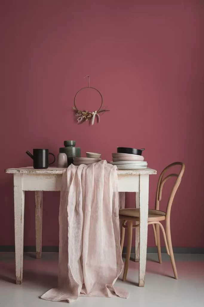
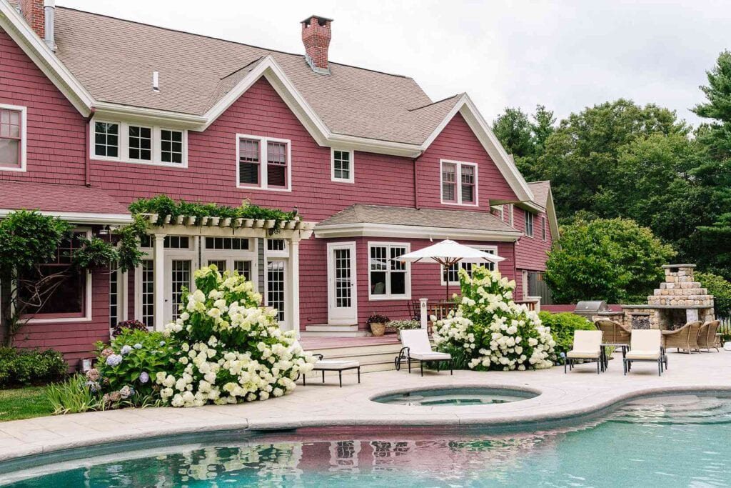
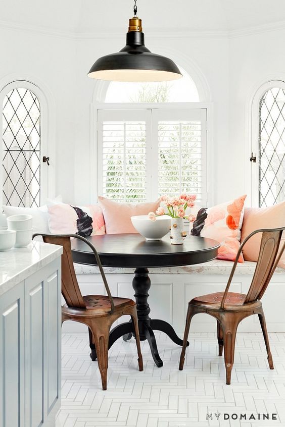
This paint color shade is perfectly paired with shades of whites and accents of wood tones. Coastal grandmothers are going to be using this shade a lot!
Spanish Moss by Krylon
Color experts love a good green shade and this year’s Moss Green by Krylon is sure to inspire tons of projects around the house. From cabinet colors to DIY’ing a piece of furniture from the fleamarket, this shade is reminiscent of the outdoors but makes a bold statement.
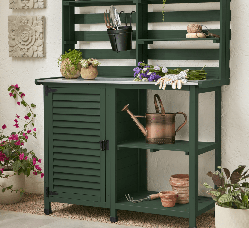
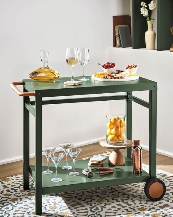
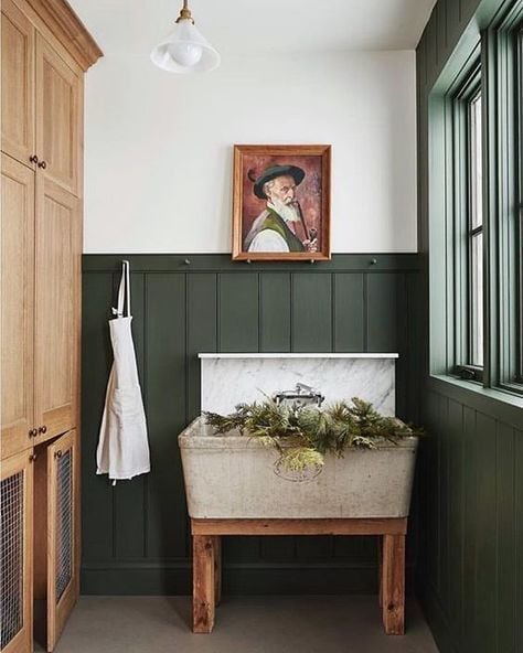
This color easily works for a transitional farmhouse decor style and even a modern boho look. Mix with black or gold accents in hardware. lighting and accessories to complete the look.
Would you like to save this post?
Canyon Ridge by Better Homes & Gardens at Walmart
Canyon Ridge by Better Homes & Gardens at Walmart is a bright and cheerful tone. It has a southwest vibe and looks beautiful with a rich deep navy, green, or black. Paired with neutral whites and creams really make it pop and feel light and airy.
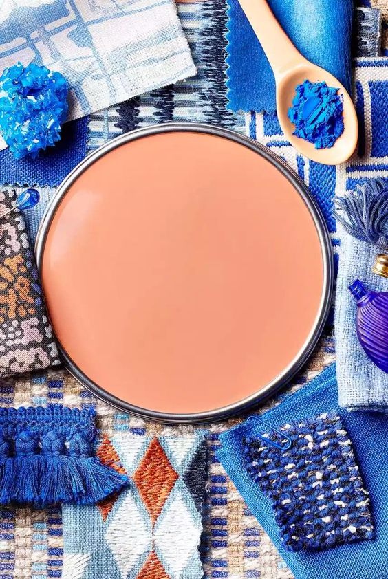
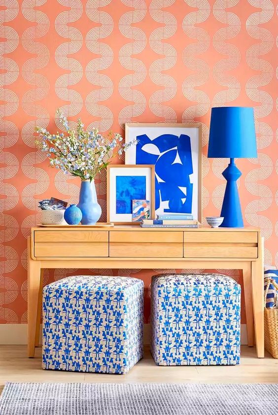
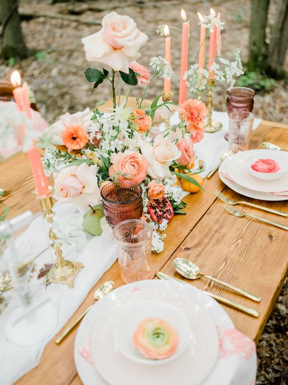
This is a great color to use as an accent wall and in small home accessories like throw pillows, vases, or faux florals.
Rustic Greige by Dutch Boy
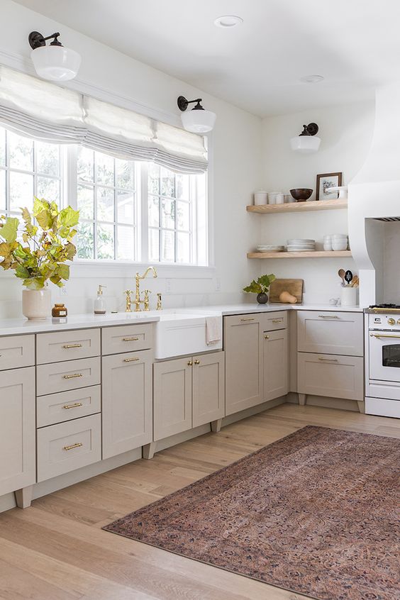
Rustic Greige by Dutch Boy is a beautiful blend of grey and beige with a slight undertone of red. It is a warm and cozy paint color that is a great alternative to white without going in a saturated color direction.
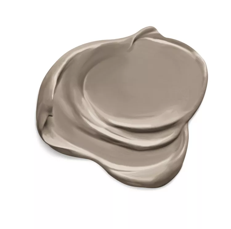
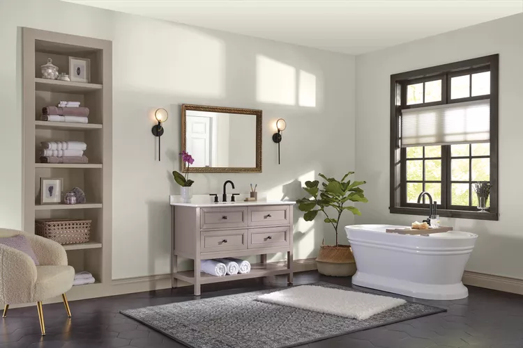
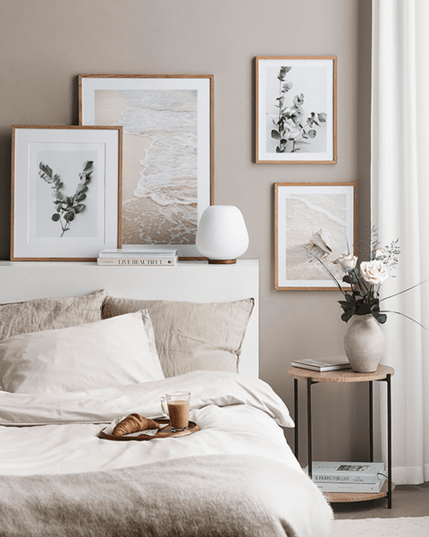
Rustic Greige is a gorgeous color to use for kitchen cabinetry or for a whole room. This paint color is to inspire rest, calm, and relaxation to a space. I love this color for a coastal decor style or even a boho design look.
6 Ways to Use Interior Color Trends
So now that I’ve shown you all the latest paint color trends for 2023, let me give you some ideas on how to use them in your own home with some real-life examples. If you are like me then you will love the visual inspiration to help get your creative juices going!
Paint
Never underestimate the power of paint. I know that’s all we have been talking about but lets break that down a bit more than just painting walls with these trending colors.
A few ideas of what to paint would be the following.
Painting Project Ideas:
Each of these are simple painting projects that could instantly transform your space with a refreshed and elevated look.
Accessories
Accessories are such an affordable and easy way to add in a punch of color or even multiple colors and shades.
Here are a few ideas on how to add colorful and unique decor to a particular space:
Tips to Decorate With Accessories:
Table Setting
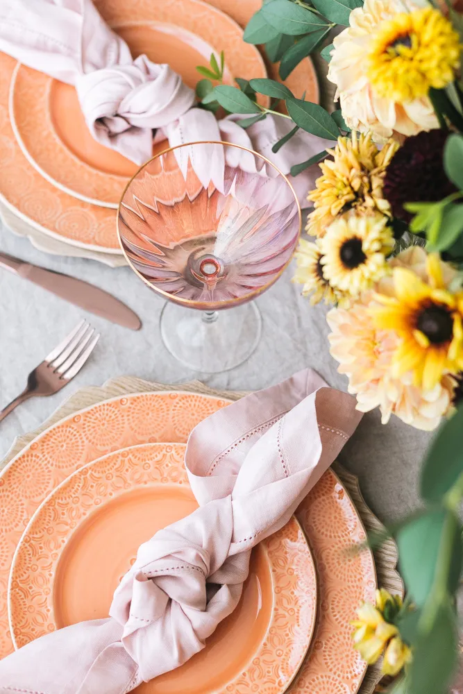
One of my favorite times to get creative with colors and decor is with a beautiful table setting.
layering plates, bowls, napkins, and accessories can make a table look unique and inviting. I typically love to have basic white dishes on hand and then mix in colorful pieces to change it up.
Trust me when I say, people always remember a beautifully set table!
Throw Pillows
My obsession for throw pillows runs strong! I truly believe you can never have enough and I even have a dedicated closet to them.
Mixing and matching pillows is a it of an art but I have spilled my secrets on how to do it effortlessly. Really you can take my tried and true formula and apply it to any room in the house.
If you love the bright rich tone of Pantone color of the year 2023, then simply pop in a few throw pillows to your space for a vibrant look.
Area Rugs
I love how area rugs can really change the whole tone of a room.
A room that is generally neutral can take on a whole new look with a colorful area rug. You can even layer rugs to create texture and pattern depth.
Bedding
This is one of my favorite ways to change a bedroom for a new season.
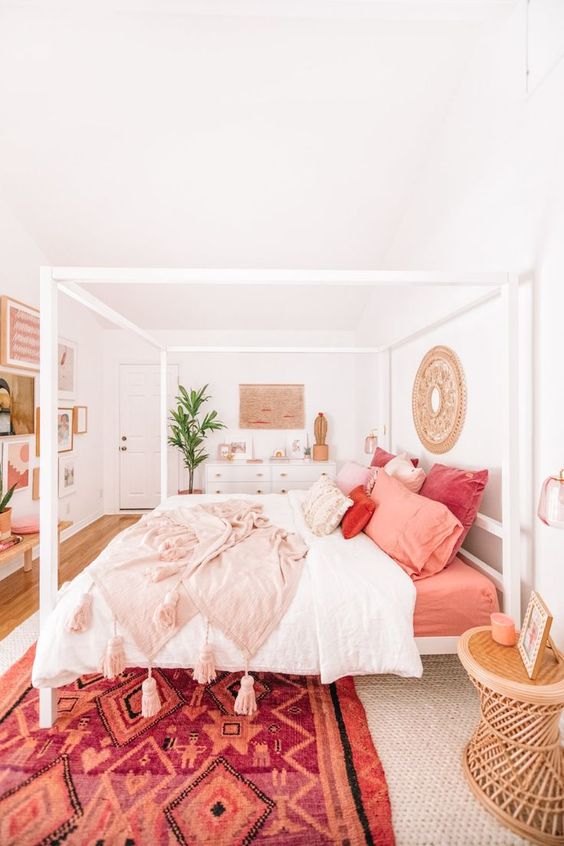
I love to pick bedding and throw pillows that can be mix and macthed together. Typically I never pick everything from the same collection. I love a more unique and collected look. So you can easily do this with more than one of the trending colors of the year.
I hope this gave you lots of ideas on what the color of the year for 2023 is from all the leading paint experts and how to use them in your own home. I wish you a colorful year in your home decor adventures!
Frequently Asked Questions
The color of the year for 2023 is Viva Magenta, a bold red with pink undertones that feels lively and full of energy. It was chosen to reflect strength, optimism, and creativity in design.
Start with smaller accents like pillows, rugs, or artwork to test how Viva Magenta works in your space without overwhelming it. If you’re ready for a bigger impact, try it on an accent wall or in a statement piece of furniture.
Yes, Viva Magenta pairs beautifully with soft whites, grays, and beiges because the contrast keeps the color bold but still balanced. It also works well with natural textures like wood and stone for a grounded look.
You can definitely use Viva Magenta in smaller spaces, but it works best in moderation so the room doesn’t feel crowded. Try using it for trim, textiles, or decor pieces instead of full walls.
Pantone selected Viva Magenta because it represents confidence, joy, and a push toward bold self-expression in design. It encourages people to be more adventurous with color choices in their homes.








I just made a DIY dog house and was looking for a perfect color scheme for it and ended up in your blog which I found really helpful! I love Terra Rosa and will surely paint the dog house with it and the white Roof, hoping my dog will love it! Thanks, Rebekah!
Oh I love this! I bet your sweet pup will love it!